
If you have a ton of data and you want to tell a good story, interactive infographics are a fantastic tool. They entice people to explore your content, whether it’s a data set or a guided storytelling experience, and they can provide far more information than a static infographic.
So, what makes a good interactive infographic? Whether it’s super simple or incredibly complex, it comes down to good design, engaging interactivity, and an interesting subject. The options are pretty much endless. If you’re thinking about experimenting with interactive infographics or looking for some serious inspiration for your next project, we’ve rounded up 101 of our favorites, covering everything from the cosmic web to cocktails.

101 Awesome Interactive Infographics
Scroll through the whole list (they’re listed, not ranked), and click on the images to visit the interactive infographic. We hope you enjoy.
1. “How Search Works: From Algorithms to Answers”
With the ease of Internet search, it’s easy to forget how much work goes into generating each search result. This interactive infographic, created by Google, helps you fully understand the process.

2. “The New New York Skyline”
New York has one of the most recognizable skylines in the U.S., but it is changing, as this interactive by National Geographic shows. Scroll through the city and click on landmarks for more information.

3. “The Evolution of the Web”
This interactive infographic by Google Chrome details the growth of the web. You can explore the infographic from two perspectives: the growth of the Internet as a whole or by looking at individual browsers and technologies.

4. “World’s Biggest Data Breaches”
Everyone is at risk of data theft, but large entities are particularly targeted. This interactive infographic created by David McCandless of Information is Beautiful lets you see who’s been hacked and to what extent.

5. “Vitamin Atlas: An Interactive Guide to Nutrition and the Human Body”
This interactive by Good Magazine guides you through the body like Ms. Frizzle guides her students on The Magic School Bus, giving you a full biology lesson.

6. “Hungry Tech Giants”
Tech giants don’t climb down from beanstalks; they grow through acquisitions. This interactive by Simply Business allows you to see the conquests of five major companies from 1999 to 2014.

7. “Diversity in Tech: Employee Breakdown of Key Technology Companies”
This interactive infographic by David McCandless looks at the demographics of the largest tech companies. The data is not perfect, as not all companies declare their figures. But you can search by gender, ethnicity, or company.

8. “Will a Robot Take your Job?”
BBC created an awesomely terrifying interactive infographic that shows the likelihood of robots making your job obsolete. Either type in your profession or choose from a comprehensive list to see the percentage.

9. “A Visual Introduction to Machine Learning”
Machine learning is the field of study that gives computers the ability to learn without being explicitly programmed. It is as abstract as it sounds, but if you want to learn more the best way to do it is with this interactive infographic created by Stephanie Yee and Tony Chu.

10. “45 Words You Should Know About HIV/AIDS”
This interactive created by Healthline fights misinformation surrounding HIV and AIDS. Terms are color-coded, and you can click to learn more.

11. “The Visual Web”
This interactive infographic by Ceros visualizes a study conducted by GumGum and Brand Innovators about the power of visual content.

12. “Mapping the Dead: Gun Deaths Since Sandy Hook”
This Huffington Post interactive map of gun deaths in the U.S. allows you to see how prevalent gun violence is across the country and in your own state.

13. “International Women’s Day: Political Rights Around the World Mapped”
The Guardian’s interactive map on women’s rights allows you to scan information by region, time period, or by right (voting, right to run, elected). More info is found by clicking on a country.

14. “The Data That Lies Beneath”
Column Five partnered with Lucidworks to create this interactive infographic, which examines true cost of dark data and how brands can tap into the huge potential dark data provides.

15. “NFL Salaries by Team and Position”
The Guardian’s interactive team created this interactive infographic to showcase the salaries of NFL players, based on their team and position. You can compare teams or explore a single team’s data.

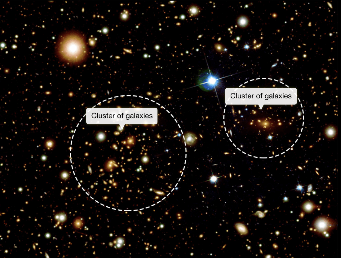
16. Viewspace.org
These epic interactives let you explore all aspects of space, from star formation to dark matter.
17. “Gay Rights in the US, State by State”
This interactive by The Guardian showcases the evolution of gay rights in America. It’s broken down by state and region, allowing an in-depth look at all laws regarding marriage, hospital visits, adoption, employment, housing, hate crimes, and schools.

18. “Geography of Hate: Geotagged Hateful Tweets in the United States”
Created by a professor and students at Humboldt State, this piece shows an interactive map of all tweets featuring hate speech in America. The data is from all geotagged tweets between June 2012 to April 2013.

19. “What’s Your Pay Gap?”
This visualization by the Wall Street Journal highlights the issue of pay discrepancy. The interactive lets you plug in your profession and calculate how much you make compared to the opposite gender. (Interestingly, it shows that women getting paid less. There are professions where men are making less than their female counterparts—cough cough: dieticians.)

20. “Parable of the Polygons: A Playable Post on the Shape of Society”
This piece by Vi Hart and Nicky Case illustrates the complications of small individual biases and their impact on society as a whole. You’re playing a game with “unhappy polygons” and learning about society all at once.


Comments