
Net neutrality, the idea that all content on the web should be accessible, regardless of the source, is a hot-button issue—and the subject of the documentary Killswitch, now streaming on Netflix.
It’s a fascinating watch, but the film is especially close to our hearts because Director Ali Akbarzadeh and production company Akorn asked us to lend our typography skills to the title sequence and introductions for main speakers.
Killswitch tells an important story, so we were more than happy to help.
Column Five x Killswitch
Our main goal was to support and enhance the narrative through typographic design. To do this, we drew inspiration from the title sequence designed by Editor CJ Sato of Akorn.
While so many documentaries rely on a cold, CIA spy-meets-Matrix aesthetic, Sato chose to go the opposite route, making the intro full of color and rhythm.
It combines abstract color with old grainy film reels showing people using what would now be considered ancient technology. The visuals are coupled with an original track by Co.Fee, which beats beautifully in sync. It was this sensory rush that served as the basis for our typographic decisions.

Type as Character
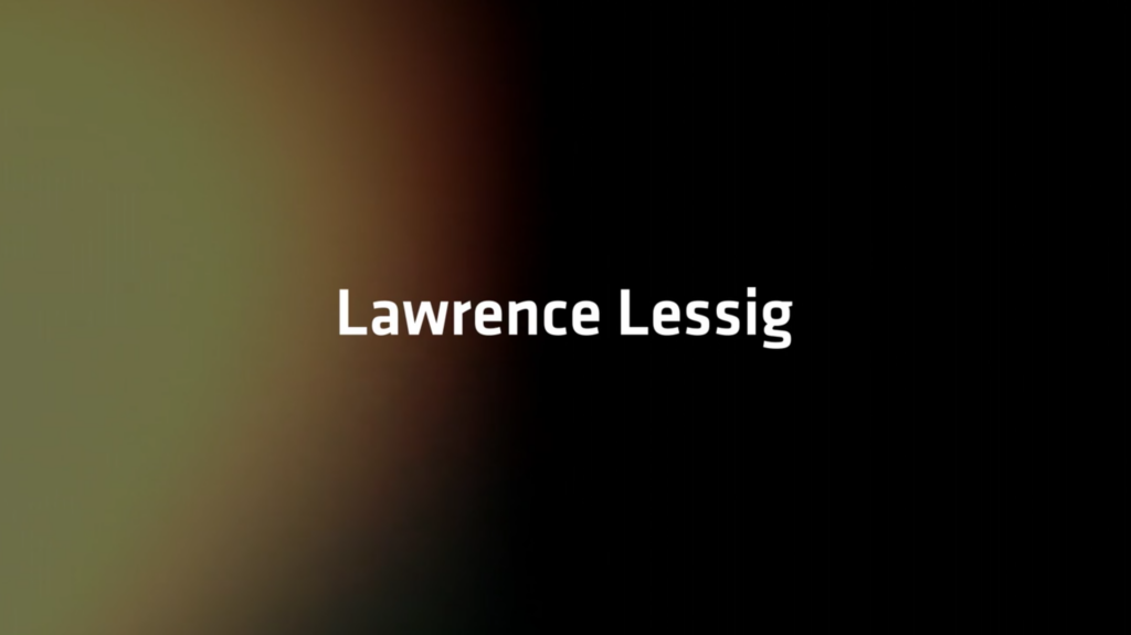
There are three main speakers in the film: philosopher Peter Ludlow, writer Tim Wu, and Professor Lawrence Lessig. These three are the crux of the narrative, the humble brilliance of the film. For that reason, we felt they each deserved their own unique typographic treatment, inspired by their individual perspectives.
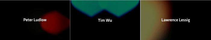
Instead of a typical lower-thirds treatment, we introduced each speaker with a frame of their own, their name centered against a glowing abstract color in a field of black.
Ludlow, the fiery persona full of controversy, ignites the film with an unapologetic attitude. His name appears in white type over a throbbing red light, like blood pulsing in your chest.

Tim Wu, the father of Net Neutrality, assesses the issue through a more intellectual, historical lens. His name appears directly under two equal-sized teal shapes, pinned at the top frame. The composition is balanced and symmetrical, matching the cadence of his Wu’s straightforward statements.

Finally, Professor Lawrence Lessig is the warm glow of the film—both in sentiment and visual representation. (His inspiring words and actions throughout the film are born from a deep reflection on the loss of his surrogate son, Aaron Swartz.) His name appears alongside an expanding golden light.
Although a small part of the film, we loved contributing these simple pieces of visual storytelling.
Many thanks to Killswitch crew for collaborating on this project and giving us a great creative challenge. We hope you enjoy the documentary as much as we enjoyed working on it.
Check out Killswitch on Netflix and take a look at more of our unique projects. If you have a story to tell through visual content, we’d love to chat.