Strong graphic design does more than look good. It grabs attention, elicits emotion, builds trust, and signals value (particularly for brands). There’s a reason a single design tweak can turn a forgettable ad into something people talk about. And the pioneers of design understand that power intrinsically.
The designers below have all shaped how we see brands and products. They’ve created legendary logos, campaigns that grabbed your attention, and visual languages that whole industries have adopted. Moreover, their principles can transform your content marketing right now.
What can you learn from them?
- When to break the mold, like Paula Scher did with her bold, type-driven posters for The Public Theater.
- When to keep things simple, as Massimo Vignelli did with the New York City subway map to make chaos readable.
- How to create a visual identity that sticks, like Jessica Walsh’s playful, color-soaked campaigns for brands that wanted to stand out.
Ready to make your brand unforgettable? These designers show exactly how it’s done, with real-world examples you can use right now.
15 Famous Graphic Designers Every Marketer Should Know (And What You Can Learn From Them)
We’ve broken this list into two categories of designers who have made a real, lasting impact.
- Legendary pioneers: They laid the foundation, inventing techniques that future generations have built upon.
- Contemporary trailblazers: They take those classic ideas and make them work for today’s digital world.
Let’s start with the legendary pioneers.
Legendary Graphic Designers: Foundational Principles for Timeless Branding
1. Saul Bass: Kinetic Typography Pioneer
Bass is an iconic designer who transformed the opening credits in films like Vertigo, Psycho, and The Man with the Golden Arm. He turned static titles into dynamic visuals that set the tone for the story through bold, minimalist typography with movement. He knew movement grabs attention quickly, and simplicity communicates more effectively than clutter. We see both principles carry throughout his work.
Marketing lesson: Use simple, dynamic graphics to grab attention and show brand energy. Make your logos, video intros, and social content move with purpose, not just for show.
2. Paul Rand: Master of Corporate Logos
Rand’s work endures because it’s clear, flexible, and instantly familiar. He liked geometric forms and playful simplicity. And through his logo designs, he determined that a good logo should work at any size, work in any medium, and still look sharp in black and white. In essence, he believed that logos aren’t just logos; they’re visual shortcuts that tell a story at a glance.
Marketing lesson: Design logos that are memorable and versatile. Test your brand marks on everything from business cards and billboards to your website and socials to make sure they’re legibile and impactful.
3. Milton Glaser: Emotive Illustrative Design
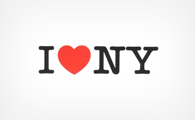
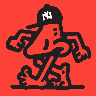
Milton Glaser designed the iconic I ❤ NY logo and the famous psychedelic poster for Bob Dylan. He didn’t just create images; he shaped how people felt about brands and culture. Glaser revealed that design is, at its core, about emotion, memory, and connection.
Glaser’s work particularly stands out for its expressive, hand-drawn style. He used bold colors, playful shapes, and unexpected details, which made his designs feel personal and alive.
He also understood that people remember how a design makes them feel, not just what it looks like. His visuals are memorable not only for the emotions they evoke but for their representation of a moment in culture. The I ❤ NY logo became a symbol of hope and pride for New Yorkers in the 1970s, while the Dylan poster captured the energy of the 1960s music scene.
Marketing lesson: Don’t just show your brand. Make people feel it. Use emotion and storytelling in your visuals. When you connect with people on a deeper level, your brand becomes more than a logo. It becomes a feeling they remember.
4. Herb Lubalin: Typography as Expressive Art
Herb Lubalin made typography emotional and bold, giving letters true personality. With Avant Garde magazine, he broke the rules of traditional type. He created the ITC Avant Garde Gothic font, which became iconic for its geometric shapes and tight spacing. Lubalin’s layouts also used overlapping letters, dramatic scale, and unexpected forms. Every headline and logo he touched felt alive.
He believed typography should do more than deliver a message. It should make you feel something. Hence, he used space, contrast, and custom letterforms to turn words into visual stories. His work with ITC (International Typeface Corporation) changed how designers thought about type and proved that the look of your words can be as powerful as the words themselves.
Variety was the key to his success. He used tight kerning, custom ligatures, and playful arrangements. He often broke words apart or stacked them to create rhythm and movement. He treated negative space as a design tool, not just empty background. And his type choices always matched the mood and message of the project.
Marketing lesson: Use unique type to set your brand apart. In fact, your typography should match your brand personality as much as your color palette, whether you’re modern, classic, friendly, or bold. Don’t settle for default fonts. Choose type that tells your story.
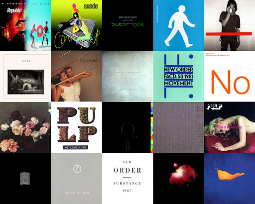
5. Peter Saville: Minimalism Meets Conceptual Depth
Peter Saville designed some of the most memorable album covers for Joy Division and New Order. His style? Clean, simple, and never cluttered. He leaves plenty of empty space, drawing your eye to the most minor details and inviting you in. (Think about the cover for Joy Division’s “Unknown Pleasures.” It’s a black background and white lines, but it’s unforgettable.)
Saville’s restraint makes his designs stand out, proving that sometimes, less really does say more. He also creates layered designs, hiding details in plain sight. That’s not to say his designs are cluttered. But the intentional use of color, shape, and typography means that element serves a purpose. Nothing feels random or thrown in.
Marketing lesson: If you want people to remember your campaign, don’t give everything away. Use concept-driven, restrained design. Make people curious. When you make your audience think, you pull them in. They engage with your message because they want to solve the puzzle. Remember: Effective marketing doesn’t spoon-feed. It sparks interest and rewards attention.
6. Stefan Sagmeister: Rule-Breaking Visual Experimentation
Stefan Sagmeister designed album covers for The Rolling Stones and Talking Heads that broke every rule in the book. A true genius, he didn’t just use Photoshop. He carved promotional text into his own skin for a poster, showing real pain for real impact. For another project, he spelled out words using hundreds of bananas, letting them rot over time to reveal the message. He uses everyday objects, his own body, and even food to turn design into an experience you can’t ignore.
Sagmeister questions every design tradition. He doesn’t settle for safe or expected. He picks materials and methods that force people to stop and look. His work sticks in your mind because it’s raw, unexpected, and sometimes shocking. The work is powerful because it makes you feel something. Whether it’s discomfort, surprise, or curiosity, you remember the message.
Marketing lesson: The best campaigns push boundaries and make people talk, so go bold. Don’t play it safe. Use materials or ideas no one expects. If you want people to notice your campaign, break the pattern.
7. Massimo Vignelli: The Power of Consistent Grid Systems
Massimo Vignelli shaped how millions navigate New York City. He designed the iconic NYC subway signage system in the 1970s, turning a chaotic, confusing network into something people could actually use. (By using color-coded lines, clear typography, and consistent layouts, he created a map that allowed riders to find their way, even if they don’t speak English.) He also created the American Airlines branding, giving the airline a clean, modern look that stood out for decades.
Vignelli approached every project with a strict, logical system. He used tight grids to organize information and relied on Helvetica for its clarity and neutrality. He believed design should guide people, not distract them. One of the biggest secrets of good design is that you don’t actually notice good design—it just works and makes your life easier. Vignelli’s work proves that design isn’t about decoration. It’s about solving problems and making things understandable.
Marketing lesson: Keep everything clear and consistent across your brand. Build a design system so every touchpoint, from your website and ads to your packaging and emails, feels like it comes from the same place. When you do this, you make your brand easy to recognize and trust.
Contemporary Trailblazers: Innovative Approaches for Modern Marketers
8. Jessica Walsh: Vibrant Collaboration and Emotional Impact
Jessica Walsh co-founded &Walsh, a creative agency known for its bold, innovative campaigns. She’s led projects for Adobe that combine striking visuals with honest, human stories. Walsh believes that showing real collaboration and vulnerability helps brands build genuine connections with people.
Her design style stands out with bold colors, layered mixed media, and unfiltered storytelling. Every project feels personal and easy to relate to, and she often works directly with clients and their audiences, turning their stories into the heart of each campaign. Walsh’s approach proves that when you invite others into the creative process, you get work that feels authentic and fresh.
Marketing lesson: Don’t just talk at your audience. Work with them. Authentic campaigns come from real partnerships and honest stories, not just polished ads.
9. Aries Moross: Playful Experimental Identity Design
Moross brings a lively, hand-drawn look to brands that you’d usually expect to play it safe, such as Nike’s bold campaign posters or MTV’s animated bumpers. Their designs feel personal, almost like someone doodled them during a creative burst, but they still look sharp and ready for the spotlight.
Why does this matter? Most big brands stick to clean, predictable graphics. Moross flips that script. (Imagine a Nike ad where the swoosh is sketched in neon colors, or an MTV logo that looks like it’s been painted with a marker.) Suddenly, brands feel approachable and fun, not stiff or distant. In a world where so much content is crafted by machine, Moross’ hand-drawn typography and bold, bright color palettes ultimately make brands more human.
Marketing lesson: Inject playfulness into your brand to highlight its human side. In a market full of perfect, polished images, showing real personality helps you connect and stand out.
10. Michael Bierut: Strategic Simplicity in Brand Systems
Michael Bierut, a partner at Pentagram, led the redesign of the Verizon logo, a project that transformed a simple checkmark into a universally recognized symbol. He’s shaped the look of brands you see every day, but his real skill? Making design choices that feel so natural, you wonder why they weren’t always there.
Some of his signature techniques include building clear visual hierarchies and smart grid systems to make sure you know where to look. These design systems adapt easily, so brands look consistent everywhere from billboards to mobile screens.
Marketing lesson: Tie every design decision to your business goals. Don’t pick colors or layouts just because they look good. Make sure every visual choice pushes your strategy forward.
11. Paula Scher: Typography-Driven Environmental Graphics
Paula Scher created Citibank’s branding and designed public murals that use bold, oversized type. She transforms typography into a visual experience that feels architectural, turning letters and words into the main event, not just background decoration.
She’s particularly known for using huge type and strong, saturated colors, which makes her designs stand out on city streets and in busy spaces. And she makes sure every letter and color choice supports the brand’s personality and message.
Marketing lesson: Make your message impossible to ignore, no matter where it appears. Your brand should stand out on a billboard, a storefront, or a business card. If people can spot it from a distance, you’re doing it right.
12. Chip Kidd: Narrative-Centric Book Cover Design
Chip Kidd designed some of the most recognizable book covers, including Jurassic Park and Watchmen. His covers do more than just look good; they set the tone for the story and pull readers in without giving away the plot.
He is especially known for using visual puns and subtle narrative hints like a single image or a clever twist that makes you stop and think. But Kidd’s covers don’t just summarize the book. They spark curiosity and invite readers to explore what’s inside, using every detail, from typography to color, to add to the story’s mood.
Marketing lesson: Use visual storytelling to build curiosity. The best campaigns don’t just push for a quick sale; they make people want to know more. When you create intrigue, you get people talking and coming back for more.
13. Jon Contino: Handcrafted Authenticity
Contino creates unique brand identities by hand, making a brand feel personal and memorable, not just polished. In a world full of quick digital solutions, Contino’s hands-on approach brings brands to life in truly meaningful ways.
Through hand-lettering and textured illustrations, he gives brands a sense of history and depth. These details make even new brands feel established and trustworthy. Every piece is also custom-made, not pulled from a template, meaning you can genuinely see the care in the brushstrokes and the unique textures.
Marketing lesson: Custom visuals send a clear message: you value authenticity and heritage. When you use original artwork, you show clients and customers that you pay attention to every detail. In a world full of generic designs, this approach sets you apart.
14. Emily Oberman: Pop Culture-Infused Graphic Branding
Oberman has designed graphics for Saturday Night Live and Rolling Stone that reflect what’s happening in pop culture. She studies trends, listens to conversations, and brings that energy into her work. This makes her designs feel like they’re part of the current moment. (And it’s how she keeps brands fresh and connected.)
Her signature style includes using bold colors, unexpected layouts, and references from music, movies, and social media. She also doesn’t recycle old ideas. Instead, she adapts quickly and brings new influences into every project.
Marketing lesson: If you want your brand to stay relevant, you need to pay attention to culture. Use references your audience recognizes to show them you get what matters to them. When your brand feels in sync with your customers’ world, you build trust and loyalty.
15. Tobias van Schneider: Digital-First Minimalism
As Spotify’s lead product designer, van Schneider shapes digital experiences that put users first. He doesn’t design to impress other designers. He designs to solve real problems for real people. Every decision he makes—colors, layouts, icons—serves a purpose. He wants users to find what they need without thinking twice.
You see this in Spotify’s interface. The clean UI keeps distractions out of the way. Strong, simple icons guide you through playlists, albums, and settings. You never wonder what to click next. The app feels familiar, even if it’s your first time using it. In Van Schneider’s world, every element on the screen has a job. If it doesn’t help the user, it doesn’t stay.
Marketing lesson: Always put user experience and clarity first, helping people reach their goals quickly. Don’t make them guess or wait. Make every interaction smooth and obvious. When you do, users stick around and come back.
How to Apply the Lessons of These 15 Famous Graphic Designers
These designers all follow key principles:
- Simplicity works faster than complexity.
- Emotion drives action, not just logic.
- Experimentation leads to breakthroughs.
- Consistency builds trust.
Check your visuals against these simple rules, and you can guarantee your content will make an impact.
Need more inspiration? Try these tips to strengthen your visual communication, or reach out to Column Five if you want to make your brand stand out.


Let's upgrade your marketing game
Get fresh tips, how-tos, and expert marketing advice every week. (15,000 people already are.)