
There’s a ton of content in the world; the average American is bombarded with around 34 gigabytes of it each day. How do you cut through the clutter and make an impact with your audience? By producing quality branded content. The best branded content has both beauty and substance, providing true value to your audience.
Much of the content created today contains brand messaging, but it doesn’t deliver that story in a compelling way. Data visualization is an oft-overlooked tool that, when used correctly, can transform the way a story is told. Here are 3 reasons to embrace data-driven storytelling.
1) Data Makes Your Story More Credible
Branded content helps nurture a relationship with an audience and create a brand experience, but when you include data, you introduce a unique element: cold, hard data that speaks for itself. This is a powerful way to show, not just tell, your story. Branded content is all about the soft sell, positioning your brand as a provider of valuable and credible content. Using data, especially data that comes from an unbiased third-party source, is a fantastic way to show your credibility and build trust—both of which will improve your reputation and encourage readers to consume your content.
Posts with visualizations receive 94% more page visits.
2) Data Visualization Is More Impactful
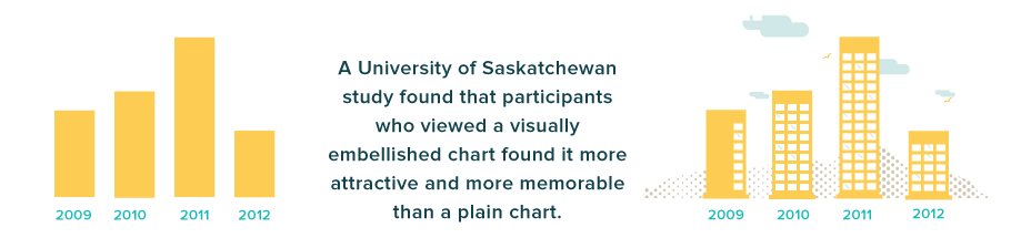
Focused and relevant data can be incredibly effective at transmitting your content’s meaning and significance. Yet without context and proper presentation, statistics and data sets can be difficult to interpret. Worse, key insights can be missed entirely because your audience is too bored or too overwhelmed to interpret the data. Well-designed visualizations do the heavy lifting for your audience. Not only are they more visually appealing than text and numbers alone, they also increase comprehension and retention, adding a richer layer to the story and making a more lasting impact on your audience.
 3) Data Visualization Is Engaging
Clean, compelling and credibly sourced visuals draw your audience into the content, encouraging them to explore the data. Both static and interactive data visualizations invite readers to examine the data and derive the deeper meaning. This fosters a more personal, significant and active interaction that enhances any type of content.
A Column Five interactive invites users to engage with Supreme Court data on their own terms.
How to Incorporate Data Visualization Into Your Content Marketing
As you create a mix of content for your marketing efforts, consider how you might apply data visualization to create a richer experience.
Visualize All Content. Look at your existing content, as well as your upcoming content, to look for data visualization opportunities. Perhaps an old white paper can be turned into an infographic. Maybe an article could benefit from a quick visualization.
Look for Data. Whether it’s your own internal data or a new data set released by a relevant research firm, keep tabs on potential data sets that you may be able to craft content around.
Use Visualizations as Micro-Content. Single visualizations are an excellent way to create micro-content that engages your audience. A powerful visualization, extracted from an infographic or white paper, can be posted on social accounts as a teaser, which helps to generate interest and expand the content’s reach.
No matter what the application, data visualization is an effective way to increase the credibility, meaning and impact of your branded content.
- Find out how to get the most mileage from your content by Maximizing Your Publishing with Microcontent.
- Learn everything you need to know about visual content in The Ultimate Guide to Visual Content Marketing.
- Get the most eyes on your content by reading The Ultimate Guide to Content Distribution.

Let's upgrade your marketing game
Get fresh tips, how-tos, and expert marketing advice every week. (15,000 people already are.)