Let’s be honest, when most people think about graphic design (and the principles of graphic design), they picture eye-catching visuals or maybe a slick logo. But here’s the thing: good design isn’t just about making things look pretty. It’s really about making your message clear, memorable, and actually effective. And if you’re in marketing, you already know that clarity and impact can make or break your campaign.
So, why does this matter? Well, think about the last time you scrolled past an ad because it was cluttered or confusing. That’s what happens when design fundamentals get ignored. But when you get the basics right, your content doesn’t just look better; it works better. It draws people in, keeps them interested, and helps them remember what you’re all about.
So, let’s dig into the 10 graphic design basics every marketer should know, along with real-world examples and a few tips to help you better apply these principles.
Top 10 Essentials for Marketing Success: Each Principle of Graphic Design Explained
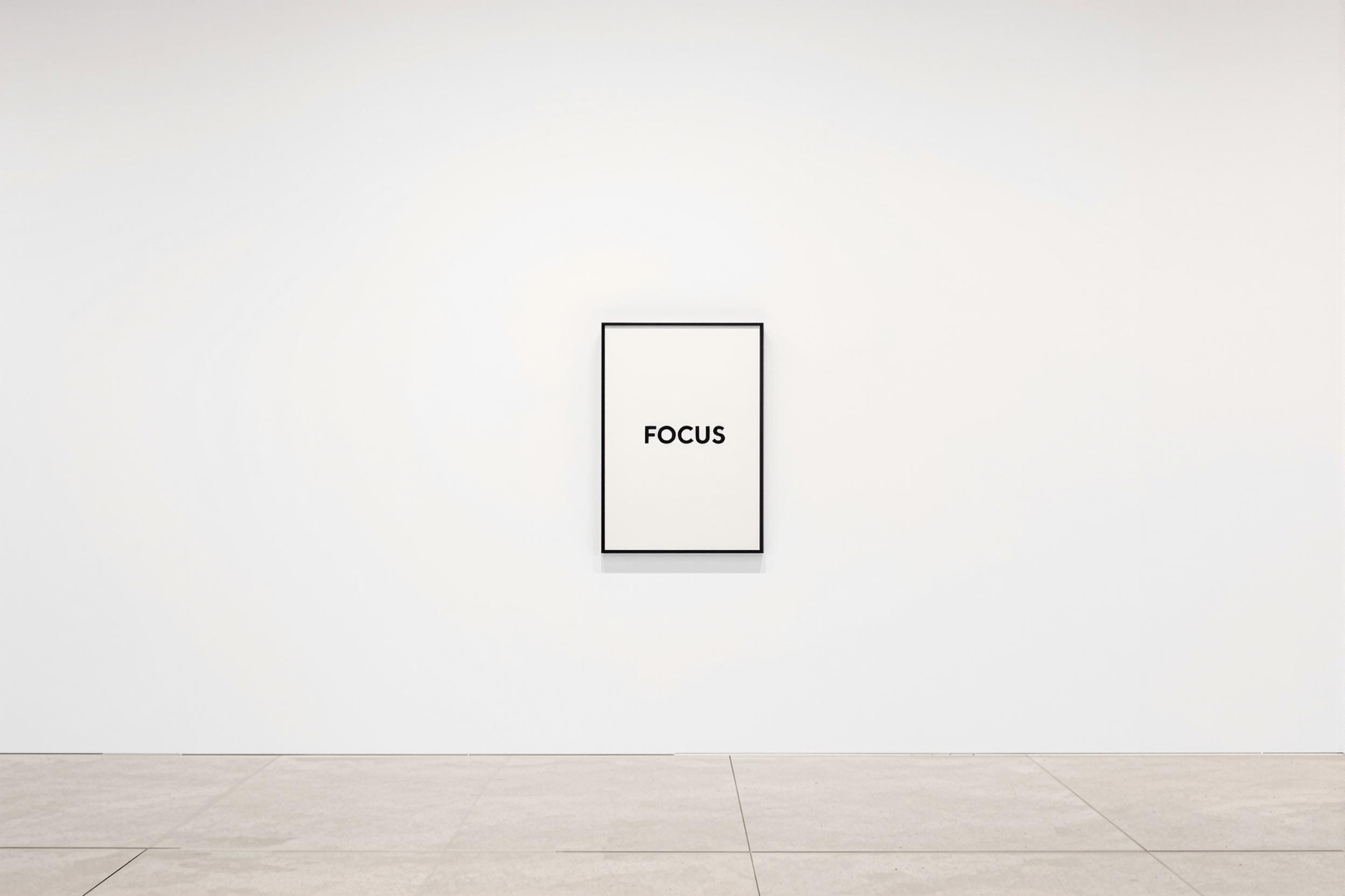
1. Visual Hierarchy
Ever wonder why your eyes jump straight to the big, bold headline on a poster or website? That’s visual hierarchy at work. Expert designers use size, color, and placement as visual cues to guide you through content, helping you better understand and navigate the information.
Tips to apply visual hierarchy correctly:
- Make your headline impossible to miss. Use the largest font, and don’t be shy with bold type.
- Let your subheadings and details support the main message. But keep them a step down in size and weight.
- Use color to draw attention. Want someone to click a button? Give it a color that pops against the background—think of it like putting a neon sign on your best offer.
- Place the most important info where people naturally look first. Most folks start scanning from the top left, just like reading a book.
Note: Use your design tools intentionally and thoughtfully. If you try to make everything stand out, then nothing does.
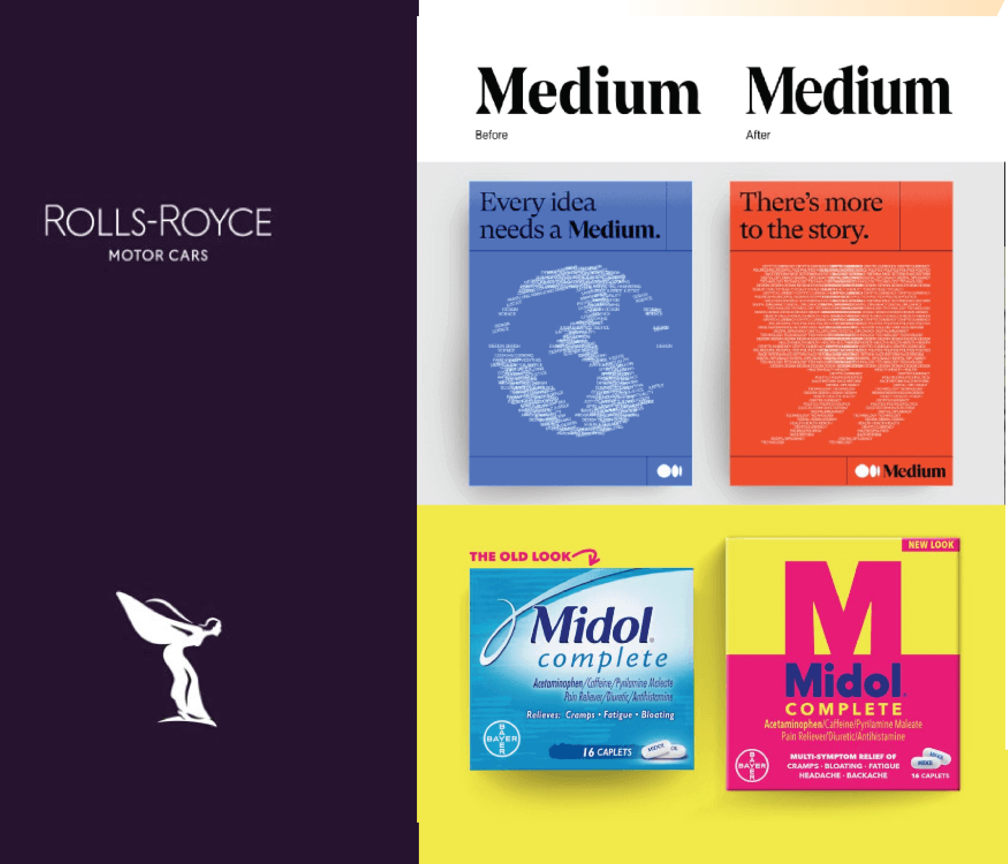
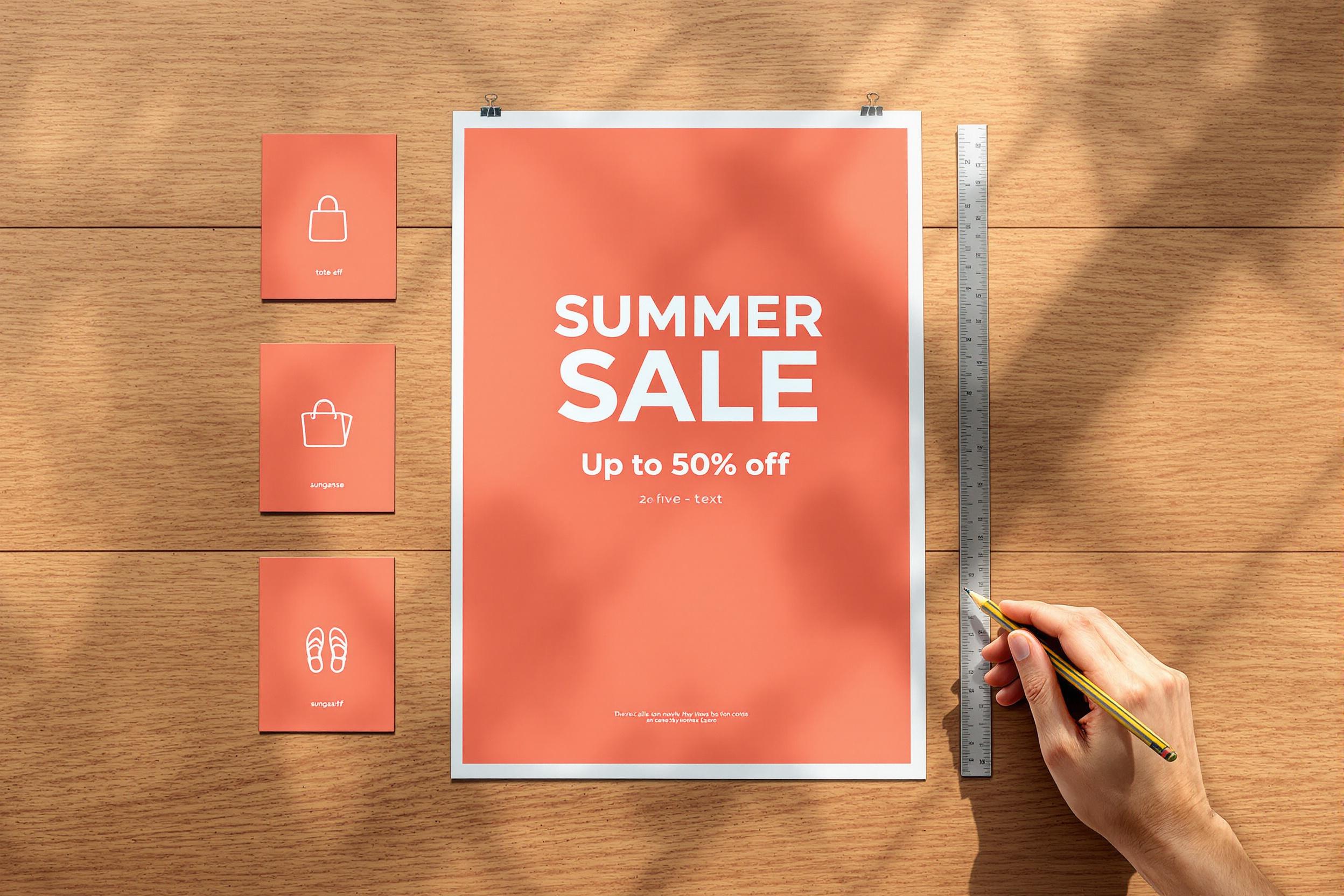
2. Contrast
Ever notice how some designs just grab your attention, while others fade into the background? That’s contrast at work.
You can achieve contrast in multiple ways using color, scale, placement, etc. And just like hierarchy, contrast can drastically improve how people navigate content and how they interact with it. For instance, HubSpot increased conversions by 21% simply by changing a CTA button from green to red. That’s a great example of how one small design change can make a significant impact.
Tips to use contrast correctly:
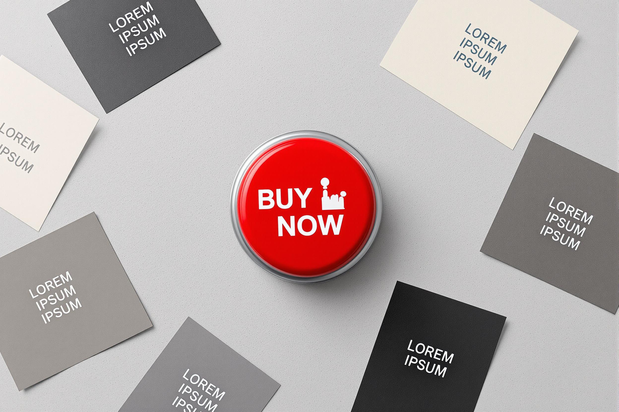
- Put a dark, saturated button on a light background when you want people to take action. “Buy Now” should never hide in plain sight.
- Pair a chunky, bold headline with lighter, smaller body text. It’s like giving your main point a megaphone and letting the details speak at a normal volume.
- Play with color combos. Keep legibility and accessibility in mind, but don’t be afraid to experiment. Sometimes the most unexpected pairings get the best reactions from your audience.
The next time you’re working on a design, ask yourself: does my main message jump out, or is it lost in the crowd? A little contrast can make all the difference.
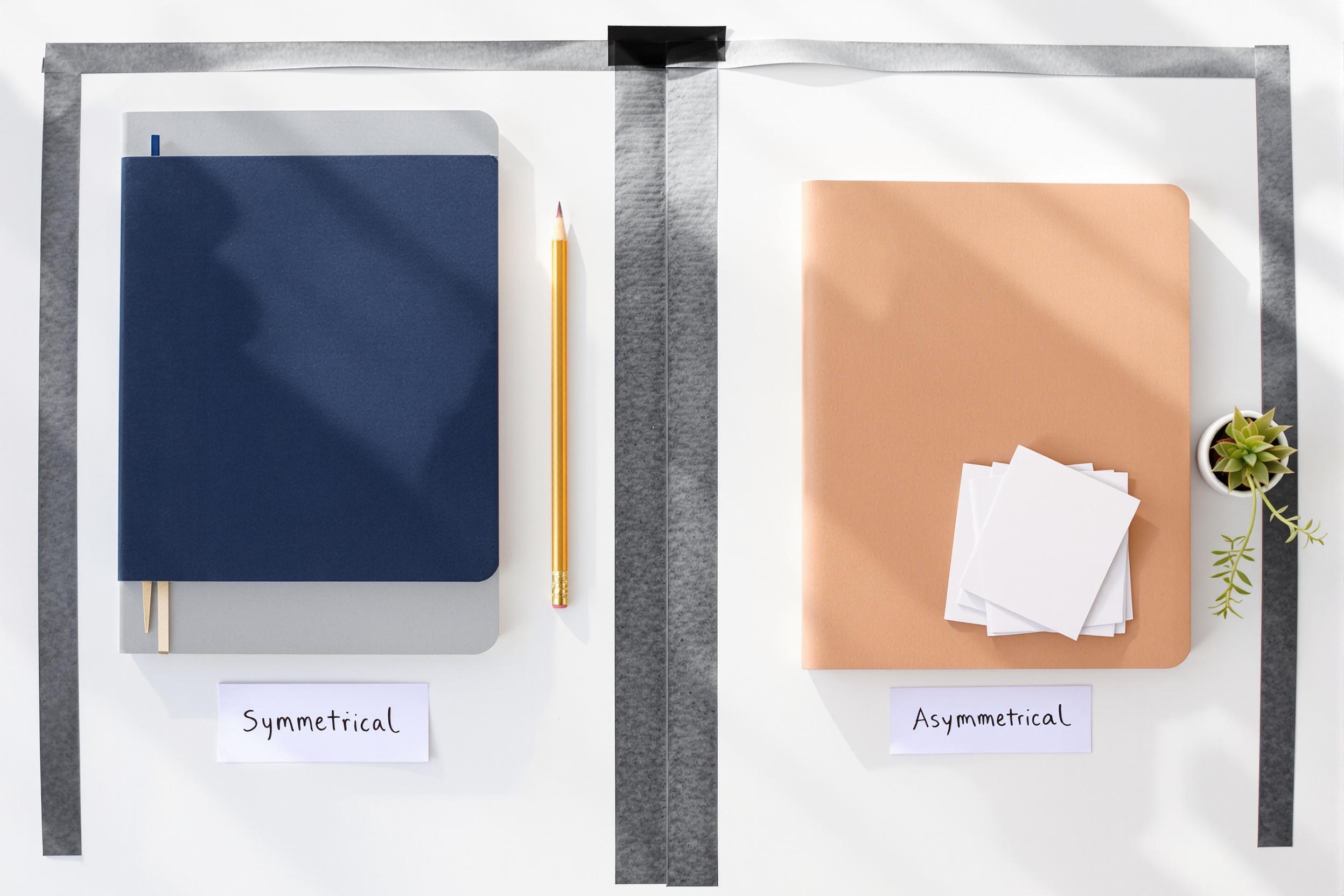
3. Balance
Balance is a unique concept, and you can play with it in expected and unexpected ways to elicit different reactions.
In design, we talk about two types of balance.
- Symmetrical balance: This includes elements that mirror each other and create a sense of order. This is often used to create a formal, traditional look (e.g., a business card with centered text).
- Asymmetrical balance: This includes elements with an uneven distribution. Asymmetrical design feels more dynamic and modern (e.g., a website with a large image on one side and text on the other).
Both can work in different contexts, so you want to consider your audience, your medium, and your distribution channels when you make design decisions. (For example, asymmetrical Instagram carousel posts often see a 22% increase in swipe-through rates.)
Tips to use balance correctly:
- Use symmetry for a more formal, sophisticated feel. This is especially helpful for event invitations, corporate materials, or luxury products. Note: You don’t have to use identical mirroring to achieve symmetrical balance. For example, you can offset a large image with several smaller text blocks to achieve that type of buttoned-up symmetry.
- Use asymmetry for materials that need to grab attention. That includes things like creative campaigns or social media graphics. It’s also useful when you want to achieve a more informal or relaxed feel.
- Use negative intentionally. Regardless of symmetrical or asymmetrical balance, consider the way you use negative space to draw attention or let the design breathe.
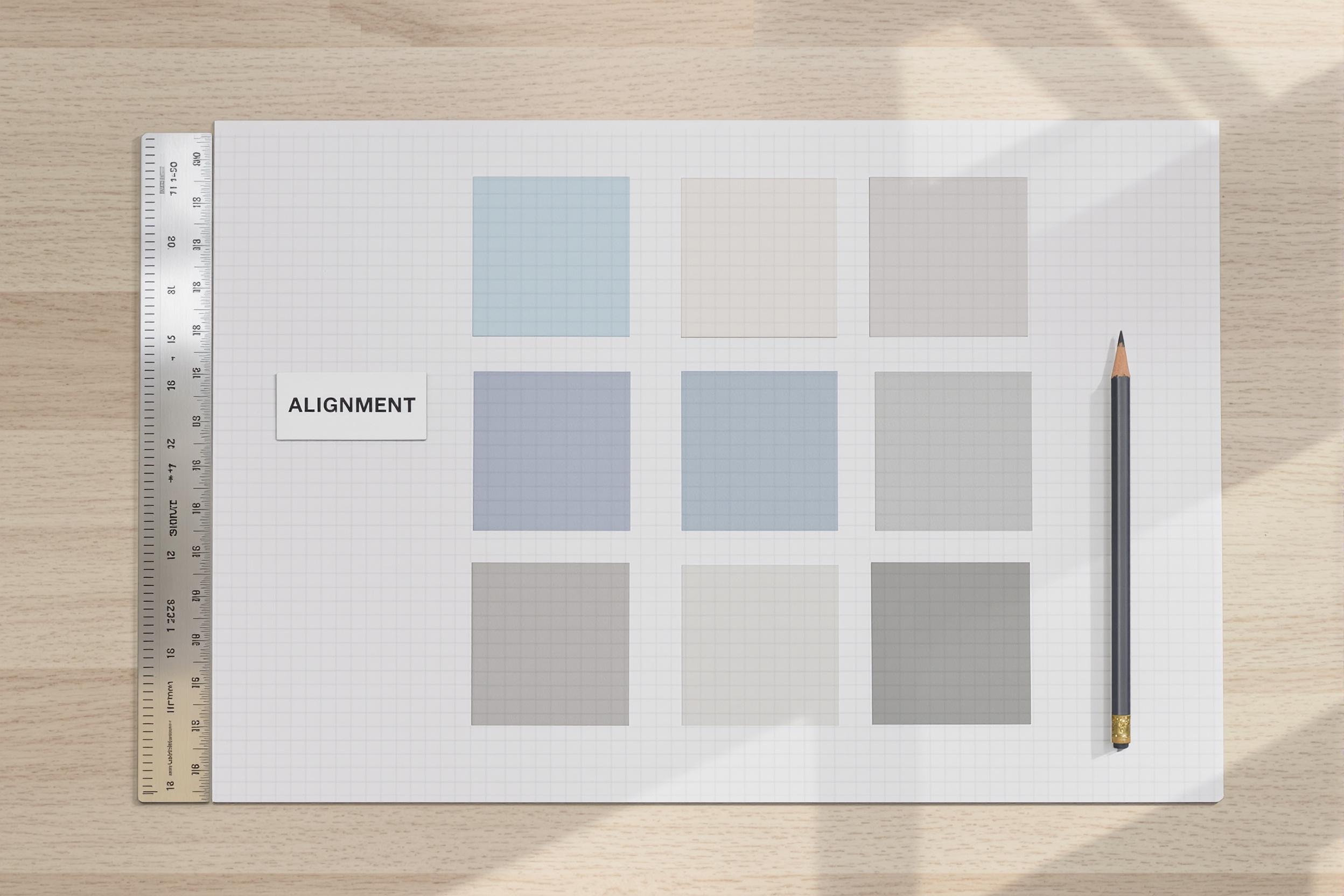
4. Alignment
The devil is in the details, and unintentional misalignment is always an eyesore. When you line things up—like text, images, or buttons—content just looks cleaner (and is often easier to read). It’s a small step, but it makes a big difference to the overall visual experience.
Tips to use alignment correctly:
- Align all text to the left for a modern, readable layout. Keep legibility and hierarchy in mind.
- Use a grid system to ensure images and buttons are evenly spaced. Even if people can’t identify what’s off, incorrect spacing degrades any design.
- Be consistent with design elements. For example, place your logo in the same spot on every piece of collateral to make your content more recognizable.
5. Proximity
Putting related things together helps your brain better categorize information, making designs feel less chaotic and much easier to comprehend.
Remember: your goal is to help people navigate your content as quickly and effectively as possible, so don’t make them go hunting for key information all over the place.
Tips to use proximity correctly:
- Group related elements to improve the buying experience. For example, you would group a product image and its price. Or you might place testimonials right next to product descriptions to reinforce credibility.
- Use conventional placement. For example, keep your contact button in the top right of your nav, or put basic contact info in the footer.
- Place things closer together for convenience. For example, on a website, keep your navigation links close together so that people can easily navigate to what they want.
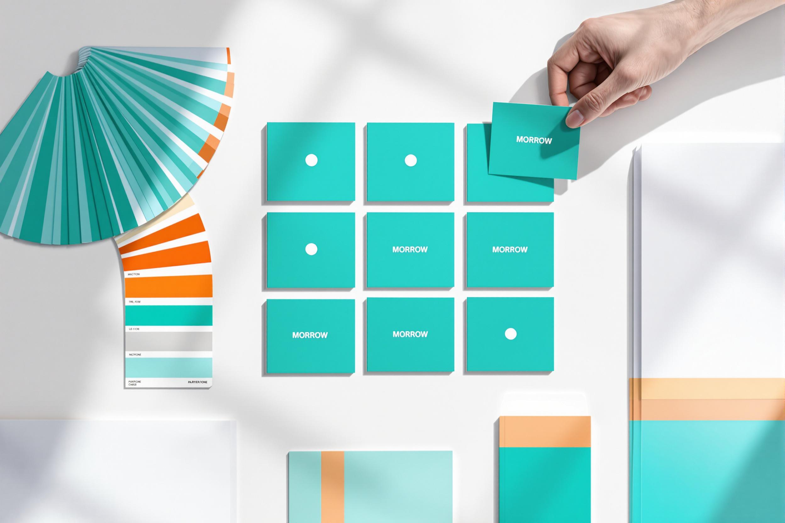
6. Repetition (aka Consistency)
It’s harder and harder to stand out in the marketplace, which is why it’s so important to tell a consistent visual story. When you use the same colors, fonts, and images over and over, people become more familiar with your brand and more likely to build a relationship.
This helps you:
- Stand out against the competition. It’s easy to blend, but a consistent visual identity helps people pick you out of a crowd. For example, you’d never mix up a Starbucks with any other coffee shop, based on interior design alone.
- Build trust. When things look the same every time, people feel like they know what to expect.
Tips to use repetition correctly:
- Templatize your work. Social media posts, email headers, presentations—anything that you repeatedly create should be templatized for consistency.
- Stick to a defined color palette. Make sure it works across channels, and use it across all marketing materials.
- Limit yourself to two or three fonts for a cohesive look. Any more than that begins to feel more chaotic and harder to identify.
7. White Space (Negative Space)
White space is a powerful tool to both draw attention and give your eyes a break. It is one of the most underrated and underused elements in design, but it is a powerful tool to help people focus on the right elements.
It can also be used as a form of visual storytelling to communicate a larger story. (Volkswagen famously used white space to reinforce their “think small” ethos.)
Tips to use white space correctly:
- Give headlines plenty of breathing room. Use proper space between lines of text too.
- Use extra space to delineate sections. This is the key to break up long content and make it more readable.
- Use white space around your CTA or key elements. This helps make them the focal point.
8. Scale and Proportion
Scale and proportion are similar, but there are clear distinctions.
- Scale relates to the size of an item. Larger items are going to stand out, and that can be a benefit or a detractor, depending on what you’re trying to draw attention to in your design.
- Proportion relates to the sizes between different items. This can help create a sense of balance and symmetry—or make one item more prominent than the other.
They are both powerful tools, so it’s important to use both scale and proportion intentionally.
Tips to use scale and proportion correctly:
- Make the most important things larger. For example, if you want to highlight your main offer on a website, use scale to make it stand out.
- Use consistent sizing for a clean look. That includes elements like icons and buttons on your website.
- Use scale to maintain hierarchy. Again, you want to ensure that subheadings are always smaller than main headlines but larger than body text.
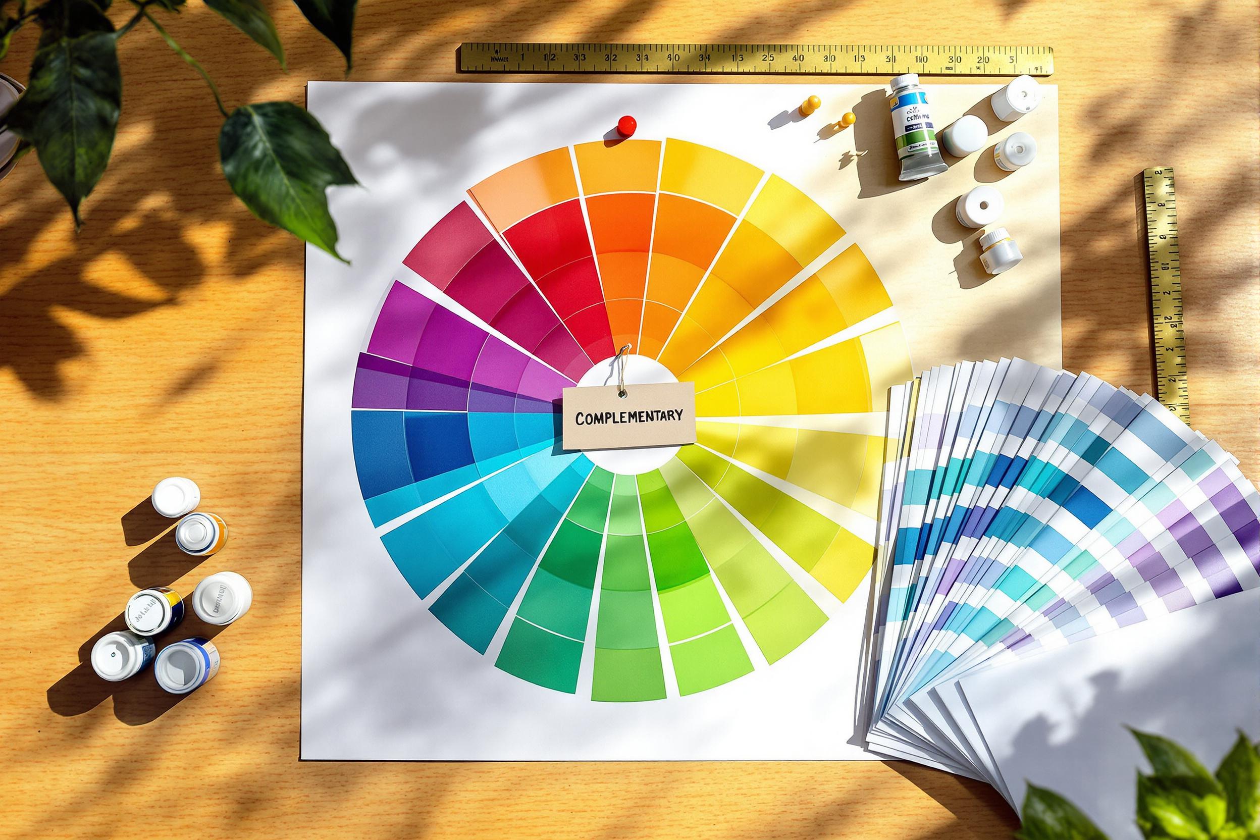
9. Color Theory
Why do some color combos just click, while others feel off? That’s color theory at work. Depending on their placement on the color wheel, some combinations create tension and others create cohesion.
- Complementary colors are total opposites on the color wheel. Picture blue and orange, or pink and green. The contrast creates a dynamic excitement.
- Analogous colors sit side by side on the wheel. Think blue, teal, and green. They blend smoothly, creating an environment that’s easy on the eyes.
Choosing colors isn’t always easy. You need to experiment to get the right palette, but always start by thinking about the emotion or mood you want to elicit in your audience.
Tips to use color correctly:
- Choose brand colors. Choose colors that reflect your brand’s values and personality. That should include 1 main color, 2 primary colors, 3-5 complementary colors, and 2 accent colors.
- Use accent colors to highlight important elements. That includes things like callouts or CTAs.
- Stick to a limited palette. Too many colors distract and overwhelm.
- Consider color psychology. When planning campaigns, consider the intrinsic symbology that people assign to the colors (e.g., use green for eco-friendly products).
For more tips, see our guide to choose the right brand colors.
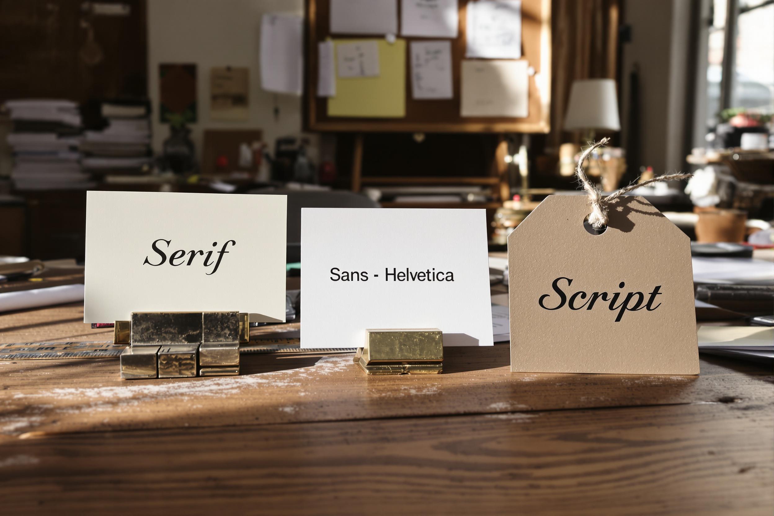
10. Typography
Think about the way playful typography on a birthday invite feels different than the sharp, serious letters on a legal notice. That’s not an accident. The size, shape, and personality of typography influence the mood before anyone even reads a word.
For clarity, typography refers to a family of fonts (e.g., Times New Roman), and a font is a specific typeface within that family (e.g., Times New Roman Bold).
Next time you’re choosing your typography, ask yourself:
- Does this match the vibe I’m going for?
- Is it legible?
- Will it make my message stand out?
Tips to use typography correctly:
- Limit yourself to two or three fonts for consistency. Any more than that and you dilute your brand identity.
- Consider the use case. Serif fonts (like Times New Roman) convey tradition and reliability, which is great for law firms or financial services. Sans-serif fonts (like Arial or Helvetica) feel modern and clean. These are ideal for tech companies or startups. Script fonts add a personal, creative touch—perfect for invitations or boutique brands.
- Test for legibility. Always test your font choices on mobile devices to ensure readability.
Use Each Principle of Graphic Design to Boost Your ROI
Remember: Whether you’re trying to grab attention or increase comprehension, the ultimate test of a design isn’t if it’s pretty; it’s if it resonates with an audience.
No matter what type of content you’re creating, if you apply these principles of graphic design, you will absolutely improve your brand experience for your audience and ensure every piece you create does, in fact, resonate.
If you need to upgrade your design, chat with us about how we apply these design principles at Column Five for brand and creative development.

Let's upgrade your marketing game
Get fresh tips, how-tos, and expert marketing advice every week. (15,000 people already are.)