
A strong visual brand identity is a powerful force. In a crowded marketplace, it can help you stand out, communicate who you are, and—ultimately—entice people to form a connection with you. Your brand colors are a significant part of that visual identity. But choosing the right colors for your brand shouldn’t be done arbitrarily. Here, we’ll break down everything you need to know about branding through color and offer our best tips to help you create the perfect palette.
How Color Benefits Your Brand
Color isn’t just an aesthetic element; it’s a true branding tool. When used well, color enhances your brand experience at every touchpoint, from your product design, to your website, to your content. If you’re trying to make a good impression from the jump (and, of course, you are), there are many ways color can increase your impact and benefit your brand.
1) Differentiation
There’s a reason color TV took over the world. Color naturally grabs attention and makes things more enticing. In fact, according to a 2017 study published in the Journal of Consumer Research, highly saturated color elicits arousal, thus capturing attention (and, in the case of the study, affecting the perceived size of products).
Because color is inherently appealing, it is an easy way to draw attention and—more importantly—differentiate yourself from your competitors, whether you’re trying to stand out on a store shelf or in a social feed. (Many brands have done this so well you don’t even realize it. Just try to imagine Apple without its signature minimalist white or Google with a monochromatic icon.)
2) Emotional Response
Color is particularly powerful because of its ability to elicit emotional responses and influence people’s moods. If you want to cultivate a particular emotion or reinforce your brand value, color is an effective way to do it.
For example, Honda reportedly increased sales 35% in one dealership by closing sales in a room with a soothing blue palette. Similarly, a Virginia Tech study found that using red on webpage backgrounds influenced consumers to bid more during an online auction.
Remember: Long-term brand success depends on the relationships you build, and an emotional bond is at the core of every relationship. Whether you want people to view your brand as a trusted advisor, a security guard, or a fun best friend, color can do a lot to elicit those emotions.
3) Comprehension & Engagement
Your brain is prewired to process visual content faster than text. Hence, visuals are particularly effective when you want to communicate nonverbally. When you use elements like color in your design, you can make things easier to understand. Whether you highlight notable information in an infographic or use color in a data visualization, you can make it easier to engage with and synthesize content, helping people understand (and recall) information more easily.
In fact, research has found that adding color can enhance content comprehension by up to 73%. 
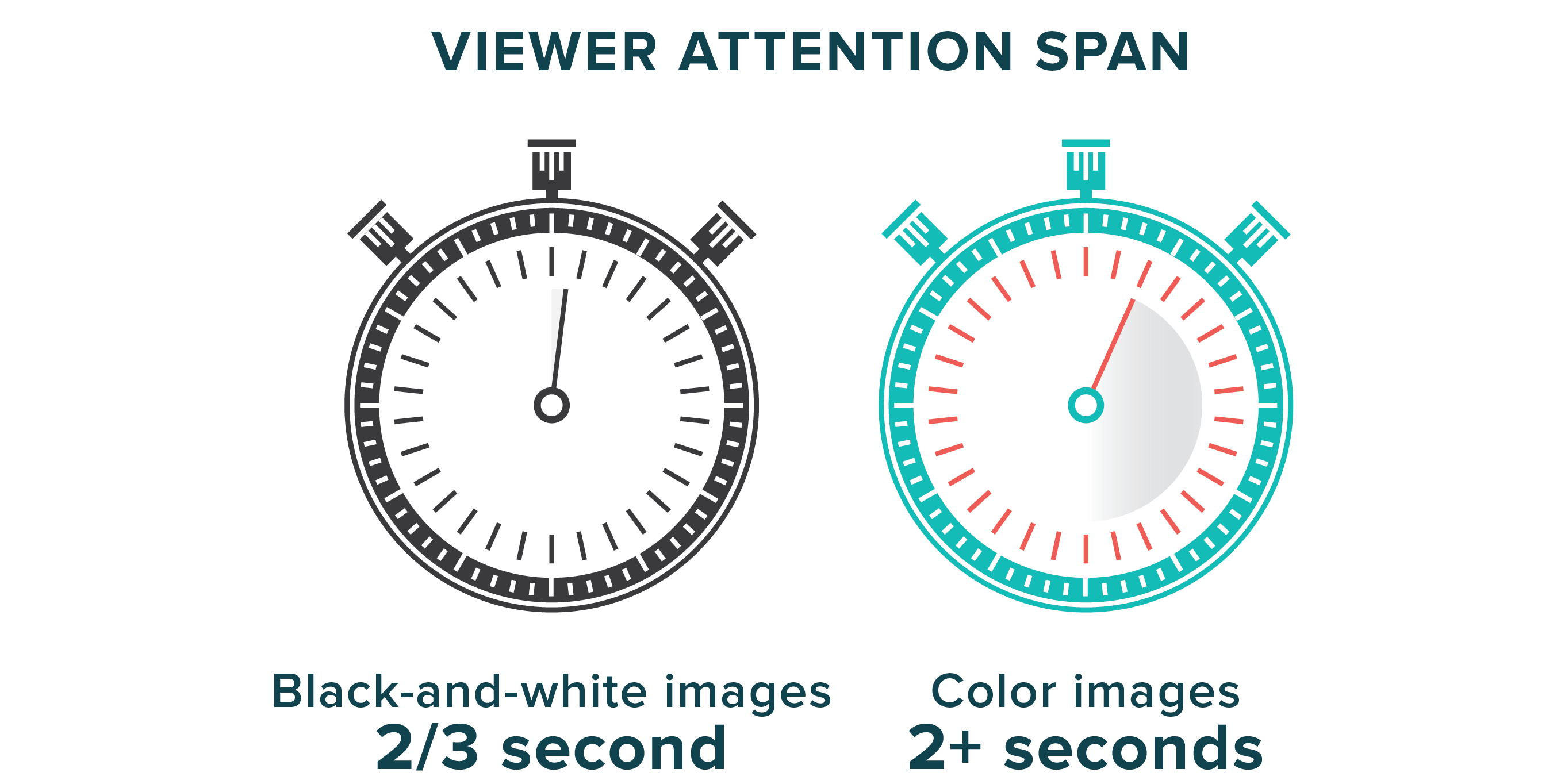
Additionally, because color makes content more attention-grabbing (and, therefore, more stimulating), research has found that readers will spend more time looking at color images than black-and-white ones.
When you’re trying to communicate information about your brand—at any stage of the buyer’s journey—using color effectively can drastically enhance your content, increasing its impact and, hopefully, compelling people to take the action you want.
That said, while there’s no doubt that color is hugely beneficial to your brand, no single color will magically increase your page views or social media shares. To increase your chance of success, however, you should think strategically and intentionally about how you use color.
What to Know Before You Choose Your Brand Colors
Having helped many brands craft their visual identities, we’ve found that finding the right colors doesn’t start with picking palettes. You need to think about your overall brand goals, what you’re trying to communicate, and how you can use color to do so.
1) Consider Your Personality
Color is highly subjective, but it absolutely elicits an emotion. What do you want to say about yourself? Bright, bold colors are expected if you’re playful and fun. Muted tones will lend an air of seriousness and sophistication.
Again, while color can be subjective, certain meanings have been traditionally ascribed to different colors.

2) Think About Who You’re Trying to Reach
You know who you are and what you’re trying to achieve. But how can you communicate that to the people you’re targeting? What colors are they likely to gravitate toward? (For example, a children’s toy company probably wouldn’t do well with the all-black branding of a luxury men’s fashion line.) Also, think of who you’re competing against. How can you use color to stand out?
3) Think of Your Emotional Benefits
What product or service do you sell? What feeling do you provide? Happy and light? Serious and professional? Consider how you can cultivate that feeling through color.
For example, does your product or service enhance someone’s life, or prevent something bad from happening to them? A 2009 study by the University of British Columbia found that people responded more to ads for a prevention-focused product that used the color red, and gain-focused ads that used the color blue. While this isn’t a hard and fast rule, it’s worthwhile to consider.
Similarly, a 2006 Cardiff Business School study found that people react more positively to products branded with a color they perceived as appropriate for the product. The study categorized colors into functional colors and social-sensory colors.
- Functional colors: gray, black, blue, green
- Social-sensory colors: red, yellow, pink, purple
People responded better when a functional product was branded with a color that is perceived as functional. Tl;dr: If you want people to feel that your new life-saving medical device is reliable and will keep them safe, you probably shouldn’t use hot pink and green for your brand colors.
4) Consider How Your Colors Will Be Used
Some colors don’t render well on screens, so be cognizant of how you’ll be using them. You want to give designers the right tools to work with.
Once you’ve thought through these important factors, it’s time to start playing with color.
How to Choose Colors for Your Brand Identity
Whether you’re starting from scratch or updating your existing palette, here are the simple steps to follow to find the right colors for your brand.
1) Start with Color Inspiration
Whether it’s a color tool, image, or Pinterest board, explore color imagery that speaks to you. Luckily, there are a ton of color inspiration sites and tools to help inspire you. Some of our faves:
- Adobe Capture CC: Helps you turn photos into color palettes.
- Branding Color Quiz: Quiz to find out what colors are good for your company.
- Colorhexa: Provides information about any color.
- Colorhunt.co: Hand-picked color palettes.
- ColourLovers.com: A great site for color geeks.
- Colr.org: Tool to play around with color palettes.
- Coolors.co: Color scheme generator.
- LOLColors: Curated color palette inspiration.
- Paletton.com: Tool to create color palettes based on color theory.
- Pantone Color Finder: Helps you locate specific Pantone colors.
- Color Palettes of the Fortune 500: Explores the primary and secondary color palettes of major companies.
2) Start Playing Around
Experiment with monochromatic, analogous, and complementary pairings. Create contrast. Add light and dark tones.
3) Identify Your Dominant and Accent Colors
The palette you create is up to you, but we recommend you stick with:
- 1 main color
- 2 primary colors
- 3-5 complementary colors
- 2 accent colors
Remember: You want to offer enough options for designers to play with but not enough to overwhelm them.
What to Do Once You’ve Chosen Your Colors
Now that you have your brand palette selected, you need to make sure it’s applied consistently. You should also make sure your colors fit seamlessly into your overall visual identity, as everything from your logo to iconography should work well together.
To keep everything consistent…
- Create a full brand style guide that includes real-world examples for easy application.
- Try our tips to design a logo with less stress.
- Find out how to choose the right typography for your brand.
- See our step-by-step guide to building a brand identity to fill in any gaps.
- Follow our visual identity checklist to make sure you have all your bases covered.
- Bookmark these 100 tips, tools, and resources to create a great brand identity.
And if you get stuck at any part of the process, consider bringing in expert help. Find out what it’s like to work with us on a brand identity engagement or holler at us. We’d love to help you bring your brand to life.

Let's upgrade your marketing game
Get fresh tips, how-tos, and expert marketing advice every week. (15,000 people already are.)

This article is super helpful for anyone building a brand identity—it breaks down key factors like personality, emotional impact, and real-world use with actionable tips, so if you ever need a quick free online tool to test or refine your brand color palette, there’s one on mytoolhub worth checking out.
free online tool mytoolhub
Looks like a helpful resource. Thanks for sharing, Robert!
Look to increase my knowledge in marketing for a housing property business
Excellent resource. Extremely helpful in aiding us in developing our brand identity. Thank you!
Wonderful to hear!
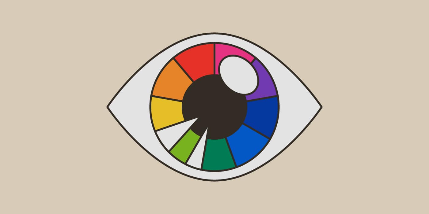
Brand color