

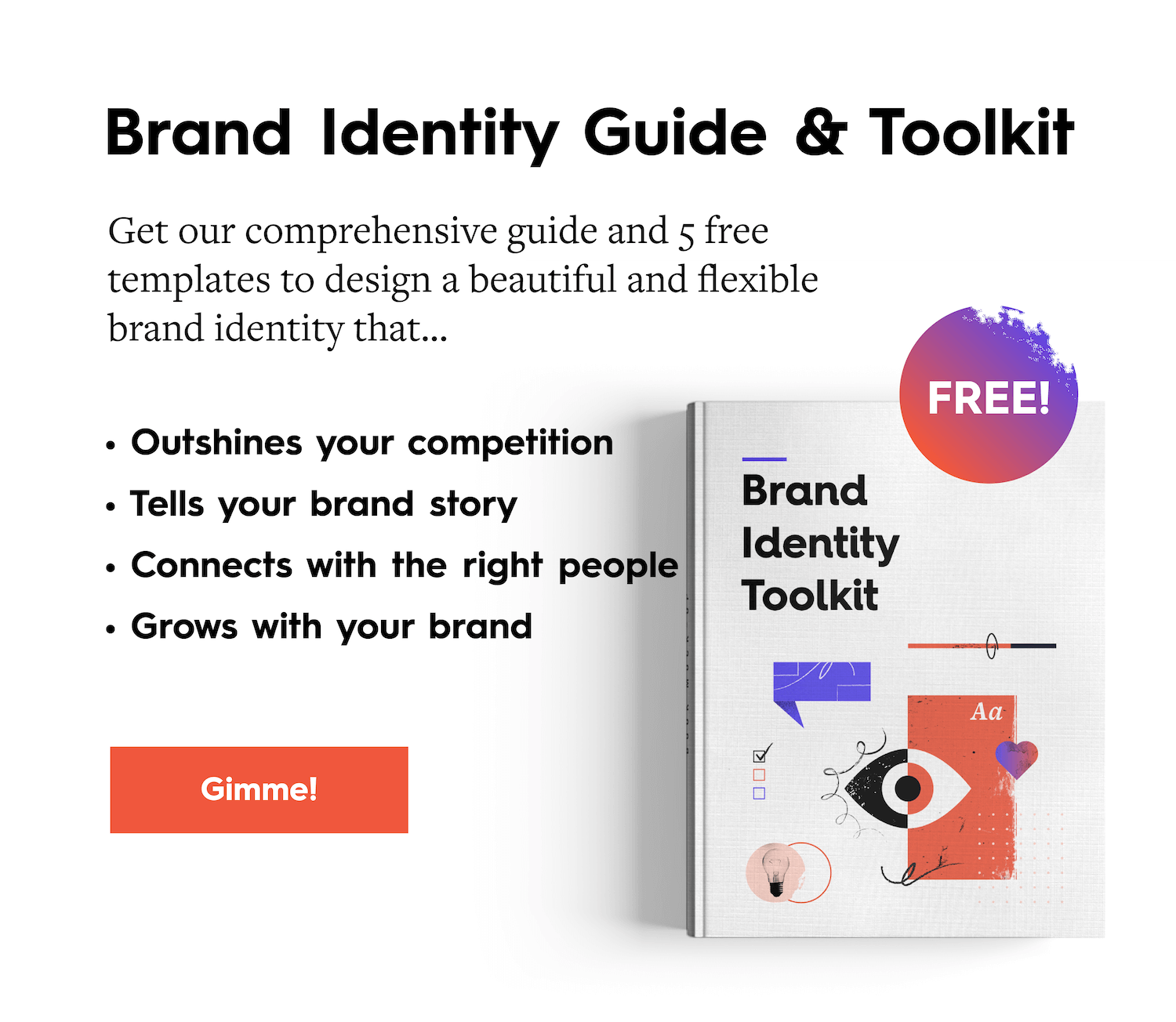
Your brand’s core visual brand identity is made up of a holy trinity of design:
- Logo
- Color
- Typography
Each serves a unique purpose, requiring careful thought and intention. And each comes with its own challenge. Typography, specifically, can be a bit tricky. How do you choose the right type? Where do you find it? How do you know it will work?
If it’s time for you to develop your brand’s typography, don’t stress. We’ve helped shape many brands’ visual identities, so we know all about the struggle. We also know how to make it easier for you.
Here, we’ve broken the typography process down into 4 simple steps that get you from A to Z. From great inspiration sites to the questions you should ask, here’s everything you need to find the perfect typography for your brand.
Before we dive in, though, let’s break down some terminology.
The Difference Between Fonts and Typefaces
Today, you hear the words “font” and “typeface” used interchangeably when talking about the art of typography. But there is a distinction, which goes back to the printing press days.
Back when typesetting was done by hand, every character required a separate metal block. If you wanted to print the letter “A” in Times New Roman, you used one block. If you wanted to print the letter “A” in Times New Roman Bold, that was a separate block. Hence, there was a distinction in words:
- Typeface: A type design (e.g., Times New Roman)
- Font: A particular size, weight, and style of a typeface (e.g., Times New Roman, 12 pt., Bold)
Now that everything’s digital and computer programs allow you to instantly manipulate text, the terms have lost their distinction. For the purposes of this blog, when we refer to a typeface, we mean a particular style, as well as a set of one or more fonts in that style (aka a font family).
Now that we’ve cleared that up, let’s get into it.
How to Develop Your Brand Identity Typography in 4 Steps
Finding the perfect typography is a fun and creative quest, but you should approach it with a very specific goal: to choose 2-3 typefaces that best represent your brand.
Note: Your typeface is different than your logotype (your company name rendered as a logo). Your logotype should be its own entity, so don’t use the same type for both. You can, however, make creative adjustments to your logotype to make it distinctive from your brand’s default type.
Step 1: Decide on Open Source, Primary, or Custom
There are several ways to find typefaces that you like. You can scour open source options that are free. You can license others for a fee. Or you can develop your own. Like anything, there are pros and cons to each. Deciding which to use depends on your brand’s unique needs now and in the future.
Open Source (Free Typefaces)
- Pro: They’re free and easy to get your hands on.
- Con: They’re generic, and they can be limited.
Open source typefaces are a popular option for many brands, particularly startups. They’re easy to find and experiment with. They’re mostly web-friendly (especially Google Fonts), ensuring consistency across platforms. But, like anything free, you pay a price in other ways. Bland, boring, and basic styles add very little to your brand identity. Since anyone can use them, they can be found everywhere (looking at you, Helvetica!), making it harder to distinguish your brand.
If you want to go the open source route, here are a few places to look:
Primary (Typefaces You Pay For)
- Pro: There is a huge variety, and you can find many reasonably priced options.
- Con: Those licensing fees can add up.
If you want more creative freedom and flexibility, then primary is the way to go. You have options for many more styles, which may be better suited to your brand identity.
One caveat to going this route: While the typefaces are generally less expensive, licensing can add up if:
- You’re working with freelancers or additional collaborators who will need their own license.
- You need to license multiple fonts within the same type family (e.g, bolds, italics, etc.).
- You’re working with different platforms (e.g, you need licenses for desktop, web, mobile apps, e-pubs, etc).
If you want to pay for primary, here are a few places to look:
Custom (Typefaces You Design)
- Pro: It’s entirely unique, designed for your specific applications.
- Con: It’s costly and time-consuming.
If you want to literally make your mark, custom typography is the way to do it. A proprietary type lets you craft a completely unique visual language, designed for your specific brand. You can design exactly for your needs, but it comes at a hefty cost in both time and money.
Building a robust typography library from scratch (including primary, secondary, and possibly tertiary type, plus various fonts for each) requires a tremendous amount of work. Finding the right designer and getting everyone to agree on the final design is also a project in itself.
Still, many brands have done it, considering it a worthy investment both for their brand power and bottom line. For example, Microsoft created Segoe, NFL created NFL Endzone Slab, and Netflix created Netflix Sans to save “millions” on font licensing.
If custom is for you, here are a few places to start:
- BitFontMaker
- Fontstruct
- Font Shop
- Glyphs
- Robofont
- MCKL Type
- Commercial Type
- OH no Type Co
- Delve Fonts
If you’re not sure what to do, it might help to start sourcing typographic inspiration, which may lead you in the right direction. A few sources places to look:
- Typewolf: Great curated typography inspiration.
- Typogui: A convenient resource for all things typography.
- Typographica.org: A review of typefaces and type books.
- Brand New: A review of fresh and updated brands that often includes commentary on type usage in the context of the brand.
Step 2: Narrow It Down
It’s easy to get excited and start bookmarking a million typefaces, but don’t overwhelm yourself. Aim for 5-10 typeface options to start. As you search, ask yourself these questions to find out if the typeface will be a strong contender.
Is it distinctive? You want something that makes you stand out from your competitors.
Is it flexibile? Your typography will be used for all sorts of applications. Does it work equally well in print and on the web? Is it responsive? Will it work on everything from your product to your blog?
Is it comprehensive? Your brand will continue to grow. You may experiment with different content or platforms, and you need typography that can grow with you. Does the typeface have all the characters you need? Is it available in multiple sizes and weights?
Is it complementary? You need the typeface to work well with the other elements of your brand identity. For example, if you have a smooth and round logo, it might not pair well with a jagged death metal typeface. Remember that you’ll also be selecting several typefaces, so make sure those complement each other well, too.
Is it legible? Really look at all details of your typeface. Are you satisfied with the letter forms (capital and lowercase)? Is it legible at a small size? Are characters distinctive enough? Do any characters link together in odd ways (e.g., an “f” and an “i”)? Pro tip: To figure out if there’s enough distinction between characters, use this clever test from lettering artist Jessica Hische:

Step 3: Pair & Play
Now comes the fun (and sometimes frustrating) part. To design a strong typographic language, you need typefaces that work well together—and in various applications, such as your website, product copy, packaging, etc. The goal here is to narrow it down to your 2-3 frontrunners.
As you play around, it’s helpful to create mockups for all sorts of use cases, including print and web, to help you really see if they work or not.

A few helpful tools for pairing and experimenting:
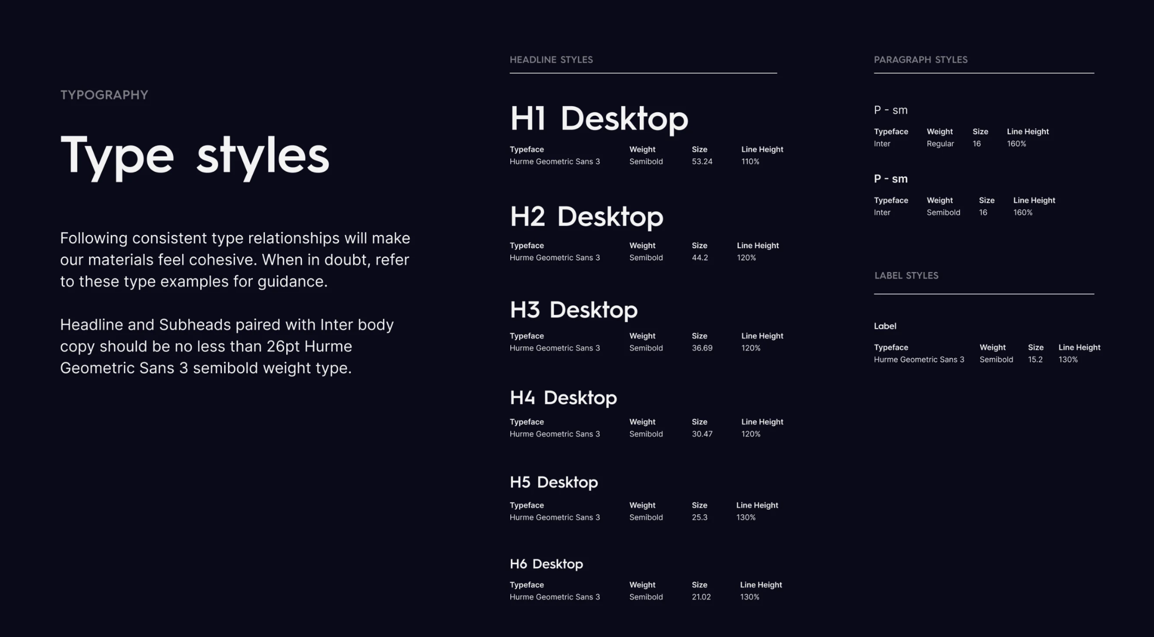
Step 4: Design Your Hierarchy
Once you’ve selected your 2-3 typefaces, it’s time to create a design system that puts them together in a logical, intuitive way that will be easy for content creators to replicate. This is incredibly important. Some brands are too lax, with type treatments that are totally inconsistent. Conversely, some brands have such an overly complex system that even a seasoned designer can struggle to apply it correctly. Aim for a healthy balance.
With your 2-3 selections, you’ll designate your:
- Primary type: This should be the default typeface, a reflection of the overall brand identity.
- Secondary type: Your secondary should complement your primary, and support the typographic design system. You can play around with opposites in your primary/secondary (e.g., mixing serif with sans serif).
- Tertiary type: This can be used for accents.
Remember: Each style is meant to serve a specific purpose and play a specific role in your design system. Designate “roles” for each typeface, when it comes to things like:
- Headers
- Subheads
- Body copy
- Callouts
- Pull quotes
- Product packaging
Pro tip: Create a comprehensive brand style guide that includes clear and relevant examples of use cases, as the Column Five brand style guide shows:
Remember: Your Brand Identity Doesn’t Stop at Typography
Building a brand is an ongoing project. Whether you’re starting from scratch, rebranding, or tinkering with what you have, there are always ways to do it better. If you need more tips on designing your brand identity:
- Find out how to design a logo you love.
- Use these 75 helpful tools and resources to help you build your brand.
- Follow this checklist to make sure your visual identity is complete.
And if you’re strapped for time or don’t have the bandwidth, consider bringing in expert help. Find out what it’s like to work with us on a brand identity engagement or holler at us.

Let's upgrade your marketing game
Get fresh tips, how-tos, and expert marketing advice every week. (15,000 people already are.)

this was really helpful – thanks for the resources.
Happy to hear it!