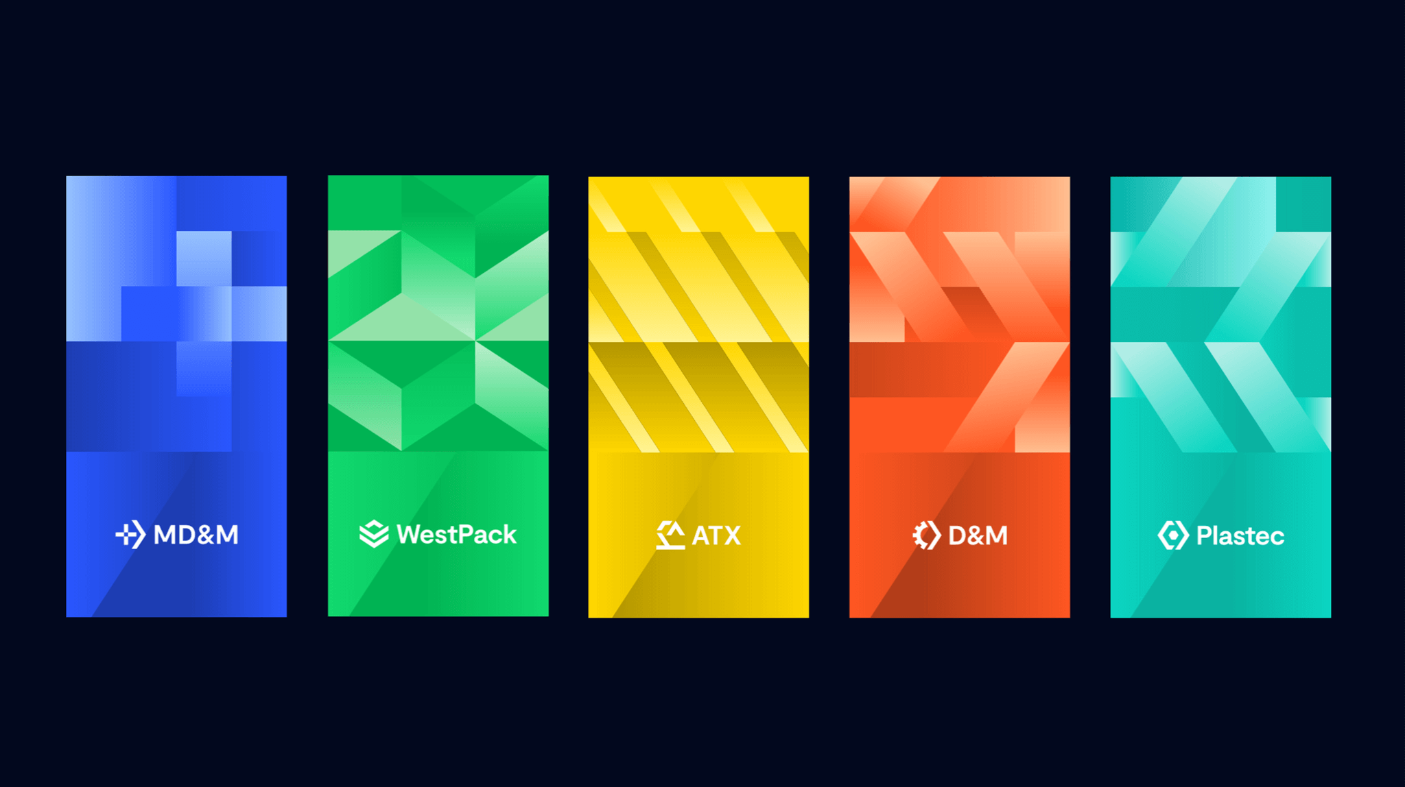
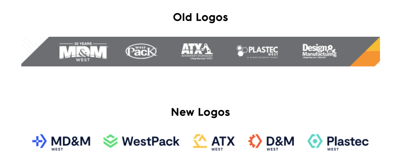
Informa is a leading international events, intelligence, and scholarly research group that connects people from different industries to help them learn more, know more, and do more. Their annual conference in Anaheim, California, is the largest advanced design and manufacturing event in North America, bringing together attendees from five industries: medtech, plastics, automation, design, and packaging. Informa has a variety of sub-brands that represent each industry at the conference whose logos were all in need of a redesign. As these brands would be featured heavily on signage and collateral at the conference, the real challenge was to design a set of logos that would accurately represent each individual brand, yet complement each other aesthetically and convey that they represent increasingly connected industries.
Instead of designing each logo individually, then modifying them to look similar, we started with a single element that would appear in all logo iterations: an arrow. This represented the progress and movement of each industry, and gave us a strong geometric foundation to build the other logos. To create a visual throughline, we incorporated the arrow motif into each logomark in a different way, using the brand’s color palette to differentiate as well. Together, the logos depict a strong community—one of the key themes of the conference itself.