Like any design geeks, we love a good before and after makeover, especially when it’s a rebrand. A good rebrand is a thing of beauty—when it’s a true brand strategy overhaul, communicated through a visual identity. (Too often brands embark on a rebrand without 1) a good idea and 2) a clear vision. When they do, the results are less than stellar. If you’re planning a rebrand, identify the reasons you’re doing it before you pull the trigger.)
That said, many brands pull it off perfectly. And when we see their great work, we think it deserves to be celebrated. That’s why we’ve assembled this roundup of awesome rebrands across industries, from housewares and tech to beauty and baby gear.
10 Inspiring Rebrand Examples
These diverse brands strike the perfect balance by focusing their messaging, elevating their aesthetic, and creating a stronger brand experience at every level. We hope they inspire you to think critically and creatively about your own approach.
1) Coty
- Agency: Workroom
- What we love: Their comprehensive visual language
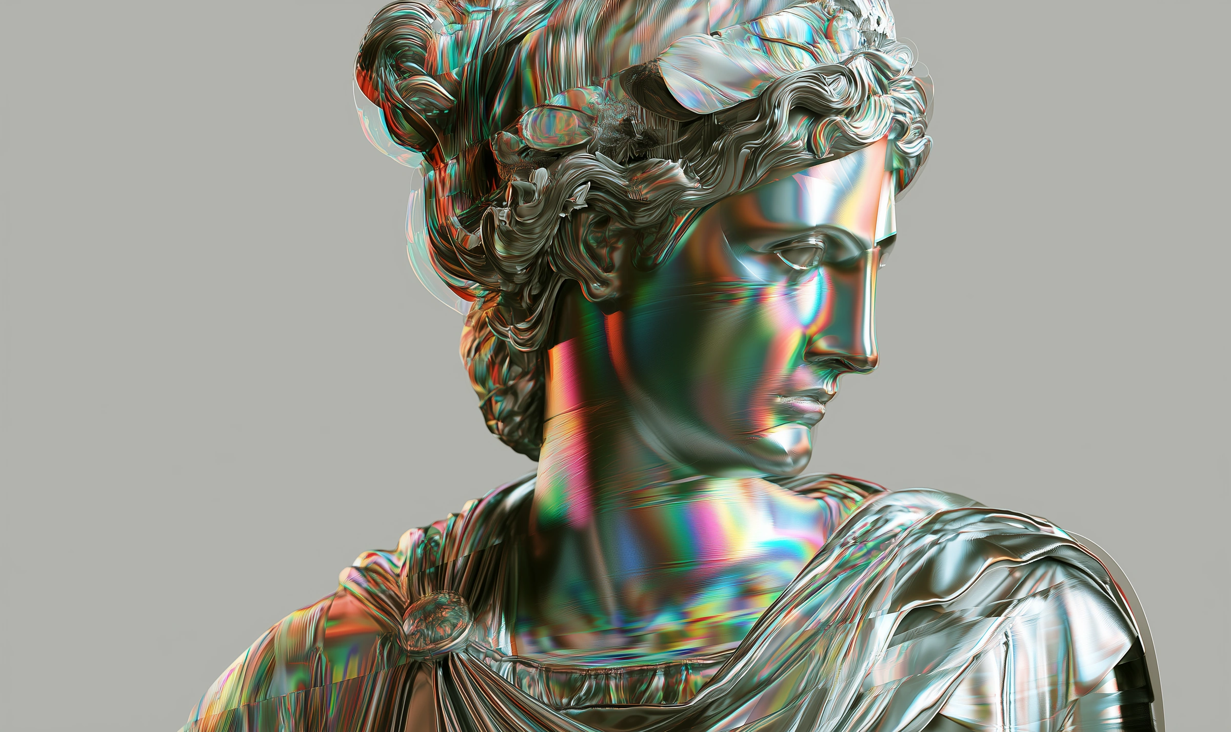
As part of its rebrand, beauty brand Coty put its purpose “to celebrate and liberate the diversity of beauty” front and center. In a massive visual overhaul, branding agency Workroom chose the butterfly as its inspiration to symbolize the diversity of beauty in nature—and people.
This included a detailed visual language featuring bold, bright imagery, which carried the butterfly theme throughout. They even designed the custom type Coty Sans, which features the “special curves mirroring a butterfly’s symmetry.”


2) GLPS
- Agency: Make®
- What we love: Their powerful logo
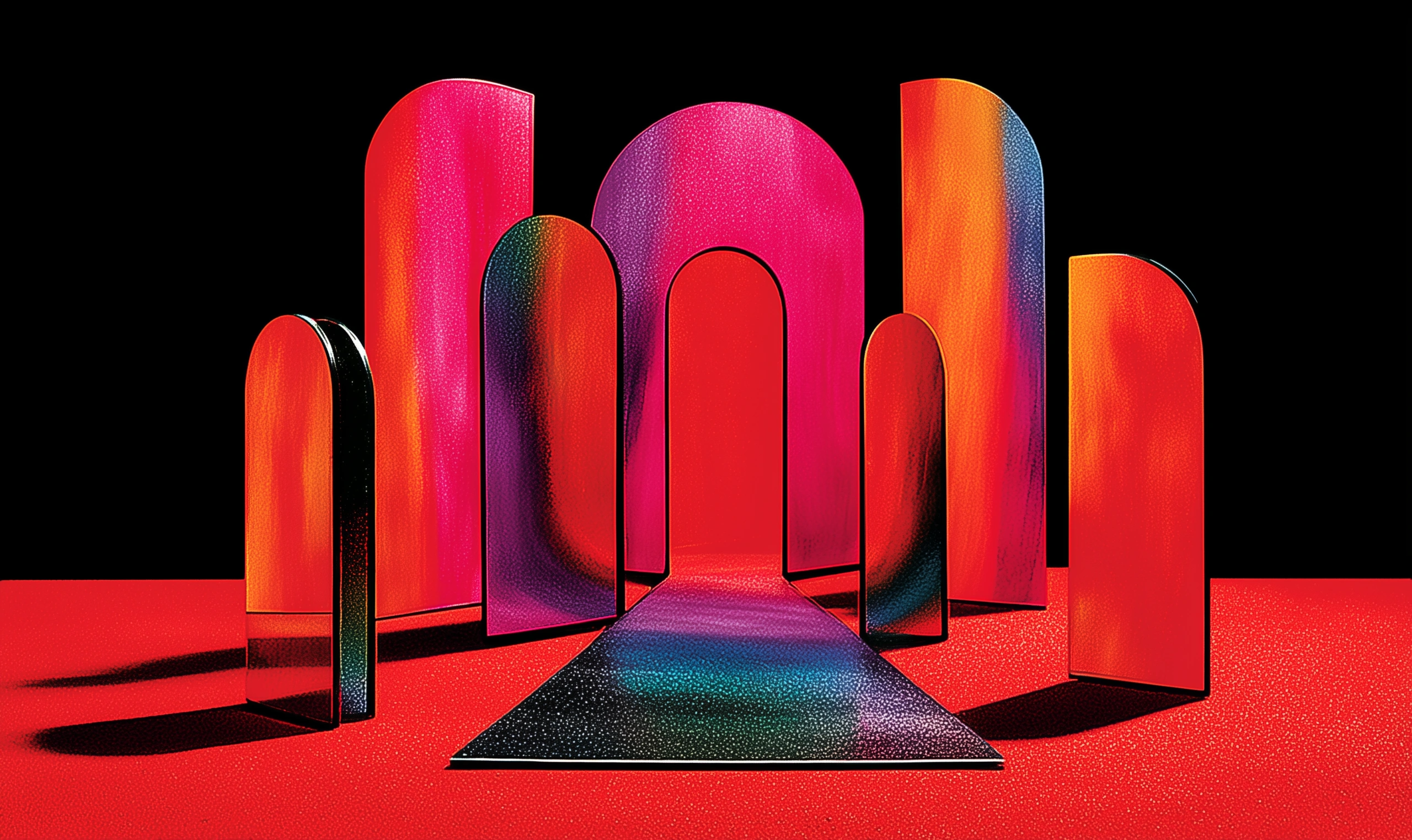
GLPS specializes in lightning protection for the wind, aerospace, and construction industries. As such, they are tasked with selling protection for one of nature’s most chaotic and uncontrollable phenomena.
To bring a sense of power and control, the rebrand focused on the brand promise of “empowering you to take charge.” Their beautiful logo does this perfectly, sandwiching a lightning surge between clean and orderly type—a visual symbol of their protection solutions.


3) ACLU
- Agency: Open
- What we love: The brand values brought to life through color
ACLU’s mission is “to defend and preserve the individual rights and liberties guaranteed to every person in this country by the Constitution and laws of the United States.”
With a goal to unite the country and embrace inclusivity, they ditched their old blue branding (perceived as a partisan message) and embraced a palette of blue, red, and, well, everything (14 colors to be exact). They also collaborated with the ACLU’s disability rights team to make sure elements like color and text size made the materials accessible for everyone.


4) PNG AIR
- Agency: Principals
- What we love: Their focus on cultural identity
PNG Air is an airline based out of Papua New Guinea. Their comprehensive rebrand included a name change (from Airlines PNG), positioning, and a visual identity overhaul. The goal was to transition the company from a generic price-focused airline to a powerful brand with a strong identity.
To do this, Principals incorporated a visual motif of significant cultural icons, paying homage to the brand’s history, country, and brand promise: to serve their people.


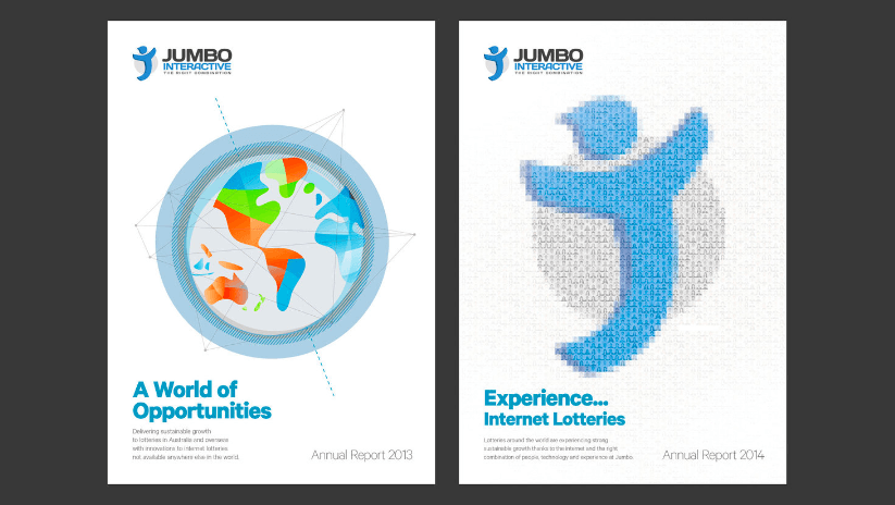
5) Jumbo
- Agency: FutureBrand
- What we love: Their future-focused thinking
A good rebrand is flexible enough to grow with the brand, however it evolves. For Jumbo, an online retailer of lottery tickets in Australia, the company’s ambitious plans to expand globally required a rebrand that could launch the brand to that next level.
The brand idea “Imagine More” became the anchor for their rebrand, symbolized through Joe, their elephant mascot that embodies “the idea of ‘big’: big excitement, dreams, jackpots and, of course, the promise.”


6) Tupperware
- Agency: FutureBrand
- What we love: Their modern take on a classic brand
Tupperware often conjures images of ‘70s moms. Instead of running from it, the brand acknowledges that image as a significant part of their legacy—and their greater mission. They aren’t just about the containers; they’re about empowering the women who sell their products around the world. Thus, “confidence becomes you” became their rebrand rallying cry.
Their bold visual makeover introduced vibrant colors, people-focused imagery, and a cleaner aesthetic to bring the brand into the modern age.


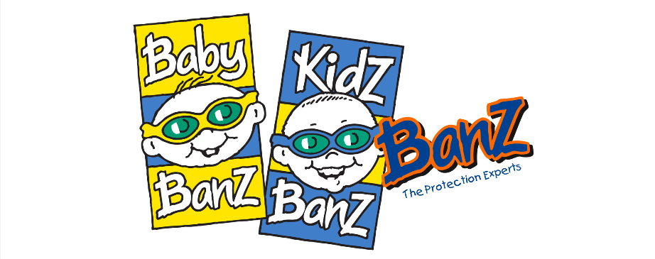
7) Banz Carewear
- Agency: Bubblefish
- What we love: Their cohesive vision
Banz is an Australian company whose products protect babies and kids from UV radiation and extreme noise. They offer a wide range of goods, but that diversity was a problem—in their disjointed branding. They needed cohesion and a focused message that resonated with mothers.
The result was a rebrand that brought unity and a strong emotional connection to mothers, using monkey imagery that captured the animal instinct of protection and care.


8) Engineers & Geoscientists British Columbia
- Agency: Twice/DDB
- What we love: Their simplified image
With a name like The Association of Professional Engineers and Geoscientists of the Province of British Columbia (APEGBC), this trade organization needed to bust out of their dated and stuffy image.
To do this, they embarked on a rebrand to modernize the organization, promote its mission (“to regulate, support and promote the engineering and geoscience professions in BC”), and garner public interest. This was achieved with a shortened name (Engineers & Geoscientists British Columbia) and a visual identity that is elegant and sophisticated yet modern and accessible.
We were particularly impressed by the genius logo: the diamond represents both the work below the earth, done by geoscientists, and the work above the earth, done by engineers.


9) DXC Technology
- Agency: Siegel+Gale
- What we love: Their creative merger
There are many reasons to rebrand, and a merger is chief among them. That said, it’s also one of the biggest challenges. When Computer Sciences Corporation and the Enterprise Services business of Hewlett Packard Enterprise merged to create DXC, they needed a total rebrand to unite the two worlds.
As the brand is the world’s leading independent, end-to-end IT services provider, the identity focused on the brand’s mission: “to help clients succeed in the face of accelerated innovation.” As such, the identity takes a bold and authoritative approach, positioning them as a leader in their fast-paced industry.


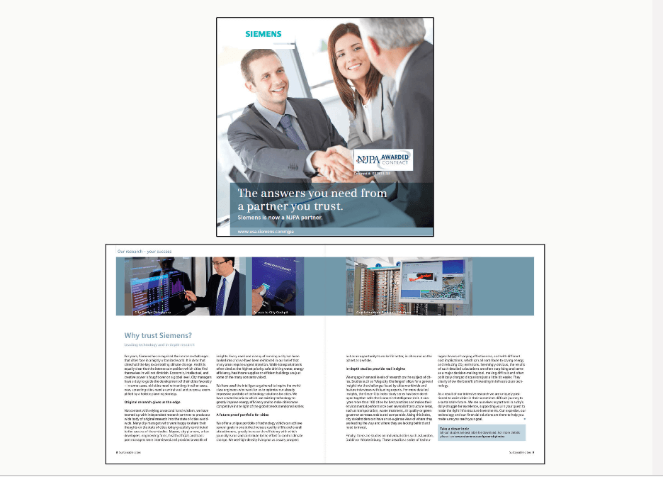
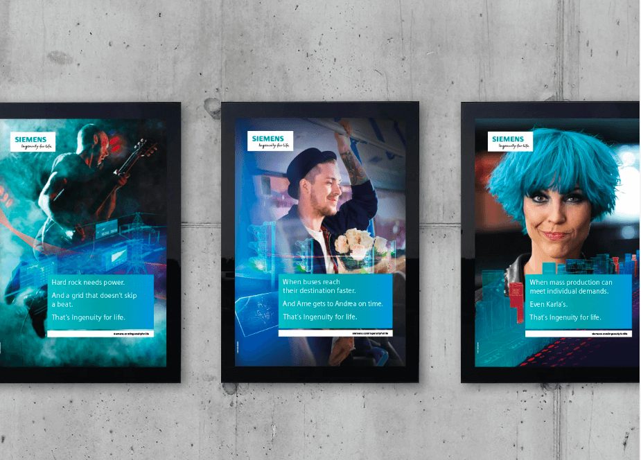
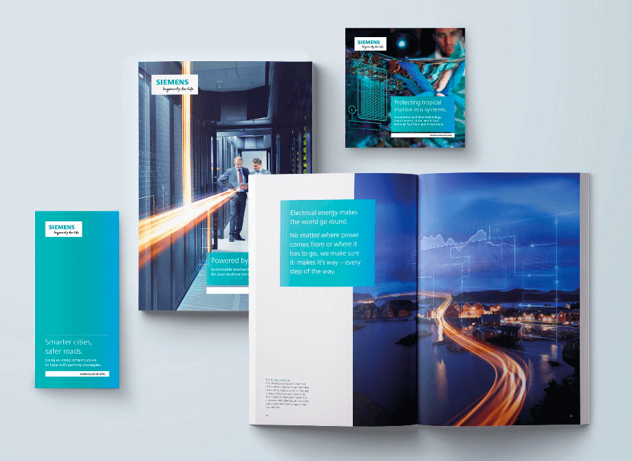
10) Siemens
- Agencies: Interbrand/MetaDesign/KANTAR Added Value
- What we love: Their energitic revamp
For a 170-year-old brand, maintaining relevance is always a challenge. For Siemens, the engineering and tech brand dedicated to innovation that improves quality of life, it was time to double down on their brand promise.
Thus, their rebrand hinged on one premise: Ingenuity for life. The new identity put people first, with a bright, energetic, and dynamic visual language that was both flexible and adaptable.
How to Do Your Rebrand the Right Way
When it comes to a rebrand, something different doesn’t always mean something better. When brands embark on a rebrand “just because,” the results are often less than stellar. That’s why it’s important to think deeply and get your ducks in a row before you do one:
- Get your team on the same page by doing a brand audit survey before you write your creative brief.
- Find out what mistakes to avoid to save time, money, and energy.
- Try our step-by-step tips to do a rebrand without losing your mind.
- Use our convenient visual identity checklist to make sure yours is complete, and find out how to create the strongest visual identity, based on science.
But if you’re just plain overwhelmed and truly don’t know where to start, let’s talk it out.

Let's upgrade your marketing game
Get fresh tips, how-tos, and expert marketing advice every week. (15,000 people already are.)