Think infographics are dead? We’ve heard all the complaints: the market’s too saturated, nobody cares about infographics anymore, etc. But as far as we know, not only are infographics not dead, they can give your site life long after they’re published. That’s why they are great tools to help your SEO. Every marketer is always on the hunt for the next holy grail, but infographics remain one of the most reliable ways to get your brand out into the world and higher in those rankings.
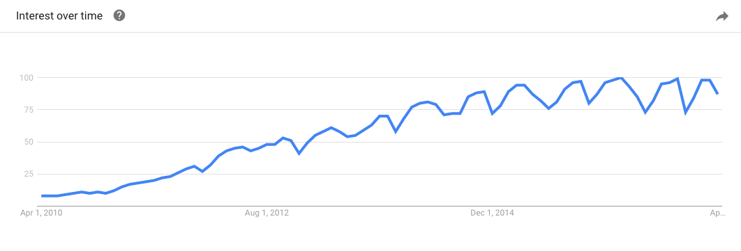
BTW, for skeptics who think “infographics” died five years ago, take a look at the interest in “infographics” over the last 7 years, according to Google Trends.
But back to what we were saying.
Infographics and Your SEO strategy
We’ve made more than 4,000 infographics for everyone from tiny startups to Fortune 100 companies, we wrote a book about the power of visual storytelling, and we’ve seen stellar results for both our clients and our own company. When it comes to SEO, we know that infographics provide very specific benefits—especially in a world where it’s become increasingly harder to stand out.
1) Traffic: A well-crafted infographic made for a specific group is a great way to generate traffic. If it’s interesting, relevant, and valuable, it is more likely to get eyes. But note that we said “well-crafted.” Along with the infographic renaissance, we’ve seen a surge of eyesores. Just because you slap together an infographic doesn’t mean you’ll get boatloads of traffic. But if you strategize well, you can see a solid jump.
2) Link Building: According to Search Engine Journal, content and link-building are two of the four most important ranking factors in 2017. Luckily, link building is one of the biggest challenges that infographics solve for. Again, people are always looking for content to curate, share, or reblog. When you craft a solid infographic that’s of interest to a particular group of people, they’ll want to share that information—and give you the credit.
3) Relevancy: An interesting infographic can circulate for many years. There are many topics that are always of interest to your audience, industry, or the general public. Depending on your expertise, you can approach topics from unique angles, and they can sustain popularity long after you post them. (In fact, the more specific your angle, the more you can demonstrate your authority on the topic.)
4) Versatility: Whereas other forms of content are a one-and-done deal, the visual nature of infographics makes them more useful. With a divisible content strategy, you can turn a single infographic into multiple pieces of content, whether used in e-books or as microcontent for social promotion. With this content, you get more bang for your buck and more opportunities to hit gold.
While it’s nice to talk about what infographics can do, we’d rather show you what they’ve done for us. So let’s go back to 2013.
Case Study: Massive Health Infographic
Back in October 2013 we created the infographic “Carbs are Killing You: Why Eating Fat Doesn’t Make You Fat” for Massive Health, a company focused on developing patient-centered digital tools to treat and manage chronic disease.
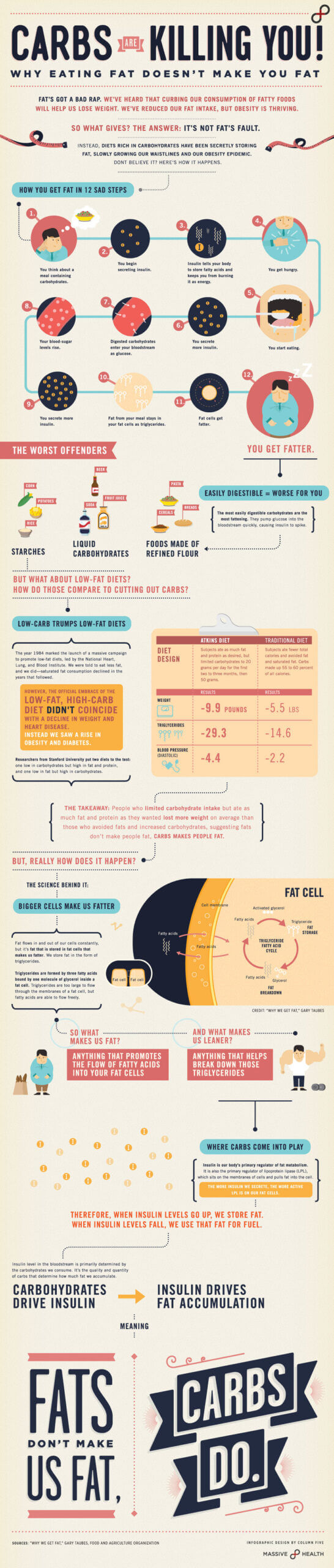
Like many infographics we create for clients, this little gem ended up in our portfolio. And that’s how a simple infographic posted almost four years ago went from a piece in our portfolio to the third most trafficked piece on our site.
Traffic
To start, it had about as much traffic as you’d expect of a portfolio piece for most of its lifespan. Then, in June 2016, we noticed it going crazy on the site.
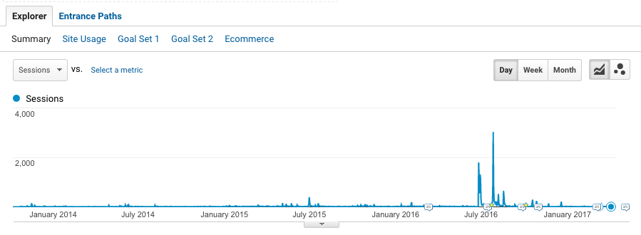
In addition to organic search, the piece had made it to social, where it was spreading like wildfire. Oh, and all this? Happening three years after it was first published.
Link-Building
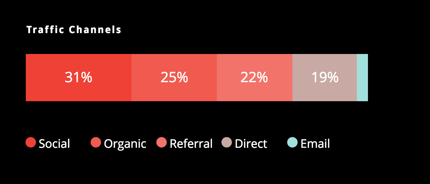
The graphic had also been published on natural health website mercola.com and marksdailyapple.com, giving us a huge spike in referral traffic. The graphic had also been linked to by authority site Forbes.
Relevancy
The debate over carbs and fat is always popular, which is why it spread on social (and garnered plenty of organic traffic) and was picked up by many health-related blogs. Its catchy title and clean design also helped communicate the subject directly and clearly.
Without doing anything, this evergreen infographic brought us traffic and referral links from authority sites, both of which help our SEO. So how can you use infographics in your own SEO strategy?
How to Create Infographics for SEO
There are many factors that go into making a successful infographic. Here are the important steps to take.
1) Start with Your Goal
“SEO” is not a goal, but “increasing organic rankings for keywords related to core business” is. Creating infographics just because it’s hip or because a competitor did isn’t going to lead to success. You need to know not only what your goal is for this particular project but how it fits into a larger context. Is this a one-off? Is it part of a larger series? Is it supporting a specific campaign? These may seem like big-picture questions, but they will ultimately guide your creative decisions, from the idea you choose to the headline you use.
2) Choose a Subject People Care About
This is hands down the biggest mistake we see people make over and over. They make infographics they want, not what their target audience wants. We’ve said it before, and we’ll say it again: You have to know who you’re trying to reach, what they care about, and how your infographic will provide them something of value. (If you don’t know who you’re trying to reach, try our easy exercise for creating marketing personas.)
There are several ways to approach ideation. The good news is you don’t have to reinvent the wheel, but you do need to make sure your idea serves your audience and your goal. It’s likely you already know what subject you want to address, but you need the right angle and execution. A few ways to find it:
- Add your spin on a well-covered subject. Is there some way to bust a conventional myth? Would you take a contrarian stance? Does your data disprove a popular hypothesis? Don’t be contrarian just to be edgy, but if you have a unique or unusual take on something, your audience may appreciate it.
- Do something no one’s done before. We’re big fans of using proprietary data to create content. It lets you tell unique, exclusive stories that are wholly original. Not sure where to start? Here are 9 sources to find data and 5 ways to find the story in that data.
- Do something someone did before—better. You don’t have to change the game, but you can provide a better, more comprehensive resource than already exists. High-value, rich content is the key to good SEO, so whatever you can add, you should.
- Improve something you’ve already done. You may already have some great stuff, but it could probably use some refreshing. One of the easiest strategies to create something of interest is to “fill in the gap.” When you look at an existing piece that needs updating or what your competitors are putting out (aka anything on the first page of Google), look at what information is missing. What could be added? What angle also needs to be addressed? This will help you hone in on providing more value and adding a unique spin.
We like to use Answer the Public, which is a helpful tool that lets you search what questions people are asking search engines (related to certain terms). It can help you easily identify those knowledge gaps.
In some cases, you might find multiple angles—more than can be addressed in one infographic. If so, a series can provide more content—and more support—for your subject.
3) Choose the Right Keywords and Titles
Titles and keywords are incredibly important; they should not be an afterthought. (Trust us, trying to retrofit a keyword once you decide to post is not the way to go.) In fact, keywords should be assigned during the ideation phase, and your infographic should be created with one keyword or phrase in mind. This isn’t to say you create an infographic that includes the keyword word 50 times. The real key to a great infographic is telling a strong story, but you absolutely need to know what you’re trying to rank for—and that you have a compelling title that tells that story. When you’re trying to find the right keyword, there are a number of things to consider:
- Relevancy: Is this the right keyword to help you achieve your goal? Are people interested in this topic?
- Popularity of the term: If you want to reach people, make sure you are speaking their language. While you might want to rank for a certain term, it may not be what people actually search for. Your product may be “macrobiotic dog food,” but people are far more likely to search for “healthy dog food.”
- Longtail keywords: Longtail keywords can help you diversify your content, especially if you tend to cover the same subjects.
Additionally, you can comb industry publications, competitor sites, and other relevant sources to find out what subjects people are talking about, interested in, sharing, etc. Here are a few of our favorite tools and sources to find out about relevant keywords and topics.
4) Create Your Infographic Around That Keyword
The key to great content that gets you loads of organic traffic, ultimately, is value. People want content that delivers on its promise, that educates them, gives them practical knowledge, entertains, or inspires them. Your job is to create a strong infographic that does this. How to do it?
- Tell a story. Slapping together random bits of information isn’t a story. You need a strong narrative that entices, engages, and guides the reader to a logical conclusion.
- Use the right language. You are speaking to a specific group of people. Craft your infographic with them in mind. Watch your word choice, avoid buzzwords, and speak to their level of intelligence.
- Use a straightforward headline. Yes, puns are fun. But you risk alienating an audience if they don’t know what the infographic is about. (They have limited time; respect it by making everything clear in your headline and intro.)
- Design for story. Again, your goal influences every aspect of your infographic—especially design. Make sure you have the right format and follow best practices.
While we’ve covered the basics here, we’ve compiled all our best tips (from making over 4,000 infographics!), which you should definitely check out.
5) Optimize for SEO
Now, of course, here’s the big one. Too often we see that people put all their energy into creating infographics and forget to put that last 10% in to actually optimize them. It’s not hard to do, but you need to know what to do. A quick checklist:
- URL String: Ensure your keyword (or phrase) is included in your URL.
- Meta Description: Craft a strong meta description that entices people to check out the post and, of course, includes the keyword.
- H1 Headings: Headings are great ways to break up text and make it more readable. Google likes when they include keywords, too.
- Image Alt Text: Unless you have a fancy hardcoded infographic, the content in your infographic isn’t crawlable. That means you must, must, must include your keyword in image titles and alt text. This “tells” the engines what the image is. This is the biggest rookie mistake, and we see it all the time.
- Page Length: Infographics alone can do well, as we see, but Google is really honing in and high-value, rich content. That means posts that are 1,000+ words. You can craft content around your infographic, and you can also add your infographic (even relabeled with a different keyword) to existing posts to enhance the content.
- Page Load Times: People are impatient. If they have to wait for an image to load, they’ll move on. If you’re not sure how your load times are looking, try this free tool to find out.
- Social Sharing Buttons: One of the best things about infographics is that they are shareable. Make sure social sharing buttons are present and working! Social shares contribute to your SEO, so you want to make it as easy as possible for viewers to share.
Note: The Yoast plugin is our favorite tool to help ensure each post is optimized. (It lets you know how you’re doing and offers suggestions to help improve the SEO on your page.)
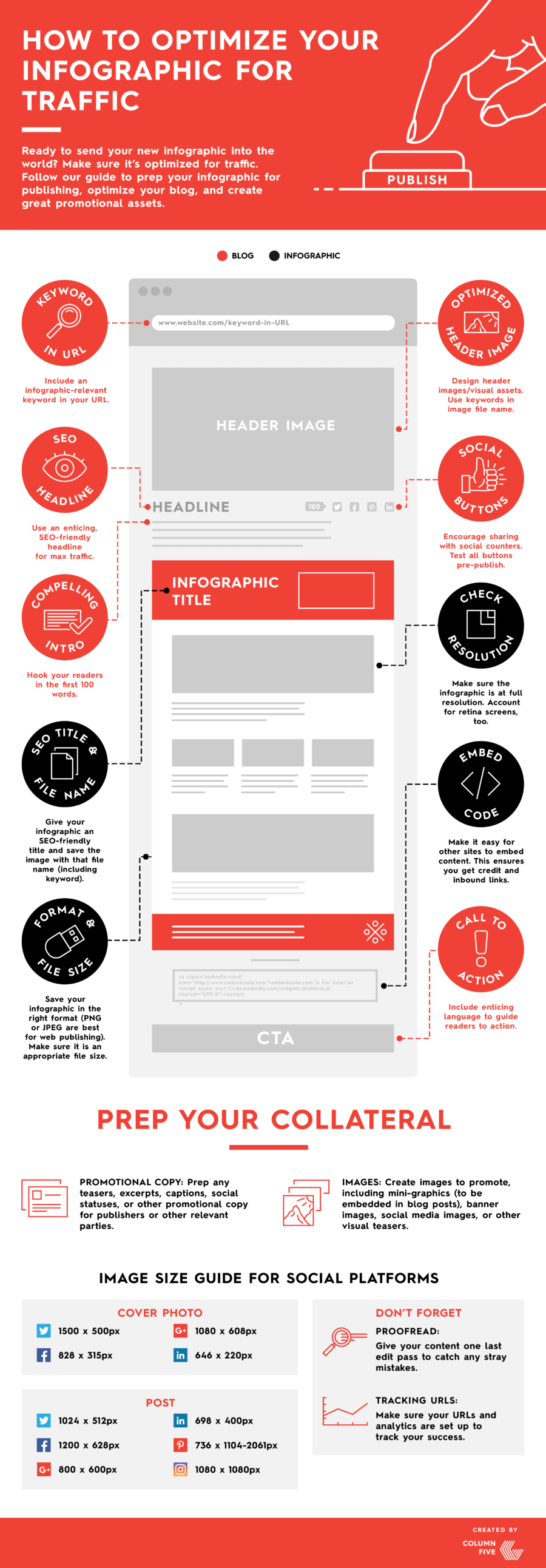
Need a recap? Here’s an infographic to help you.
We hope these tips help, and we hope you’ll continue to educate yourself about how to make better content. If you want more tips and inspiration, here are a few posts you might like to check out:
- 9 Infographic Design Examples that Will Leave You Inspired
- How to Build an Effective Content Marketing Team
- 7 Traits every Great Content Marketers Has
If you still need a little help with your infographic, we’re happy to lend a hand.

Let's upgrade your marketing game
Get fresh tips, how-tos, and expert marketing advice every week. (15,000 people already are.)