
Although the infographic Renaissance has triggered its resurgence, data visualization is nothing new. For hundreds of years, data designers have brought numbers to life to give us better insight into the world around us—and their data storytelling lessons are as relevant as ever.
To take a little walk down memory lane, we’re showcasing historic data visualizations that demonstrate great data storytelling. From data labeling to proper comparison, here are 7 things you can apply to your own data visualizations.
1) Keep the Focus on the Data

Charles Minard’s 1858 “Les Émigrants du Globe” map was a simple depiction of immigration patterns. Simple is the keyword here. There are no over-illustrated continents that distract from the immigration routes. There is no unnecessary labeling (beyond the simple continent name), and the key is simply colored. Everything is easy to track and discern. It’s simplicity at its best.
2) Label for Comprehension

While it feels like there’s a lot going on in this 1865 chart depicting British coal production from 1850-1864, Minard helped make the data more accessible through useful labeling. We see the X and Y axis labeled in increments for context, along with grid lines and directly labeled sections, color-coded for distinction. (Note that he didn’t also include a colored key, which would have been redundant.) Well-labeled charts reduce interpretation time, helping increase comprehension.
3) Choose the Most Effective Data Visualization

There are many ways to display data, but the goal is always to tell the strongest story. That’s what Florence Nightingale was determined to do when she and William Farr analyzed death rates during the Crimean War and realized that most soldiers had not died in combat; it was actually “preventable diseases” that claimed the most lives.
To convince Queen Victoria and Parliament to invest in better sanitary conditions, she needed to present the data in its most impactful way—as she said, “to affect thro’ the Eyes what we fail to convey to the public through their word-proof ears.” In 1858, she created the “Diagram of the causes of mortality in the army in the East,” which featured the entirely new polar area chart, a variation of the pie chart. The visualization shows death by month, color-coded by cause of death. The chart showed the story impactfully, and she successfully argued her case for better sanitary conditions.
4) Tell a Comprehensive Story

The beauty of data visualization is that you can communicate far more information in a more digestible package than you can with text alone. While that doesn’t mean you have to use every piece of data at your disposal, you can tell a rich story in a single visualization. Charles Minard’s 1869 map of Napoleon’s Russian campaign shows this well.
As data visualization expert Edward Tufte notes, “Minard’s graphic tells a rich, coherent story with its multivariate data, far more enlightening than just a single number bouncing along over time. Six variables are plotted: the size of the army, its location on a two-dimensional surface, direction of the army’s movement, and temperature on various dates during the retreat from Moscow. It may well be the best statistical graphic ever drawn.”
5) Order data for comprehension

True data visualization artists know that data visualization is about more than displaying data; it’s about displaying data so the reader understands that information quickly and completely. Simple details like ordering do a lot to enhance the experience of viewing a data visualization.
This is demonstrated with William Playfair’s “The Commercial and Political Atlas” from 1786, depicting Scottish exports and imports throughout the year. Playfair depicted the data in ascending order so the viewer could quickly identify the most active regions. To order effectively, arrange data numerically, alphabetically, or sequentially.
6) Compare for Context

One of the biggest benefits of data visualization is the ability to not just “see” but be able to compare data points. Playfair’s 1805 “Chart of Universal Commercial History” plots the ebb and flow of regions throughout history, allowing us to see the individual story compared to the larger view. These types of micro/macrocosm looks help provide context and color to a data story.
7) Make it Beautiful
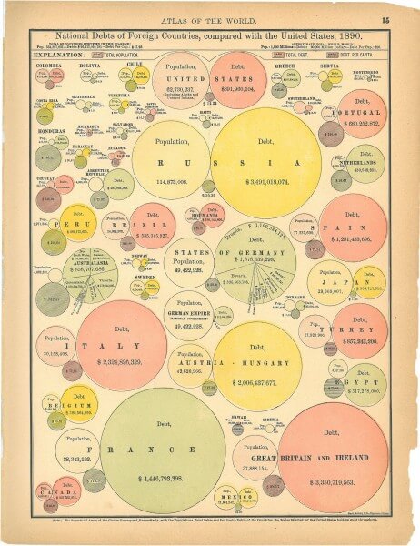
While data visualization best practices have changed, the art remains just that—an art. This specimen from the Rand McNally World Atlas was published in 1890. The subject is certainly less than thrilling (“National Debts of Foreign Countries and the U.S. in 1890”), but it is so damn pretty you’d want to hang it in your office today.
Although we can always learn from history, data visualization is an ever-evolving practice. To make sure you stay on top of best practices, here are a few posts that can help:
- Learn more about why data storytelling is so powerful.
- Find out how to pick the right format for your data.
- Check out these 9 sources for great data.
- Try these 25 tips to enhance your data visualizations.
- Dive deeper into data storytelling with our book Infographics: The Power of Visual Storytelling.
If you need a little help with your data storytelling, we’d love to work together.

Let's upgrade your marketing game
Get fresh tips, how-tos, and expert marketing advice every week. (15,000 people already are.)