Data is everywhere these days, and it’s likely you do—or will—use it regularly. But we know it’s probably been a while since you sat through math class, or maybe you never quite learned the data basics. (Don’t worry, we won’t call you out.) Instead, we want to help you get a grasp so that you can better understand and ultimately visualize the data you work with. Here are the data basics you need to know.
WTF Is Data?
Data is any information you are collecting: numbers, statistics, measurements. It can also be words, observations, or other inputs.
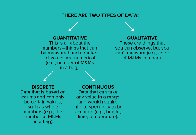
If you are dealing with numbers that represent something measurable, like sales of a product, you are dealing with quantitative data. If you are dealing with information that represents something less measurable, like how people feel about a product, you are dealing with qualitative data.
Each quantitative data point or variable you collect will be continuous or discrete, but as a whole, you are dissecting your data in one of two ways:
Cross-Sectional: The sample of elements is measured only once. This shows you a snapshot of variables at a point in time (e.g., market survey).
A sample visualization of cross-sectional data.
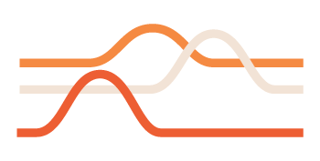
Longitudinal: The data sample is measured repeatedly over time (e.g., stock prices, monthly sales data).
A sample visualization of longitudinal data collected over time.
What Makes a Data Set?
A data set is comprised of variables; each individual data point—the thing that is measured or counted—is a variable. Each variable can be examined on its own or in relation to other variables to reveal insights, including:

Mean: The sum of all variables divided by the number of variables.

Range: The difference between the highest and lowest variables in your data set.

Quantiles: The values taken at regular intervals from the inverse of the cumulative distribution function (CDF) of a random variable.
Variability/Standard Deviation: Measures of how far a given variable is from the mean.

Distribution: The distribution of data around a central value.

Outliers: A variable that is an abnormal distance from other variables in your data set.
Data Relationships
Depending on what type of data you’ve collected, you will see different relationships represented in your data set. Understanding these relationships—and which visualizations communicate that relationship—will help you better communicate your data. Here are some of the most common.
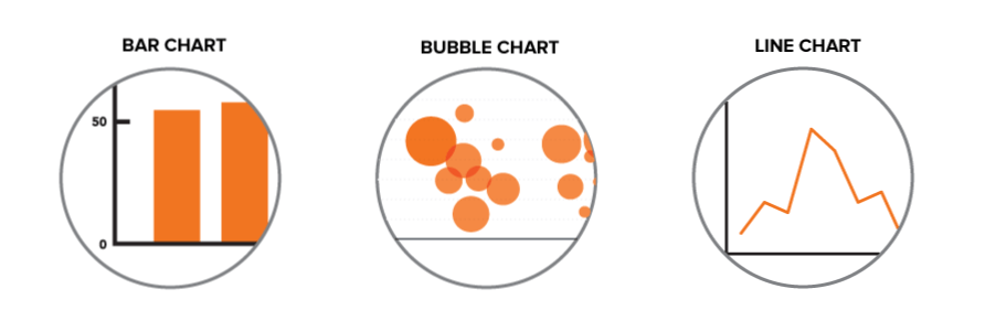
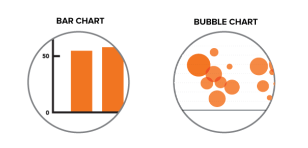
 Nominal comparison: This is a simple comparison of the quantitative values of subcategories (e.g., number of visitors to a website).
Chart Types for Nominal Comparison
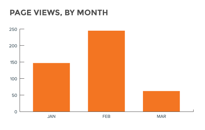
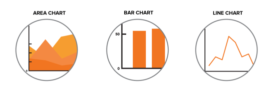
 Time Series: This tracks change in value of a consistent metric over time (e.g., monthly sales).
Chart Types for Time Series
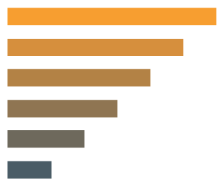 Ranking: This shows how two or more values compare to each other in relative magnitude (e.g., NBA players, ranked by height).
Chart Types for Ranking
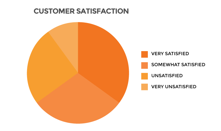
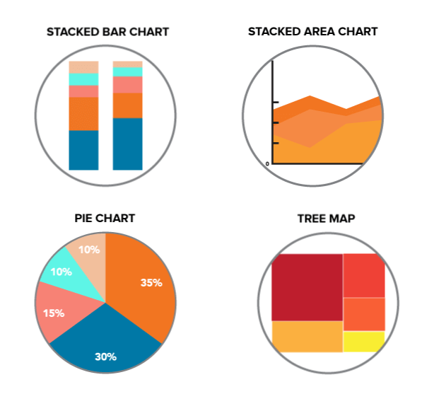
 Part-to-Whole: This shows a subset of data compared to the larger whole. This is used to show things like proportion or percentages (e.g., percentage of customers purchasing various products).
Chart Types for Part-to-Whole
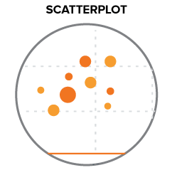
 Correlation: This is data with two or more variables that may demonstrate a positive or negative correlation to each other (e.g., salaries by level of education).
Chart Type for Correlation
Want to know more? Follow our guide to design the most common charts and graphs.
- Find out how to get the most mileage from your content by Maximizing Your Publishing with Microcontent.
- Learn everything you need to know about visual content in The Ultimate Guide to Visual Content Marketing.
- Get the most eyes on your content by reading The Ultimate Guide to Content Distribution.

Let's upgrade your marketing game
Get fresh tips, how-tos, and expert marketing advice every week. (15,000 people already are.)