Any piece of communication you create and share is a part of your brand story. Whether it’s an infographic or your employee orientation handbook, meant for internal reference or external viewing, it’s still a representation of your brand. Which is why it’s important to create consistency in all your content—even in things like your report design.
Plenty of marketers focus on making on-brand content marketing, but reports deserve the same treatment. The look, the feel, the voice—it all affects how your content is consumed and how your brand is perceived. So, before you send your next annual report to the printer or send a monthly report to a client, give it a pass to make sure it’s truly on brand. And to make it even easier, use our handy checklist.
The Checklist for On-Brand Report Design
Your brand is communicated through both copy and design. Here’s how to make sure both are on point.
In Your Report Copy…
Remember: A good report follows a structured narrative that leads the reader through the content intuitively. Consider:
- Brand voice: Your brand’s personality is communicated through the language and words. Give content a quick pass to see if any words or messaging seems off, and keep an eye out for specific words you should and should not use. (For example, we don’t like to use the word “audience” in our content because it sounds like impersonal marketing speak.)
- Tone: Your report should always reflect your brand’s tone—with sensitivity to the subject at hand. Is your brand tone authoritative? Enthusiastic? Friendly? Helpful? If you can’t easily identify it, amp it up.
- The takeaway: After reading the report, is the reader meant to draw their own conclusions or come away with a specific takeaway? If your report is meant to garner support for your brand in some way, make sure that underlying story is clear and reinforced.
- The reader: Reports can sometimes contain data or other dense information for readers to synthesize. While visualization can help with this, it’s important to talk to your reader at their level, use terms they’re familiar with, and speak at their knowledge level.
(For more tips on writing well, check out our roundup of 101 tools, tricks, and resources for copywriting.)
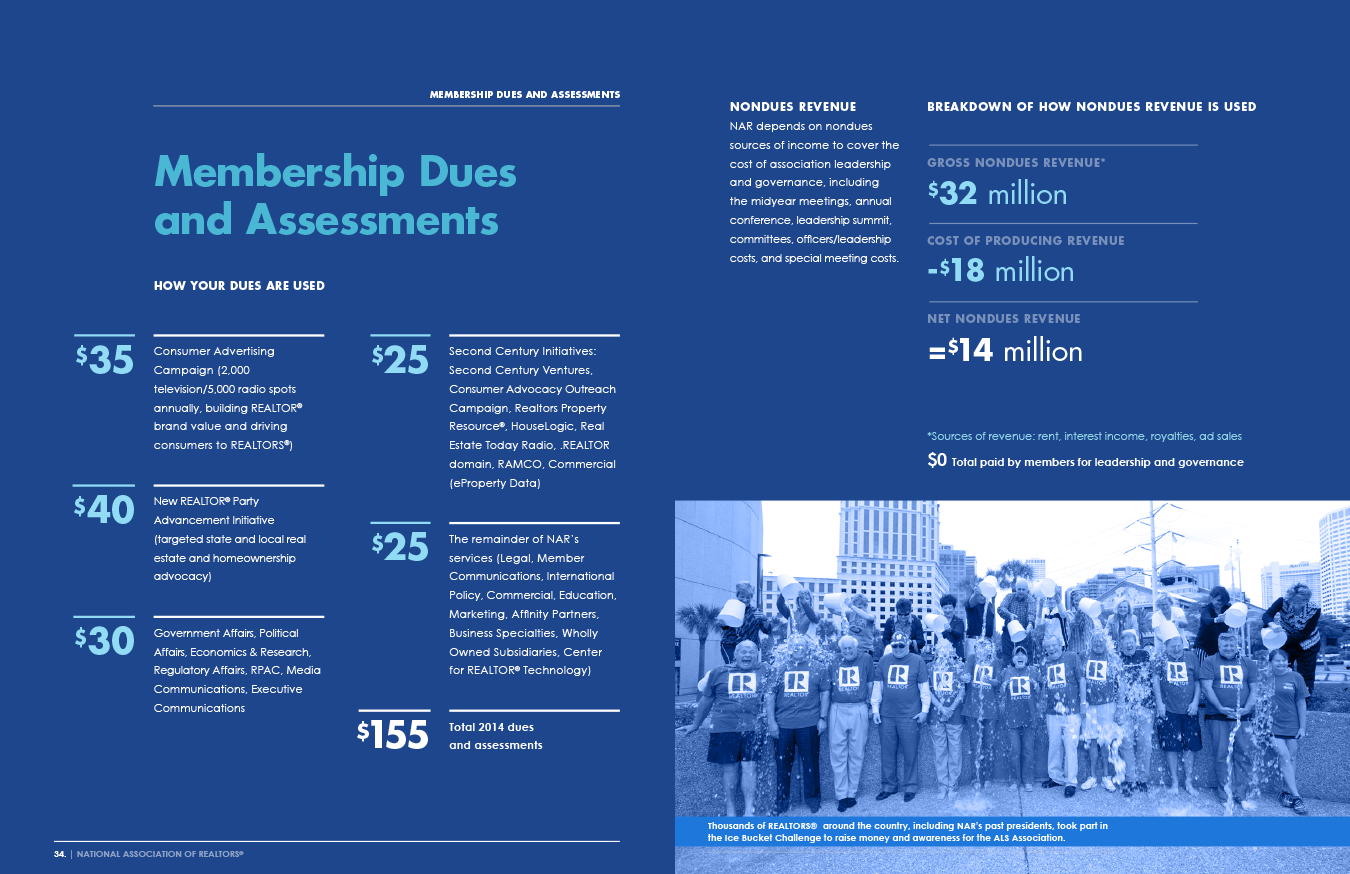
Example: For the 2014 National Realtors Association annual report, the trade association crafted their report around the theme “You are NAR.” Imagery and language supported the theme, speaking directly to their members in a friendly and celebratory tone.

In Your Report Design…
Good report design follows your brand’s visual language (a set of guidelines that detail how to apply design elements in the best way). Your brand should already have one, but here are our tips to build one if you don’t. Still, sometimes off-brand elements can make it in, especially if you’re working with an outside designer or content agency. To avoid this, make sure your visual language is up-to-date and easy for your designers to access.
For your report design, make sure those guidelines are interpreted and applied correctly—and that they follow design best practices.
- Colors: Are all color codes correct? Are they used effectively? (Tip: Use 1 or 2 dominant colors, plus 2-3 accent colors.)
- Logo use: Is the logo rendering correctly and used sparingly? Remember: You don’t want to overbrand your content.
- Fonts and typography: Are headers, subheads, and callouts easy to identify? Are there any spacing issues to address? Tip: Don’t use more than 2 typefaces.
- Hierarchy: Is there an intuitive, logical flow overall—and is there an easy-to-follow hierarchy on the page?
- Photography and illustration: Are visuals on theme and high res?
- Iconography: Are icons easy to understand and used effectively? You don’t want the reader to have to work to understand them—and you don’t want to unnecessarily clutter your design with them.
- Data visualization: Are visualizations designed according to your guidelines, as well as best practices? Try these 25 tips to improve your data visualizations.
- Interactive elements: If you are working with an interactive report, does everything work? Animations? Visualizations? You don’t want anything lagging or distracting the viewer.
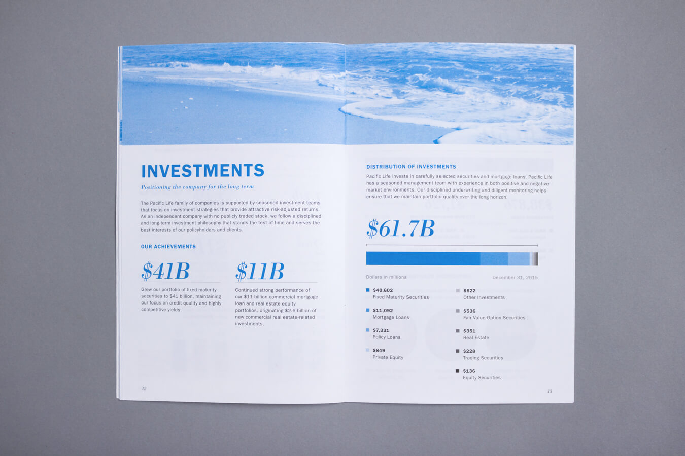
Example: The 2015 Pacific Life Annual Report used an oceanic theme that beautifully incorporated the brand’s visual language elements, from headers and data visualization to photography and typography. 
How to Ensure Your Report Design Is Always On Brand
One of the reasons people struggle to create a cohesive brand is because they don’t have enough time to approve everything that goes out the door. That’s understandable, but you can make your life easier with a simple trick.
Ask your designers to create report design templates (if you don’t have them already). This will reduce production time and help you ensure that your visuals are on point. You can follow these same steps to create templates that are easy to mix and match.
For more tips and inspiration on creating stronger reports:
- Follow these 7 report design and storytelling tips.
- Learn how to use data visualization to make your report design memorable.
- Try our top 10 tips to create a beautiful, attention-grabbing report design.
- Get inspired by these 40 examples of beautiful annual report design.
- Find out how these 7 brands are turning their reports into unique content marketing.
But if you have any questions or reports you need a helping hand for, we’d love to chat.


