
Data stories are a powerful tool for content marketers. They help you establish your expertise, cultivate trust, and more. But for data noobs the process of finding them can seem super intimidating. Where do you get that data? What do you do when you have it? How do you uncover interesting insights? Relax. We got you.
Here, you’ll find our handy step-by-step guide to turn your spreadsheets into compelling stories. Hope you’re ready to dive into all that sweet, sweet data.

How to Find Good Data Stories
Good data stories don’t just come from data; they’re actually hidden in data relationships. When you start to play with your data, you begin to see how each data point relates to another. The patterns you see (or don’t) help uncover what—if any—story is there. Understanding what type of data relationships to look for helps you find those stories faster. But first, let’s guide you through the steps to get to that point.
Step 1: Start With Good Data
Your data should always be from a credible source and presented without spin. Internal data is especially impactful, as it is entirely unique and original. If you’re not sure where to look, here are 9 sources of internal data you probably already have. You can also see our roundup of 100+ free data sources if you’re looking for general data. (And don’t forget to source correctly.)
[bctt tweet=”Remember: Good data stories start with good data. ” username=”columnfive”]
Step 2: Organize Your Data
Most of the time you’ll be working with data from a spreadsheet. Now it’s time to get it organized.
Note: The format of your data depends on what kind you have, so let’s talk about different kinds of data.
- Is this data one point in time? For example, If you have data from a 2020 survey, you’d have survey questions in the column and answers in the rows.
- Are there multiple time periods with only one observation? For example, if you have data on Apple stock prices from 1990-2019, the format would have years in the rows and the variable or stock prices in the columns. Note: If the years and variable are switched, no big deal. Spreadsheets have a function where you can paste the values “Transposed.” This will switch the rows and columns of the data.
- What if your data has multiple observations over a time period? Let’s say you have a dataset that has info on multiple countries from 1990-2019. This data will still have years in the rows, but each column will specify which observation is for that particular year. In this example, you would have a “country” variable that identifies which country the data is referring to.
Alright, now it’s time to clean things up.
- Identify missing values or bad data. These will make you a less credible source since your statistics will be wrong. Do a visual inspection to make sure that the data points make sense. For example, if the data set measures human weights, does it make sense for someone to be 2,000 pounds? Get rid of rows where there are tons of missing data.
- Look for outliers in your data. These would be data points that don’t seem to fall into your range of expectations. Outliers are usually thought of as a nuisance, but they could also offer interesting stories and insights. For example, if we expect sales to go down in all counties, then a spike in sales in one county would be an outlier (more on that later).
Step 3: Visualize Your Data
When we talk about data visualization at this stage, we’re not talking about the beautiful data visualizations your designers create. It’s simply the tools that let you literally “see” your data. (This is why we love data visualization so much—it’s an easy way for our brains to understand what we’re looking at.) Technically, this phase is referred to as exploratory data analysis, but we don’t want you to get too overwhelmed too quick.
For this example, we’re using Google Sheets.
1) Highlight the data you want to visualize.

2) Click on “Insert” and scroll down to “Chart.”

From the “Chart” editor you can use the recommended charts or choose your own graphs by clicking on the “Chart Types” tab. The “Customization” tab allows you to do things like rename your title and axes, change colors, or increase the font size.

Remember that different types of data are best represented with certain types of graphs. In the next section, we’ll cover what kinds of graphs can help you answer your data questions.
Step 4: Examine Data Relationships
This is actually the fun part where you start to search for your story by examining relationships. As you play around with visualizations and analyze according to relationship, you’ll start to see behavior patterns that will lead you in the right direction.
But first, you need to understand what type of relationships to look for.
5 Types of Data Relationships
There are many different data relationships, but we’re going to cover the top 5 most common. These will most likely apply to the data you have at hand, and will help you start to get a sense of what else you might like to explore in other data sets.
As you dive into these, consider what types of interesting angles your findings might support. A few questions to ask yourself as you go:
- Does the data support or disprove my hypothesis?
- Does it debunk a widely held belief?
- Did data increase, decrease, or flatline?
- Does the data show any differences between groups?
- What are the top 10 (or bottom 10) observations for a metric or variable?
Relationship 1: Correlation
This is data with two or more variables that may demonstrate a positive or negative correlation to each other.
- Positive: An increase in one variable results in an increase in the other.
- Negative: An increase in one variable results in a decrease in the other.
Common chart types:
- Scatterplot
- Scatterplot with a fitted line
The strength of a correlation is measured by a correlation coefficient. A popular way to measure this is using the Pearson Correlation Coefficient of Pearson’s R ranging from -1 to 1. This measures how closely the points in your scatterplot resemble a line. A correlation coefficient of 1 means there is a perfect positive correlation. A correlation coefficient of -1 means there is a perfect negative correlation. A correlation coefficient of 0 means there is no correlation.
(In less technical terms, the more the dots on your scatterplot resemble a line, the higher the strength of a correlation.) You can also check out this game, which helps you identify the strength of correlation visually.
Here’s a scatterplot with a fitted line that shows the relationship between GDP per Capita and Coca-Cola prices for different countries.

The line shows that there is a positive relationship. This means as GDP per Capita increases, the price of a Coke increases. Through visual inspection we can see the dots don’t make a perfect line, so we can say the correlation is only moderately strong. In fact, after calculating Pearson’s R, the correlation coefficient is 0.51.
What you want to look at here is how they interact. Do both variables influence each other? Do they increase, stay the same, or decrease? Remember: Correlation does not equal causation. (Just because there are more ice cream sales and shark attacks in the summer doesn’t mean that ice cream causes shark attacks.)
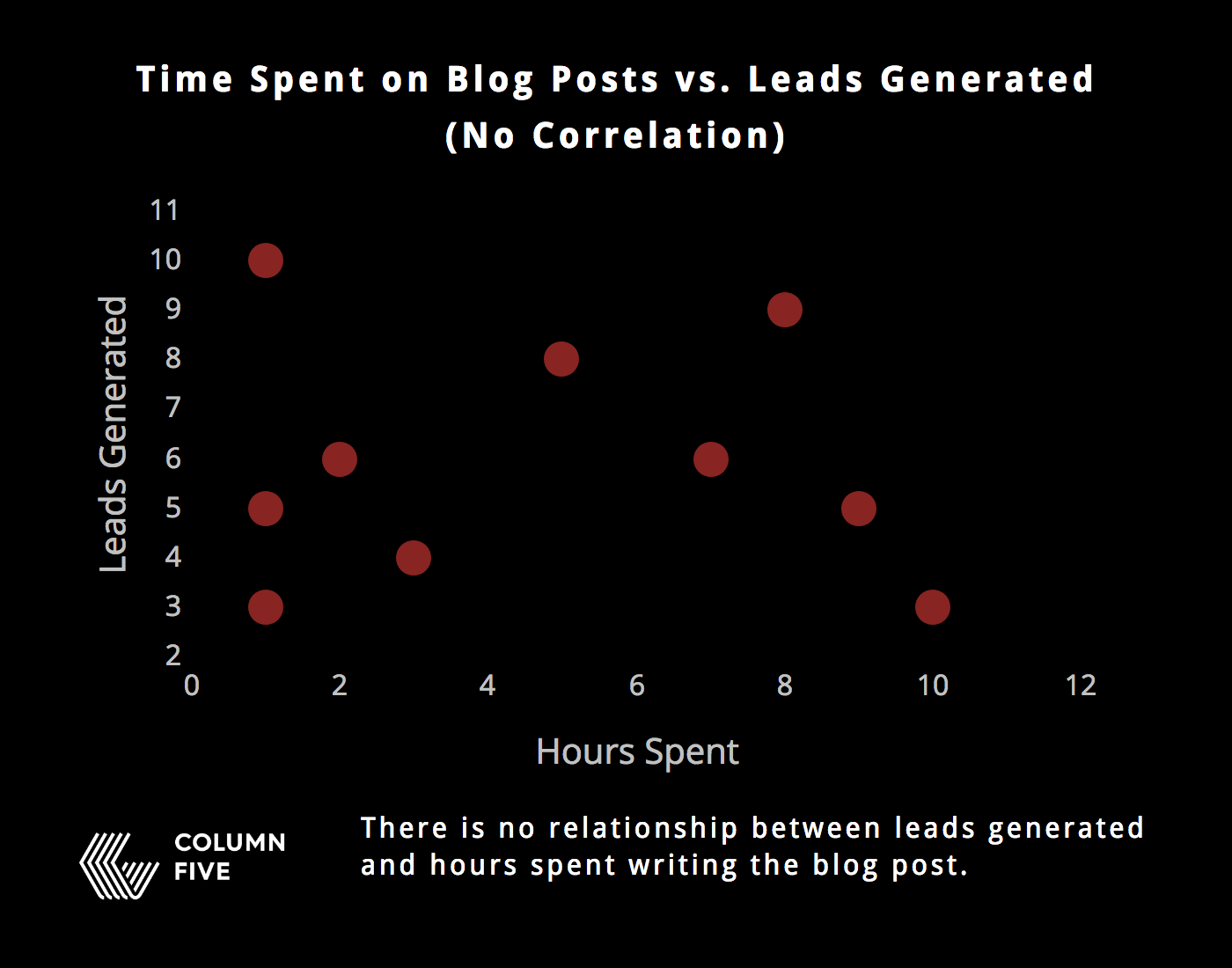
For example, you might wonder about the relationship between leads generated by a blog post and the number of hours spent writing the post.


Relationship 2: Trends
Look for noticeable trends, increasing or decreasing, in the data.
Common chart types:
- Bar chart
- Line chart
For example, you might look at how many page views your website gets every day in a month to identify which days of the week generate the most traffic.

Relationship 3: Distribution
This shows data distribution, often around a central value. Distributions are useful for understanding the minimum, maximum, mean, median, and range of a specific variable. Looking at a distribution lets you understand the shape of your data by looking at the average and end values.
Common chart types:
- Histogram
For example, you could group clients by how much revenue they generate for your company in a year. This way you can see what the average client spends, as well as the range a client might be expected to spend.

Relationship 4: Outliers
This is any data that acts unusually or outside the norm.
Common chart types:
- Scatterplots: Shown by points on the plot that lie away from the trending areas.
- Histograms: The tails of the histogram show if there are many outliers in the data.
- Bar charts: Any unusually high or low values.
For example, going back to our previous example, the trend of the histogram we expect to see is that there are less clients in the first and the last groups. But this histogram shows us an outlier. There are actually a lot of clients that spend $51,000 – $55,000—even though we expected there to be less. It would be interesting to investigate why there are so many clients in that group.

Relationship 5: Comparisons and Rankings
Comparison: This is a simple comparison of the quantitative values of subcategories.
Common chart types:
- Bar chart
There are many ways to compare data. You can compare sets or look at subcategories within those sets.
For example, you might look at data comparing click through rates for different colored CTA buttons. Which get higher clicks, and why?

Ranking: This shows how two or more values compare to each other in relative magnitude.
For example, which type of content has the highest page views? Rankings help you easily compare how much traffic a page is generating.

How to Turn Insights Into Data Stories
Once you think you’ve found your story, follow these tips to make sure you tell it effectively.
1) Know who you’re writing for. Effective data storytelling doesn’t mean you tell whatever story you want. It means you find a story that is interesting for the people who are going to read it. Consider:
- Is this relevant?
- Does it solve a problem or expand their knowledge?
- Have they heard this story before?
Sometimes you have a story that can be told to multiple (or larger) audiences. If you have the data, hone in on the most interesting angles. Remember, too, that it’s your job to turn your data into a story that is easy to digest.
Speak to people in a way that they understand, and provide as much context as possible.
2) Craft a strong narrative. Your data stories should be intuitive and easy to follow. Don’t overload people with charts, but don’t make them hunt for the insights either. Find out how to craft an effective data narrative that is impactful and easy to understand.
Note: Data can be powerful; it can also be manipulated, misinterpreted, and misrepresented. Make sure you are telling the full story. Sometimes people have an idea for a data story and try to retroactively make their data fit that narrative. If the data isn’t there, the story isn’t there. Luckily, oftentimes searching for one story will lead you to another.
3) Design according to best practices. Data visualization doesn’t just visualize the data; it enhances appeal, comprehension, and retention. Make sure you’re using the best data visualization format for your story, and that your designers are presenting it in its most optimized—and accurate—form. For more on this, see our guide to designing the most common graphs and charts, and take a look at these 25 tips to improve your data visualizations.
BTW, your data visualizations can be used and re-used in all sorts of content. Try these 10 tips to repurpose your data visualizations.
Data storytelling isn’t always easy,
but it’s always worth it.
The more you practice, the better you’ll get. Just keep an eye out for more opportunities to flex your skills and you’ll find great stories to turn into great content.
That said, we know not everyone has the resources or bandwidth to create data stories consistently. If you still need a little help with your data storytelling, take a look at these tips to find the right data visualization agency (and find out how to work with them once you do). We’d also love to chat about what you need.