

When you’re trying to reach different groups of people—and move them to act—you need good content and a clear call to action to finish the job. A well-crafted CTA can lift conversions across the board. The problem? Weak CTAs still sink plenty of campaigns. You don’t have to write award-winning copy, but a few simple tweaks to wording and placement can make a big difference in how people respond to your content. Here, we’ve rounded up some practical tips and real examples that show what types of CTAs work (and why).
As you read, watch for strong examples and action-ready prompts. Use them to spark ideas for your own approach.
But first, a quick recap.

What Is a Call to Action (CTA)?
Each piece of content you create can start a real connection with the reader, but you need something to keep that interaction going. A call to action is an invitation to take the next step.
A CTA can be a button, link, or short message that nudges someone to do something specific, like sign up for a demo, schedule a consultation, or download a guide. They are prompts designed to drive a specific behavior.
The best CTAs are:
- Clear
- Concise
- Compelling
Whether someone skims a blog post, watches a video, or checks the pricing page, using a simple CTA will help them move through the next stage on the path to purchase.
7 Tips to Write an Effective Call to Action
Because CTAs carry so much weight, you need to give them extra attention. No matter your industry or budget, use these simple tactics.
1) Use a command verb.
Strong verbs help people act right away. Marketing copy can set the scene, while the CTA gives direction. Imperative verbs make that direction clear (think commanding verbs like sign up, try, get, book, download, start, or join).
These types of words cut friction and guide the click.
Examples of command verbs:
- Claim your free trial now to start enjoying our premium features.
- Get your free e-book download today and learn how to boost your productivity.
- Try our limited-time offer!
- Join our community of like-minded individuals and start achieving your goals.
- Register now to secure your spot in our upcoming webinar.
- Upgrade your account now to unlock additional features and benefits.
- Start your 30-day challenge now and transform your life.
- Download our app today and enjoy instant access to all our services.
- Book your appointment now and take the first step toward a healthier you.
- Sign up for our free newsletter.
- Schedule your custom consultation.
Example: Bombas pairs “Go ahead, make yourself comfortable” with products built for comfort. The command matches the promise.

Example: Half Magic Beauty also uses an imperative command with “Take your glitterpill,” a cheeky play on words to encourage site viewers to shop their glitter cosmetics.

2) Speak to your audience’s desired future state.
A good brand tells a good brand story, and that is directly tied to the promise you’re making to your audience. What will they get by buying your product/service? How will they benefit? How does your product speak to their wants or needs, solve a problem, or improve their lives? Crafting a CTA that promises their ideal future state (in which they’ve bought and are now enjoying the desired results) will always make them want to click.
Connect your call-to-action to that future:
- “Streamline your workflow today”
- “Maximize your productivity”
- “Transform your life”
- “Achieve your goals”
A little energy helps. Even one well-placed exclamation point can really lift the mood.
Example: Mailchimp skips the feature pitch and goes straight to impact: “Convert more customers at scale.”

3) Speak to their pain points.
Relief motivates. If a product removes friction, say that. Show that you understand the pain and offer a clear path out. This is a smart way to not only present your brand as the problem-solver but also reinforce the pain that the user is currently experiencing.
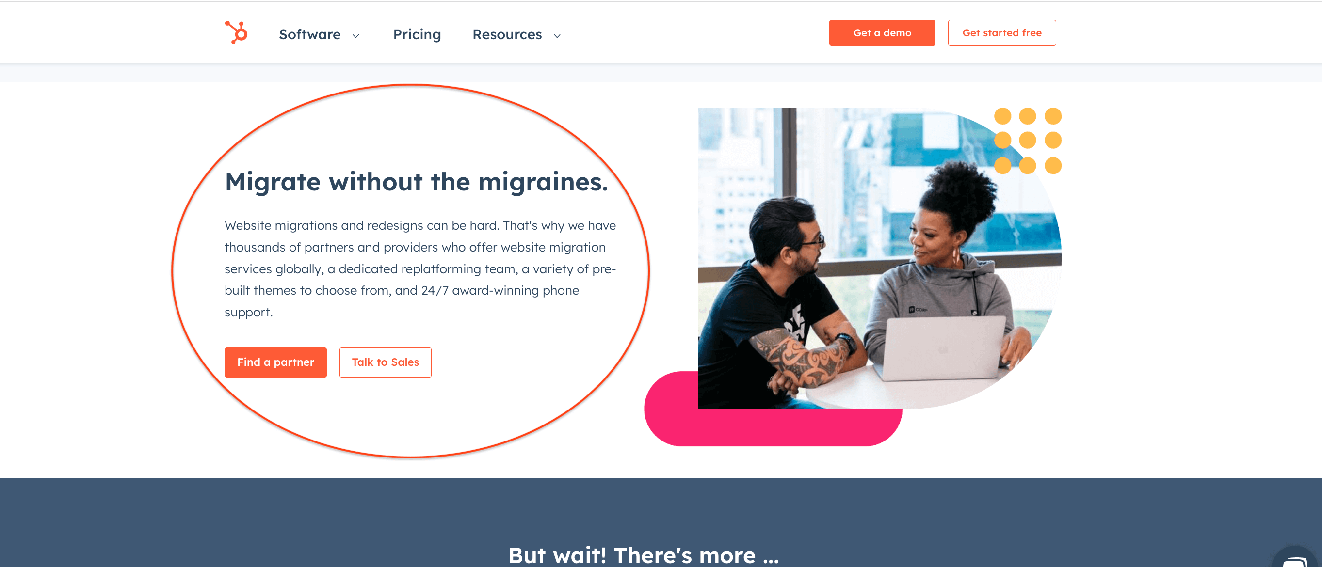
Example: HubSpot uses “Migrate without the migraines.” The promise is simple: move fast without the headache.
4) Create a sense of urgency.
Urgency can help when it’s honest and relevant. Words like “now” and “today” help, as do limited-time offers, countdowns, or limited quantities.
Not every offer fits a flash sale, though. If timing isn’t the hook, use energy and emotion:
- “Turbocharge your sales!”
- “Save a dolphin’s life”
- “Give a child a lunch”
Add intrigue to spark curiosity when appropriate.
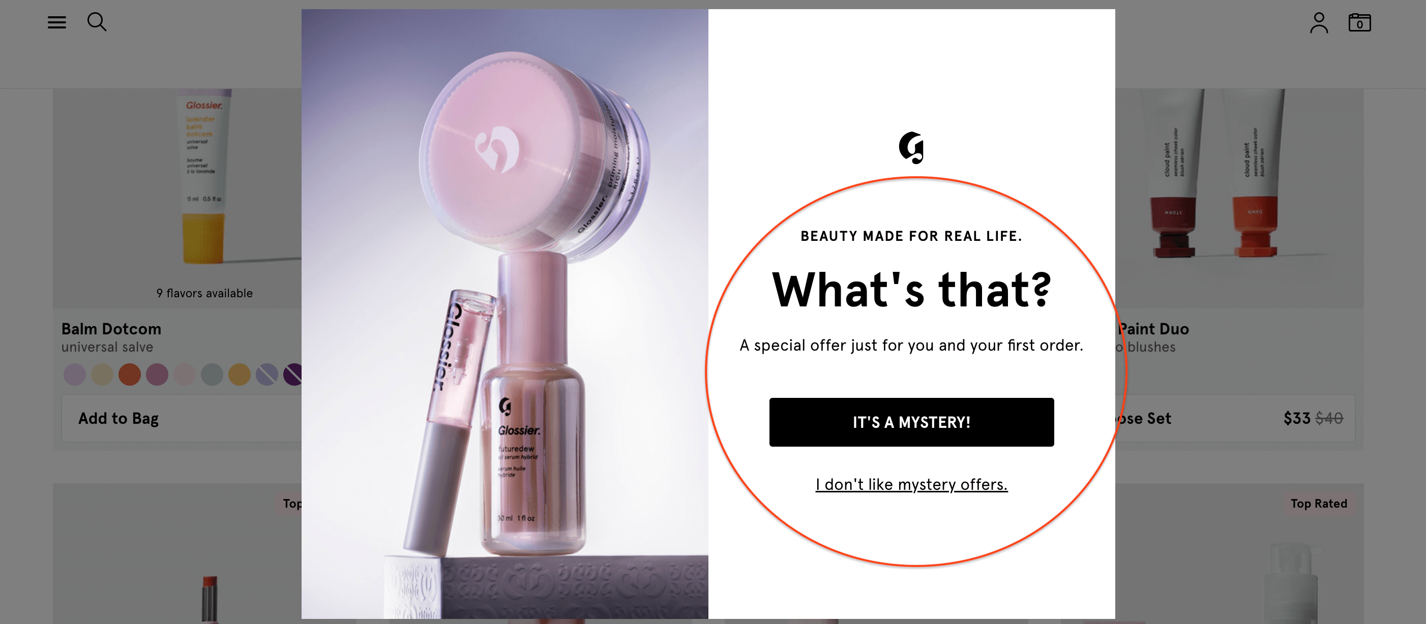
Example: Glossier uses the mystery of “What’s that?” in its CTA to prompt the click and reveal.
5) Use a number.
Numbers add specificity and trust. They set expectations and make outcomes tangible:
- “Make 50% more sales”
- “Save 4 hours a month”
- “Join 1,000,000 people getting fitter”
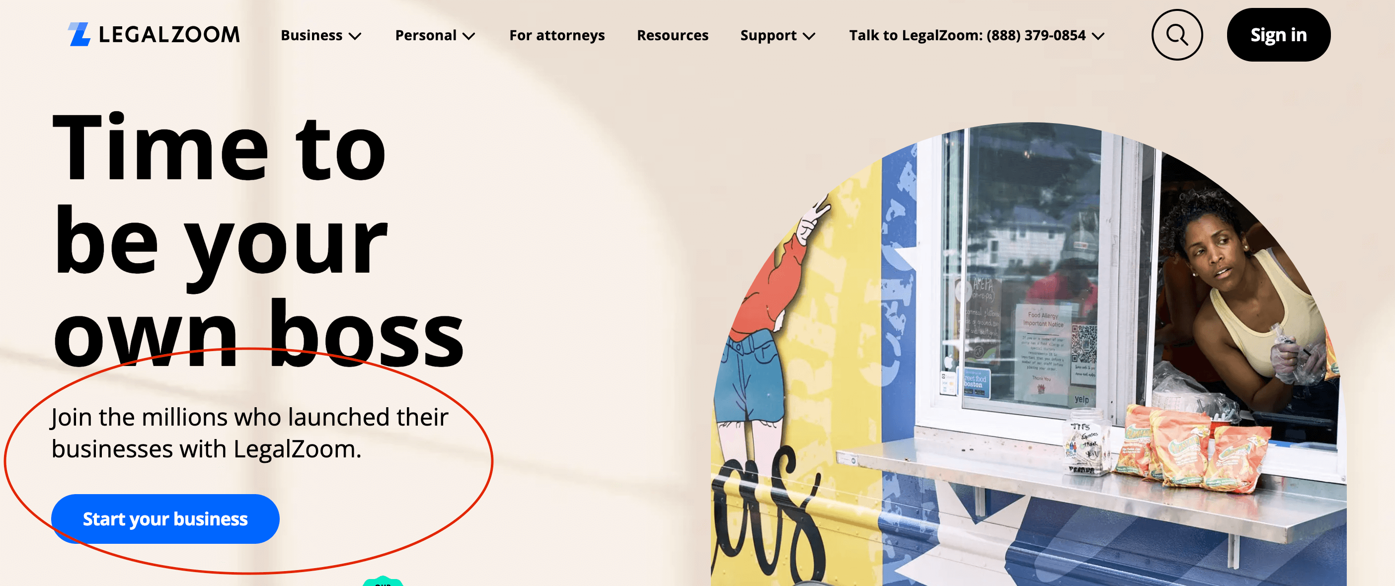
Example: LegalZoom taps social proof: “Join the millions who launched their businesses with LegalZoom.”
6) Keep it short.
CTAs work best when they get to the point. Aim for under 10 words when you can. Focus on clarity over cleverness.
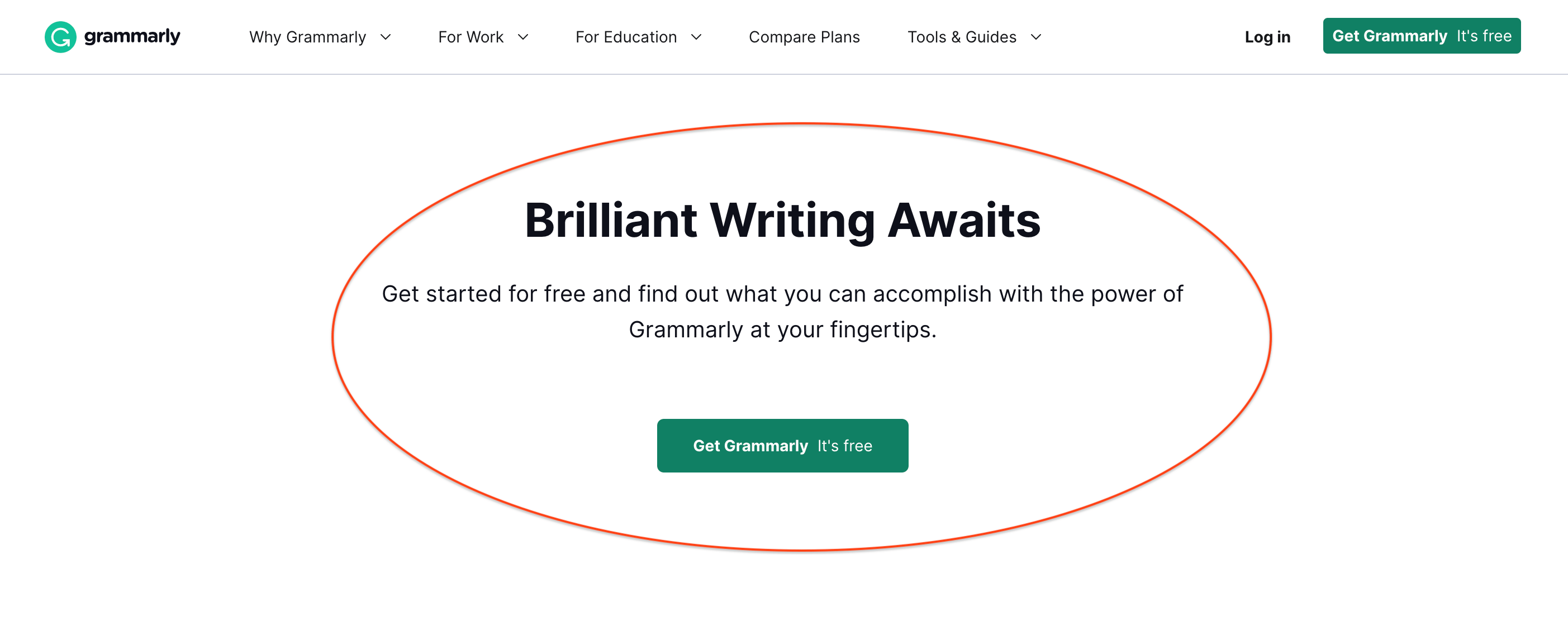
Example: Grammarly says everything you need to know: “Brilliant Writing Awaits.”
7) Speak to your audience’s generational drivers.
Different age groups respond to different cues. Tailor the call to action to what motivates them.
Baby Boomers: quality, reliability, service
They respond well to CTAs that emphasize the quality and durability of a product or service.
- “Invest in quality that lasts”
Gen X: independence, practicality, value
They want control, straight answers, and no fluff.
- “Make your mark”
Millennials: innovation, convenience, experiences
They respond well to CTAs that emphasize the latest trends and technologies.
- “Join the future of fitness”
Gen Z: impact, community, authenticity
They choose brands that act on their values and speak like real people.
- “Make a difference with every purchase”
Example: ColourPop speaks native slang—“Don’t get FOMO”—to drive urgency and connection.

CTA Examples and Best Practices
CTAs turn passive readers into people who act. To work, they need to be obvious, specific, and aligned to what people want.
1) Start with your primary CTA.
What do you want most: newsletter signups, demo requests, or free quotes? Lead with that, then add a secondary CTA for those not ready yet:
- Primary: “Learn more”
- Secondary: “Get a free resource”
2) Use proven templates to move faster.
You can then refine the language to match your customer and your offer. Keep testing. Small tweaks add up.
3) Use CTAs across the buyer journey.
They should show up wherever people interact with you:
- Landing pages: “Get your free download”
- Blog posts: “Start your journey”
- Emails: “Claim your spot”
- Social: “Shop now”
Match the CTA to the moment and the action you want. When the timing feels right and the ask is obvious, more people say yes.
Of course, landing pages are one of the most important places to optimize CTAs, so pay special attention to those.
Landing Pages that Inspire Action
A landing page has one job: turn visitors into customers or leads. Make one primary call to action the focus, then design everything else to support it.
- Use a single, clear CTA with a strong verb: “Sign up,” “Get started,” or “Call now.”
- Keep the layout clean. Cut anything that doesn’t help someone take that step.
- Add an exit-intent pop-up to catch people before they leave. If scarcity is real, say it: “Only 5 spots left.”
Think about how people are viewing your landing page, too. For example, most people visit sites on their phones, so the CTA needs to be mobile-optimized, easy to see, and responsive.
- Place the CTA where thumbs naturally reach. Make buttons large enough to hit without zooming.
- Use short, action-first language that fits mobile behavior: “Tap to get your estimate,” “Shop the sale,” “Download the app.”
- Consider a sticky footer button so the CTA is always within reach.
- Test on different devices. Check speed, spacing, and how the page feels in one hand.
Most importantly, keep it simple. Aim everything at the one action that matters and make it effortless, especially on a phone. Take a critical look at all your channels to make sure you’re offering the same experience. Pay extra attention to your social media, too.
Social Media CTAs
CTAs work when they match why someone opened that app in the first place. On mobile, they should be native, fast, and easy to act on.
Design CTAs for the format:
- Stories: use link stickers, polls, and “DM for details” to start quick chats.
- Reels/TikTok: add on-screen text and captions with the CTA in the first 2-3 seconds.
- Feed posts: put the action in the first line of the caption and mirror it in the creative.
- YouTube: use end screens, pinned comments, and timestamps to drive the next step.
- LinkedIn: end with a simple ask that fits work mode (e.g., “Save for later” or “Comment with your take”).
Match the action to the moment:
- Discovery content: “Save this checklist” or “Follow for next week’s tip.”
- Consideration content: “Watch the walkthrough” or “Compare plans in two clicks.”
- Conversion content: “Book a table for Friday” or “Start a free trial today.”
Use social CTAs to build momentum, not just clicks:
- Spark conversations: “Reply with a question” or “Vote and tell why.”
- Encourage sharing: “Tag a friend who needs this” or “Share to your team chat.”
- Nudge micro-wins: “Add a reminder,” “Save this template,” or “Turn on notifications.”
Make it effortless:
- Keep the CTA and the value side by side in the creative.
- Use short links or native buttons to avoid extra taps.
- Add captions and subtitles so the ask lands with sound off.
Test where it counts:
- Swap CTA verbs by format: “Try,” “Watch,” “Book,” “DM,” “Save.”
- Rotate placement: first line, end card, sticker, or comment.
- Track with UTMs and compare by post type, not just by platform.
Keep it human, keep it native, and ask for the smallest next step that fits the moment.
How to Ensure Your CTAs Are Successful
If you want to write CTAs that always hit the mark, there are a few more ways to ensure your copy always lands.
- Keep personas up to date. Review them every six months so messages reflect real needs, pains, and motivations. Revisit your marketing personas.
- Inject your brand voice. Keep CTAs clear, but let your personality show where it helps. Familiar labels still work for high-intent actions. For example, “Contact Us” remains a strong, simple choice. But you can play with your brand voice elsewhere to add more personality.
- A/B test. CTAs are easy to test and quick to learn from. Experiment with verbs, benefits, and formats to find the most effective version for your people.
- Consider design. Use CTAs with strong visual cues, clean headlines, and smart placement to guide action. Sales pages, especially, benefit from clear prompts that remove guesswork.
That said, CTAs work best inside a strong content strategy. For alignment across your content, grab our free guide to content strategy. And if you want help bringing that strategy to life, see what it’s like to work with us on content strategy or reach out.

Let's upgrade your marketing game
Get fresh tips, how-tos, and expert marketing advice every week. (15,000 people already are.)


This is FANTASTIC!!!
Thank you!
So happy to help!