As data storytellers, we tend to advocate for letting the data do the talking. We can frame it, we can present it, we can provide context, but we like to show the story most of all.

So when we recently stumbled across an old video of beloved master storyteller Kurt Vonnegut visualizing story arcs in true data scientist fashion, we were beside ourselves. (Storytelling + data visualization + data visualization about storytelling = minds blown.)
As Vonnegut shows, stories—no matter the medium—can be examined in a profoundly scientific way.
These days, we tell plenty of stories with computers—it’s our specialty. But the shapes that Vonnegut draws freehand are profoundly beautiful in their simplicity.
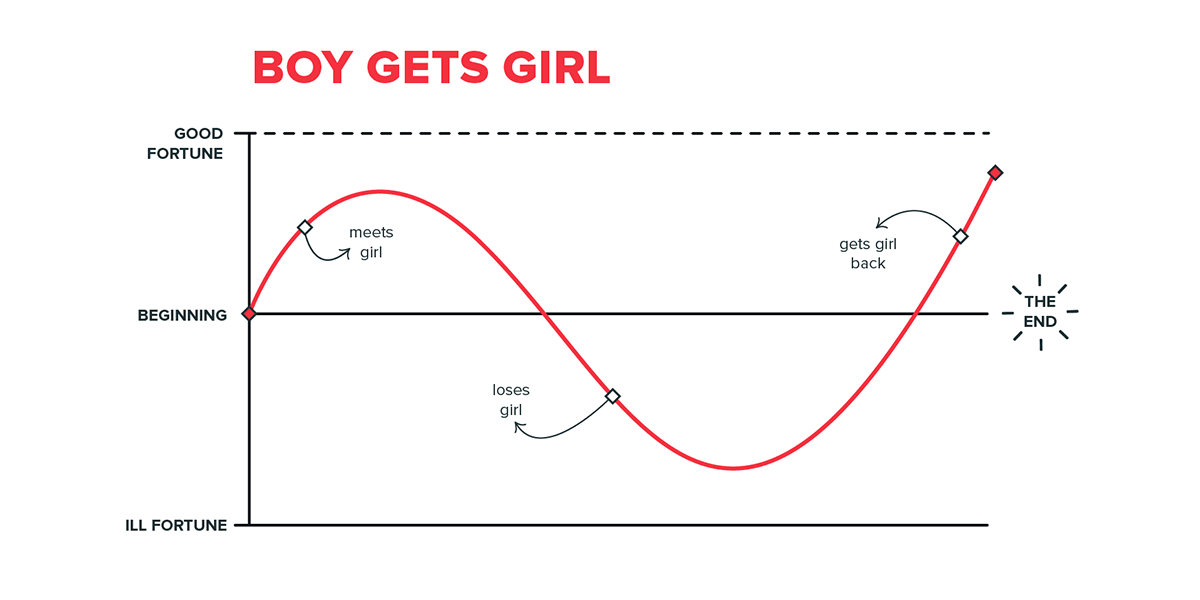
Vonnegut shows that every story can be visualized: the magnetic pull of the characters, the meticulous weaving in of themes, the glorious clash of good and evil—you name it. In fact, Vonnegut points out, we often just tell the same stories over and over. Here they are:


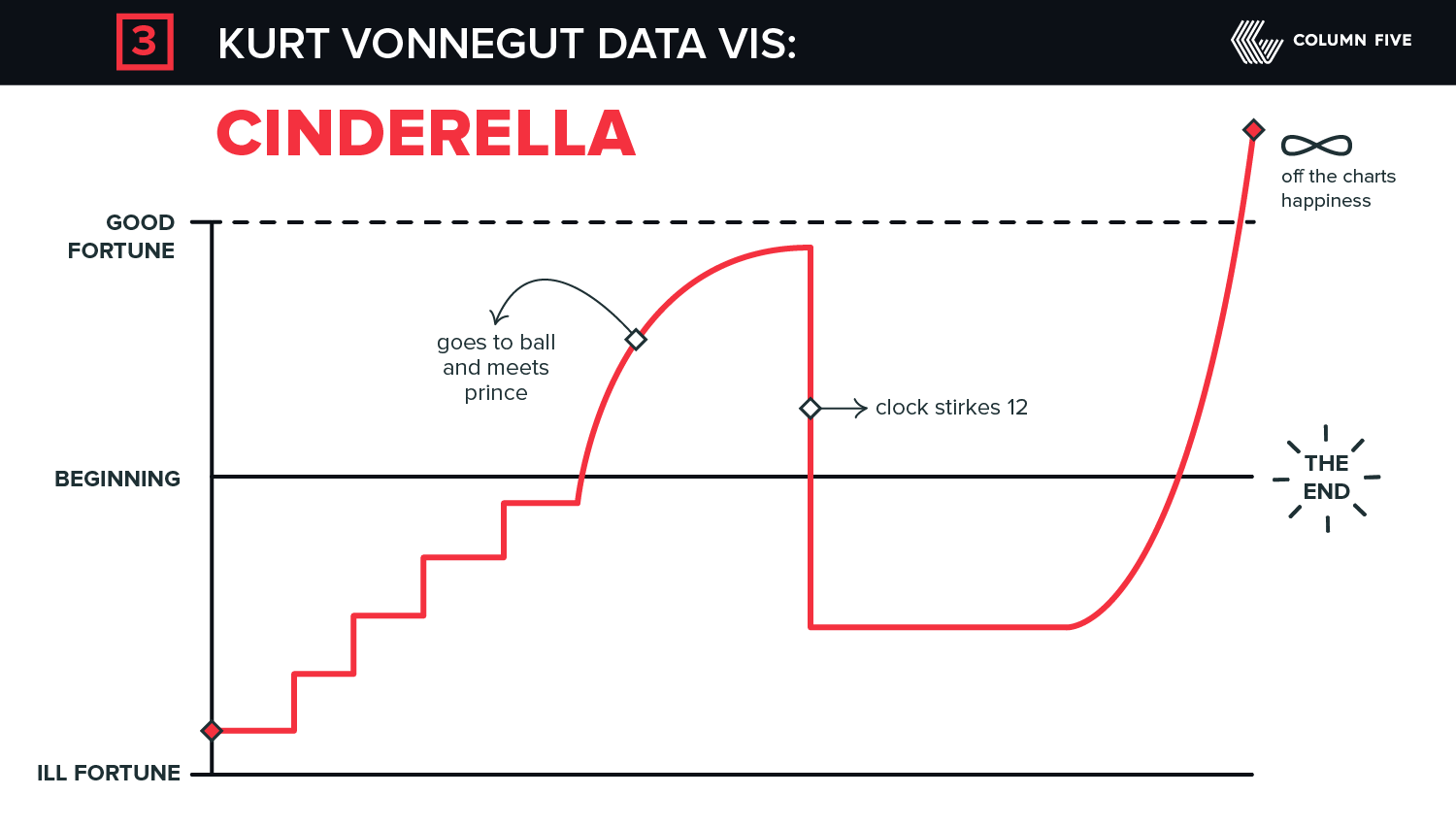
Every century, storytellers thrive off human data (emotional, mental, societal, philosophical, political, economic, religious, etc.), and they craft challenging chronicles of our evolving world. But, as Vonnegut points out, a million stories can be told in a single shape.
- Find out how to get the most mileage from your content by Maximizing Your Publishing with Microcontent.
- Learn everything you need to know about visual content in The Ultimate Guide to Visual Content Marketing.
- Get the most eyes on your content by reading The Ultimate Guide to Content Distribution.


Let's upgrade your marketing game
Get fresh tips, how-tos, and expert marketing advice every week. (15,000 people already are.)