One of the most challenging parts of launching a new venture is branding: building a solid visual language that establishes your brand at all touchpoints, from your logo, to your website, to your business card. It’s a huge creative challenge but one of our favorite things to do.
We recently got to flex our skills with UCI Applied Innovation, a new unit of University of California, Irvine whose exciting mission is “to bring campus-based discoveries together with Orange County’s vibrant business community to support job creation and economic growth.” This venture also includes The Cove, a 31,000-foot workspace hub. As an Orange County startup ourselves, we know how important these resources are. We also happen to be neighbors with The Cove, so their work is physically near and philosophically dear to us.
How We Created the Branding
Naturally, we were happy to partner with the team to create and shape their branding, providing guidelines that would allow The Cove to create visually cohesive collateral, print, presentations, and more.
The biggest challenge of the branding project was creating a visual identity and assets that appropriately reflected the UCI Applied Innovation mission. The unit’s goal is to create a vibrant “world-class entrepreneurial ecosystem” between the university and the larger business community, to foster new life. The Cove is the center for this activity, dubbed “a safe harbor” for entrepreneurs. They had already adopted this ocean-inspired language, which provided the perfect foundation for us to build our branding around. Water, waves, sand—all became the visual queues to inspire us.
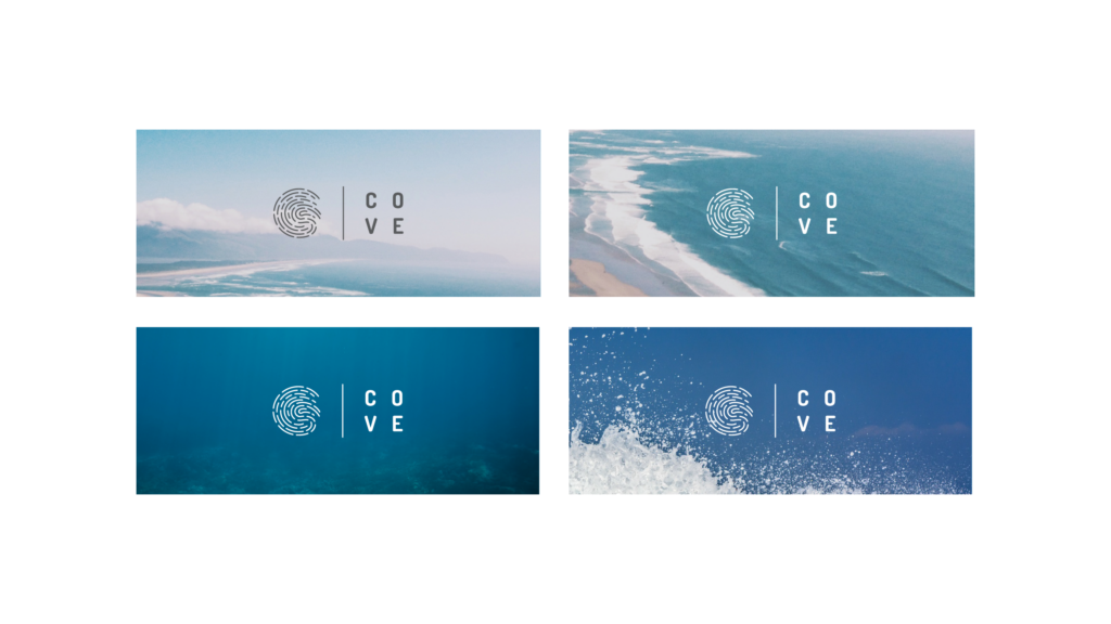
The Logo
As with any branding project, the logo was the anchor of the visual language. To inspire the team, we brainstormed the words associated with the UCI Applied Innovation mission, which the designers then used to create visual queues and logo mockups.
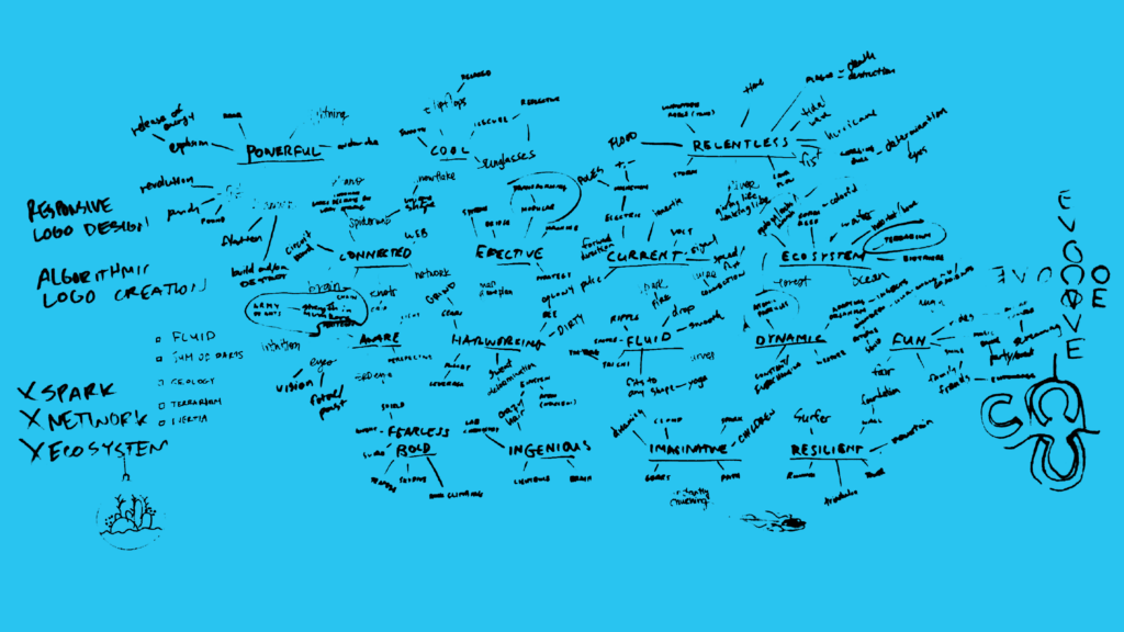
The Cove is the most visible extension of the Applied Innovation unit, the physical space and community-facing arm. A workspace and incubator where many minds work on many things, it is an active hub of activity. As we worked through logo ideation, there were multiple iterations reflective of The Cove, inspired by the work done there and, of course, the oceanic imagery.

You can see the evolution of the logo designs, from the most basic shapes to the more elaborate illustrations.
We landed on the final design both for its simplicity and its meaning.
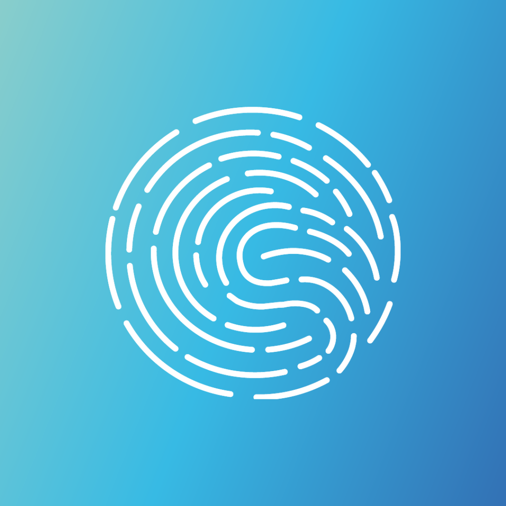
The logo is reflective of water movement, a turning of tide. It is a cohesive movement, made by individual elements (lines). As such, it looks like a singular image but is the result of multiple parts—exactly what The Cove aims to do: mobilize individuals to contribute to the larger business community. From a technical perspective, it is simple and adaptable for the unit’s needs, whether it appears on business cards or the site. 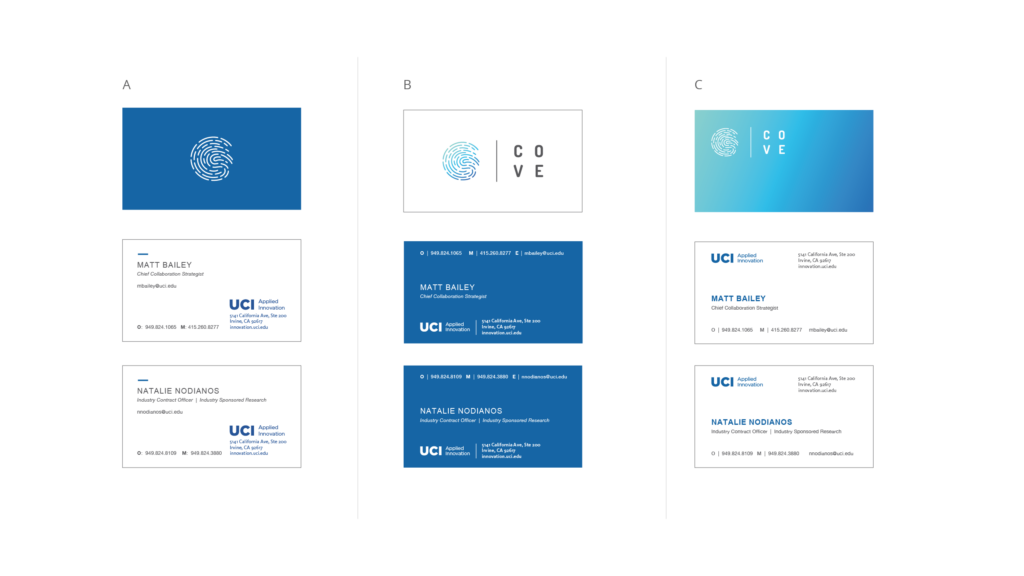 Now, while we were pleased with the static version of the logo, we desperately wanted to see that water move, so we also animated the logo for The Cove website. (That same animation now plays on one of the many large TV screens at their offices.)
Of course, the logo was only the beginning of the branding.
Core Branding Elements
To ensure consistent branding across all mediums, we also created a comprehensive visual language (also inspired by “the Southern California lifestyle,” as Creative Director Nate Butler puts it). The full visual language dictated a variety of elements, including:
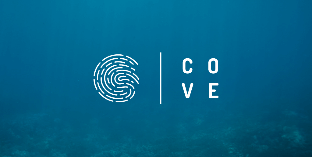
Color palettes: Aquatic shades of blue, gray, and black allow for variation and creativity without straying from the core colors.
Iconography: Detailed guidelines for all icons and stylization, inspired by the logo.
Photography: Specifications for image type, use-case, and application.
“It was a creatively challenging project, but we were able to build a robust and flexible visual identity system for this exciting new startup ecosystem,” Butler says. “I’m excited to see them put it to good use.”
If you need help creating or refreshing your branding, we’d love to chat. (And if you’re curious to see more of our branding, check out what we did for Trezo d’Haiti coffee.)

Let's upgrade your marketing game
Get fresh tips, how-tos, and expert marketing advice every week. (15,000 people already are.)