Ebook marketing can be your brand’s secret weapon. Great ebooks contain valuable information that readers are happy to give up their email for—and they generate leads for a long time. (We know this first-hand. Some of our oldest ebooks are the most popular content we’ve ever put out.) But not all ebooks are equal. No matter how good your content, shoddy ebook design can send your reader running. It’s a bummer to see how many marketers ignore this fact.
Since we’re design freaks (and a little content marketing crazy), we want to give you a solid understanding of what will make or break an ebook design.
How to Use Design to Improve Your Ebook Marketing
To get you started, here are our top 10 tips to turn an eye-sore into a high-converting piece of awesomeness.

1) Start with an eye-catching cover.
First impressions are everything. An eye-catching cover that communicates the ebook theme at a glance goes a long way. (You’d be surprised how a simple tweak in imagery or font size can change the feel.) Consider how your imagery, colors, and typographic choices may be altered for stronger impact.
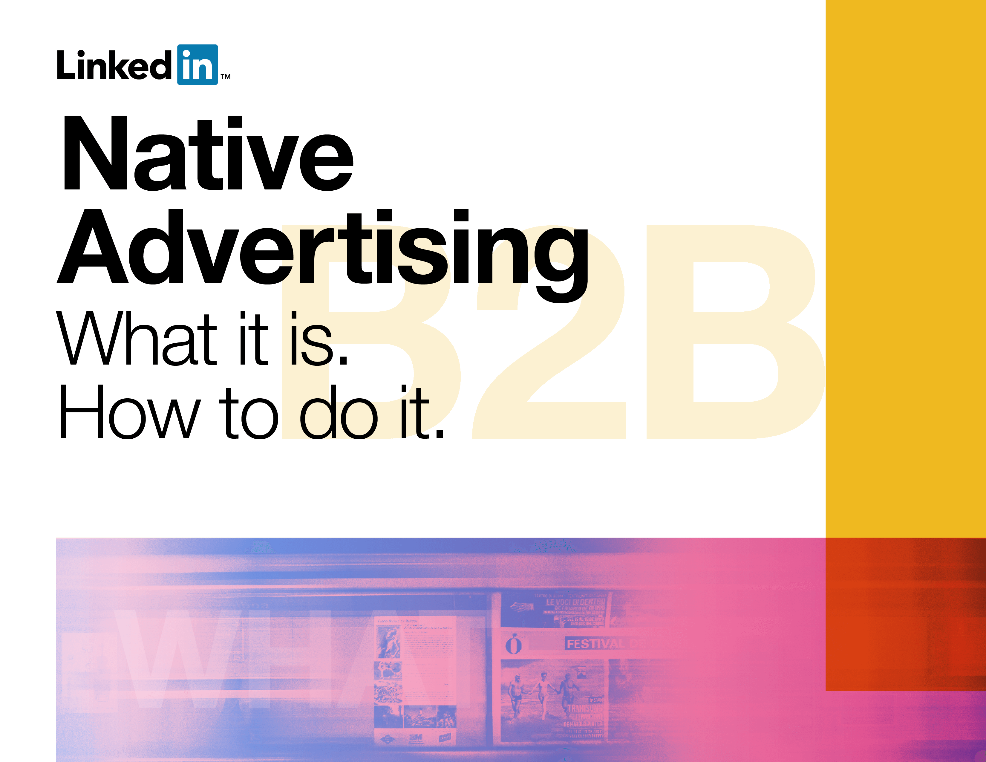
Example: We partnered with LinkedIn Marketing Solutions to create an ebook about native advertising. The cover conveys the subject directly and simply, presented in a clean, slick, and on-brand visual.
2) Apply strong design principles.
When we talk about “design,” we mean a creative execution that employs all the fundamentals of design, including:
- Unity/harmony
- Balance
- Hierarchy
- Scale/proportion
- Emphasis/focal point
- Contrast
- White space
When a reader’s eye lands on a page, they should be stimulated, not overwhelmed. No elements should compete, there should be a logical flow, and the content should visually “breathe.” Remember, always, that design is meant to enhance—never distract. As such, you should question every element; on the flipside, you should also be able to defend any design choice.
3) Use on-brand colors.
The colors you choose influence the tone and feel of the content. They should reflect your brand’s visual language, and be used intelligently and intuitively. Tip: Choose one or two primary colors and two to three accent colors.
Example: We worked with Google to bring their Trust/SMB Whitepaper to life. Using the brand’s colors, we used blue as the base and red and yellow to accent data visualizations and illustrations.

4) Add eye-catching imagery.
The exciting thing about ebook design is that each page gives you creative freedom. Imagery is a great tool to help enhance the content, add personality, provide context, and further the story. Depending on your brand guidelines, you may opt for photography, illustration, iconography, line art, spot illustration, etc. Regardless, look for opportunities to elevate design through imagery.
Example: LinkedIn is all about connecting people’s careers. In the Data-Driven Recruiting ebook we created for them, we used bright, people-focused imagery that depicted collaboration. This helped add both a human element and emphasize the sense of connectedness the brand promotes.

5) Follow best practices for visualizations.
Ebooks are often used to break down concepts, offer insight into subjects, or support a certain claim. As such, data visualization and information design are great tools to help make these concepts clearer. But make sure you’re presenting visualizations in their most effective form. Depict concepts as simply as possible (e.g., don’t try to show too much in one diagram.) Double-check your data design. You can also give content a pass to see if anything could benefit from visualization.
Example: We used plenty of data visualization to bring the numbers in HP’s 20/20 ebook to life and help readers “see” the insights.

6) Tame your typography.
Your ebook is based around the words you write. But the story in those words can be interrupted or convoluted by poor typography. If fonts are hard to read, intrusive, distracting, or placed inconveniently, it will break up the flow in and interrupt your reader’s experience.
Make sure your typography choices and layouts emphasize legibility and hierarchy. Tip: Break up blocks of text with imagery or white space, and don’t use more than two typefaces in your ebook design. (If you want to learn more about working with type, the Typography Checklist course from Typewolf is incredibly helpful.)
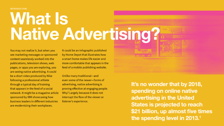
Example: The typography design in LinkedIn’s native advertising ebook follows a solid grid, using callouts intuitively and presenting a clear typographical hierarchy.
7) Use ebook design for storytelling.
You can get as creative as you want, and you should, as long as it serves the story.
8) Think in chapters.
Following traditional ebook design will help segment content, making it easier for your reader to navigate to what they want.
9) Make negative space your friend.
This rule applies to pretty much everything. You only need enough to design to enhance, not overwhelm.
10) Remember your specs.
Are you designing for web or print? The format may affect your design. (We can’t say it enough: Confirm this upfront!)
How to Do Better Ebook Marketing
To create better ebooks, you need to stay up-to-date on the latest visual communication tips, trends, and research. If you want to learn more…
- See our complete guide to write, design, and promote an ebook.
- Get inspired by these awesome examples of great ebooks.
- Improve your design even more with these helpful ebook design tips.
And if you need an expert to help you out, let’s chat.
