Data visualization design is both an art and a science, which is why it can be challenging for noobs to master. But if you want to master data storytelling—and make a strong impact through content—it’s a crucial skill.
The Power of Data Visualization
Your brain is prewired to process visual content much quicker than text, which is why data design is so effective. By “seeing” the data, it is easier for your brain to intake, synthesize, and retain the information presented.
To see the power of data visualization at work, watch this quick video.
https://vimeo.com/29684853
Unfortunately, a lot of people think that slapping a few charts together means you’re doing data visualization design well. Not only are you not doing it well; you might actually be hurting your brand. Subpar data design comes in many forms—a confusing visualization, mislabeled data, 3D charts that skew perception, etc. In these cases, your credibility may be on the line, and nobody wants that.
Even if you’re not misrepresenting data, if you aren’t presenting it in its most optimized form, you’re doing a disservice to your reader. Luckily, there are many simple things you can do to ensure your data stories make the impact they should.
So, if you’re ready kick your data visualization design game up a notch, we’ve compiled our team’s best tips to help you fix common data design mistakes and enhance your existing data visualizations, one chart at a time. We even arranged this list by category in case you need a quick reference. We hope they help.
25 Tips for Data Visualization Design
To start, let’s cover a few general things to keep in mind. Remember that every data visualization design choice you make should enhance your reader’s experience—not yours. (Sorry, but it’s not about showing off your sweet line-art skills.) Follow these tips to do your data justice.
1) Choose the chart that tells the story. There may be more than one way to visualize the data accurately. In this case, consider what you’re trying to achieve, the message you’re communicating, who you’re trying to reach, etc.
2) Remove anything that doesn’t support the story. No, that doesn’t mean you kill half your data points. But be mindful of things like chart junk, extra copy, unnecessary illustrations, drop shadows, ornamentations, etc. The great thing about data visualization is that design can help do the heavy lifting to enhance and communicate the story. Let it do its job. (But don’t use 3D charts. As previously mentioned, they can skew perception of the visualization.)
3) Design for comprehension. Once you have your visualization created, take a step back and consider what simple elements might be added, tweaked, or removed to make the data easier for the reader to understand. You might add a trend line to a line chart, or you might realize you have too many slices in your pie chart (use 6 max). These subtle tweaks make a huge difference.
 Comparison
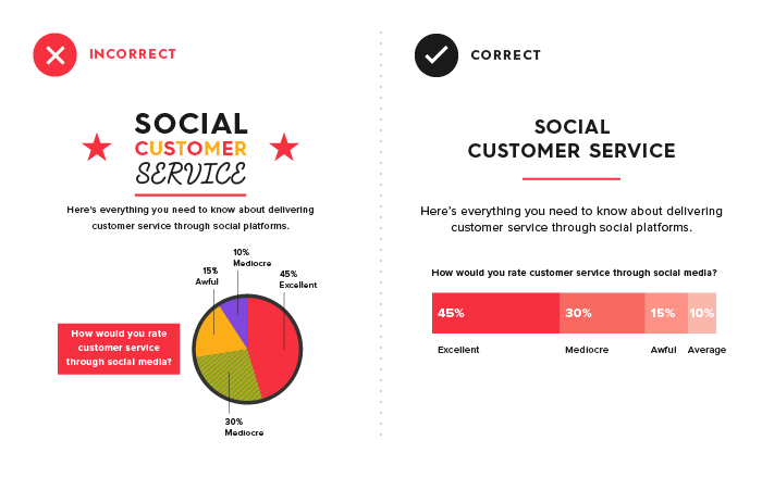
Data visualization makes comparison a lot easier, letting you actually “see” how two different data sets stack up to each other. But just putting two charts side by side doesn’t necessarily accomplish that. In fact, it can make it more confusing. (Ever tried to compare 32 different pie charts? Yeah, didn’t think so.)
4) Include a zero baseline if possible. Although a line chart does not have to start at a zero baseline, it should be included if it gives more context for comparison. If relatively small fluctuations in data are meaningful (e.g., in stock market data), you may truncate the scale to showcase these variances.
5) Always choose the most efficient visualization. You want visual consistency so that the reader can compare at a glance. This might mean you use stacked bar charts, a grouped bar chart, or a line chart. Whatever you choose, don’t overwhelm by making the reader work to compare too many things.
6) Watch your placement. You may have two nice stacked bar charts that are meant to let your reader compare points, but if they’re placed too far apart to “get” the comparison, you’ve already lost.
7) Tell the whole story. Maybe you had a 30% sales increase in Q4. Exciting! But what’s more exciting? Showing that you’ve actually had a 100% sales increase since Q1.
Copy
Data is about numbers, certainly, but it is generally used in conjunction with copy to help provide context for the point at hand. That said, in many data visualizations, infographics, and e-books, we see data visualization and copy working against each other instead of together.
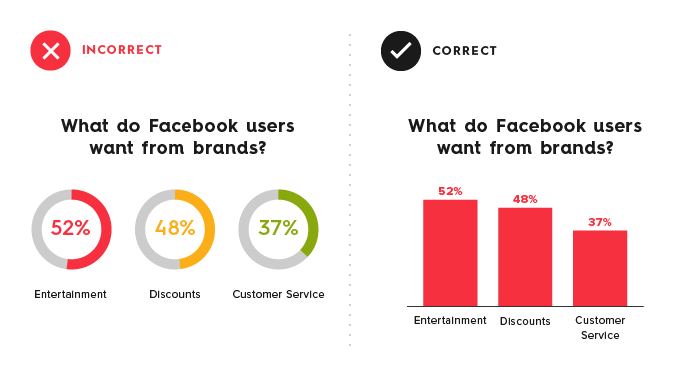
8) Don’t over explain. If the copy already mentions a fact, the subhead, callout, and chart header don’t have to reiterate it.
9) Keep chart and graph headers simple and to the point. There’s no need to get clever, verbose, or pun-tastic. Keep any descriptive text above the chart brief and directly related to the chart underneath. Remember: Focus on the quickest path to comprehension.
10) Use callouts wisely. Callouts are not there to fill space. They should be used intentionally to highlight relevant information or provide additional context.
11) Don’t use distracting fonts or elements. Sometimes you do need to emphasize a point. If so, only use bold or italic text to emphasize a point—and don’t use them both at the same time.
Color
Color is a great tool when used well. When used poorly, it can not just distract but misdirect the reader. Use it wisely in your data visualization design.
12) Use a single color to represent the same type of data. If you are depicting sales month by month on a bar chart, use a single color. But if you are comparing last year’s sales to this year’s sales in a grouped chart, you should use a different color for each year. You can also use an accent color to highlight a significant data point.
13) Watch out for positive and negative numbers. Don’t use red for positive numbers or green for negative numbers. Those color associations are so strong it will automatically flip the meaning in the viewer’s mind.
14) Make sure there is sufficient contrast between colors. If colors are too similar (light gray vs. light, light gray), it can be hard to tell the difference. Conversely, don’t use high-contrast color combinations such as red/green or blue/yellow.
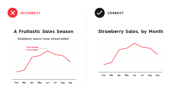
15) Avoid patterns. Stripes and polka dots sound fun, but they can be incredibly distracting. If you are trying to differentiate, say, on a map, use different saturations of the same color. On that note, only use solid-colored lines (not dashes).
16) Select colors appropriately. Some colors stand out more than others, giving unnecessary weight to that data. Instead, use a single color with varying shade or a spectrum between two analogous colors to show intensity. Remember to intuitively code color intensity according to values as well.
17) Don’t use more than 6 colors in a single layout. Enough said.
Labeling
Labeling can be a minefield. Readers rely on labels to interpret data, but too many or too few can interfere.
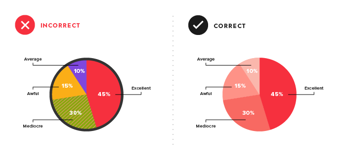
18) Double check that everything is labeled. Make sure everything that needs a label has one—and that there are no doubles or typos.
19) Make sure labels are visible. All labels should be unobstructed and easily identified with the corresponding data point.
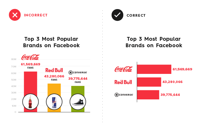
20) Label the lines directly. If possible, include data labels with your data points. This lets readers quickly identify lines and corresponding labels so they don’t have to go hunting for a legend or similar point.
21) Don’t over label. If the precise value of a data point is important to tell your story, then include data labels to enhance comprehension. If the precise values are not important to tell your story, leave the data labels out.
22) Don’t set your type at an angle. If your axis labels are too crowded, consider removing every other label on an axis to allow the text to fit comfortably.
Ordering
Data visualization is meant to help make sense. Random patterns that are difficult to interpret are frustrating and detrimental to what you’re trying to communicate.
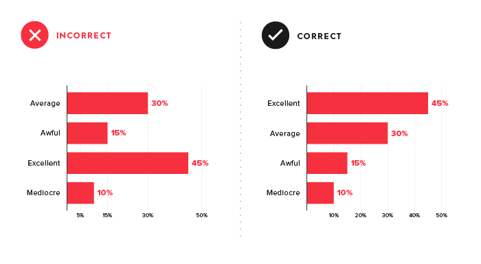
23) Order data intuitively. There should be a logical hierarchy. Order categories alphabetically, sequentially, or by value.
24) Order consistently. The ordering of items in your legend should mimic the order of your chart.
25) Order evenly. Use natural increments on your axes (0, 5, 10, 15, 20) instead of awkward or uneven increments (0, 3, 5, 16, 50).
How to Master Data Visualization & Storytelling
Of course, if you really want to stay on top of your game, make sure you’re up-to-date on best practices for data storytelling at every stage of the process.
- Use the right sources. Great stories come from great data. While you can find a larger variety of external data, internal data is a particularly effective source of unique and interesting stories. To find external data, check out these 100+ sources of free and credible data. For internal data, here are 9 places to look. You can also follow our tips to source that data correctly in your content.
- Craft a strong story. The true power of data storytelling relies on your ability to extract and shape a cohesive narrative. Start with this step-by-step guide to find stories in your data and craft an effective data narrative. You can also download our free e-book, The Content Marketer’s Guide to Data Storytelling, for more tips on bringing your data to life.
- Choose the right format. To make sure your data has the strongest impact, you need to present it in the right package. Whether you’re creating an e-book, infographic, or motion graphic, pick the right format for your data visualization story.
- Apply design fundamentals. Good design matters. Remember, too, that differentiating yourself through design is crucial to stand out. Start with our guide to designing the most common charts and graphs, find out how to keep your content on brand, consider experimenting with different visual styles, and get inspired by more examples of technology infographics, B2B infographics, and interactive infographics.
- Make the most of your content. Get more mileage by repurposing your data visualizations, or turning your old content into infographics, e-books, animated infographics, reports, microcontent, etc.
- Promote the right way. Don’t let good data stories get buried. Find out how to promote your content like a content agency, and optimize your blog for SEO.
If you still need a little help with your data storytelling, don’t be afraid to seek outside help. Here are a few tips to find the right data visualization agency, as well as tips to work together once you do. We’re also happy to talk through any of your data design challenges—seriously, we’re data geeks.





I like this blog so much, bookmarked.
Glad to hear it.
After reading your article – it has given me a lot of inspiration for using Data, and Data Storytelling to help shape true narratives of social matters. Great article – and well explained.
So glad to hear it!
Very helpful and interesting curriculum
Happy to hear it!