In marketing, good e-book design isn’t just about making something pretty; it’s about enhancing your viewer’s experience with your content. When you turn a boring cover into a stunning calling card, or a cluttered layout into a visual treat, or a confusing data set into an elegant visualization, you make it that much easier to grab—and, most importantly, keep—your audience’s attention.
We love it when we see brands from all industries up their e-book game by applying A+ design, and we think seeing others’ good work can inspire you too. That’s why we’ve rounded up some of the most standout examples of e-book design we’ve seen lately.
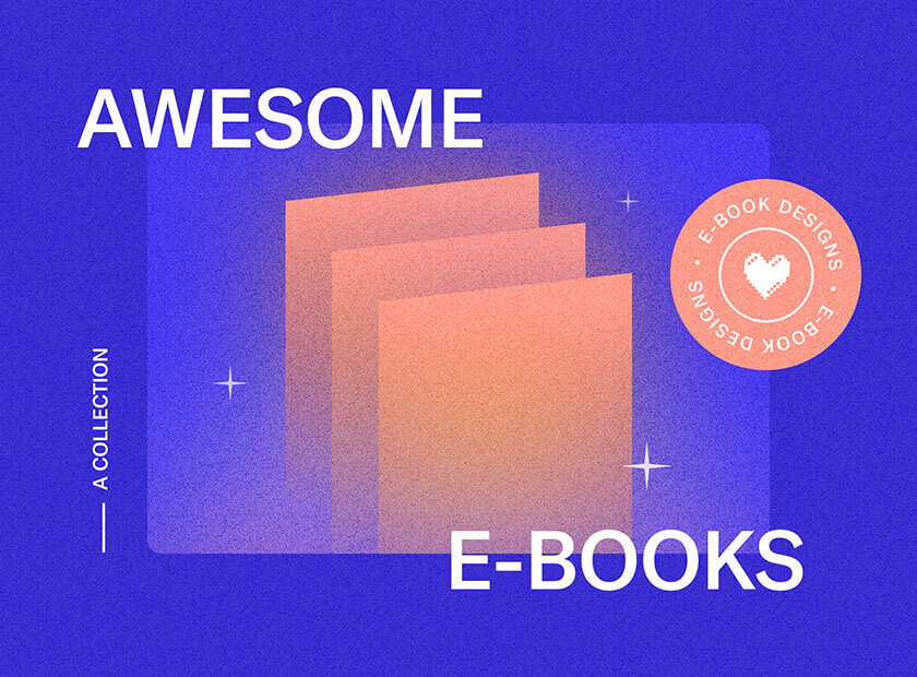
7 Excellent Examples of E-Book Design
If you’re facing an e-book design project and need a little inspiration, we have just what you need. Here are seven great takes on e-book design from both B2B and B2C brands.
1) The Secret Sauce by LinkedIn
Why we love it: A great cover

We’re suckers for a bold visual, and this e-book cover hits the mark for several reasons.
- It’s a clever theme, demonstrating that LinkedIn has the literal secret sauce (bonus points for making it the only bottle with a label).
- Its clean photography really pops, especially compared to most of the boring covers in the B2B space.
- It reflects LinkedIn’s brand identity via their signature bright blue (a visual differentiator).
When you’re looking to make an impact, a visually arresting cover is the way to do it in an instant.
Note: While a cover is incredibly important, maintaining a design aesthetic throughout all of your content is equally as important. LinkedIn decided to promote the e-book by creating an infographic, which also carries the same visual theme. A+ all around.

Tip: Make sure your e-book design reflects your brand identity. To make it easier for content creators to replicate, find out how to craft a strong brand’s style guide.
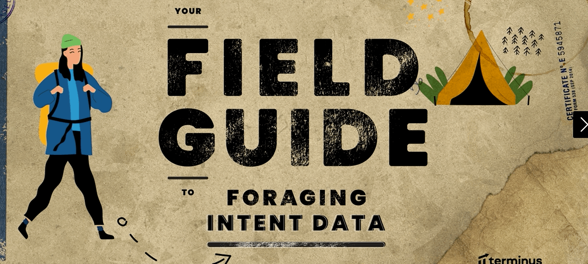
2) Your Field Guide to Foraging Intent Data by Terminus
Why we love it: A clever theme
Gathering data is a crucial part of a marketer’s job, but you can feel like you’re lost in the weeds. Terminus does an excellent job of translating this metaphor into an exciting adventure guide. From the people and animals to the maps and trails, this interactive e-book is a perfect example of how a little creativity can drastically enhance a viewer’s experience. By giving it this unique twist, learning how to gather data feels like an exciting adventure—not a dull chore.
Tip: It’s easy to come up with obvious visual metaphors (e.g., lightbulb = idea), but challenge yourself to come up with a visual theme that is both relevant and interesting.
3) Break Free of Boring B2B by Ceros
Why we love it: Unusual imagery
This is a perfect example of super creative e-book design for a subject that can be notoriously, well, boring. This interactive e-book is an explosion of color, pattern, and surprising imagery that is totally unexpected. From a screaming bear to a soda-drinking cat, it takes Internet meme aesthetic to a whole new level while delving into the ins and outs of B2B content marketing. We love an eye-catching interactive, and this brings the best of animation and information together in one easy-to-navigate package.

Tip: Since you don’t have to be literal in your metaphors, think about the real message you’re trying to deliver. Ceros wanted to prove that B2B doesn’t have to be boring, so they created a totally surprising and whimsical e-book design to prove just that.
4) STFU Already by Unbabel
Why we love it: Bold palette and typography
Not all e-books have to be interactive adventures. Unbabel’s thoroughly entertaining PDF e-book proves you can make a big impression without a ton of bells and whistles. Its bright and bold color palette, playful illustrations, and beautiful typography make the subject matter that much more interesting. Whereas they could have taken the technical route, espousing their software benefits in a boring brochure, this technicolor approach generates excitement and curiosity about their offering. F yeah, Unbabel.


Tip: Bold colors can help you stand out from your competition, especially when you use them for your cover. If you’re not sure what fits your message, find out how to curate the right color palette for your brand.
5) How EU Banks Can Ensure EPI’s Success by Feedzai
Why we love it: Pops of personality
Any time a brand can transcend their product offering and show us who they are, it’s a win for brand storytelling. Feedzai is a perfect example of this. For an e-book about financial safety, which may seem rather droll, they do a good job of adding personality via people-centric illustrations (which feature a balance of genders and more than one skin tone—thank you).

Tip: Depicting diversity is crucial. Be mindful of who you’re representing through imagery (be it illustration or photography).
6) How to Successfully Negotiate a Higher Salary in 4 Easy Steps by Her First 100K
Why we love it: Simplicity with style
Good e-book design doesn’t mean you have to design a custom font, create hand-drawn illustrations, or conduct a 5-day photoshoot to get the best images. This guide makes great use of photography, typography, layout, and negative space to deliver the information in a straightforward, cohesive package. If you wanted proof that strong design can elevate even the simplest e-book, this is it.


Tip: If you don’t have a ton of design resources, simple typography treatments and callouts can do a lot to make content easily digestible.
7) Einstein’s Guide to AI Use Cases by Salesforce
Alright, so this one isn’t technically an e-book, but it is a clever piece of lead generation. You answer a few questions about what type of work you do, and this interactive guides you to the most relevant case study for you. This is a very clever way to create a personalized, guided experience through strong design. The Einstein character animation, the simple and clean navigation, and the brand colors make this a clearly branded experience.

Tip: Simple interactivity can make all of your content more engaging, whether it’s an e-book, guide, or questionnaire. If you’re curious to learn more, find out how to brainstorm great interactive content ideas.
How to Nail Your Own E-book Design
We want to see better e-book design in the world, so we’re always happy to share the tips we’ve learned from our own projects. If you’re looking for more tips to improve your e-books…
- Learn more about why design can make or break your e-book.
- Follow our step-by-step guide to create an effective e-book from scratch.
- Try these helpful tips to improve your e-book design.
- Get even more inspired by these 50+ examples of great e-books.
And if you need a partner to help bring your next e-book to life, here are 12 tips to find a good content agency. You can always hit us up too.

Let's upgrade your marketing game
Get fresh tips, how-tos, and expert marketing advice every week. (15,000 people already are.)