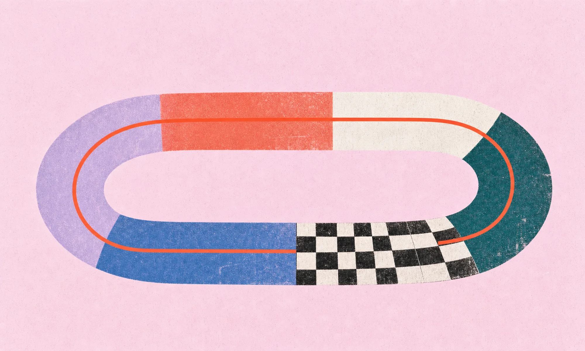
Brands are realizing the importance of visual content to their content marketing initiatives. Under the visual content umbrella, infographics are a major talking point for brands, publishers, and third-party content hubs. Like all visual content, infographics have the ability to make complex information more comprehensible and engaging for people. That is, if the infographic is designed correctly—and we don’t mean just how it looks. These infographic design tips will help you get the most out of your visual content.
6 Infographic Design Tips
Want to increase the impact of your infographics? Follow these simple tips.
1) Establish a production process.
Whether it’s incredibly detailed or rather informal, setting some form of a production process will go a long way. When designing an infographic, you’re usually working in a team of at least 3 people (client, project manager, designer). Sometimes (most times), however, you’ll work with larger teams. With a documented production process every team member has clear instructions for their responsibilities as the project evolves.
Aside from a clear division of responsibility, following a production process increases project efficiencies. Are designers using the most up-to-date brand guidelines? Are we staying within the allotted budget? Are we going to meet the deadline? All these issues that can easily be solved by a production process.
2) Good design starts at the content phase.
Perhaps one of the most important aspects of good design, from an infographic design perspective, is the quality of the content (or story) behind the infographic. A world-famous designer can spend hours making something beautiful, but the infographic isn’t going to fulfill its purpose if the story is fragmented. Before any design takes place, organize all information into a content document so your team can develop the story without any outside factors. Does the story make sense? Does the featured data support the story? Is all the necessary information provided so readers will understand the story being told? It’s best to ask these questions before a designer ever starts working. Think of the story behind an infographic as the foundation of a great building. If the foundation is fragmented, the building is worthless.
3) Longer isn’t always better.
When you hear the word “infographic,” you probably picture a long, strip-style image with 3 to 4 sections of information, a couple graphs, and some cool illustrations. You’re not wrong, but you’re not completely right, either. The word “infographic” is literally the combination of the word “information” and the word “graphic.” So, any information represented in visual form is technically an infographic. The question becomes: How long is too long or how short is too short? The answer is that an infographic should be whatever size it needs to be to appropriately support the story. If you remember tip #2 (good design starts at the content phase), then you should work toward developing a story that is consolidated, to the point, and supported by data. If the content is foundationally strong, then the length of the infographic is a bit superfluous.
TL;DR: The length of the infographic shouldn’t dictate the story. The story should dictate the length of the infographic.
4) Err on the side of simplicity.
Simplicity is magic in infographic design. It’s easy to get carried away with textures, typography, and colors. These things aren’t inherently bad, but they hurt content comprehension when used in excess. Here are some practical tips to help keep your infographic design looking fresh:
- Use a grid to keep things aligned. This makes everyone’s eyes happy! And your ODC readers will thank you.
- Keep your color usage to a minimum. Nobody wants to read the rainbow.
- Try to stick to one or two typefaces. There’s beauty in restraint.
- Use textures cautiously. Sometimes, they can make text difficult to read—and what’s the point in that?
- Don’t write everything out when you can explain it visually. This is visual content, after all.
Simplicity doesn’t just refer to the actual design of the infographic, either. Ensuring the narrative is simple and concise is a crucial step in the infographic design process—and something we’ve been ranting about now for two tips.
5) Optimize the graphic for where it lives.
Too often, infographics are created for environments where they’ll never live. A great example is designing an infographic needed for print but posting it to a blog where the text may be too small to read. Before designing, the designer is going to wonder about the dimensions to create the infographic. That completely depends on where the finished product will live. If a company’s blog is set at 800 pixels wide, then the designer will know the resolution to ensure text and colors are properly displayed. This also means a designer would need to adjust the graphic for other use cases like social media, third-party publisher sites, and print media. Designing a single asset that will work 100% perfectly across all mediums is impossible, so it’s important to prioritize what’s most important and be ready to alter the graphic as various needs present themselves.
6) Make sharing easy (like, really easy).
Content is only as good as your ability to share it. It’s sort of like the tree in the forest: If an infographic is designed but no one ever sees it, does it really exist? As a brand, your infographic design stretches beyond the actual graphic itself, taking into consideration your brand’s landing page, calls to action, and messaging. You’re creating an infographic for a reason, so it needs to be really easy for users to know what that reason is and decide whether or not they want to participate. Do you want them to share the infographic with their friends? Do you want them to download an e-book? Do you want them to sign up for your newsletter? Whatever the end result, clear and straightforward directions are vital.
Let’s say the goal of the infographic is to get as many social shares as possible. Great! Are the social sharing buttons on your landing page easy to find? Do they automatically have a caption created for the desired social media platform? Is there an image that would make the caption better? These are all questions that users aren’t going to answer themselves. They want to click to share, and that’s it. Make sure the sharing features are optimized so that they can.
By now, you’ve hopefully figured out that great infographic design is far more than the finished product. It takes into consideration the story, the style, and the page where the infographic will appear. By following these simple steps, you can take your infographics to the next level—critically thinking about the business results behind the infographic and how to best optimize that infographic to give your brand its best chance at achieving those results.
If you have any questions about infographic design, we’d love to talk.


Let's upgrade your marketing game
Get fresh tips, how-tos, and expert marketing advice every week. (15,000 people already are.)