There’s nothing we love more than solid data storytelling, especially when we get to help a brand bring their own data to life. LinkedIn’s 2017 Workforce Report is our latest collaboration with the brand—and a stellar example of how to turn internal data into headline-worthy content. If you’ve been hesitant to use your own data in your marketing, their example will convince you to do it ASAP.
LinkedIn’s Data Goldmine
We’ve collaborated with LinkedIn on many projects over the last few years, helping the company communicate through e-books and infographics. (We also trade content marketing tips from time to time.)
Since we believe strongly in LinkedIn’s mission to connect people to opportunity, we’re always happy to help them reach their audience through compelling visual content. Luckily, they have plenty of great ideas for all sorts of content, thanks to their goldmine of data.
With access to 133 million U.S. worker profiles, 3 million monthly job postings, 20,000 companies, and the 50,000 potential job skills workers can add to their profiles, LinkedIn has especially unique insight into the state of the U.S. workforce.
Instead of letting that data rest in their servers, the brand wisely sought to turn it into a useful resource for their audience. Thus they created the LinkedIn 2017 Workforce Report, a monthly report to shine a light on the U.S. job economy.

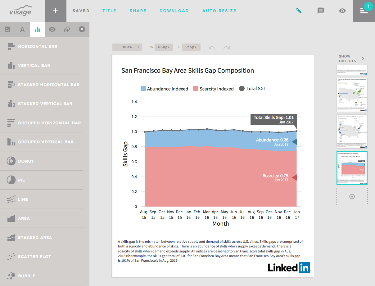
Each month, they analyze the data for country-wide trends, as well as trends in 10 of the largest U.S. cities. The report details the most interesting and influential metrics about the American workforce, including hiring trends, migration between cities, and relative scarcity and abundance of skills.
The report is meant to help workers better navigate their careers and to give companies a better understanding of the state of their industries, making it a fantastic piece of content to support LinkedIn’s mission.
The report also happened to be an enormous undertaking, requiring some of the biggest design problem-solving we’ve ever had to do.
A Data Visualization Challenge
LinkedIn came to us with a formidable request to contribute data visualizations to the report; they needed us create 101 beautifully designed graphics and data visualizations every month—and deliver them within 24 hours of receiving the data. While this seemed impossible initially, even with our entire design team working on it, we knew we could do it if we figured out a way to automate the graphic creation process dynamically from the data.
Fortunately, our software company Visage, a web-based design platform that allows users to create visual content and reports, had been building a new feature to address this very significant yet common challenge. (Many clients and companies we talk to are struggling to find a solution for regularly creating well-designed graphics with minimal time and effort.)
To complete LinkedIn’s ask—and ensure accuracy and quality of the graphics—we collaborated to create an automated system.
First, our team designed on-brand templates for the graphics and data visualizations that would accompany each report. Then we implemented these custom templates into Visage, where they could be easily edited by the LinkedIn team.

Our new Google Sheets integration enabled us to connect LinkedIn’s data directly to the report, so we could refresh the graphics with a single click when new data was received.

Through this process, the LinkedIn team was reassured that all charts were accurate, on-brand, and ready for publish as soon as they were created. Even better, we could create a high volume of visualizations in very little time.

It was exciting to test these new features with such an amazing client and come up with a helpful solution that both teams felt confident in. So far, the LinkedIn 2017 Workforce Report has been well-received, so we’re glad it paid off.
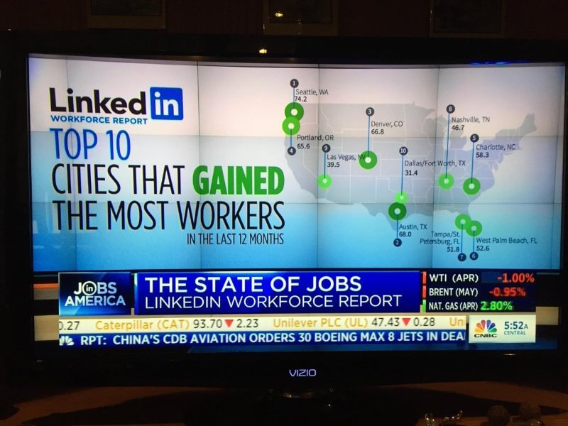
(Although only in its second month, the report has garnered 8,600+ mentions and significant buzz. In February, it was tweeted by Microsoft CEO Satya Nadella. March’s report was also tweeted by President Donald Trump and featured in a live segment on CNBC.)
We hope it will continue to make an impact each month, and we’re proud to be a part of the project.
We’d also encourage you to consider what data you might turn into a great piece of original content or regular series. If you need a little help, we’d absolutely love to help you out.
Want more on creating great data-driven content?
- Find out the 3 reasons you should pursue data storytelling.
- Check out the animated infographic we made to showcase NewsCred’s survey results.
- See how we turned 10 million data cells into a sleek interactive for Northwestern University in Qatar.