61. “How Red Meat Joined the 478 Other Things That Might Give You Cancer”
This interactive, created by Bloomberg, helps readers understand what’s happening in the meat industry, particularly how meat contributes to cancer.

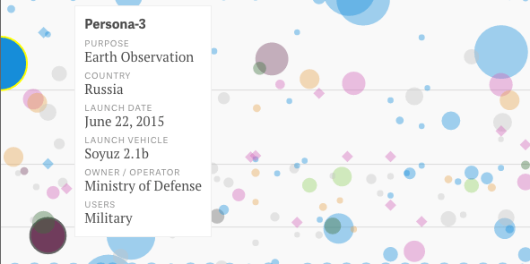
62. “This is Every Active Satellite Orbiting Earth”
This interactive infographic by David Yanofsky and Tim Fernholz shows the more than 1,300 active satellites orbiting space. They can be searched by country, age, purpose, user, and more.
63. “Cosmic Web”
The Cosmic Web, or the idea that the universe is a set of discrete galaxies held together by gravity, is still very abstract. This interactive created by Kim Albrecht combines three models of the cosmic web to let you explore.

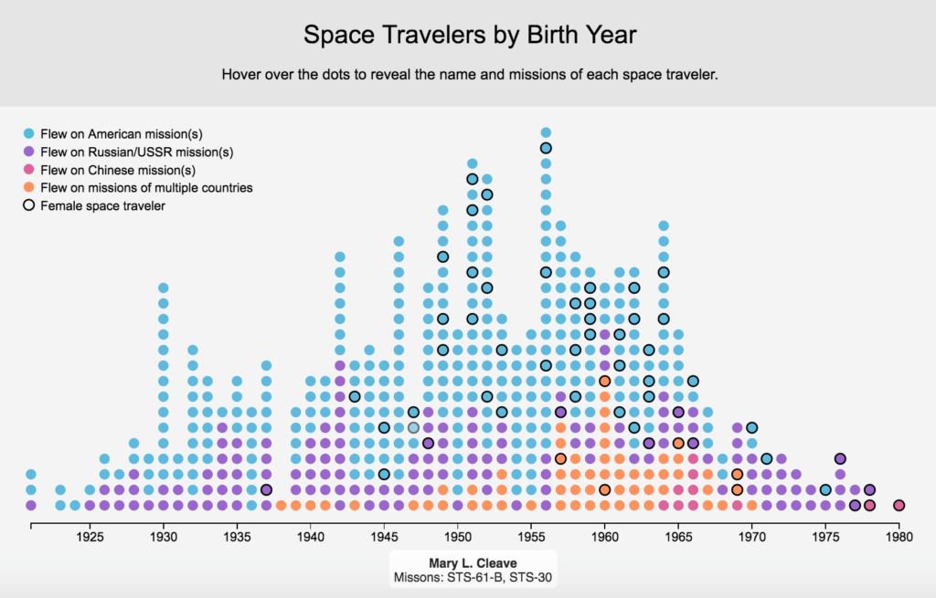
64. “The Demographics of Space Travel”
This interactive created by Amanda Montañez for Scientific American shows the demographics of space travel up to 1980. The number of explorers is categorized by country of origin and gender. You can also click on individual data points to reveal the traveler’s name and mission details.
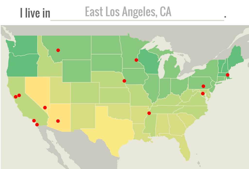
65. “1001 Blistering Future Summers”
This interactive, brought to you by Climate Central, shows what summers are like in your city now—and what summers will be like in 2100. It really puts climate change front and center.
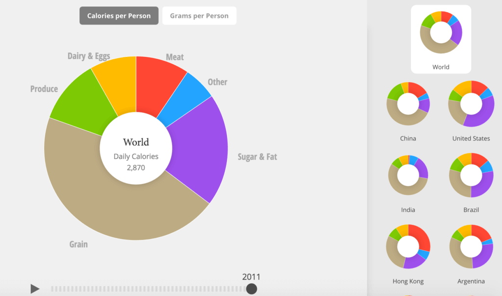
66. “What the World Eats”
This interactive infographic by Fathom gives you an in-depth look at the food intake of 22 different countries. Data can be analyzed by year, the quantity of food, or caloric intake.
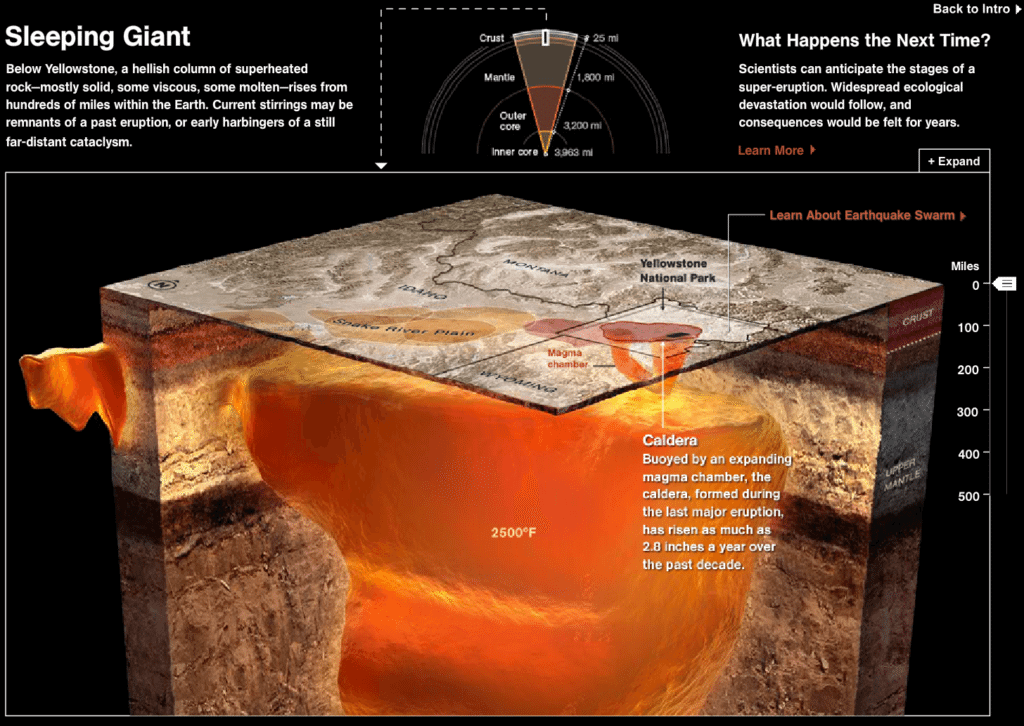
67. “When Yellowstone Explodes”
This is another awesomely informative scientific interactive brought to you by staffers at National Geographic. It takes you 500 miles under the Earth’s crust to see what’s underneath one of America’s most beloved state parks.
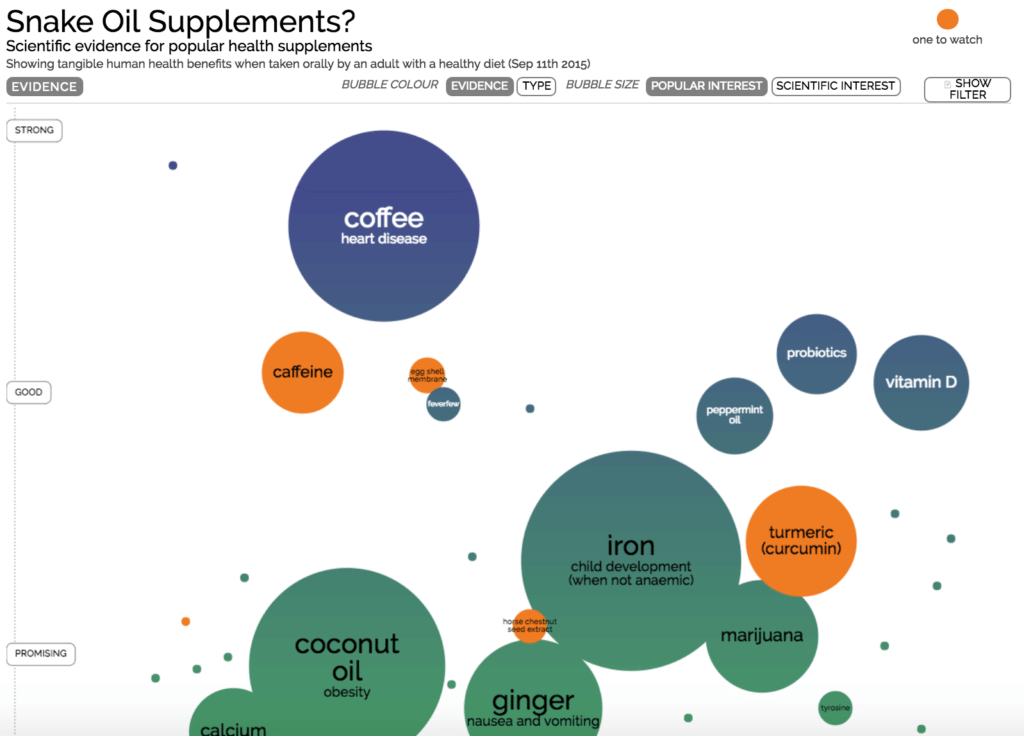
68. “Snake Oil Supplements”
This interactive infographic by David McCandless allows you to explore the many different solutions to medical ailments, all ranked by their effectiveness.
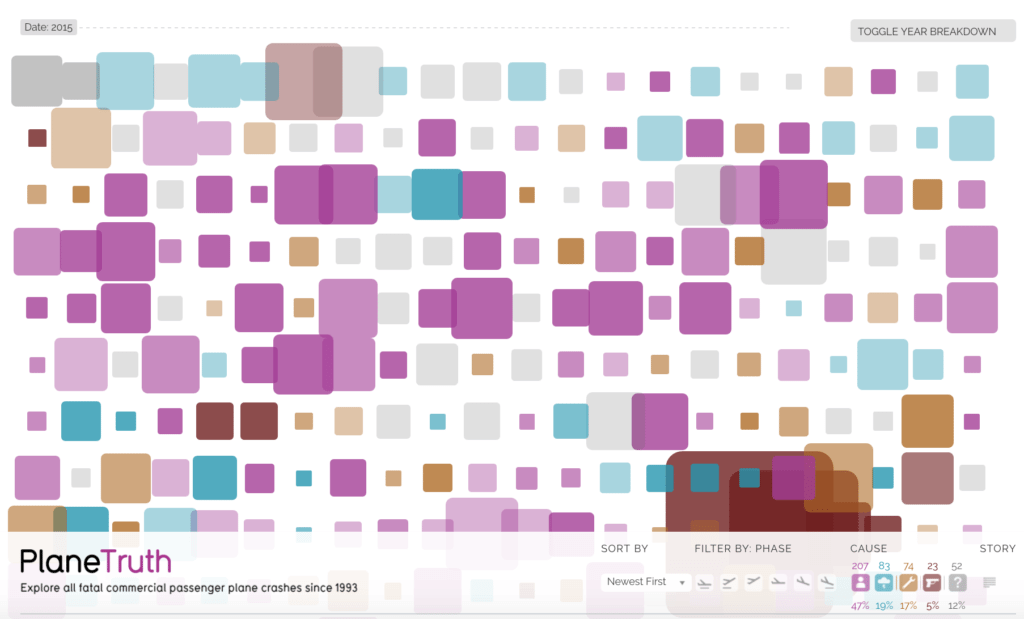
69. “PlaneTruth”
This interactive by David McCandless (surprise!) is for everyone whose hands sweat more than normal when a plane experiences turbulence. See the specific details relating to every single commercial plane crash of the last 20 years. And just in case you’re wondering, 47% of the crashes were caused by human error.
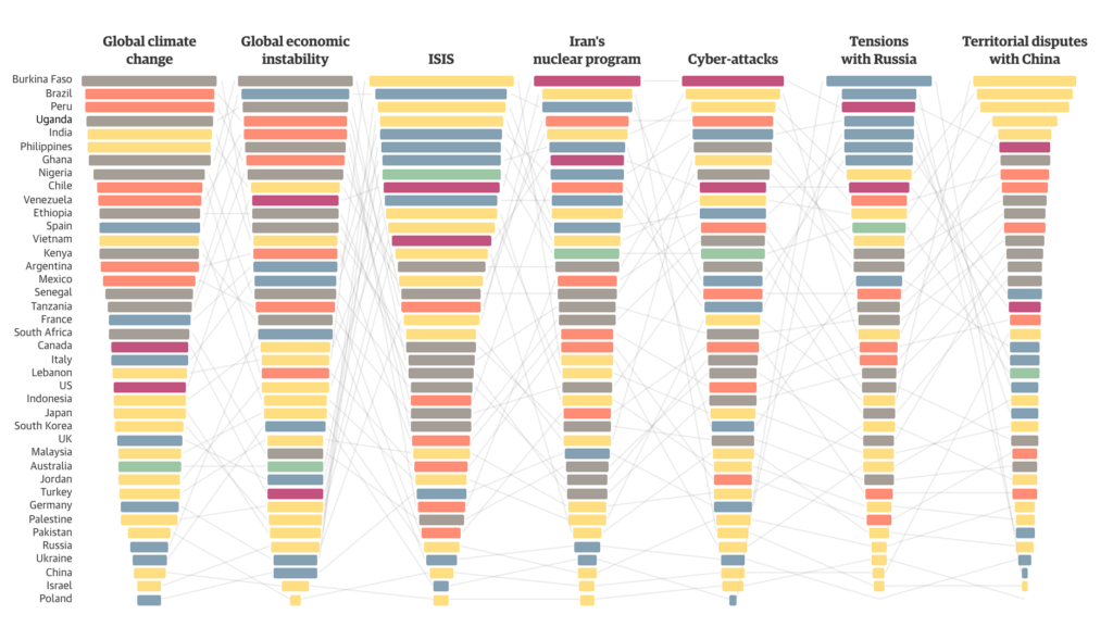
70. “Global Threat Interactive: What’s the World Scared of?”
Fear has the uncanny ability to transcend language barriers and control the masses. But do we all fear the same things? The Guardian visualized the fears that bind us in this fascinating piece.
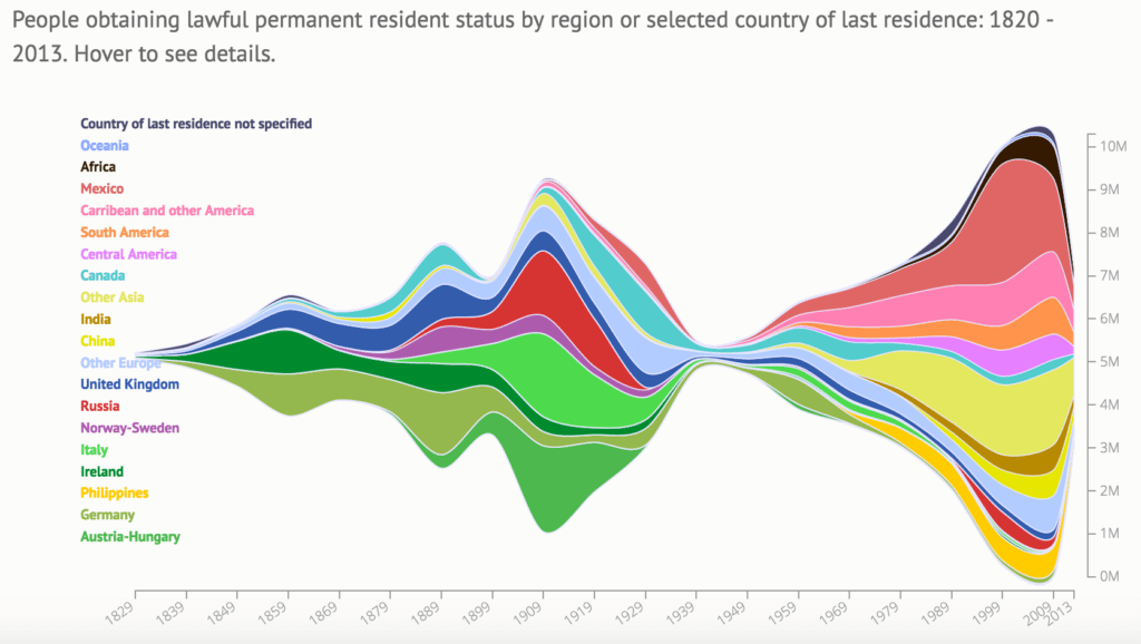
71. “200 Years of Immigration to the U.S.”
U.S. immigration is always a hot-button topic, but this interactive by Natalia Bronshtein of Insightful Interaction approaches the subject simply. The visualization breaks down legal immigration over the last 200 years, based on data provided by the U.S. Department of Homeland Security.
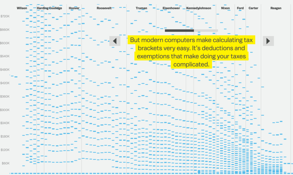
72. “100 Years of Tax Brackets, in One Chart”
The best interactives take a very complicated topic and present it in a simple, easy-to-read graphic. That’s exactly what Alvin Chang of Vox did with this interactive on tax brackets, which shows you the number of tax brackets by presidency.
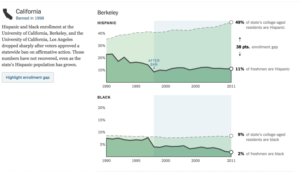
73. “How Minorities Have Fared in States with Affirmative Action Bans”
This interactive by Ford Fessenden and Josh Keller was created for The New York Times to highlight the issues associated with bans on affirmative action. You can look at data year by year, from individual universities, and different states.
74. “What Would it Take to Turn Blue States Red?”
This political interactive lets you toy with voter turnout to see what it would take to change a state’s party alliance. As you adjust the demographic blocks, the states jump from Democrat to Republican or vice versa. This gem is also brought to you by Nate Silver.

75. “Infinite Jukebox”
This is pretty trippy. This interactive by Paul Lamere analyzes and breaks down your favorite song into specific parts. You can play each individual section to see exactly how the song is constructed.

76. “How Fast is LAFD Where You live?”
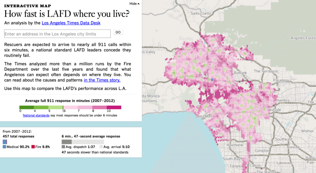
When you’re having a heart attack, the cliché “every second counts” could not ring more true. Ben Walsh, Robert Lopez, and Kate Linthicum of The Los Angeles Times created this interactive infographic to accompany their story on longer wait times for rescue teams headed to exclusive neighborhoods.
77. “Out of Sight, Out of Mind.”
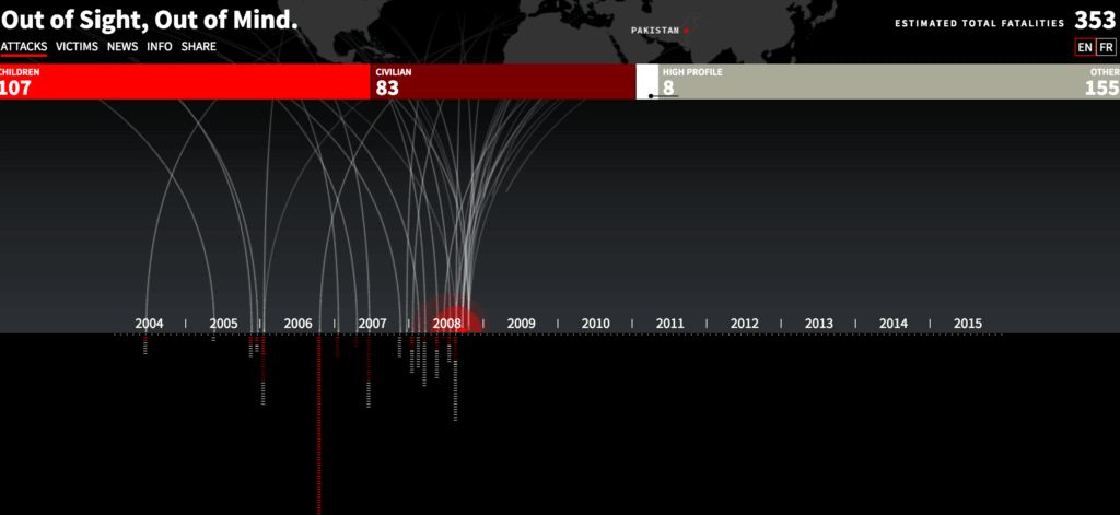
This profound interactive infographic by PitchInteractive shows the tragic breakdown of drone strikes. You can search data by attack or victim stats.
78. “Notabilia”
This interesting interactive by Moritz Stefaner, Dario Taraborelli, and Giovanni Luca Ciampaglia visualizes the Wikipedia articles that have been deleted, revealing a larger snapshot of what is conventionally accepted by Wikipedia.

79. “Inequality is Real”
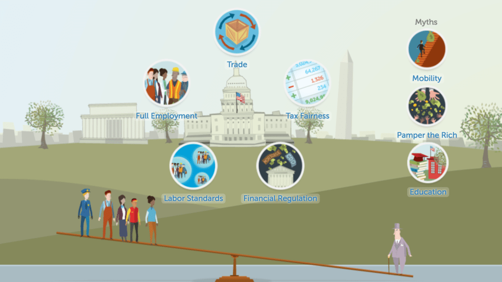
This interactive by Periscopic and the Economic Policy Institute helps you truly grasp the idea of income inequality. Through illustration, animation, and video, you learn what inequality is, how it happens, and how it can be resolved.
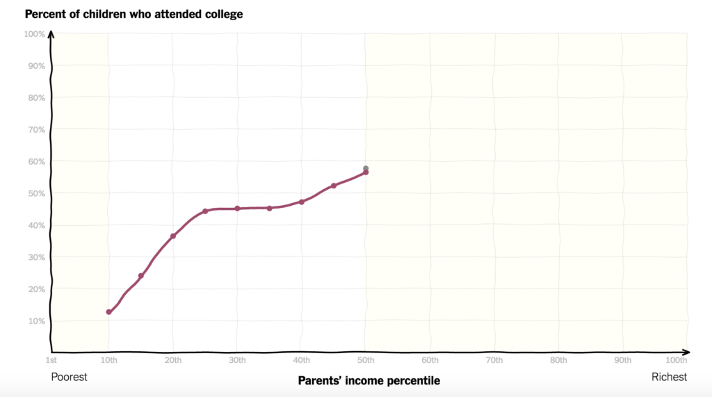
80. “You Draw It: How Family Income Predicts Children’s College Chances”
The best part of this interactive by Gregor Aisch, Amanda Cox, and Kevin Quealy for the New York Times is that the interactive first asks your opinion, then shows how your predictions fit into the actual data.
