21. “The Refugee Project”
The refugee crisis is one that affects people all over the world, but the true issue can be difficult to understand without a visualization like this from Hyperakt and Ekene Ijeoma, which shows refugee migration from 1975-2014.

22. “Years You Have Left to Live, Probably”
Wouldn’t it be nice to know exactly when you are going to die? Isn’t that the reason so many people visit psychics? This visualization from Nathan Yau allows you to input your gender and age, then it calculates the probability of how long you will live.

23. “How You Will Die”
Another cheery infographic by Nathan Yau answers the second part of the death question— not just when you’ll die but how. Input a bit of information about yourself, such as gender, ethnicity, and age, then see a list of possibilities for your demise.

24. “Wind Map”
Made by Fernanda Viégas and Martin Wattenberg, this gorgeous visualization shows real-time wind patterns from the National Digital Forecast Database. Zoom closer to see weather conditions in your area.

25. “Scaled in Miles”
Miles Davis had an impressive career, and this impressive visualization by Fathom captures it. Explore the data from more than 400 recording sessions.

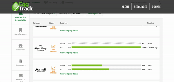
26. “EggTrack Report”
This interactive infographic by Compassion In World Farming is an innovative tool to track the progress of companies that have pledged to use 100% cage-free eggs by 2026 or sooner.
27. “Workers’ Comp Benefits: How Much is a Limb Worth?”
Workers’ comp is a pretty awful, lengthy process for those unfortunate enough to experience it. But did you know there’s actually a price tag on each of your limbs, depending on your state of residence? This interactive infographic by ProPublica lets you compare compensation by limb, state, and national average.

28. “Global Child Mortality”
This interactive was created by Halina Mader for UNICEF and educates you on the issue of child mortality all over the world. 
29. “The Fallen of World War 2”
This interactive by Neil Halloran combines infographics, video, and photos to provide an in-depth look at WWII deaths by time, place, and country. The data viz shows the staggering number of deaths on all sides, especially for Germans.

30. “From Aspiration to Action: What will it take to end Malaria?”
This interactive created by Column Five for the Bill & Melinda Gates Foundation spotlights efforts to eradicate Malaria. Explore the individual efforts, regions most affected, and where the majority of the finance comes from.

31. “Species in Pieces”
This beautiful interactive celebrates evolutionary distinction using only CSS polygons (created by Bryan James). As you scroll through the endangered species, each animal transforms into the next, making this site not only informative but also visually stunning.

32. “World Inequality Database on Education”
Interactive Things created this interactive for UNESCO to illustrate the disparity in education around the globe. You can compare countries, compare groups within countries, and spot overlapping disparities.

33. “The Dude Map: How Americans Refer to Their Bros”
Dude, bro! This interactive infographic map of the U.S. was created by Quartz. Using data from billions of tweets, it tracks the heaviest uses of various terms of endearment across the country.

34. “U.K. Energy Consumption Guide”
This interactive was created to help Brits visualize their energy consumption. Designed for EvoEnergy by Bryan James, you can quickly compare current consumption trends with those of the past.

35. “Inception”
The movie “Inception” left many of us bickering about what truly happened. But Matt Dempsey puts those debates to rest with his interactive, which helps make sense of the plot.
36. “Small Arms and Ammunition – Imports and Exports”
This interactive was produced by Google. It’s a fascinating look at the transfer of small arms, light weapons, and ammunition across the globe between 1992 and 2010.

37. “People for Periods”
People for Periods is an interactive project by Column Five dedicated to exploring the history and state of menstrual health care around the world to start the conversation and normalize the experience.

38. “Poverty Tracker”
This interactive infographic by Fathom focuses on poverty in New York City, guiding viewers through the struggle toward wealth. Data can also be filtered based off of education, gender, age, and ethnicity.

39. “Digital Attack Map: Top Daily DDoS Attacks Worldwide”
Distributed Denial of Services (aka DDos) attacks make websites unavailable by overwhelming them with traffic from multiple sources (usually bots they’ve acquired through malware). This interactive created by Google Ideas and Arbor Networks shows the history of these attacks. This visualization is beautiful—until you realize all the pretty colors are black-market hackers.

40. “How Music Travels: The Evolution of Western Dance Music”
Want to know the roots of trance or blues? This great interactive from Thomson shows the twisted history of music’s roots, layered over a map for maximum clarity.


Let's upgrade your marketing game
Get fresh tips, how-tos, and expert marketing advice every week. (15,000 people already are.)