
Ebooks take a ton of work to create, so it’s always a shame to see great content sabotaged by poor design. Unfortunately, there are plenty of ebook eyesores out there. Unfortunately, bad design isn’t just an oversight; it can hurt your brand.
Ebooks are valuable lead generation tools, but they only work if people engage with the content. A bad cover won’t entice people to see what’s inside. Dense blocks of text will make them tune out. And a mislabeled chart will have them questioning your credibility. That’s why great ebook design is so important.

How to Design a Better Ebook
Even the best designers can overlook design issues, so it’s important to take a final pass before you send any ebook out the door. To help you cover all your bases, we’ve compiled a helpful list of 30 ebook design tips. (We also broke them down by category for easy reference.) Use it as a checklist to make sure your design is as strong as possible—every single time.
The Basics
1) Create an eye-catching cover.
The cardinal sin of ebook design is a boring or distracting cover. Design a compelling, eye-catching visual that communicates the theme and entices people to see what’s inside. (This goes for your thumbnail images, too.)
Example: Marketo uses a bold, graphic, and colorful cover to grab attention.

2) Apply your brand identity.
A visual language is crucial to communicate your brand story across all marketing content. Make sure your design adheres to your color palette, typography, illustration style, etc. (If you don’t have a visual language, find out how to build a brand identity and create brand guidelines to help people apply it.)
Note: While your ebook should reflect your brand identity, avoid over-branding: Too many logos, CTAs, or brand mentions will make your ebook feel like a sales brochure instead of marketing content.
3) Use the correct dimensions.
You want to present content in its most optimal form. Where will your ebook live? Do you want people to be able to print it out if they want to? Double-check that you have the appropriate dimensions and resolution.
4) Make your TOC clickable.
Anything you can do to improve user experience will be much appreciated. Hyperlinking your TOC so that it jumps right to a specific chapter makes navigating the content so much easier, especially if someone is looking for specific information.
5) Confirm page numbers are correct.
The devil is in the details. No matter how sure you are, take another pass to make sure every page is correct and in the proper order.
Color
6) Limit your colors.
Don’t go color crazy. A good rule is to use 1 or 2 dominant colors, plus 2-3 accent colors.
7) Keep colors consistent.
Don’t arbitrarily use colors from page to page, especially for elements like charts and graphs. Stick to one consistent color to highlight pertinent info or data points.
8) Use strong contrast.
This makes it easier for people to distinguish between colors, especially for color-blind people.
Example: HubSpot uses contrasting brand colors throughout their ebooks.

Data Visualization
9) Choose correct data visualizations.
There are many types of charts you can use to display data, but choosing the right presentation is crucial if you want to deliver information in its most impactful form. For example, if you want to compare data, it may be more effective to use one grouped bar chart instead of three individual bar charts.
Of course, not all designers are well-versed in data design, so it’s important to do your due diligence. See our guide to design the most common charts and graphs.
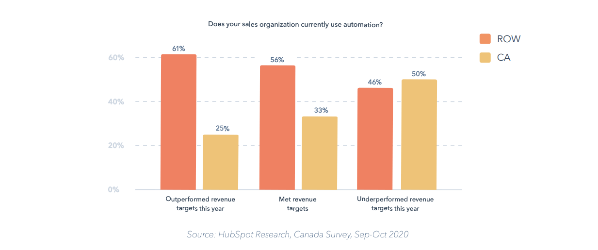
Example: HubSpot makes it easy to compare data sets with a simple, clean grouped bar chart.
 10) Optimize for comprehension.
Good data visualization isn’t just about displaying information; it’s about enhancing the comprehension of that information. Beyond chart choice, small design tweaks can improve or interrupt the way people perceive data. (For example, things like 3D charts or patterns on a bar chart can skew perception.) To ensure you’re presenting content as effectively as possible, see these 25 tips to improve your visualizations.
11) Triple-check your chart labels.
Make sure all numbers, labels, and legends are present and accurate. It’s a little thing, but it’s also one of the most common mistakes we see when in data visualizations across all content.
Imagery & Illustration
12) Choose a visual theme.
Strong imagery and illustration elevates your ebook design and enhances the story. That said, make sure you choose a theme that makes sense for the content. Remember: Design is meant to enhance—never distract.
Example: Secret Sauce: How LinkedIn Turns Up the Heat on Their LinkedIn Marketing Campaigns is a LinkedIn guide to help marketers make the most of the platform. The ebook features a culinary theme, including LinkedIn-branded sauce bottles and chili peppers in the brand’s signature blue color. This is a clever and playful way to bring the content to life.


13) Use a single illustration style.
Consistency is the key to good design. You don’t want to add to visual clutter, so stick to a specific style, and use illustration sparingly. If you can’t justify why an illustration enhances the design, ditch it.
14) Use intuitive icons.
This is a common problem in corporate communication. Icons are either too generic (e.g., a lightbulb to represent an idea) or too abstract to understand. Again, focus on how your iconography can enhance comprehension.
15) Avoid stock photos (if you can).
If you must, at least add filters or other elements to customize the image.
16) Be aware of who you’re depicting.
Whether you’re using stock or custom photography, be mindful of who you’re depicting. You may want to add more diversity of ethnicity, gender, etc. to better connect with your audience.
17) Check your resolution.
Pixelated images are the bane of a designer’s existence. Always work with hi-res images (and double check that they’re rendering appropriately).
Layout
18) Create a clear visual hierarchy.
You want to help the reader easily navigate content and identify the most pertinent info, so create a consistent and intuitive layout. Note: While you can be creative with your visuals, don’t get too creative with the actual hierarchy. Mixing it up page to page can be disruptive to the reader.
19) Add white space.
If content is too crammed, readers feel fatigued. Let the visuals breathe, and cut copy if you need to. Also, beware of visual junk. Kill any unnecessary ornamental illustrations, imagery, and chart junk. (This is an easy way to get more white space.)
20) Highlight important information.
Use headers, pull quotes, and sidebars to draw attention to the most important insights. This is another huge help to your reader.
Example: Marketo integrates callouts throughout the ebook, making it easy to glean information at a glance.

21) Be mindful of length.
We’ve seen ebooks double in size simply because the designer injected elaborate chapter breaks or filler pages. While you don’t want to cram, you do want to be economical with your space.
22) Avoid redundancy.
If you have a chart title, section header, and callout that all say the same thing, condense and cut. Design is there to improve comprehension, not overly explain.
23) Double-check your alignment.
The eye craves symmetry and balance. Watch for alignment in your body copy, as well as sidebars and headers.
24) Keep it simple.
Things like overly ornate borders or footers usually just distract. Clean, simple design is always a safe bet.
Typography
25) Limit your fonts.
Use no more than 3 or 4 fonts total, and keep type styles consistent throughout. See our guide to find the best typography for your brand for more guidance.
26) Distinguish your hyperlinks.
If content is hyperlinked in a PDF, make sure it is underlined or color-coded so that people know to click. (And double-check that it works!)
27) Don’t over-design your text.
Legibility is everything. Sometimes designers get too creative with things like headers or chapter breaks, adding all sorts of detail and illustration that actually make it harder to read the text.
Example: Blend uses simple typography and a clear hierarchy to guide readers through the content.

28) Check for widows and orphans.
Do a final pass to make sure you’ve caught them all.
29) Eliminate inconsistent spacing.
Make sure your tracking, leading, kerning, and paragraph spacing are all on point.
30) Be mindful of text size.
Your audience may be reading the ebook on a variety of devices, from desktop to smartphone. Make sure text will be legible regardless of device.
Don’t Be Afraid to Experiment With Your Ebook Design
No matter how talented you are, you can always learn something or try something new with your ebooks. If you’re looking to mix it up:
- Take a look at these awesome ebook design examples for some good inspiration.
- See our complete guide to create awesome ebooks.
- Learn how to turn your ebook design into different pieces of content.
But if you’re still feeling stuck and need some design help, let’s talk.