A brand identity isn’t one single entity. It’s the composite of many elements: your logo, brand colors, voice, values, and more. Above all, a brand identity is how you communicate with the world, both verbally and visually.
Building a strong brand is all about building an authentic relationship with people, and that relies on good communication. If you can’t effectively communicate, you can’t effectively connect. (In our experience, this is one of the biggest problems brands struggle with.)
But if you can create a brand identity that accurately reflects who you are and what you’re about, you can form stronger relationships and attract the people who want to work with you. So, how do you build that identity? Luckily, scientific research can help.
How to Build a Better Brand Identity
Although you can’t control people’s perceptions of your brand, there are subtle things you can do to create a better brand experience. Creating a stronger visual identity and using better brand messaging can positively influence how people feel about your brand—if you do it the right way. The good news is researchers are learning more about how certain elements impact brand perception (or whether they do at all).
Whether you’re starting a brand identity from scratch or undertaking a rebrand, these interesting insights can give you an upper hand when it comes to things like writing powerful taglines or choosing better fonts.
To help you build the best brand identity you can, we’ve collected some of the most fascinating research on how brands can present themselves more effectively. You’ll find tips on everything from choosing the right brand name to testing fonts, plus conventional wisdom to follow and myths you can forget once and for all. We’ve also broken everything down by category, so you can easily reference (or bookmark for later). We hope it helps.
Brand Names
There are plenty of myths about what makes a good name. We’ve heard them all: It should rhyme! It should be quirky! It should be less than 7 letters! While these are well intentioned, they are not a prescription for the perfect name. When it comes to naming, the most interesting insight comes from a 2010 University of Alberta study, which found that people have a more positive reaction to brands with repetitively structured names, such as Coca-Cola, Kit Kat, and Jelly Belly. But this isn’t a hard and fast rule.
When it comes to finding a memorable and catchy name, what you want is something that resonates with people (not just pleases them through repetition). The most effective names help you communicate something about your brand in a way that is:
- Meaningful: It communicates your brand essence, conjures an image, and cultivates a positive emotional connection.
- Distinctive: It is unique, memorable, and stands out from your competitors. (Simple names aren’t very interesting, but combining two known words, such as FaceBook or JetBlue, can make them more novel and, thus, more impactful.)
- Accessible: People can easily interpret it, say it, spell it, or Google it. (Even if you have an unusual or bizarre name, it must be understandable.)
- Protectable: You can trademark it, get the domain, and “own” it, both legally and in the general consciousness.
- Future-proof: It can grow with the company and maintain relevance—and be adapted for different products and brand extensions.
- Visual: You can translate/communicate it through design, including icons, logos, colors, etc.
(For more tips on how to choose the best name, follow our 4-step process.)
Taglines
Your brand’s tagline is a short statement that communicates your brand essence, positioning, and distinguishes you from your competitors. Yes, it’s a tall order. But you can create an effective tagline with a few helpful rules.
Like brand names, there are plenty of theories about what makes a great tagline. While people usually focus on what makes a memorable tagline, a 2014 study by researchers from Texas Tech University, Cal State Fullerton, and University of Georgia uncovered some interesting insights about what makes a tagline not just memorable but likable.
The researchers asked study participants to identify their favorite taglines, then analyzed the taglines according to 14 characteristics often associated with a strong tagline (e.g., rhyming, length, etc.). What they found was that recall could be influenced by repeated media exposure (meaning people remembered taglines the more they saw them), but exposure didn’t influence how they felt about the brand.
If they didn’t like a tagline, they didn’t like it—no matter how often they saw it. When it came to likability, only three conventional characteristics mattered:
- Clarity of message
- Creativity of phrasing
- Inclusion of a benefit
When crafting a tagline, keep these three elements front and center. As lead researcher Piyush Kumar says, “If recall becomes a problem, you can always pump more money into it and increase a slogan’s memorability. But you can’t pump more money and make something more likable once it’s already been crafted.”
(For a little inspiration, check out these 13 examples of brands that created great taglines.)
Logo Design
Designing a logo that appropriately reflects and communicates your brand identity is vital. To do this well, it’s important to understand how people visually process and assign meaning to images.
A 2015 study published in the Journal of Consumer Research sheds interesting light on this subject. During the study, researchers conducted five experiments to test how people interpret different logo shapes by having participants look at ads with logos that were either circular or angular.
- Circular shapes: Curved and without sharp angles (e.g., an oval or a circle)
- Angular shapes: Straight lines and sharp corners (e.g., a triangle or a square)

Researchers found that logo shapes influenced how participants perceived a brand, conjuring specific associations.
- Circular shapes were associated with softness—not just physical softness but softer attributes such as being more caring, warmer, and kinder.
- Angular shapes were associated with hardness, as well as traits like durability.
A study by branding firm Siegel+Gale reveals similar results. After asking 3,000 respondents to evaluate the logos of more than a hundred top brands, the firm analyzed and categorized the most memorable logos into 9 different categories, including organic and geometric shapes.
Organic shapes were considered:
- Warm/caring
- Fun
- Fresh
- Friendly
- Innovative
Geometric shapes were considered:
- Powerful
- Innovative
- Respected
- Smart
- Cool
(For a full rundown of the different traits associated with the 9 different logo design styles, see the full study.)
Beyond these associations, the study also identified that the most common trait of the most memorable logos was simplicity. Regardless of your product or service, keep it simple and you’ll do better.
(If you’re struggling to come up with a new logo, check out our step-by-step process for logo design.)
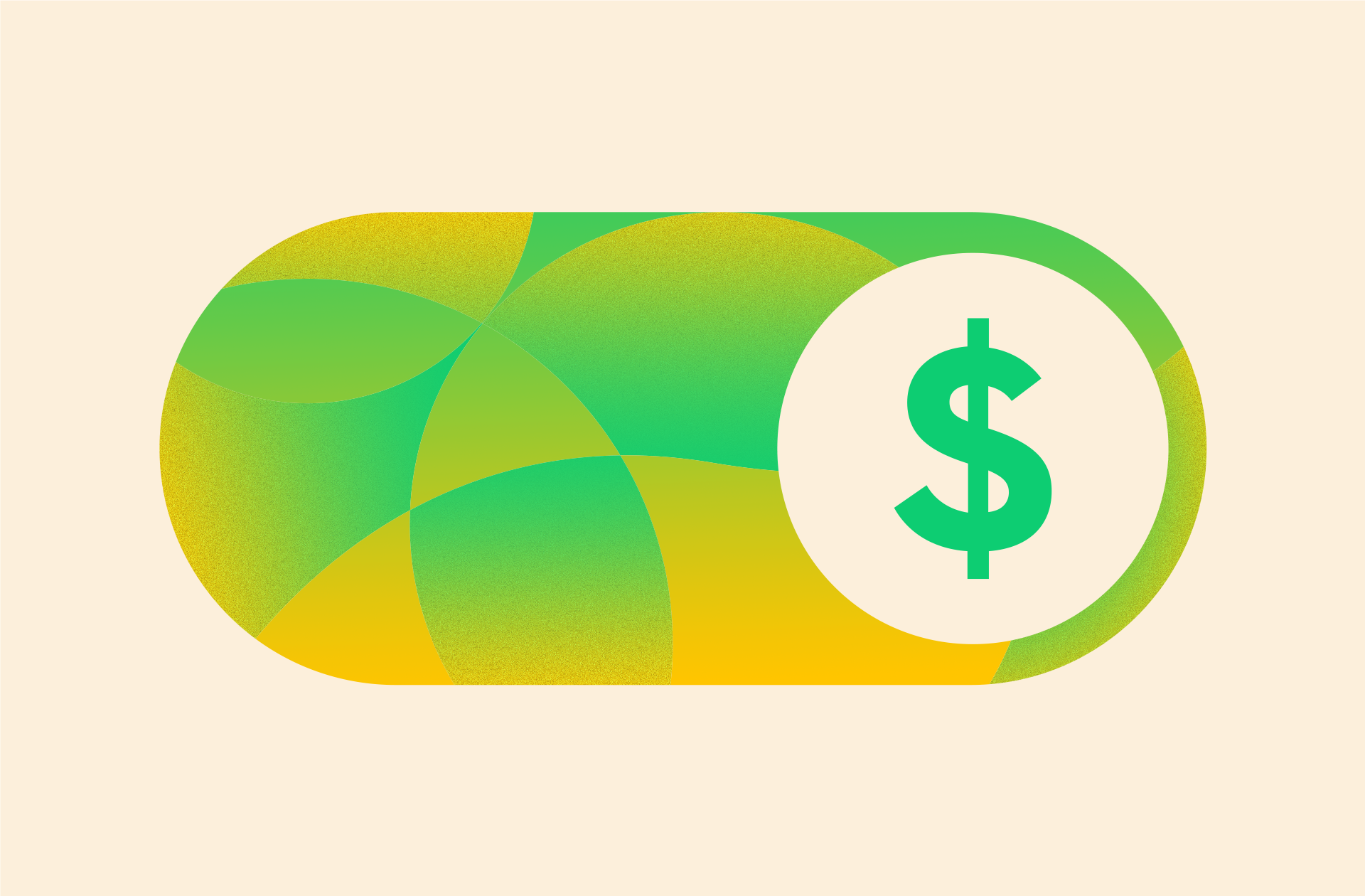
Colors
Color is one of the most powerful yet mystifying elements of branding. Research suggests it can affect everything from brand perception to purchasing intent, yet it is a bit of a tricky science.
Not all colors evoke the same things in everyone because our associations with color are very subjective. But it does affect our perception. In fact, a 2006 University of Winnipeg study found that people judge products within 90 seconds—and 62%‐90% of that assessment is based on colors.
A few more interesting findings based on research:
1) Colors should be appropriate. A 2006 Cardiff Business School study examined how logo colors might affect people’s perceptions of brands, specifically looking at how the perceived appropriateness of a color related to the product. To test, the resarchers divided colors into functional and sensory-social categories.
- Functional colors: Gray, black, blue, green
- Social-sensory colors: Red, yellow, pink, purple
They found that people responded better when functional colors were used in the branding of a functional product (e.g., gray and black for car tires or power tools) and social-sensory colors for a social-sensory product (e.g., pink for ice cream or perfume).
2) Colors can reinforce benefits. A 2009 study by the University of British Columbia examined how the use of the color red or blue might affect a brand’s messaging, specifically how the colors influenced a brand’s perceived benefits.
Most products/services benefit the user in one of two ways: prevention or gain. For example, consider how a toothpaste might be marketed.
- Prevention: The toothpaste prevents cavities.
- Gain: The toothpaste whitens teeth.
The researchers showed participants ads that featured different messaging, paired with either blue or red backgrounds. They found that people responded better to prevention-focused ads that used the color red and gain-focused ads that used the color blue. This makes sense. Prevention is related to avoiding negative things, and red is the color associated with danger, including things like stop signs or fire trucks. Conversely, the “gain” messaging was reinforced by blue, a calming color associated with pleasant things like blue skies and water.
3) Brand colors should match brand personality. A 2011 study from Northern Illinois University and the University of Massachusetts Amherst found that purchasing intent is influenced by color choice because colors influence how a brand’s personality is perceived. This, again, harkens back to the “appropriateness” of color choice. When creating your color palette, consider who you’re marketing to (age, gender, culture) and how to best communicate your brand persona through color. If you’re fun and playful, bolder colors might work better. If you’re sophisticated and elegant, darker, muted colors would probably be the better choice.
(If you’re having trouble narrowing it down, find out what these brand colors say about your business.)
Fonts & Typography
Different fonts have different personalities. Helvetica is the font of U.S. tax forms (and found in a million other business applications) because its strong sans-serif design feels official and important. Courier is the font of screenplays, harkening back to the days of typewriters. Each conveys a certain feeling, which is why it’s important to choose the right one for your brand identity.
But remember that your brand perception isn’t just about communicating your personality; it’s about creating a great brand experience. Certain design elements can improve or hurt that experience, creating frustration and negative feelings about your brand. For example, if your website is hard to navigate or your blog posts are difficult to read, people can be turned off. That’s why choosing fonts that reflect your brand personality and provide a great user experience is so important.
In fact, a 2007 MIT study found that font and layout design can influence readers’ moods. Those viewing ta poorly designed layout felt frustrated, while those viewing a well-designed layout felt happier and read the content faster. Neither affected how the readers understood the information, but it did affect how they felt after—and, remember, a brand is about feeling.
Similarly, a 2012 study from Humboldt-Universität zu Berlin found that larger font sizes can foster a stronger emotional connection.
When deciding between fonts, try this clever test, as recommended by lettering artist Jessica Hische.

Brand Storytelling
Whereas marketing and advertising were once about talking at people, now it’s about communicating with them, sharing information, and building a relationship. Therefore, every piece of content you make should captivate people and draw them into your brand. The most effective way to do this? Through storytelling. With the right story, you can actually trigger a biological response that compels people to engage with you.
Consider the work of Paul Zak, a neuroeconomist and professor at at Claremont Graduate University. In a 2015 study, Zak tested the power of story and its effect on charitable giving for a children’s cancer charity. He had participants watch one of two videos, telling two types of stories: an emotional and a neutral.
As Zak explains in Psychology Today, “Both videos feature a father with his four-year old son. The son is bald from chemotherapy due to his terminal brain cancer. In the emotional video, the father discussion how it feels to know his son is dying. In the neutral video, the father and son are having a day at the zoo and cancer and death are not mentioned.”
He found that the emotional narrative triggered a 157% spike in oxytocin in viewers’ brains (oxytocin is the chemical related to trust, care, empathy, and connection).
After viewing both videos, the participants were invited to donate money. One-third of participants donated, and those who donated the most had increased oxytocin levels, thus showing that the powerful story had a direct effect on charitable giving.
If you’re looking for creative storytelling opportunities, you can always mine ideas from:
- Who you are: How your company came to exist, as well as your vision, mission, values, and culture.
- What you do: The product or service you provide.
- Who you do it for: The people you want to help.
- Why you do it: Your larger goal; not just what product/service you provide but how that benefits your customer (e.g., your app helps book vacations so that your customer can truly relax).
- How you do it: Visibility into your product, production, or process.
- Where you are headed: How you are evolving and working to create the best product/service for your customers.
For more tips, find out how to make creative content that tells your brand story.
Dive Deeper Into Your Brand Identity
Creating a great brand identity is challenging but exciting work—but it’s always easier with a few tips and shortcuts. If you’re stuck on any part of the process, here are a few posts that might help:
- See our step-by-step guide to building a brand identity.
- Learn about how to write a stronger value prop.
- Try these 5 exercises to find your brand voice.
- Find out how to build a brand style guide to make sure your brand guidelines are always enforced.
- Bookmark these 75 tools and resources to help you build your brand identity.
And if you’re still stuck or need a little guidance, we’d love to chat about it.