We’re the first to say we love a good infographic. They can be awesome tools to deliver your message because they’re versatile and engaging. But the truth is infographics are not always the answer. Not every story can or should be turned into an infographic. (This is actually why there are so many bad infographics out there. They may not be inherently bad, but the content isn’t well-suited to the infographic format.)
There are plenty of marketers who consider an infographic to be the be-all and end-all in content marketing. But good content marketing is about telling strong stories—and choosing the right package to deliver those stories.

How to Know When the Infographic Format Isn’t Right
That’s why it’s important to carefully consider your story—and your resources—before you decide on your content format. If you’re wondering whether or not an infographic is the right choice, here are a few instances where you might want to reconsider.
1) When Time or Budget Is a Concern
One of the biggest mistakes brands make is making content just to make it. There are many reasons this might be your instinct: you’re trying to fill your content queue, you want to keep up with your competition, you want to follow a trend, etc. But if you don’t have the time, energy, skill, or resources to do it well, then it’s not worth doing. (In fact, a shoddy piece can do more damage to your brand credibility.)
The good news is just because you don’t have big bucks or a design department doesn’t mean you can’t make interesting content on a smaller scale.
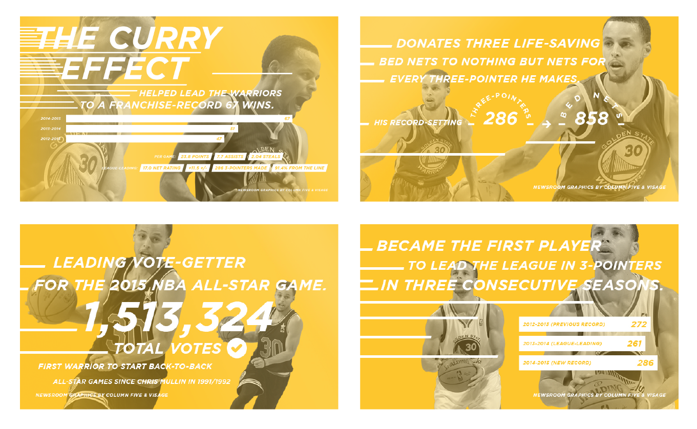
Example: We created a series of small microcontent graphics to help the Golden State Warriors celebrate Stephen Curry winning MVP in 2015. Because they were simple graphics, we were able to create them quickly and release them the day of the announcement. A larger infographic would have been more time-consuming, delaying the release and ultimately garnering less attention.
2) When You Need to Communicate Nuance or Complexity
Not every subject is black and white. While an infographic can help break down complex information, some things can get lost in a stripped-down presentation. If you are dealing with a sensitive, emotional, or complex issue, the written word gives you the vocabulary and color to control the tone or take a deeper dive.
Similarly, video allows you to control the presentation, voice, and mood, giving you more control over how the content is perceived. Infographics may still be advantageous in a longer written post—via diagrams or data visualizations embedded in a post—but they shouldn’t be solely relied on to tackle broad subjects.
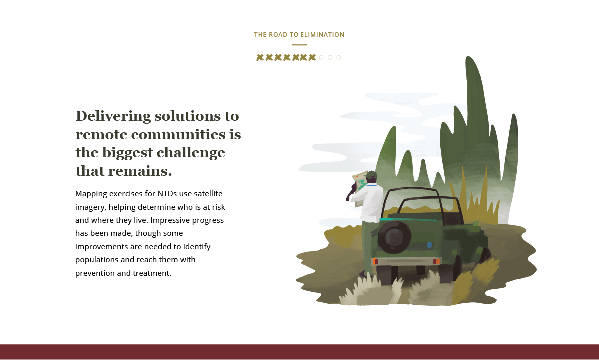
Example: We partnered with The Bill & Melinda Gates Foundation to create an e-book that told the story of neglected tropical diseases, including information about treatment and solutions. The story was too broad for a simple infographic to convey, but a well-designed e-book did so successfully.
3) When You Have a Ton of Data
An infographic is a great way to showcase data, but when you have a million data points to present, you need a way to deliver that info in an easy-to-navigate format that lets the viewer more easily engage. In these cases, interactive infographics are the answer.
You may create an exploratory interactive, where people dig into the data to derive their own meaning. Or you may present data in a narrative interactive, where you guide people through the data. Interactives are particularly beneficial because they require active participation (people inputting or physically manipulating data), making them a truly immersive experience.
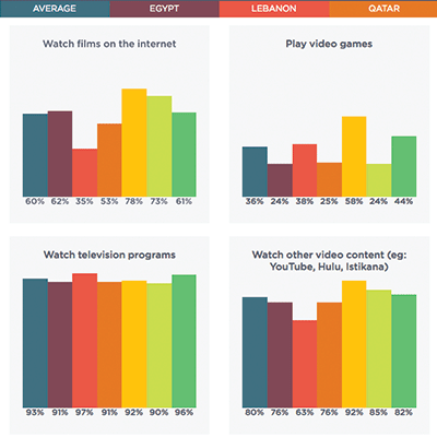
Example: Northwestern University Qatar conducted a massive survey on Media use in the Middle East. With so much data—10 million cells to be exact—a static infographic would have been impossible. Instead, we turned the information into a streamlined, colorful, easy-to-navigate experience.
4) When You Need to Elicit an Emotion
An infographic isn’t inherently unemotional, but its biggest asset is that it artfully combines copy and visuals to communicate information quickly, effectively, and efficiently. This means its primary purpose is the synthesis of information. That is a valuable service, but when you are looking to move people to action through emotion, a video or motion graphic can be a more effective tool.
Watching something on-screen triggers a biological reaction (aka emotional contagion), wherein we start to mirror the emotions of things we watch on screen. Things like voiceover and music greatly influence that emotion, giving us a powerful storytelling experience in a very short amount of time. Plus, video is a passive experience, so all the person has to do is click play and sit back.
Example: Our live-action “Child of the ‘90s” spot for Microsoft helped reintroduce Internet Explorer to millennials through a nostalgic hook. Because it emotionally resonated with the target audience, it garnered 49 million+ views.
5) When You Don’t Have Anything to Say
One of the most important things as a content marketer is to make sure you are 1) not wasting anyone’s time and 2) providing value. Unfortunately, many people are making infographics that are all fluff, no substance.
These valueless infographics come in any forms:
- Inforgraphics that are mostly illustration and no copy.
- Infographics that try to newsjack or capitalize on trends that have nothing to do with the brand (aka “5 Reasons Beyoncé’s New Single is Like Our Cloud Application”).
- Infographic “stories” that would be better off as five tweets.
You get the idea. Again, it’s better to publish better quality content less often than churn out junk constantly.
6) When You Have A Lot of Content
On the flipside, the only thing worse than a pure fluff infographic is the overly dense, never-ending infographic. You scroll, scroll, scroll, trying to wade through the paragraphs of text, then jump ship halfway through.
Sometimes this is because there’s too much data, too many stories, too much visual clutter, or confusing content to wade through. Even if it really is interesting stuff, cramming it into a single infographic will turn people away. A few ways to remedy this: turn the content into an infographic series, try a narrative interactive, consider an e-book, or write a series of blog posts (which you can also turn into an e-book).
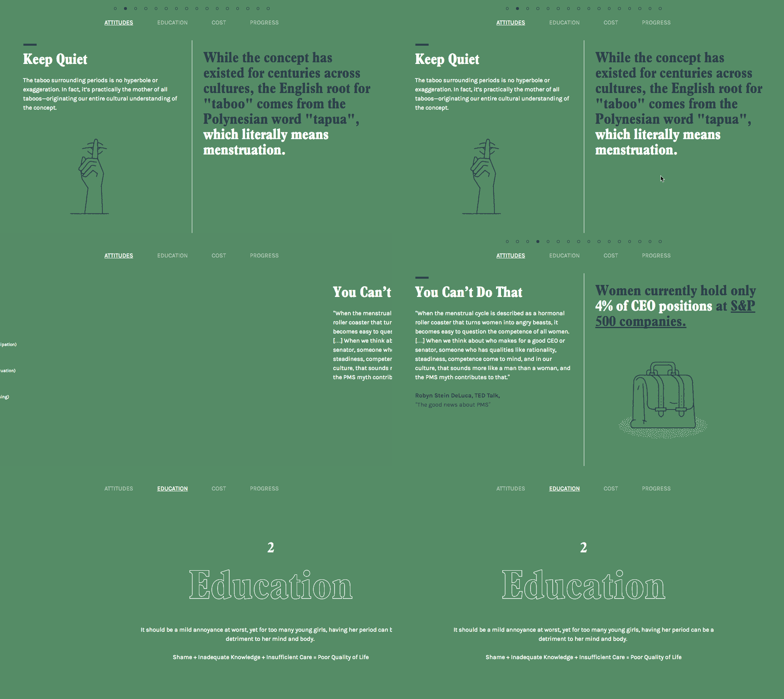
Example: To help raise awareness about the stigma of menstruation, we created a unique interactive experience that explored the social history of female menstruation, why it’s been stigmatized, and the negative effects of stigma for girls and women around the world. Putting the information into an interactive experience helped readers immerse themselves in the story, and let us communicate more information than an infographic alone would have.
Always Consider the Format First
It’s easy to get excited by a new idea, but remember the format you use to deliver your story matters just as much as the story. Sometimes an infographic is the right choice, but there are many visual content formats to choose from.
It’s also important to experiment from time to time, whether you dip your hand into an entirely new medium or simply try a different visual treatment. There are always ways to make better, more effective content. If you want a few more tips on how to mix it up or improve on what you’re already doing:
- Find out which visual format is best for your story.
- Try these 16 ways to come up with great infographic ideas.
- Find out how to repurpose your infographics to get more mileage.
- Get our best tips for making great infographics (based on the 4,000 we’ve made).
- See 9 infographic design examples that will leave you inspired.
If you still need a little help with your infographic or any other type of content, we’d love to talk about it.
