If you think logo design is easy, you’re probably not a designer. Even for seasoned pros, designing a beautiful and practical logo is a tough creative challenge. It’s a tedious process that requires a ton of research, expertise, and forethought. (That’s why we can guarantee that outsourcing the job to an intern or CEO’s nephew pretty much never turns out well.)
But even a highly skilled designer can run into trouble. Small mistakes and simple oversights can easily sabotage the logo design process—and the final design—without you even realizing it. That’s why it’s important to know what to avoid from the get-go.
The 10 Biggest Mistakes in Logo Design
We’ve had plenty of experience designing logos, so we know how to help you avoid those rookie mistakes. If you’re embarking on a fresh logo design or hitting a wall with your current design, here’s a roundup of the most common problems, plus our best tips and tricks to get you through the process.
1) Not Following an Intuitive Process
If you tell your team to just start brainstorming some ideas, you might end up with 3 or 300 ideas. If you tell your team to choose one (with no guidelines, rubric, or reasoning), it may be impossible for your team to narrow it down. The result? You go into endless rounds of fruitless iteration.
To save everyone’s sanity, from project manager to designer, it’s imperative to have a clear, intuitive process that helps you create a strong logo that works for you.
The Fix
Not sure where to start? Follow our step-by-step guide to create a logo with less stress, and bookmark these 100+ tools to build a brand identity.
2) Confusing Your Terminology
If you want any creative project to go smoothly, you need everyone to be on the same page and speak the same language. Thus, it’s important to use the right terminology.
The Fix
Know your logo definitions. The word “logo” has become a catch-all term for any image related to a brand, but in logo design, there are specific definitions for a logomark, wordmark, or combination mark.
Logomark: The image that represents a brand (e.g., Nike’s swoosh or Apple’s apple). For Column Five, it’s this:

Logotype/wordmark: A brand name in a styled font (e.g., Coca-Cola’s elaborate script or Gucci’s clean font).
Combination mark: Both the image and the styled brand name together (e.g., Puma).

For the sake of flexibility and versatility, it’s more common for companies to have all three. Oftentimes, when people refer to logo, they mean a combination mark.
3) Not Doing Enough Research
Logo design is fundamentally a communication challenge. How do you capture and communicate a brand’s essence through imagery? To do this well, you need to have a deep understanding of exactly what it is you’re trying to communicate—or not to communicate. The more knowledge you have, the better you can do this.
Rookie designers (or impatient brands) will sometimes dive into the brainstorm stage without the proper brand education. This always results in a weak logo that doesn’t accurately represent or reflect the brand.
The Fix
To make sure you have as much knowledge as possible, conduct a brand audit survey that clearly details your brand goals and objectives. Once you have this info, you can write a strong creative brief that will keep your team on the same page. (Per point 2, make sure you specify what type of logo you’re creating in your brief.)
4) Creating Your Logo Design in Color (First)
A good logo stands on its own—without color. While color is an important element, of course, starting with color can make it harder to judge if your design is strong enough. Worse, designs that do work can be dismissed just because someone is thrown off by a color.
The Fix
To ensure your logo really works, design it in black and white first. This will help you narrow down your designs (as you will likely have multiple options). Then, when you are ready to work with color, follow our tips to choose the right colors for your brand.
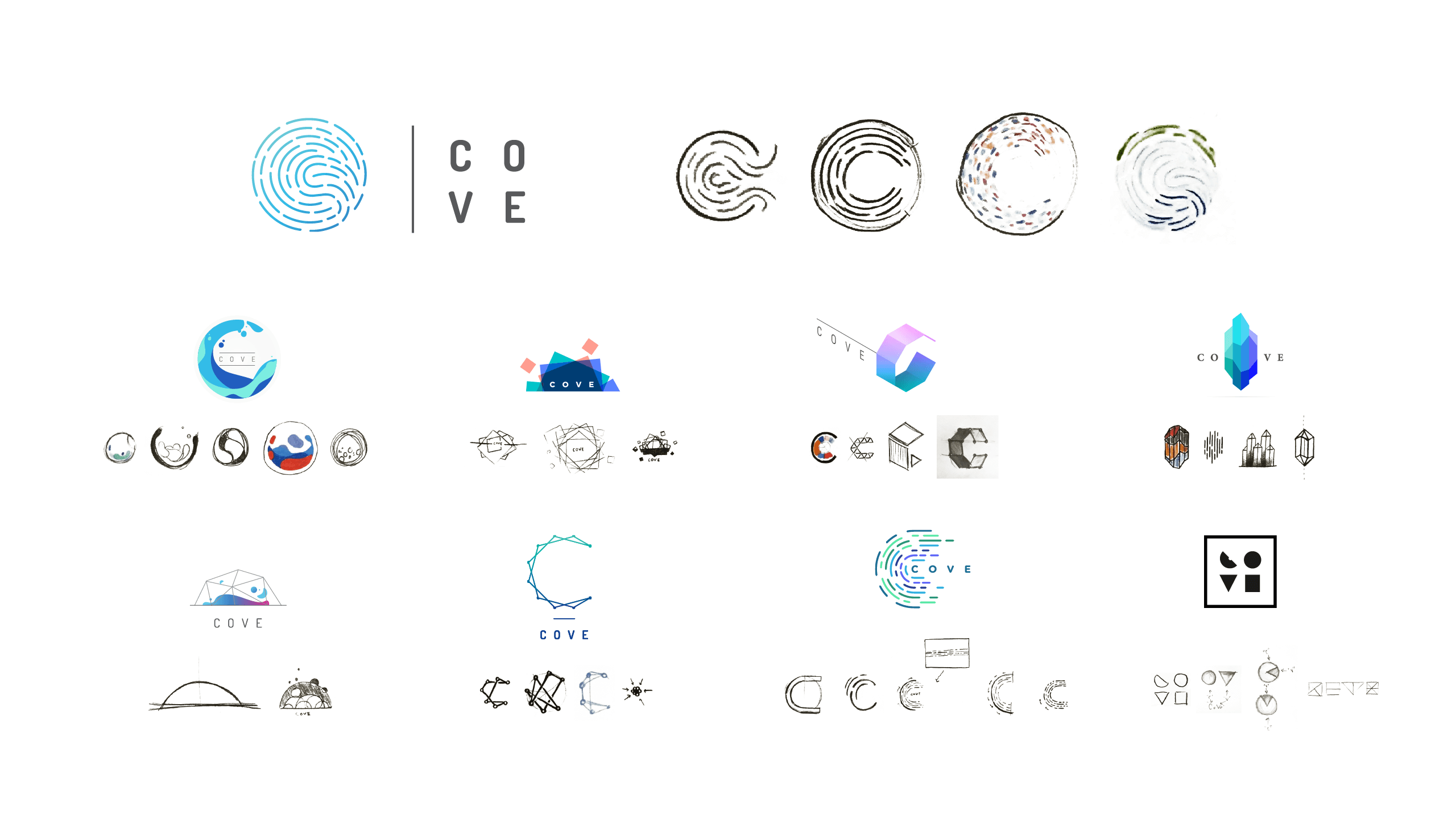
Here, you can see the evolution of the logo we designed for The Cove (UCI Applied Innovation). We started with black-and-white renderings, which allowed us to build on each design until we had a final option.
5) Using the Same Typography for Your Wordmark and Brand Content
When it comes to your wordmark, you want to keep typography simple and clean. But you don’t want to use an untouched typeface for your wordmark (e.g, Arial, 12 point). Why? Because your wordmark should be distinctive, unique, and a representation of your brand’s visual language.
The Fix
Sure, you can use a typeface as the basic inspiration (and the typeface you choose for your brand should complement your wordmark well), but it should be customized in some way. For more tips on selecting typography for your brand, check out this guide.
6) Using Generic Imagery
This shouldn’t have to be said, but we have to say it. There is nothing that will make your brand more forgettable than generic imagery. Hands shaking to symbolize community, a lightbulb to symbolize great ideas—you get it.
The Fix
The point of logo design is to find something that represents your brand, not a vague idea. You can still use symbolism, but be creative and look for things that speak to you directly.
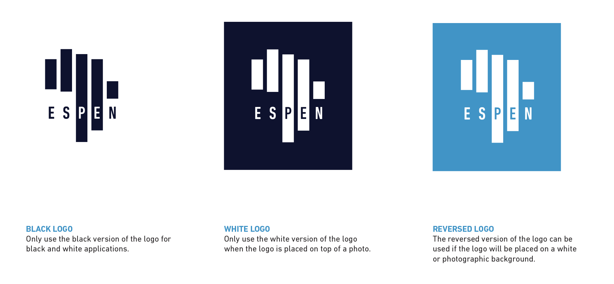
We created a new visual identity for the Expanded Special Project for Elimination of Neglected Tropical Diseases (ESPEN), a WHO organization on a mission to eliminate five specific tropical diseases. To bring their mission to life, we created a symbolic logo that features a rendering of the African continent, made of five bars: one for each disease they’re battling.
7) Using Inappropriate Imagery (Without Realizing It)
The devil is in the details, especially when it comes to design. Shapes or white space can be used strategically to reinforce brand messaging in effective ways. However, this can backfire too. We’ve seen plenty of logo designs that unintentionally deliver the wrong message in the form of overly phallic shapes, inappropriate or inoffensive symbols in white space, etc. (Out of respect, we will not include those examples here.)
The Fix
When you’re so immersed in a project, it can be hard to see any issue. That’s why we always recommend a sanity check from someone with fresh eyes.
The subtle arrow in the FedEx logo is a great example; you can see it in the white space between the E and X.

8) Making an Inflexible Logo
Your logo will be used in many ways, in many mediums. It should work well in print, online, and at different sizes (e.g., your website favicon). If your logo is too complicated, it won’t render well at smaller sizes. If it’s too generic, it won’t be distinctive enough to grab attention.
A good logo is future-proof, meaning that it will grow with your brand and work for as many use cases as necessary.
The Fix
Create mockups for both web and print assets to get a sense of how well your logo translates. If you want more logo design inspiration, check out the great examples at Logo Design Love.
9) Falling Victim to Hivemind
You want your logo to be unique and distinctive. Still, it’s easy to get sidetracked by design trends or even industry standards. This has become especially true in recent years, as entire industries have started to homogenize.
For example, type designer James Edmonson of Oh No Type Co points out the similarities in these popular brand logos:
EVERYBODY FALL IN LINE! pic.twitter.com/B9JU5nvpMu
— OH no Type Co (@OHnoTypeCo) February 13, 2018
The Fix
Remember that you’re trying to solve a communication problem. Your designers should be able to justify why every element and aesthetic choice supports your brand goals.
10) Not Providing Logo Guidelines
This is one of the most common rookie mistakes by far. Don’t go to all the work to create a beautiful logo design, then sabotage your brand by letting people use it any way they want.
The Fix
To preserve your brand’s integrity, follow our guide to create comprehensive brand guidelines. (And make sure to include real-world examples to make things as clear as possible.)
Remember: Your Visual Identity Is More Than Your Logo
While your logo may be the most recognizable element of your visual identity, there are many other ways to communicate who you are and what you’re about. For more tips on creating a strong brand:
- Complete your brand strategy to make sure your visual identity aligns with your brand goals.
- Follow these tips to design a strong brand identity, and use our checklist to design a comprehensive visual identity.
- Use our free messaging template to create a tagline, value prop, and messaging pillars that tell a consistent, cohesive story.
- Learn how to tell a strong brand story through your content.
Of course, if you’re stuck or short on time or resources, we’re happy to chat about how we can help. (If you want to know more, find out what it’s like to work with us on a brand identity engagement.)





Seriously this problems often seen by lot of logo designers. Nice Blog, the way you explained for problems is wonderful. Thanks for sharing.
Glad you found it helpful.