A lot of people want to know how to make infographics. We’ve made over 4,000 infographics for tons of companies over the last decade, so we know a thing or two about it. Most importantly, we know it’s not enough to make an infographic; you need to make a great infographic. But too often we see people sabotage their work. How? They try to do way too much, cramming as much as possible in:
- More stats!
- Another CTA!
- Product mentions!
- Another 10 sources!
The instinct is understandable. You want to get the most bang for your buck. You want to give your reader as much info as possible. But this overlooks the actual purpose of an infographic: to tell a succinct story and deliver it in a package that makes it as easy to understand as possible.

Why Less Is More in Infographics
Although infographics have always been around, it was only in this decade that marketers fell in love with them. This has prompted the revival of a wonderful and effective communication form, but many people are enamored with their flashy visuals and snazzy copy, overlooking their intended use. (In fact, we often have partners come to us asking for an infographic, when what they’re really looking for is information design. Learn more about the difference between them.)
An infographic combines copy, data, and visuals—all three of which work symbiotically—to help people comprehend and retain information more effectively. That’s why they’re so unique. But many people don’t understand what really makes a good infographic. Too many people think the infographic process is something like this:
- Slap together some copy.
- Sprinkle in some charts and graphs.
- Add a few illustrations, logo, and CTA.
- Sit back and relax.
We’re here to set the record straight. Just because you have copy, data, and visuals doesn’t mean you have a good infographic. The best, most effective infographics don’t just “deliver information” with these elements. They tell an interesting, enticing story.
Why story? When you are trying to deliver specific information or get a certain message across, wrapping it in a story makes it more accessible to the people you’re trying to reach. It’s an intuitive formula, and they know what to expect: introduction, setup, payoff.
“Cool! I can make a story,” we hear people say. And that’s when things can go even more off the rails. They drown their infographic in data. They stuff it with a novel’s worth of copy. They pack it with picture-book visuals. The result? A Franken-graphic that is an unreadable eyesore. Here’s the thing about story: It’s a balance. Sometimes you have too much, too little, none at all, or something way off track.
To make sure you’re telling a solid story, you need the right ingredients.
How to Make an Infographic That Tells a Strong Story
A strong infographic contains many elements, from the narrative to the design. To help illustrate the example, let’s walk through an infographic we created with Upwork, a global freelancing platform.
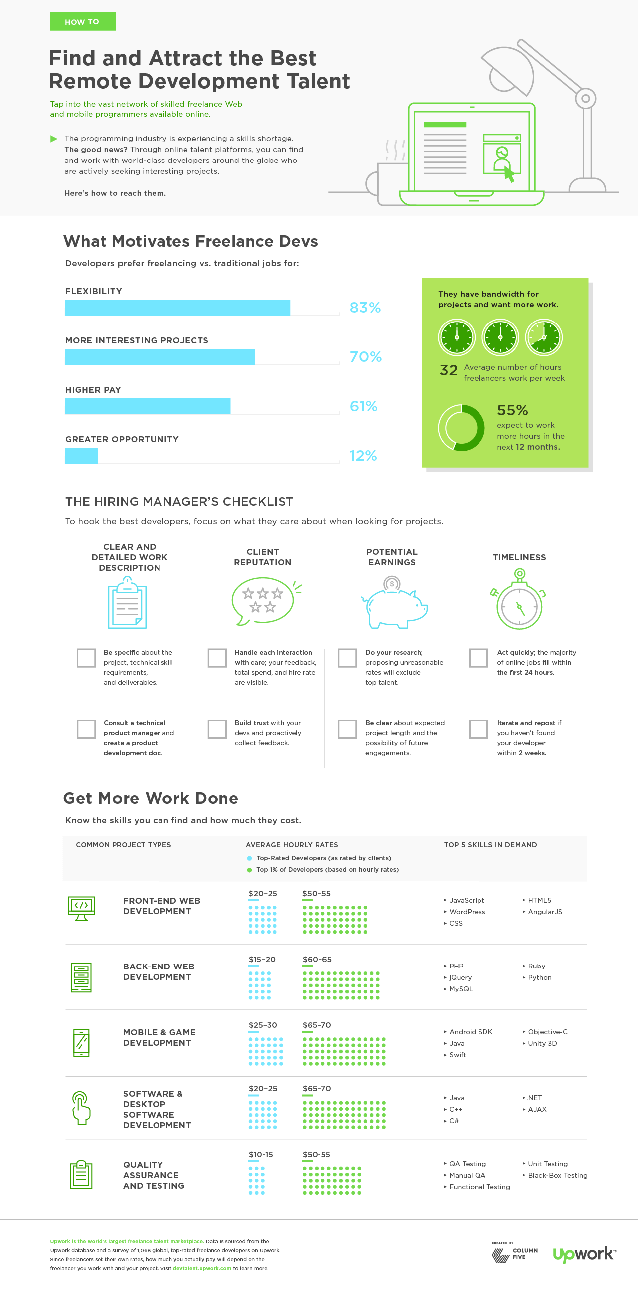
This infographic is a great example of a well-crafted, well-designed piece that is perfect for its intended audience and, therefore, helps the brand connect with them. Here’s how to emulate it.
1) Choose a single topic (that people are interested in).
This may be broad or specific, depending on your goals, but it should have a specific angle. You might craft an infographic about overall industry trends or tell a story about a specific sector of the industry, but don’t try to cover every single aspect of your industry in one infographic. Either way, it should be relevant to people’s interests.
Tip: If you are interested in exploring a topic from many angles, craft an infographic series. These can be published all together or used to enhance other larger pieces of content, such as an e-book. To make sure your story ideas are actionable and interesting to people, create marketing personas of your target audience. Try our exercise to help you do it in an hour.

The Upwork infographic is effective because it addresses a very specific subject that isn’t too broad or too granular: finding and attracting remote development talent. For a freelancing platform, this is a highly relevant topic.
2) Extract relevant data insights.
Sometimes you will already have these insights, which will inspire the topic. Sometimes you’ll have to go looking for them. The key here is to include only the most relevant data.That doesn’t mean you cut out data that doesn’t “support” your story, but you should include only that which helps you communicate it effectively.
Tip: If you don’t know how to extract those insights, try our 5 tips for finding stories in your data. Not sure where to find data at all? Start with these 104 great sources of data.
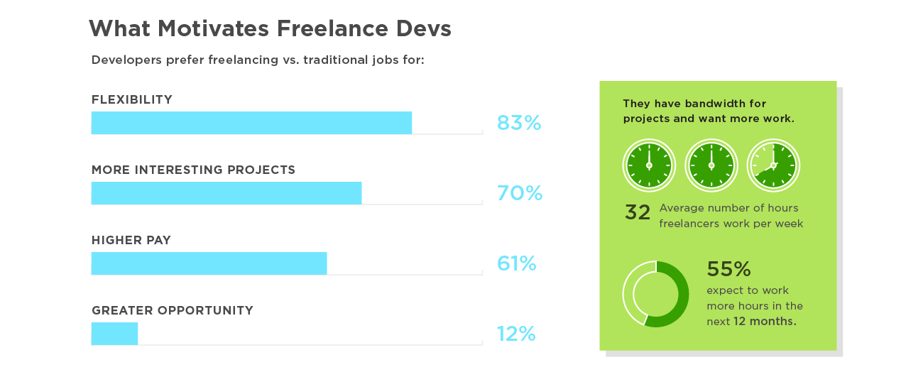
This graphic was created using Upwork company data and survey data from 1,068 top-rated freelance developers on Upwork. It provides fantastic insight into what motivates and concerns this segment of the workforce.
3) Structure a clear narrative.
The same grade-school writing rules apply:
- Introduce the topic.
- Guide readers through in an intuitive manner, with supporting data.
- Call out or provide context for any particularly relevant (or possibly unclear) data.
- Wrap it up with a simple, intuitive CTA.
When it comes to actually writing:
- Limit copy: Large blocks of text are an immediate turnoff. Data and design are meant to enhance and do some of the heavy lifting. Keep copy short, quick, and to the point.
- Kill redundancy: Again, let design do its job. Don’t over label charts. Don’t call out the same stat in the body copy, header, callout, and chart. Keep it clean and simple.
Tip: Here’s a good litmus test: Is it easy to write the headline for this story? Can you summarize your points in a few sentences? If not, you may need to simplify. Get more tips on crafting an infographic narrative, and check out these 101 resources for copywriters.
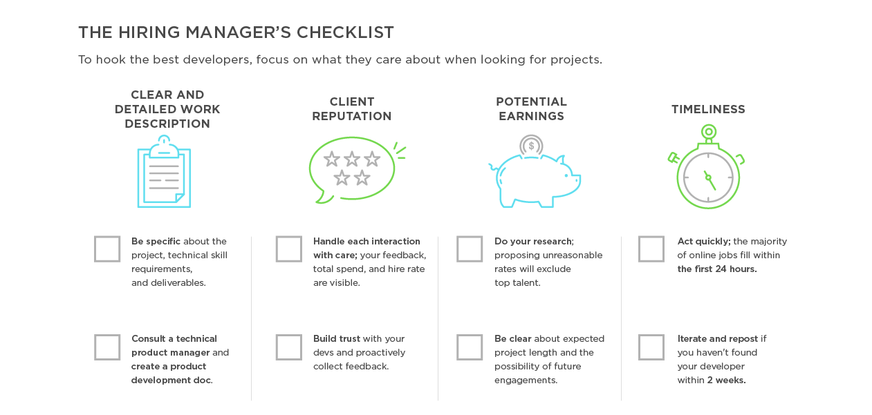
The Upwork graphic doesn’t just throw in a few random stats. It presents data and translates that data into useful and actionable tips for the target audience. This helps them not only understand those workers (through data) but understand how they can attract those workers.
4) Design for story.
Another common issue on the design side is over-designing: adding a ton of illustrations, getting too crazy with a visual metaphor, or including chart junk that distracts from data visualizations. Everything from the layout to the font choice affects how the reader absorbs the story. Design should never distract, only enhance. Never forget that white space is your friend!
Tip: Follow best practices for data visualization. Check out this e-book to learn how to design the most common types of charts and graphs, and make sure you avoid these 8 common design mistakes.
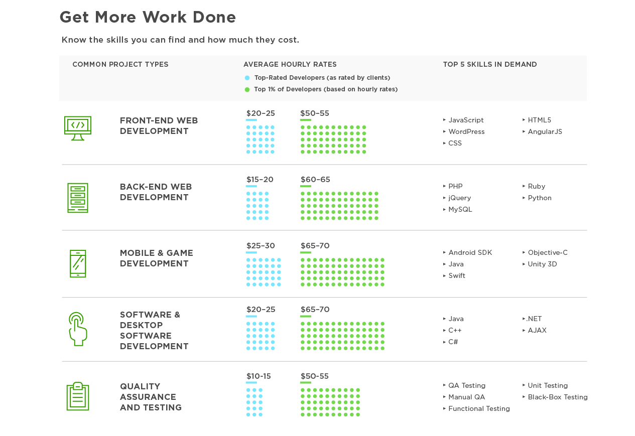
The infographic’s clean data visualization and modular design make it easy to navigate. Each panel presents a certain aspect of the story, and it flows in a logical order.
Creating great infographics isn’t difficult, but it does take knowledge, practice, and skill. To make sure you’re on top of your game, stay educated and informed. Want to start now?
- Check out even more tips to make effective infographics, from brainstorm to distribution.
- Look at these 9 infographic design examples for inspiration.
- Learn more about the power of data visualization.
If you need a little help with your infographics, we’d love to help you out.
