What is an infographic? Though infographics have become a go-to marketing tool over the last decade, we still commonly receive questions about the various terms used to describe this field of design. What is the difference between data visualization, information design, visual content, and infographics? The confusion is understandable. Many of the labels thrown around not only overlap but can be open to individual interpretation. It gets tricky.
Luckily, as an agency with a decade in the game (and a book to boot), we’re here to demystify it all and give you insight into the world of infographics, why they’re useful, and how you can take advantage of this exciting medium.
What Is an Infographic?
Well, let’s start with the word itself. “Infographic” is a portmanteau of the words “information” and “graphic.” In essence, an infographic is a form of visual communication meant to capture attention and enhance comprehension. In this era, “infographic” has become the broadest descriptor of a specific type of visual communication that includes graphics showing data, copy, or both. You’ve probably come across these types of visuals in magazines, online, or on the wall at your doctor’s office.
Example: This educational piece for the American Heart Association is an overview of atrial fibrillation.
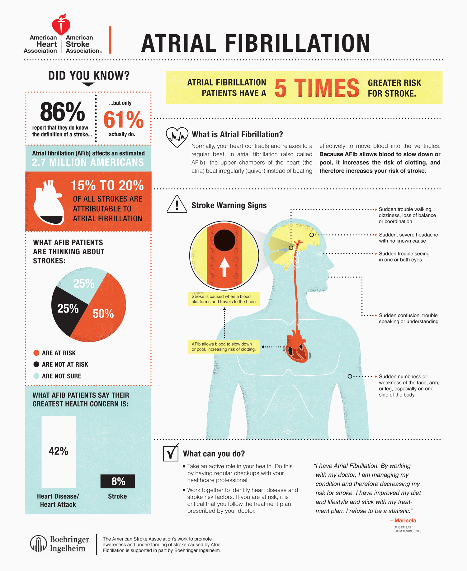
The word “infographic” has experienced a meteoric rise in popularity over the last decade, largely due to the use of this medium for both branded and editorial content on the web. But as the buzz surrounding this word has grown, so have the arguments about the real answer to the question, “What is an infographic?” There are many schools of thought, but we believe the term should remain open and inclusive as the medium evolves.
What Are the Different Types of Infographics?
While there are many different presentations of infographics, there are three general categories they can fall into:
- Data visualization
- Information design
- Editorial infographics
Each serves its own purpose and can be a powerful storytelling tool—when applied properly. Let’s explore the difference between them.
1) The Data Visualization Infographic
You may be familiar with data visualization in the form of basic charts and graphs. Data visualization is simply a visual representation of data. We consider it an artistic science, as it uses design aesthetics to increase data comprehension, synthesis, and ultimately recall. Whether you’re looking at meta patterns or single data points, data visualization translates that data into a visual language you can easily and instantly understand.
In the age of big data, this is especially important. We need to both make sense of numbers and be able to easily share the story they tell. To see how and why data visualization is so powerful, take a look at this video. (If you’ll note, we did indeed create a video that visualizes the power of data visualization—case in point.)
Now, want to see the power of data visualization at work? Take a look at the data visualization below.
Example: You probably don’t speak Italian, but you can likely decipher the information presented in this graphic by Francesco Franchi. This illustrates why data visualization is the most interesting and universal way to make information accessible and understandable to a wide group of people.
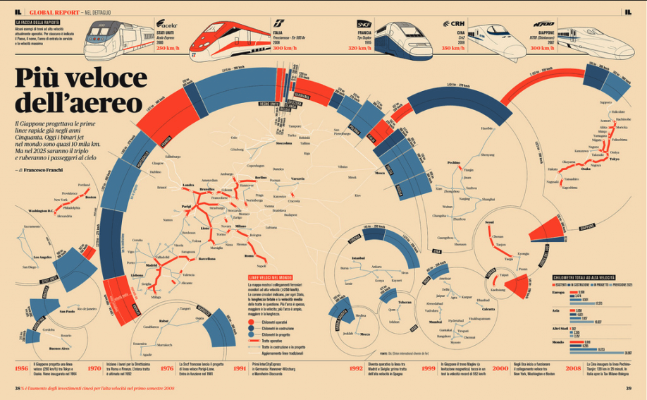
In application, the practice of data visualization is the most numbers-heavy—and typically is what a purist would describe as a “true” infographic. But, as with all infographic design, the display method is rooted in the context and desired message.
Example: This GOOD infographic features classic data visualization in the form of bar charts, pie charts, and graphs.
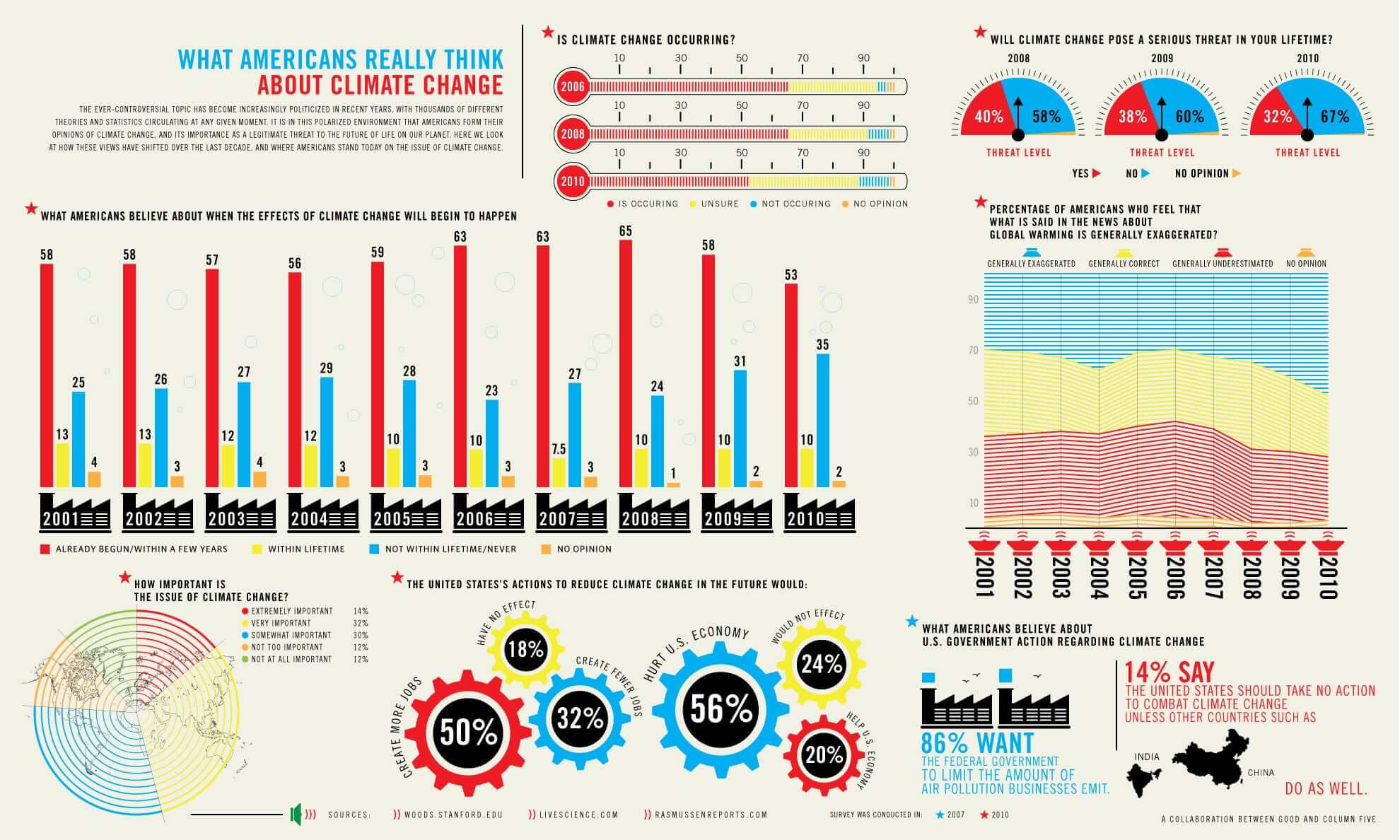
Traditional data visualizations tend to be more complex, as they are often attempting to display a great number of data points. In some cases, though, data visualization graphics functionally serve only as art pieces, if no specific message can be extracted.
Example: Reddit user andrew_elliott created this stunning data visualization of his baby daughter’s sleep habits.

When properly executed, however, data visualizations should be both beautiful and meaningful, allowing the viewer to decipher data and recognize trends while admiring the aesthetic appeal. (To dive deeper, learn more about why you should embrace the power of data storytelling.)
2) The Information Design Infographic
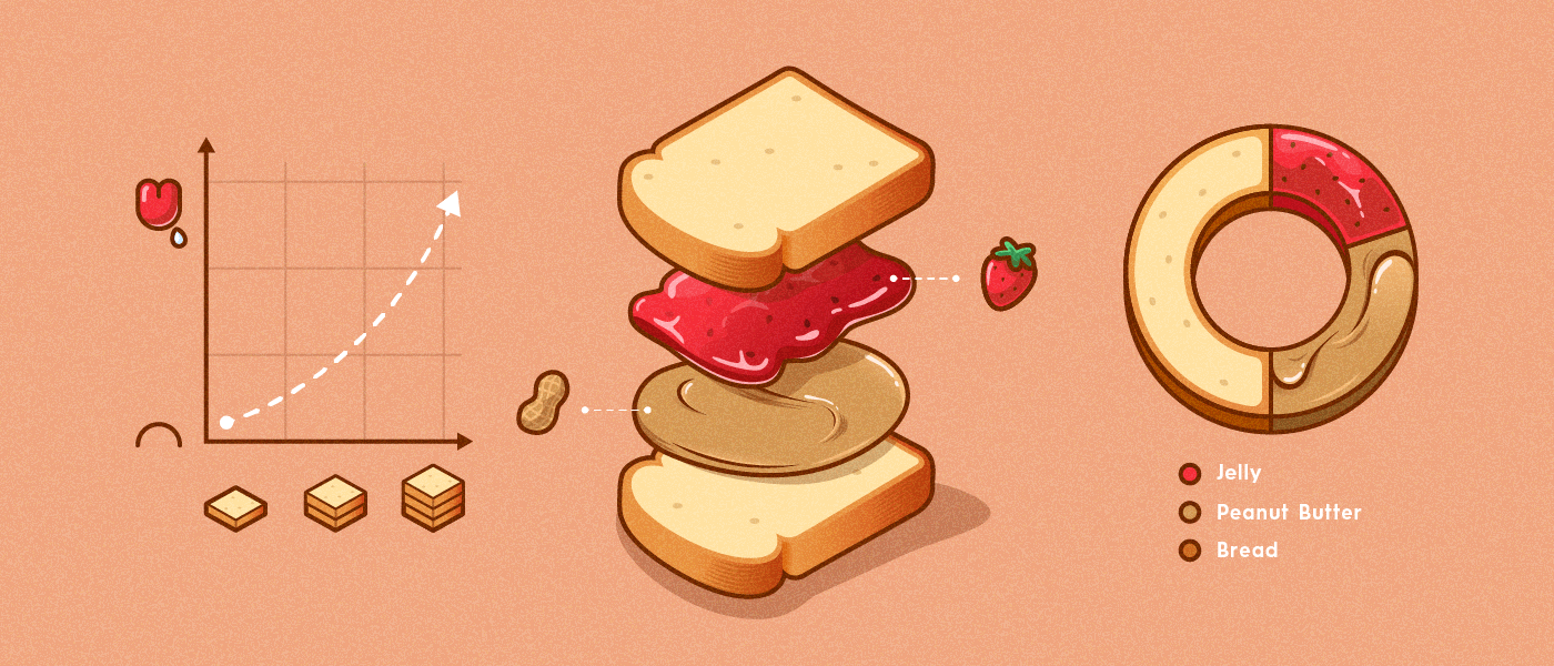
Information design is a subset of graphic design that focuses on the display of information efficiently and effectively. It’s a broad category, encompassing many functional design disciplines.
It differs from data visualization because it is not made from specific data points but rather concepts or other information, such as process, anatomy, chronology, or hierarchy.
Example: This piece of information design by GOOD compares prison food to school lunches.
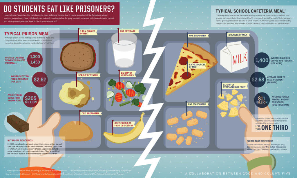
In your day-to-day life, you may encounter information design in the form of flowcharts, organizational diagrams, or timelines, clarifying structure and order in a way not possible solely using text.
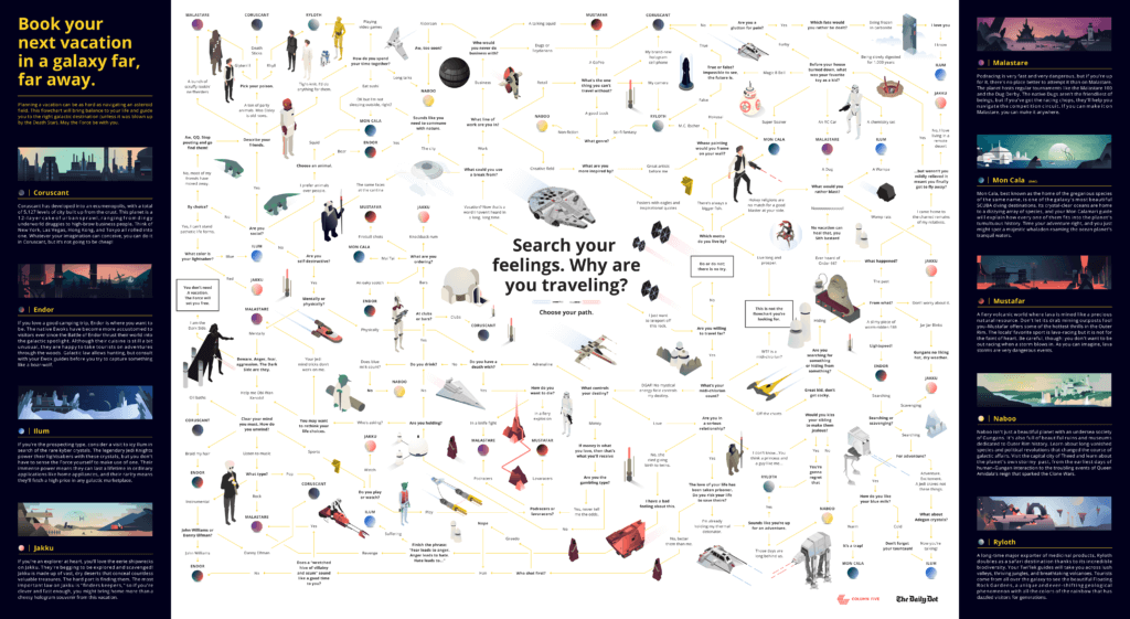
Example: This epic Star Wars flowchart by The Daily Dot is another example of useful information design.
Instructional diagrams, anatomical illustration, and some applications of cartography would also fall under this label.
Example: This map by AppliedTrust uses geographic information design.
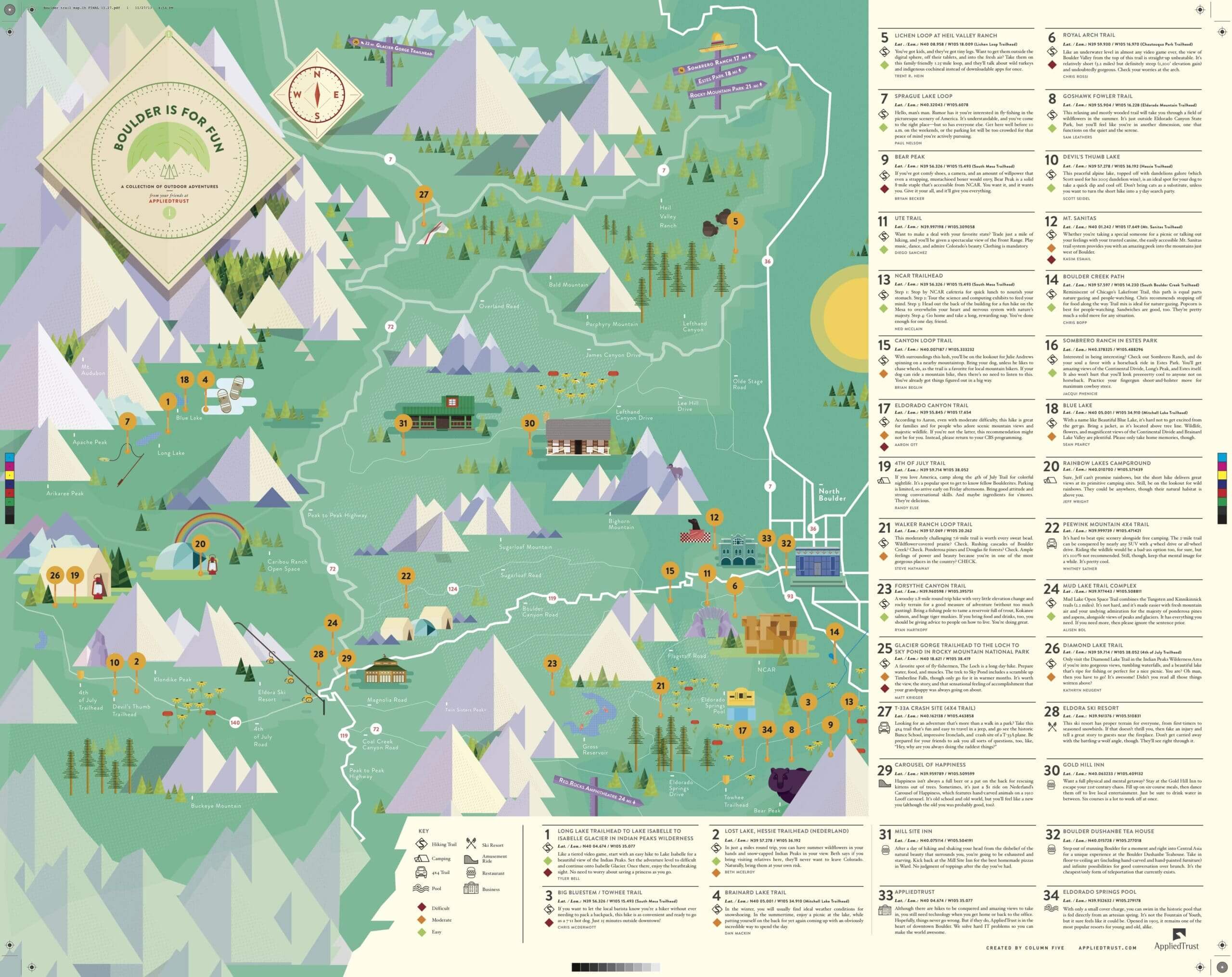
For information design, the goal is to use design to communicate a message that is both clear and universal.
3) The Editorial Infographic
Although major publications have been featuring infographics for decades, there is a shift in the style and type of visual content they are producing. This trend has also been spurred by the rise of social. Infographics have become highly shareable content, so publications are embracing the medium to better engage readers.
Previously, editorial infographics were limited to simple bars, lines, and pie charts, using illustration solely in more complex features to map an area or show the anatomy of an object.
Example: A classic editorial infographic from USA Today.
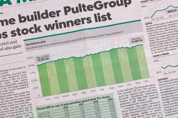
But there has been a dramatic increase in the number of publications utilizing graphic content to replace more traditional editorial features.
Example: A GOOD Magazine infographic on gun ownership.
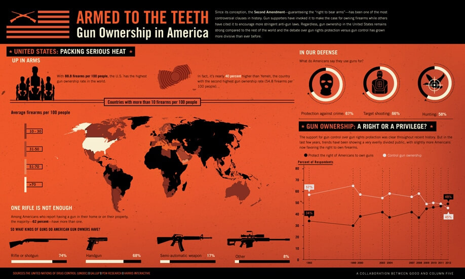
This adoption has also spread into the commercial sector, with many start-ups and larger corporate blogs using graphic content or “charticles” to display thought-leadership within an industry and bring attention to their site.
Example: This editorial infographic by Upwork gives hiring managers insight into how to hire in the tech industry.
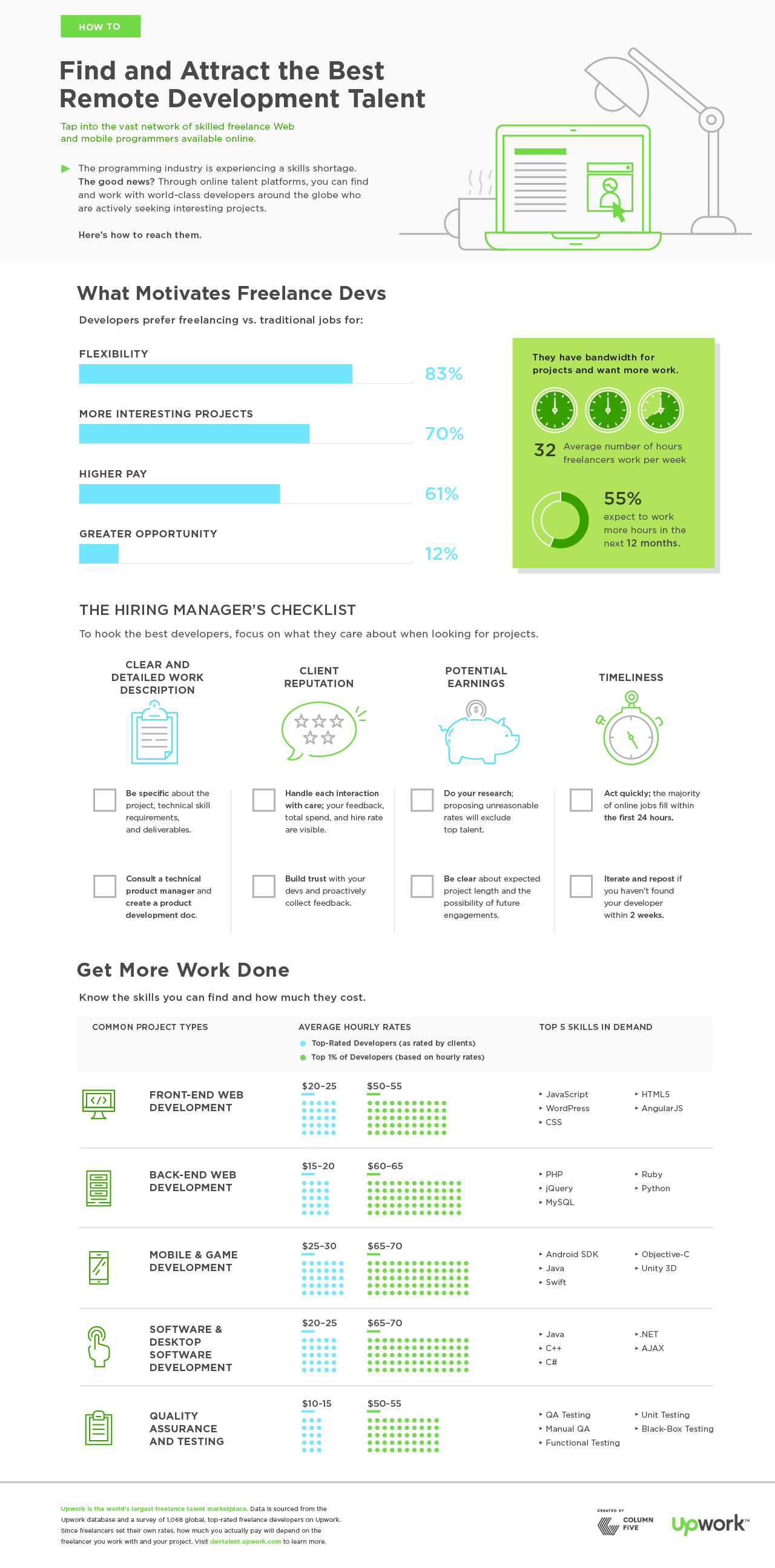
While some of these infographics can cross the fine line over to advertorial, the good ones do not. The value of editorial content is best realized when providing interesting insight from uniquely informed sources.
This doesn’t mean that infographics aren’t an incredibly valuable tool in marketing. They are, but they are most powerful and effective when they present an editorial narrative vs. a branded message. (For more on that, explore how infographics can benefit brands.)
Infographic Design Styles
Regardless of the content or data depicted—editorial or branded—infographics are more flexible than ever in terms of their design format, allowing you to tell your story in unique and engaging ways. That said, the most common formats are:
- Static infographics
- Animated infographics
- Interactive infographics
Again, each has their own unique benefit. The story you’re telling, as well as the platform you’re using to tell that story, should influence what format you choose.
1) Static Infographics
These are the simple infographics you’re probably most used to seeing, best used in blogs, articles, brochures, print, etc. Even though static infographics don’t “move,” there are many ways to make them visually interesting, including line art, illustration, photography, papercraft, and more.
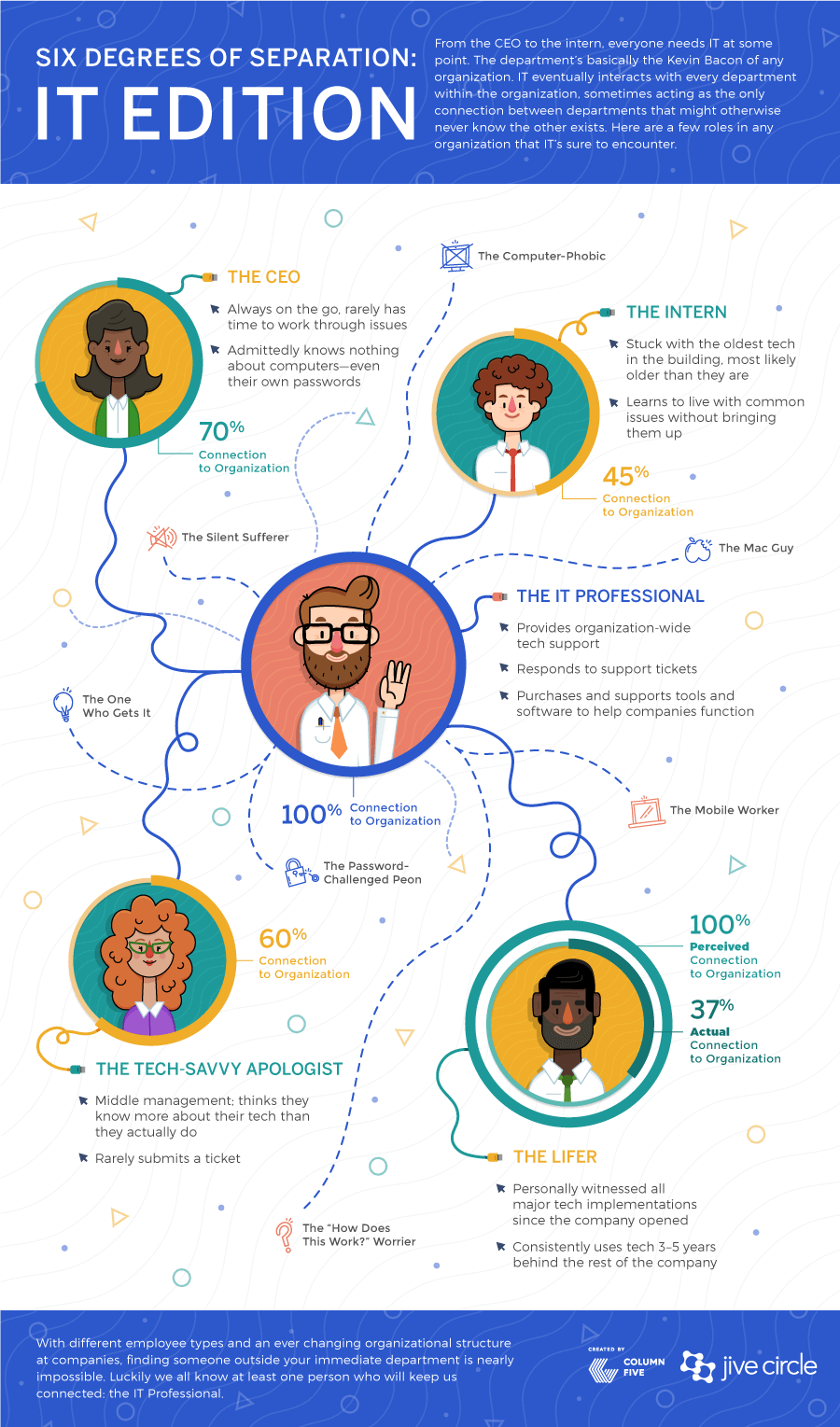
Example: This static infographic by Jive is a useful piece of content marketing, easily shared online or published alongside thought leadership.
2) Animated Infographics
Animated infographics are, as their name implies, animated. You may recognize these as GIFs of infoGIFs. They are particularly engaging if you want to grab attention, making them ideal for use on social, where they will stand out in someone’s content stream. They can also be used to enhance online articles, tutorials, etc.
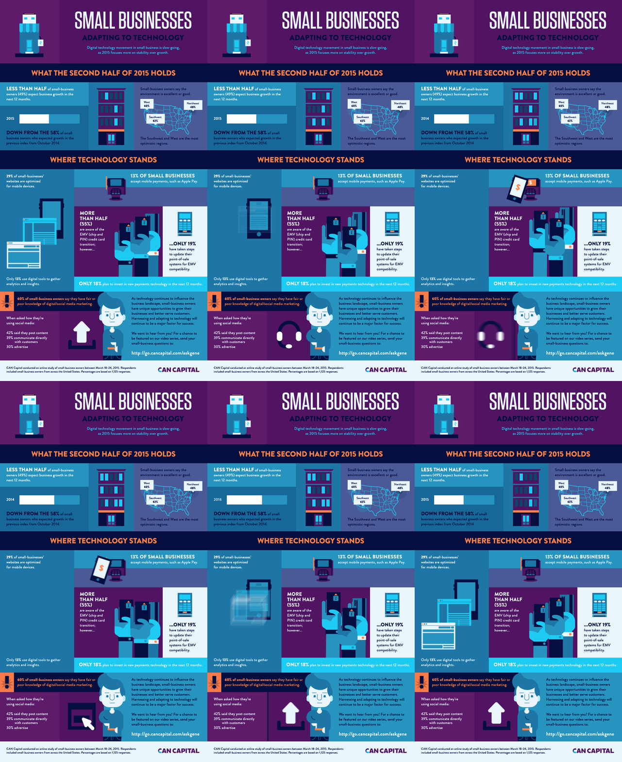
Example: This animated infographic by Can Capital looks at how small businesses are adapting to tech.
If you want to experiment with this format, here are 3 ways to turn your static infographics into animated infographics.
3) Interactive Infographics
Interactive infographics require some sort of action or input from the viewer. These are best utilized for large data sets, where a simple static infographic wouldn’t be able to tell the story sufficiently. With interactive infographics, the viewer can either explore data at will, or be guided through a contained narrative.
Example: The interactive data visualization we created for Northwestern University of Qatar turned a staggering 10 million cells of data into an easily navigable experience.

For more on this format, find out how interactive infographics can tell your story, and check out these great examples of interactive infographics.
How to Create a Great Infographic
When talking about infographics, we need to acknowledge the room for change and growth. Design is inherently about using innovation and imagination to provide clarity, and so the medium will continue to evolve over time. We just hope that as they do, creators will maintain a commitment to quality and integrity in the medium.
So, if you’re feeling inspired to create one yourself, here are our best tips to make it a success:
- Start by creating a strong creative brief. To keep your team on the same page, use our handy infographic brief template.
- Brainstorm the right ideas. Not every idea is right for your brand. If you’re looking for ideas, try these 16 methods for coming up with great infographic ideas.
- Use the right data sources. You can use internal or external data. Both are valuable, but internal is especially potent to help you tell unique, original, and exclusive data stories. Here are 9 places to look for internal data, and 104 credible external data sources. Regardless of the source, follow these 5 tips to source your data correctly.
- Tell a strong story. Follow these tips to craft an effective visual story.
- Follow design best practices. Good design is a crucial part of good storytelling. Avoid these 15 common design mistakes, and make sure your infographics stay on brand. You may also want to mix up your design from time to time. Here are 7 different styles to try, and some of our favorite examples of minimal infographic design.
- Create strong data visualizations. Good design is one thing. Good data design is another. Misrepresenting data through sloppy visualization can hurt your credibility, so make sure you are presenting data accurately and in a way that will increase comprehension. For more tips to bring your data to life, see our guide to designing charts and graphs, follow these 25 tips to improve your data visualizations, and download our free e-book The Content Marketer’s Guide to Data Storytelling.
- Work smarter. Bookmark these 100+ tools and resources to create better infographics.
- Look for inspiration. One of the best ways to familiarize yourself with strong design is to see expert examples. Check out these 75 great infographic design examples.
- Distribute it correctly. Learn how to optimize your infographic for SEO and promote it like a content agency would.
- Bring in expert help—if you need it. If you don’t have the time, energy, or resources to create quality infographics, an agency can help. Just make sure they’re the right partners for you. Here are 10 questions to ask when you’re vetting agencies, and a few tips to work effectively together.
Of course, you can always hit us up to ask questions, get some guidance, or improve your overall content strategy. We’re happy to help tell your brand story in any way we can.





good
Thank you for this well-written and informative article. The practical tips you’ve shared are going to be very useful for my work.
Happy to hear it!
cool
This is really awsome. I want to turn my post into infographic as well https://www.toptenthebest.com/top-10-best-hoverboards/ but don’t know what should be best. what would you suggest?
Thanks, Vannak. You might consider a photographic infographic or illustrated infographic with highlights of each one.
Hey C5…and friends that I see on the ‘people’ page. I am glad that you posted this article. I am using it with my high schoolers. I require students to create an infographic as part of a final presentation for an AP Environmental Science class. You don’t have to post this…I would rather you not. I just wanted to use this pathway to say hello to a couple Goons I know. 🙂
That’s so cool! Thanks for sharing (and hi from all your friends here).
i am also a infographic designer and this is the best article i read about infographic. keep up the good work
if anyone want i can do professional infographic, i have years of experience in professional infographic design.
https://www.fiverr.com/waseemgfx/do-professional-infographic-design
Thank you so much
Glad you enjoyed it, Muhammad!
Thank you for the info.
Glad it helps.
Guys that infographic about trains is not in French, it’s Italian 😉
You made the point anyway…
Agh! Scusa 🙂 Thanks for noting that, Marta.
This is outstanding, any way you can write one about the difference between dashboards and reports? Been trying to explain that one a bit.
Hey Trevor, that’s a good idea. You can see our description of ‘dashboard design’ here. As for reports, these could fall under our ‘presentation design’ and/or ‘ebooks and whitepaper’ services. See here and here for those. Hope that helps for now. I’m interested to hear how you would define them?
Ah, now I get it. I’ve been using data visualization all wrong 🙁
No worries, Mark. Now you know 🙂
Super helpful.
Glad to hear it!
This makes sense. I agree that we should consider these mediums to be always evolving. Who knows what we’ll all be making in a decade from now.
Roger that.
I’m glad you pointed out the distinction between data viz and infographics. Too many marketers are making a mess of it all.
Glad it helped!
Finally someone explained it for me. Thanks guys.
You’re very welcome.