If you want to tell a powerful story, data is the way to go. Whether it’s proprietary data, industry research, or public data, there are compelling stories all around. But even the best data story can lose impact if it isn’t presented the right way. That’s why it’s so important to choose the right data visualization format for your data.
We find that there is a lot of misinformation or misunderstanding around this topic. Many people think that throwing a few charts and graphs into an article is all they need to tell a good data story. Or they think they can stuff a trillion data points into an infographic and call it a day. While the intention might be right, the execution is so wrong.
We want you to tell the best data stories you can, so we’re breaking down the different types of storytelling formats to help you choose the best for your data. (Note: This isn’t entirely prescriptive, but it should send you in the right direction.)
Data Visualization Formats/Tools
Before we dive in, let’s clear up a few terms to specify what we’re talking about. When it comes to data storytelling, people tend to use certain terms interchangeably (or misuse them entirely), but there are very different types of data mediums and data visualization formats. For the purposes of this post, here’s how we break it down.
Data visualization: In the strictest sense, this refers to the actual visual representation of data. This may mean basic charts and graphs or larger, more complicated visuals. But it is about the visual specifically.
Information design: Information design is the visual representation of information—with no data at all (think of an organizational flow chart). We won’t be talking about info design here, but we think it’s important to understand the distinction.
Infographic: An infographic is a graphic that includes data, copy, and visuals. These elements work symbiotically to tell the story. (That means your infographic may include data visualizations.)
Animated infographic: These are infographics that include motion or animation. These are not interactive (see below), because the viewer doesn’t control the motion or animation.
Interactive infographic: An interactive infographic is any web-based content that lets you interact with the data on the screen. You may scroll over, click, expand, or otherwise manipulate the on-screen data.
Motion graphic: These are animated graphics that tell a story. Motion stories can be told through kinetic text, animated visuals, or both.
Video: This is live-action film, which may also incorporate text, graphics, etc.
Luckily, you have more options than ever to tell your story. But this can also make it tricky to choose which is best.
Before You Choose a Data Visualization Format
There are many elements that influence how you might best present your story. Before you decide on a format, think of the bigger picture. Each of these may affect the route you take.
Goal: Before you create anything or even come up with an idea, you should always know what your goal is. This is just as important to data storytelling as anything else. Are you trying to increase brand awareness? Establish your expertise? Engage your social followers? Some formats can help you achieve these goals more than others.
Story: An effective data story isn’t just a smattering of stats. If you’ve done your job well and teased out the insights, you can craft a narrative to reveal that story. That said, the story you’re trying to tell will very much dictate the data visualization format you choose. Is there a clear message? Are people meant to uncover or assign their own meaning to the story? Are you creating a useful resource? Are you trying to guide them to a next action? Keep this in mind.
Volume of data: This is one of the biggest issues we see over and over. People can go data-crazy sometimes and extract a mountain of data to turn into a story. That’s nice, but you must consider how much data is really required to tell the story. Sometimes you have millions of data points, and that’s OK. Just don’t stuff those into the world’s longest infographic.
Audience: Who are you trying to reach with your data story? Who will be interested in it? What level of knowledge or understanding do they have? What data visualization formats are they accustomed to interacting with? If you are targeting older boomers, for example, a fancy interactive might not be the way to go.
Distribution: Where will your data story live? On your blog? On social? Published on an industry site? How will you drive traffic to the piece? Know this from the get-go. If you are trying to engage people on social, the format you choose sure as hell better be optimized for social. (We once designed a beautiful animated infographic only to find out the publisher’s platform didn’t support the format. Then we cried.)
Choosing Your Data Visualization Format
Each data story is unique, so there isn’t a single rule or formula for choosing the best presentation. However, some are better suited than others to help you achieve your goals.
Data visualization
A strong data visualization can be used alone or as part of a larger piece. The power of strict data visualization lies in, of course, the visualization. A stunning visual is not only aesthetically appealing but lets the viewer “see” the story. Sometimes, a simple data visualization can be even more powerful than a detailed story with additional copy or context.
Good for: Data visualizations are often used as one part of a larger story in an infographic, white paper, e-book, on social, etc. (Simple visualizations are especially useful for situations in which time or attention is limited and you need to tell the story “at first sight,” such as a visual at a tradeshow booth.)
Example: This simple data visualization is a convenient guide to grilling meat. The data is depicted in chart form, making it easy for readers to get the info they need at a glance.

To make sure your data visualizations are effective, design them according to best practices. Find out how to do that with our Data Visualization 101 guide.
Infographics
Infographics are particularly useful to communicate in a simple, clear, and easy-to-understand way. They are aesthetically engaging and easy to share, making them a great tool for brand awareness. Publishers have become increasingly interested in infographics, as they visually enhance stories. Additionally, panels or slices from infographics can be repurposed as microcontent, helping to further promote the piece of content and give you more bang for your buck.
Good for: Social, content marketing, visual aids, editorial publishing, etc.
Example: This Jobvite infographic on paid parental leave tackles a relevant subject for their target audience and presents data in an easy-to-understand manner.

Learn more about how to craft an effective infographic narrative and get publishers to fall in love with your infographics.
Animated infographics
Animated infographics have all the same benefits of infographics, but the addition of motion makes them more attention-grabbing. They are a good option if you want to mix up your content and experiment with motion without creating a full-on interactive or motion graphic. Like infographics, motion elements can also be repurposed in other areas.
Good for: Social, advertorial, or editorial, specifically situations where you need to grab attention to attract people to the content.
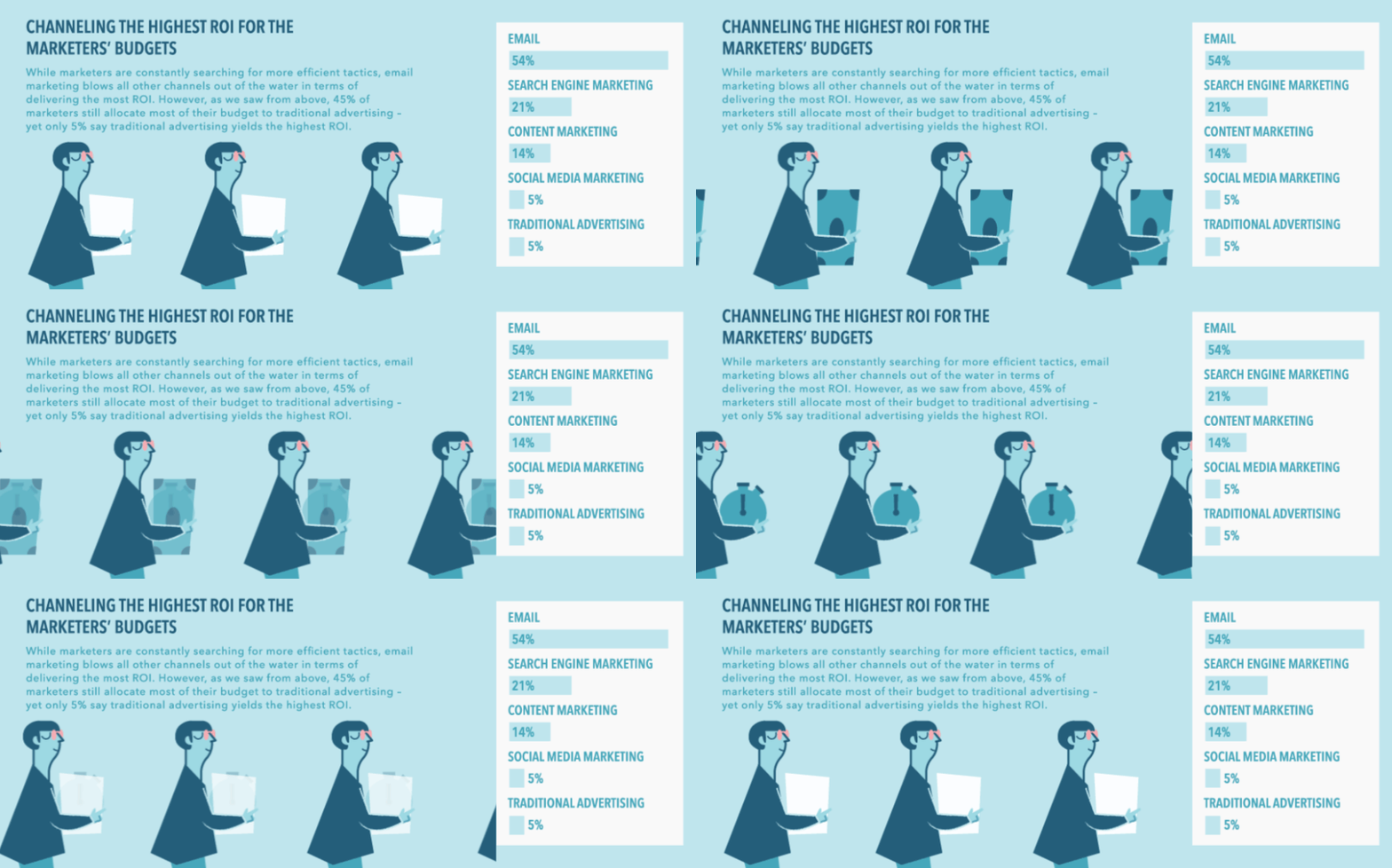
Example: We helped Newscred visualize the results of their content marketing survey by creating an animated infographic. The modular design allowed panels to be used individually or together.

Learn more about the power of motion in visual content.
Interactive Infographics
Interactive infographics are ideal for instances in which you have an enormous amount of data that needs to be easily navigable. You may present that as an exploratory interactive, in which users can dive into the data to extract their own meaning, or as a narrative interactive, in which you guide them through the interactive. Interactives require the viewer to actively engage by physically inputting information or manipulating data. It also encourages the viewer to spend more time with the content.
Good for: Engagement, deep data exploration, and immersive storytelling.
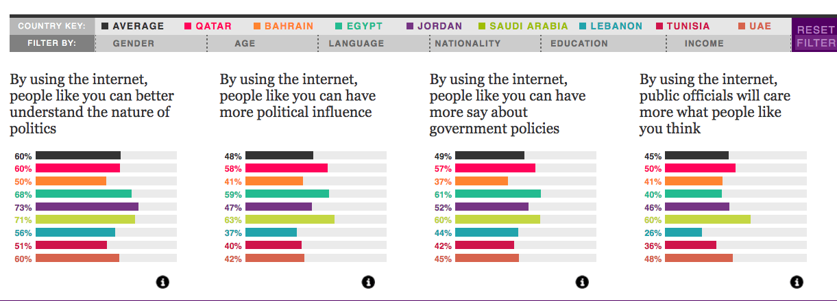
Example: We turned 10 million cells of data from a Northwestern University Qatar survey into a clean, colorful, easy-to-navigate piece. The interactive allows for exploratory storytelling, where the user can decide what data they are most interested in.

Learn more about the benefits of interactive stories.
Motion Graphics
Motion graphics are particularly useful when you have an abstract concept or a story that needs more context to connect the dots. It is a contained storytelling format, which makes it easier to deliver a succinct story or direct message. It is also passive, allowing the viewer to sit back and absorb.
Good for: Telling a succinct story in a short amount of time.
Example: We collaborated with NBC Universal to create a motion graphic encouraging Americans to reduce food waste, using data from the Natural Resources Defense Council.
Check out 6 awesome examples of storytelling through motion graphics.
Video
Video has become an increasingly popular medium, largely thanks to social platforms. Like motion, video can also incorporate text, graphics, and data visualization and offers an opportunity to demonstrate creativity. However, perhaps its strongest selling point is its ability to put a “human” spin on data stories by putting actors front and center.
Good for: Telling a succinct story in a short amount of time, especially when you are trying to create an emotional connection with the content.
Example: We partnered with Foodbeast and Totino’s to help tell a data story about Americans’ binge-watching habits. Using the actual Totino’s product as a visual challenged us to come up with creative data visualization.
https://vimeo.com/190951671
Learn more about why humans are so attracted to video.
Remember: Story First
No matter what data visualization format you choose, remember the basics that will make it succeed: Strong data and a strong story. If you need a little help in that area, here are some things that might help:
- Learn more about why data storytelling is so powerful.
- Find out how audience personas make sure your data stories will capture people’s interest.
- Check out these 9 sources for great data.
- Dive deeper into data storytelling with our book Infographics: The Power of Visual Storytelling.
If you need a little help with your data storytelling, we’d love to work together.


