There are a lot of things that 2020 brought to our company: a global pandemic, a few exciting moves, some new babies, some big marketing lessons, and, of course, the chance to do a lot of great work with awesome partners. That’s something we never take for granted, especially in times like these.
We’ve worked with so many people over the years, but one of the things we appreciate most is that our partners always keep us on our toes. Every project requires a unique solution, and each one helps us grow in a new way. But there are some projects that stick out not only because we loved the partners but because they really challenged us.
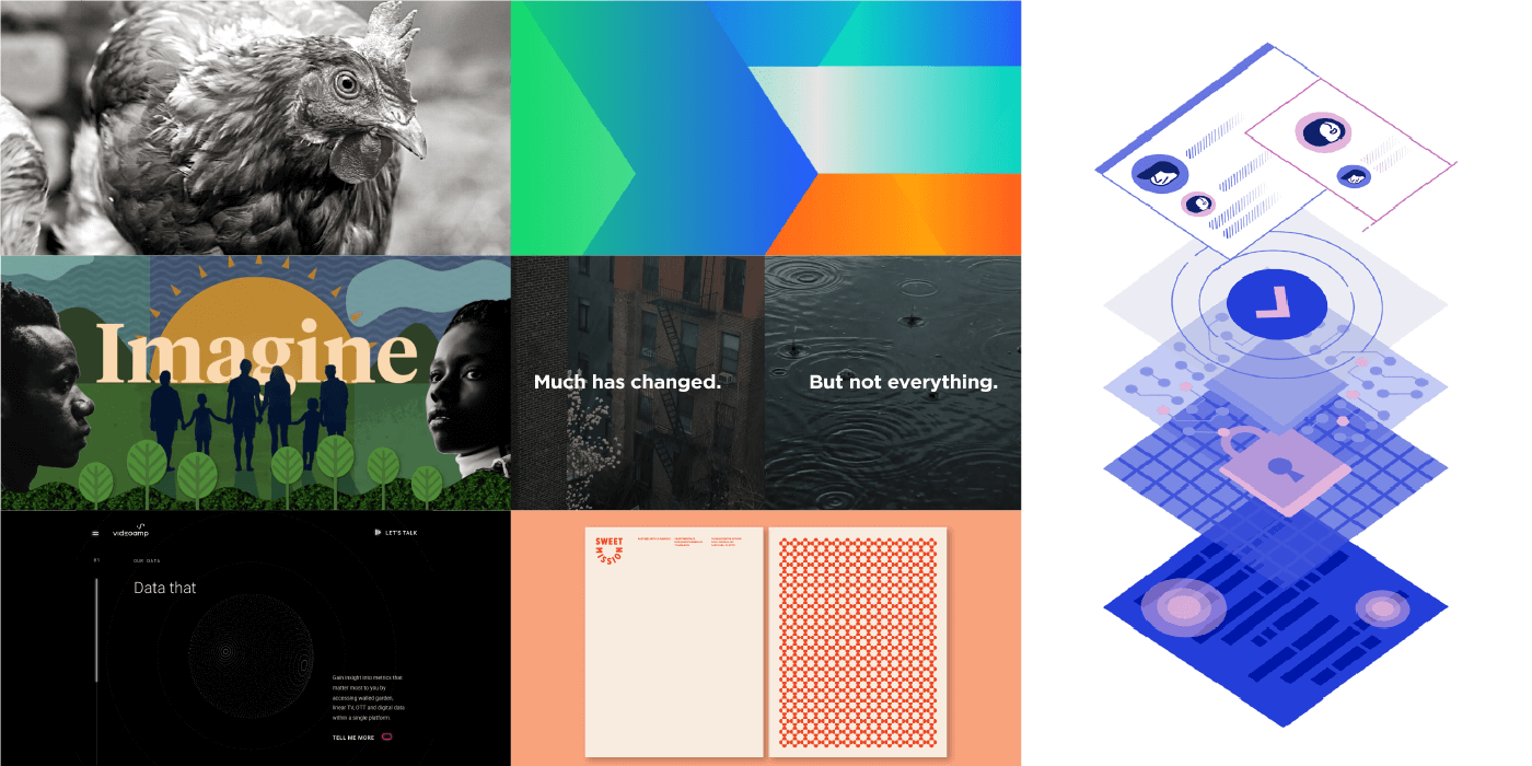
As we’ve been reflecting on the work we’ve done over the last year, from interactives and videos to websites and research reports, we realized this might be a good time to let you behind the curtain to learn about our creative process and see what our work looks like in the wild.
We won’t call this roundup a “best of” because we’re proud of all the work we do. But we can say that these seven projects made us think in new ways, find new solutions, and flex our creative muscles. We hope they’ll inspire you to do the same.
1) Compassion in World Farming
Project: 2020 EggTrack Interactive Report
Compassion in World Farming is an organization focused on ending factory farming, particularly the practice of caging egg-laying hens. Around the world, 100+ major companies have committed to using 100% cage-free eggs by 2026 or sooner, and CIWF is committed to helping them to do it.
The challenge: As part of this initiative, each year CIWF releases EggTracker, an innovative tool to track company progress toward that commitment, encourage transparency, and ensure they’ll stick to their commitment. This time around, the organization wanted to elevate the experience, so they asked us to build an interactive visualization. With so much data (270+ companies), presenting the information in an easy-to-digest format was a challenge, but we were up for it.
The solution: To turn the spreadsheet into a beautiful, seamless experience, we focused on usability and presentation. We started by cleaning and sorting data to allow people to search using different filters, including company size, region, most progress, least progress, industry, and year. This would allow users to track individual company progress, as well as larger industry trends, giving people a micro and macro view of market shifts. (Shoutout to our Senior Developer Cale Dunlap and Designer Adam Chung for sorting, cleaning, and triple-checking every data point.)


From there, we brought the data to life through simple, clean visualizations As we wanted people to focus on the story the data was telling—without the distraction of chart junk and other visual elements—we used only CIWF’s bold green color as the visual accent.
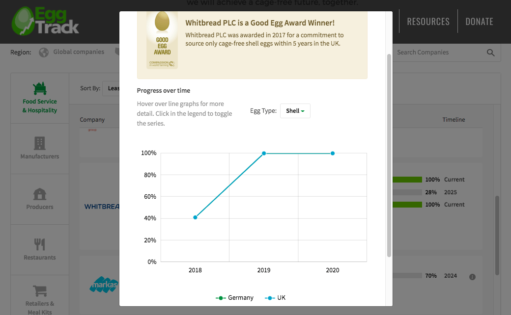
The result: it landed a feature in Bloomberg, and our CIWF partners called it the best EggTrack report yet. While that’s feedback we love to hear, what we love most is getting to do work that helps create a better, kinder world for us all. For that reason, we’re grateful to the CIFW team for putting their trust in us,
If you’re looking to showcase your brand’s values a little more, see how these brands turn their values into great content.
2) Informa
Project: Logo Rebrand & Guidelines
Informa is a leading international events, intelligence, and scholarly research group that connects people from different industries to help them learn more, know more, and do more. Their annual conference in Anaheim, California, is the largest advanced design and manufacturing event in North America, bringing together 20,000+ attendees from five industries: medtech, plastics, automation, design, and packaging.
The challenge: Informa has a variety of sub-brands (five to be exact) that represent each industry at the conference, and their logos were all in need of a redesign. As these five brands would be featured heavily on signage and collateral at the conference, the real challenge was to design a set of logos that would accurately represent each individual brand, yet complement each other aesthetically and convey that they represent increasingly connected industries.
Old Logos

The solution: A logo redesign is always a creative challenge, but five? That can be a struggle. Instead of designing each logo individually, then modifying them to look similar, we started with a single element that would appear in all logo iterations: an arrow. This represented the progress and movement of each industry, and gave us a strong geometric foundation to build the other logos. As we do with all our logo designs, we designed a simple grayscale version first. This approach ensures that the logomark is strong enough to stand on its own—without color.

Next, we fleshed out the logomarks for each brand, using imagery inspired by each industry. Some of the imagery borrowed from the existing logo, and others were new iterations entirely.
To create a visual throughline, we incorporated the arrow motif into each logomark in a different way, using the brand’s color palette to differentiate as well. Each wordmark also used a uniform typeface with dynamic angles and a bold weight, perfectly complementing the logomark design.
Old Logos
New Logos![]()
The result: Together, the logos depict a strong community—one of the key themes of the conference itself. With the logos complete, we wanted to ensure branding would be applied consistently, so we also crafted guidelines with directions for logo, type, and color use. Now, the Informa team can confidently create a variety of high-quality collateral for years to come.
If you’re looking to rebrand yourself, find out what you need to know before you rebrand, and check out our roundup of awesome rebrands.
3) VideoAmp
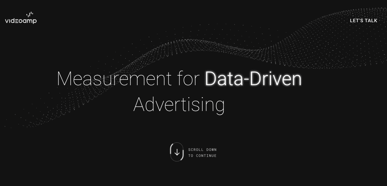
Project: Website redesign
VideoAmp is a software and data platform that helps marketers optimize their media investment. Their mission is to empower the world’s largest marketers by giving them the information they’ve always wanted but never had.
The challenge: VideoAmp approached us with a tall order: to create a brand new website that would make them stand out from their competition, make an impact on every visitor, and even nab a few design awards. Obviously, these words were music to our ears.
The solution: If there’s one thing we know, it’s that strong brand storytelling is the key to all good content, be it a full website or a simple tweet. Before we dove into site design with VideoAmp, we realized we had a big opportunity to help them better articulate their brand story.
We started by revisiting their brand strategy to clarify their goals, align their messaging, and understand exactly what brand story we wanted to tell. This would influence our creative decisions about the website, so we needed to make sure we had a strong messaging foundation.
First, we focused on concise but compelling messaging, explaining what VideoAmp does, emphasizing the value for their customers, and positioning them as experts in their industry.
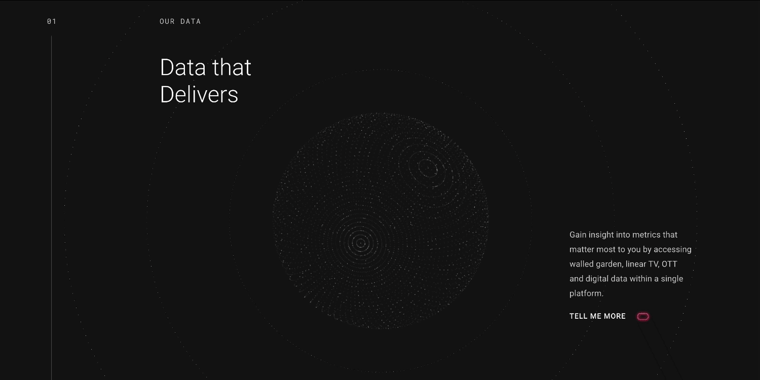
To visually reinforce their credibility, data-centric approach, and precision measurement, we focused on a clean but sophisticated aesthetic using a black-and-white color palette punctuated by intentional uses of color. To give it more life, we designed a backdrop of animated visualizations for more movement and excitement. These abstract visualizations also mirror chart design, helping to emphasize VideoAmp’s focus on data-based solutions.

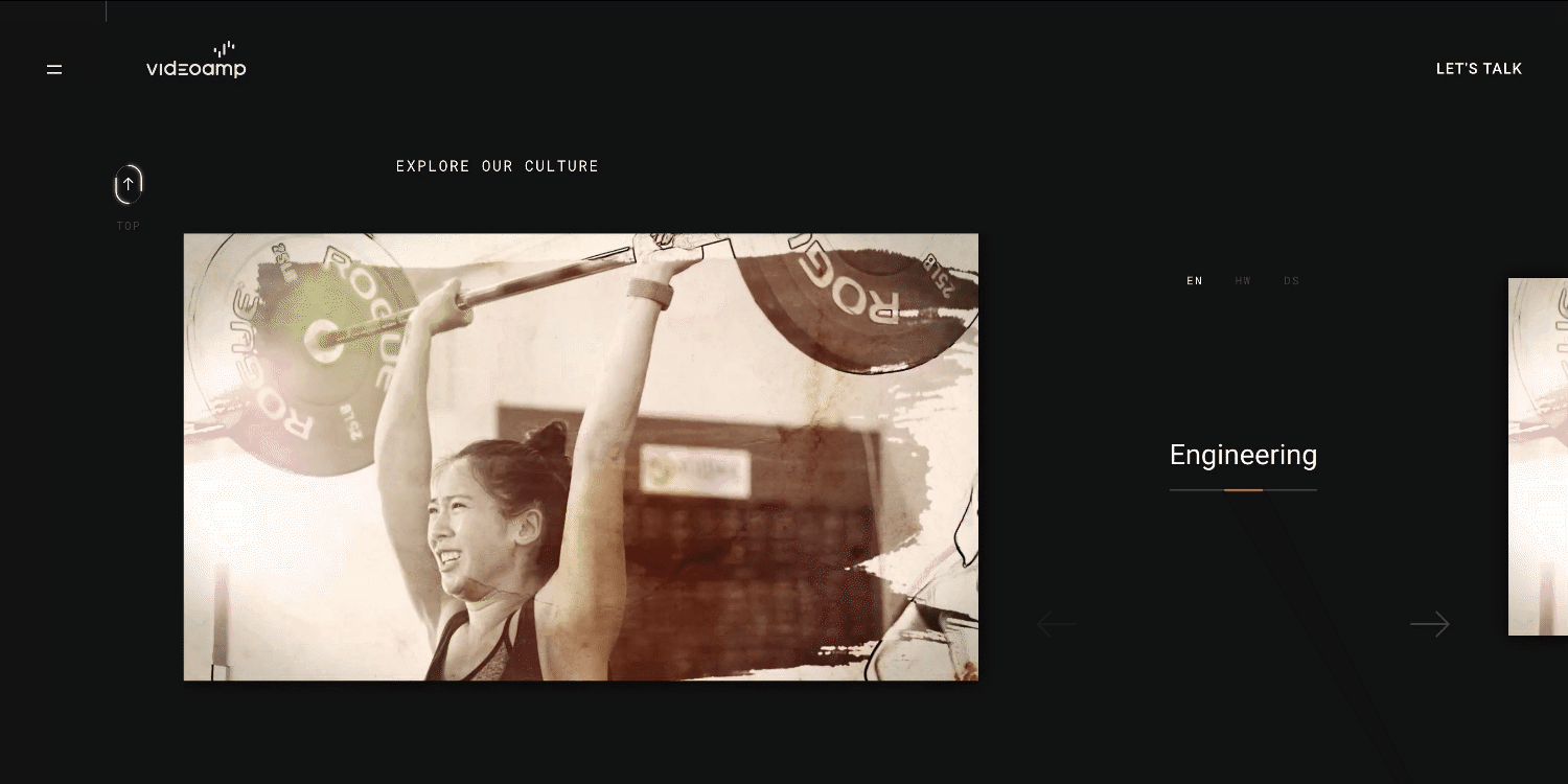
VideoAmp also wanted to feature their people more prominently. (After auditing their site, they realized culture content was particularly interesting to visitors.) To do this, we added more personality to the site through employee-centric videos, imagery, culture content, etc. This allows visitors to understand what VideoAmp does and, just as important, who they are.
The result: VideoAmp’s goal was to increase MQLs by 200% per month. In the first month since launch, they increased…850%. Oh, and they also nabbed an Awwwards Honorable Mention and a Mobile Design Excellence Award.
If you want some more detail about the project, see the whole story of how they optimized their website. If you think your own brand strategy could use some work, download our free Brand Strategy Toolkit to work through your Brand Heart, messaging, and visual identity.
4) Othering & Belonging Institute
Project: We the People, not we the corporations Video
The Othering & Belonging Institute brings researchers, organizers, stakeholders, communicators, and policymakers together to help create an inclusive, just, and sustainable society. We’ve partnered with them for some time now, and while we’ve always valued their work, their mission has been particularly relevant this year, as racial justice, social unrest, and political instability threaten our society.
The challenge: To shine a light on the danger of unaccountable corporations, the Institute asked us to create a promotional explainer video that could be used as a conversation starter to educate viewers about the subject and compel them to learn more.
The solution: The beauty of motion is that you can rely on visual and audio to tell the story. Visuals should always reinforce the narrative, but in the case of this video, figuring out what to depict was the core challenge. We wanted to strike the right tone, as this is a serious subject, but also find a way to visually communicate ideas that are abstract, such as wealth inequality.
The solution was a collage-style motion graphic video, blending photography, animation, kinetic text, graphics, and voice-over to tell the story. We used a limited color palette to communicate the dire situation, but intentionally used accent colors to help emphasize key elements in the narrative and convey a sense of urgency.
The result: The video communicates a larger story in a short amount of time, providing value to the viewer. Paired with the video viewer’s guide, a PDF of discussion questions prompted by the video, it’s the perfect conversation starter to help the Institute educate the public.
Motion graphics can be a powerful tool to tell your brand story. Find out more about why they work, and follow our guide to create them.
5) Sweet Mission
Project: Site, Brand Identity, Packaging
Sweet Mission is a cookie company with a larger mission: to help people with tumultuous pasts get back on their feet through employment, mentorship, and the skills needed to eventually run their own businesses.
The challenge: This project didn’t actually come to us as a client request. At a Connecting Things event, we heard Sweet Mission founder Jason Mercado (a true gem of a person) speak about how he had pulled himself out of homelessness and founded his business to help others do the same. We were so moved by his story we offered our services to help Sweet Mission build their brand and tell that story more effectively.
Off the bat, we noticed that the brand’s virtual presence didn’t fully communicate their inspiring vision and mission. To remedy this, we decided to develop a strong visual identity, site, and packaging to help Sweet Mission spread awareness and better communicate who they are, what they do, and why they exist.
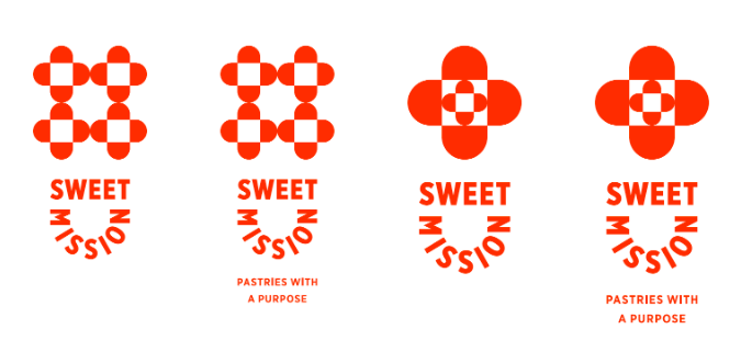
The solution: As with all branding engagements, we started by identifying Sweet Mission’s Brand Heart (their purpose, vision, mission, values). This helped them clarify and articulate exactly what they’re trying to do—and helped us develop a tagline to communicate that in a simple, snappy way: “Pastries with a purpose.”

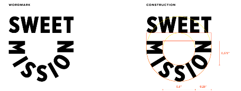
Next, we dove into the visual identity. Since Jason’s brand is all about baking for good, we were drawn to the visual of a mixing bowl, the place where the magic happens. This became the basis of our logo iterations, influencing the shape of the wordmark, as well as the four connected bowls in the logo.
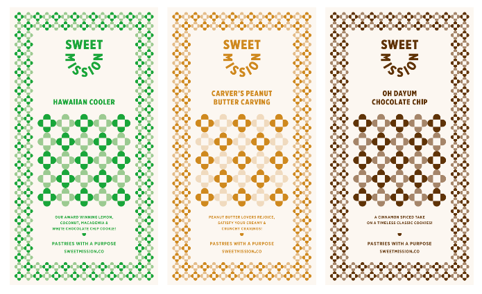
To create visual consistency in the visual identity, we repurposed the magic bowl motif throughout the website and carried it into the packaging as well. By using the same motif but playing with different colors for different cookies, the packaging tells a consistent brand story but still provides more visual interest.
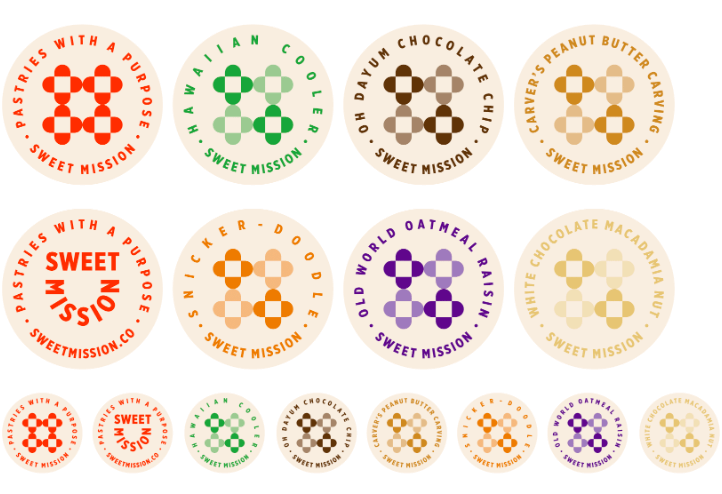
One of the biggest goals in designing the identity was to create flexible branding that could help Jason establish a presence—and grow with his business. To do this, we designed unique packaging solutions in the form of stickers and a rubber stamp. This would let Jason personalize generic packaging to maintain brand consistency, while keeping costs down.
Luckily, while working on these elements, our friends at Change for Balance also heard about Jason’s inspiring story. They eagerly volunteered to help by creating a short docu-style video showcasing Jason’s story and mission—the perfect piece of branded content to showcase on web and social, which was an unexpected but much appreciated addition to the project.

The result: Ultimately, between the brand identity, assets, and site, we were able to give Sweet Mission a cohesive, consistent brand presence—and a brand blueprint to grow into the future. We’re especially grateful for Jason’s enthusiasm, ability to provide thoughtful feedback, and eagerness to collaborate. If you’re in the mood for something sweet, head on over to his site.
Find out more about why we support passion projects, how we choose them, and what they look like in action.
6) Blend
Project: Measuring Up: Best Practices for Consumer Banking Applications E-Book
Blend’s digital platform streamlines the journey from application to close—for every banking product. Naturally, they are invested in creating the best experience at every stage of the process and empowering their clients to do the same.
The challenge: For this project, Blend was specifically interested in a report that would explore the state of the industry as it relates to the application process for deposit accounts, the keys to a good process, and how institutions can best serve their customers. To create the report, however, they needed a partner to do the research, craft the content, and design it. We were happy to take it all on, as we’ve been data geeks from day one.
The solution: This wasn’t a standard data design project. Before we could bring the data to life, we needed to get it. To start, we crafted custom criteria to outline the key factors you need to create a successful application experience—for every type of consumer. From there, we audited a list of 100 financial institutions (including banks and credit unions) and scored each according to the criteria.
Of course, the challenge with all data storytelling is identifying the most relevant information (aka the real story). Because the primary goal of the report was to help readers improve their own application practices, we focused on identifying industry trends and the most interesting insights to turn into relevant takeaways for the reader.

The result: This high-value piece of content establishes Blend’s authority and expertise in the industry, and positions the brand as a trusted resource to their customers—a content marketing win-win.
Data storytelling is one of the best ways to create credible, original content. To do it right, download our free e-books The Content Marketers’ Guide to Data Storytelling and Data Visualization 101: How to Design the Most Common Charts and Graphs.
7) Column Five
Project: Stay-at-Home Video
In a pre-pandemic world, our team was already used to working remotely. Portland, New York, Boise, LA—we’re everywhere. But that didn’t make the isolation of stay-at-home orders any easier.
The challenge: We missed being in the office, or having the option to be in the office. But we decided that even if we couldn’t be together IRL, we could still do something together. And we felt the need to express solidarity not just with each other but with our larger community.
The solution: We always like to experiment—and in a time when the world seemed upside down, we figured there was no harm anyway. So we decided to collectively create a video to capture what we were all experiencing.
As part of our group project, everyone in the office submitted a stay-at-home story in the form of a video clip documenting a part of their day. The result was a beautiful collection of moments. From birthdays and ultrasounds to stretch breaks and craft projects, they were mundane, sweet, surprising, and even scary. And when edited together, they showed us just how connected we really are—an honest reminder that life goes on even in hard times.
The result: We’ve created a lot of things we’re proud of in the last decade of C5, but this simple video will be one we’ll always remember.
Even if your team is apart, you can still make great videos together. Check out these 6 ideas to create video content even if you’re remote.
Looking back, we’re grateful for what we learned this year. We’re also eagerly looking forward to what’s next. As crazy as things are, we also see more exciting opportunities for marketers to create better content, experiment with more formats, and make the most of the resources at hand. If you’re ready to make waves in Q1…
- Think about how you can end the year strong with these 10 ideas to spend your remaining budget.
- Revisit your brand strategy to make sure it’s aligned to your content strategy.
- Prep for next year with this content marketing checklist.
And if you’re looking for a partner to help you hit your goals, check out these tips to find the right content agency for you, or hit us up. We’d love to help you make 2021 your most successful year yet.

Let's upgrade your marketing game
Get fresh tips, how-tos, and expert marketing advice every week. (15,000 people already are.)