Why a Recession Is a Great Time to Invest In Your Brand

Recession. It’s all anyone is talking about. Yes, the predictions are foreboding. But, for savvy marketers, this actually presents a huge opportunity to not only master your marketing during the recession but emerge even stronger after—if you focus on nurturing one thing: your brand. 

There’s a common adage in the fitness space that says 20% of results come from the gym, 80% come from the kitchen. (In short, you can’t out-exercise a bad diet.) I apply that same philosophy to companies looking to beat their competition in marketing. It doesn’t matter how much content you create. If you don’t have a strong brand foundation—core beliefs, strong messaging, and a solid strategy—you simply can’t produce good marketing. 

You can’t out-content a weak brand.

So with a recession looming, now is the perfect time to take a good hard look in the mirror. Double down on what’s working, taper off things that don’t produce results, and shore up what needs to improve. This starts with taking a critical look at your brand—something that influences so much more than your marketing alone. 
Brand Stratetegy toolkit CTA

How Your Brand Can Help You Through the Recession

A recession poses so many more threats to a company than customer base attrition. Your industry, your reputation, and your recruitment efforts are all vulnerable, too. And if you don’t make the right moves to navigate these pain points, you will lose long-term. Fortunately, investing in your brand during this time makes you bulletproof in five key ways, all of which are crucial if you want to win your market when the economy recovers.

1) A good brand strengthens your marketing.

During a recession, marketers are often asked to do more with less. That means every piece of content you create needs to make an impact. If your existing brand is not as clear or resonant as it should be, your marketing and sales teams have to work harder. (During a recession, that is a particularly challenging uphill battle.) 

Conversely, the clearer and more aligned your brand is between your business goals and your clients’ needs, the more resonant your marketing will be. You’ll reach the right people who are enthusiastic about buying from you, and you’ll even transform sales into the art of facilitating a purchase with bought-in believers. 
But that all starts with fine-tuning your brand: articulating your brand heart, clarifying your brand strategy, and creating strong messaging. 

  • Reassess your positioning to ensure you’re playing in the right market with the right product/service and targeting the right people. 
  • Tighten your messaging to create stricter criteria for storytelling, ensuring your marketing only delivers the most compelling stories that convert. 
  • Realign your content strategy to maximize your impact (e.g., update content, identify the right cadence and volume, optimize your production process, etc.).

Each of these actions can pay off tenfold in downstream marketing improvements. Remember: A strong brand gives you clarity and a clear direction, letting you spend the rest of your energy on strategizing the most effective ways to create good marketing as effectively as possible.

(Find out more about how to translate your brand into strong storytelling that resonates.) 

2) A “slower” time is the ideal time to do the brand work you’re too busy to do.

One of the biggest mistakes companies make (especially in SaaS) is viewing brand as a “nice to have” or a luxury during good times. These are the same folks who think of a brand as only a logo, the people most likely to shoot down a legitimate push to update said brand in good times. But a brand is not fluff. In bad times, it is your lifeblood.

The silver lining of a recession is that leadership’s mindset often shifts from “If it ain’t broke, don’t fix it” to “what changes can we make to survive this?” If you’re in a brand or marketing role, my best professional advice is to reframe this time as an awesome opportunity to become your ideal brand. If business is slowing down and you have fewer campaigns and initiatives, you can do the deep work now to become the brand buyers flock to in the future. (In some cases, this may be your only opportunity to take the time to do this work—consider it a “once in a decade” opportunity). 

Use your CEO/C-Suite’s desire to “make shit happen” (often fueled by wanting to show their team or investors they’re not operating passively) to get the buy-in you need. 

(If you need some backup, learn more about why you should ditch growth-hacking and focus on brand-building.)

3) Clients are less likely to cut ties with strong brands.

During periods of recession, businesses make cuts to everything that isn’t considered mission-critical. Thus, your product or service may be on the chopping block.

The more commodified your brand appears (especially if you’re spamming B2B buyers with desperate-looking flash sales), the less perceived value it has, so it is much easier for customers to go without.  

But if you present yourself as a differentiated brand with a respected reputation, you appear more reliable and sustainable, making your customers trust and want to keep your product/service because they view it as a worthy investment. 

Remember: Your brand is the story you tell your customers—and the story they tell themselves and others about your company.

If your customers can’t tell you apart from your competitors, you’re not gonna make it. A strong brand strategy is the key to differentiation—and a powerful way to form meaningful relationships with your customers (if you share values, goals, etc.). Those relationships themselves can help you make it through the winter.

84% of B2B buyers would buy from a supplier who they had a great relationship with—even if the terms of business were less preferential.
—Sana 2022 B2B Buyer Report

Fortunately, if you haven’t done much brand work before this recession, all is not lost. As they say, “The second best time to plant a tree is now.”

(For more guidance, see our tips to differentiate your brand.)

4) You can become the market leader after (if you adapt and others haven’t done this work).

Buying behavior often changes in a recession, and then again when there is a recovery. The market needs and wants change. Sales cycles evolve. If you hope to keep riding the wave that brought you success pre-recession, during a downturn, and then afterward, you’re smoking hopium.

During a recession, no one is coming to save you.

But if you invest in your brand, you have a solid foundation and a North Star to grow, evolve, and adapt at every point. Your Brand Heart helps you stay true to your principles and make the right business decisions for your people and your customers. Your brand strategy guides your moves in the market. During recessions, best-in-breed brands that are able to adapt well consolidate their position as market leaders and actually get stronger, even if the recessionary period represents some down years. When the market turns back up, they tend to grow first and grow the most, leaving others in their wake. 

Brands that do not adapt quickly find themselves struggling for relevance and often witness their lunch being eaten by their nimbler competitors, including upstarts that see changes to the marketplace as opportunities to exploit and leverage. 

The best leaders know it pays to be front-footed, and C-level folks will be impressed if this is framed as an opportunity to do just that. (See point 2 re: investing in your brand now.) Strengthen your brand foundation and you can be decisive and pivot quickly, emerging as a clear market winner. 

(To outshine your competition, find out how to tell stories they can’t.)

5) You can achieve brand singularity that will sustain your business long-term. 

Your success is not only dictated by your customers. Your employees are an equally valuable asset, and creating a brand that attracts the best talent is one of the best ways to future-proof your business. 

While recessions prompt many companies to freeze hiring or cut headcount, the reality is that it’s your people, their resolve, and their decisions that will determine your ability to adapt. 

As lines blur and people want their personal brands to align with their employer brands, and their employer brands to align with their public-facing brands, brand singularity is the holy grail. Thus, it’s more important than ever to create a holistic brand that resonates with your employees (and future employees), as well as the marketplace. 

Whether your company grows during the recession or stays in a holding pattern until the rebound, you’re going to want to update your talent brand as part of your larger brand efforts. 

Note: During the financial crisis, this was still a somewhat foreign idea to most companies, but today, with the advent of job and company review sites like Glassdoor, building an intentional employer brand is becoming table stakes in the mission-critical art of recruiting, assembling, and retaining a world-class team. 

Even if you already have a strong public-facing brand, investing in this aspect of your brand during this recession will pay you dividends in the long run. 

(Find out more about why building an employer brand is crucial to compete in the market.) 

How to Strengthen Your Brand Now

If you do the work now and play your cards right, you can walk away from this time as the Recession MVP of your market. But you need to get started ASAP. 

That said, this is deep work that can’t be accomplished in a vacuum—or overnight. If you need expert help to guide you through the process, see our tips to find the right creative agency for you, take a look at our brand strategy FAQs, or reach out. We’ve helped the world’s best brands find their brand and bring it to market. We’d love to do the same for you, too. 

Brand Stratetegy toolkit CTA

What Is an Infographic? Why They’re Great & How to Create Them

What is an infographic? Though infographics have become a go-to marketing tool over the last decade, we still commonly receive questions about the various terms used to describe this field of design. What is the difference between data visualization, information design, visual content, and infographics? The confusion is understandable. Many of the labels thrown around not only overlap but can be open to individual interpretation. It gets tricky.

Luckily, as an agency with a decade in the game (and a book to boot), we’re here to demystify it all and give you insight into the world of infographics, why they’re useful, and how you can take advantage of this exciting medium.

What Is an Infographic?

Well, let’s start with the word itself. “Infographic” is a portmanteau of the words “information” and “graphic.” In essence, an infographic is a form of visual communication meant to capture attention and enhance comprehension. In this era, “infographic” has become the broadest descriptor of a specific type of visual communication that includes graphics showing data, copy, or both. You’ve probably come across these types of visuals in magazines, online, or on the wall at your doctor’s office.

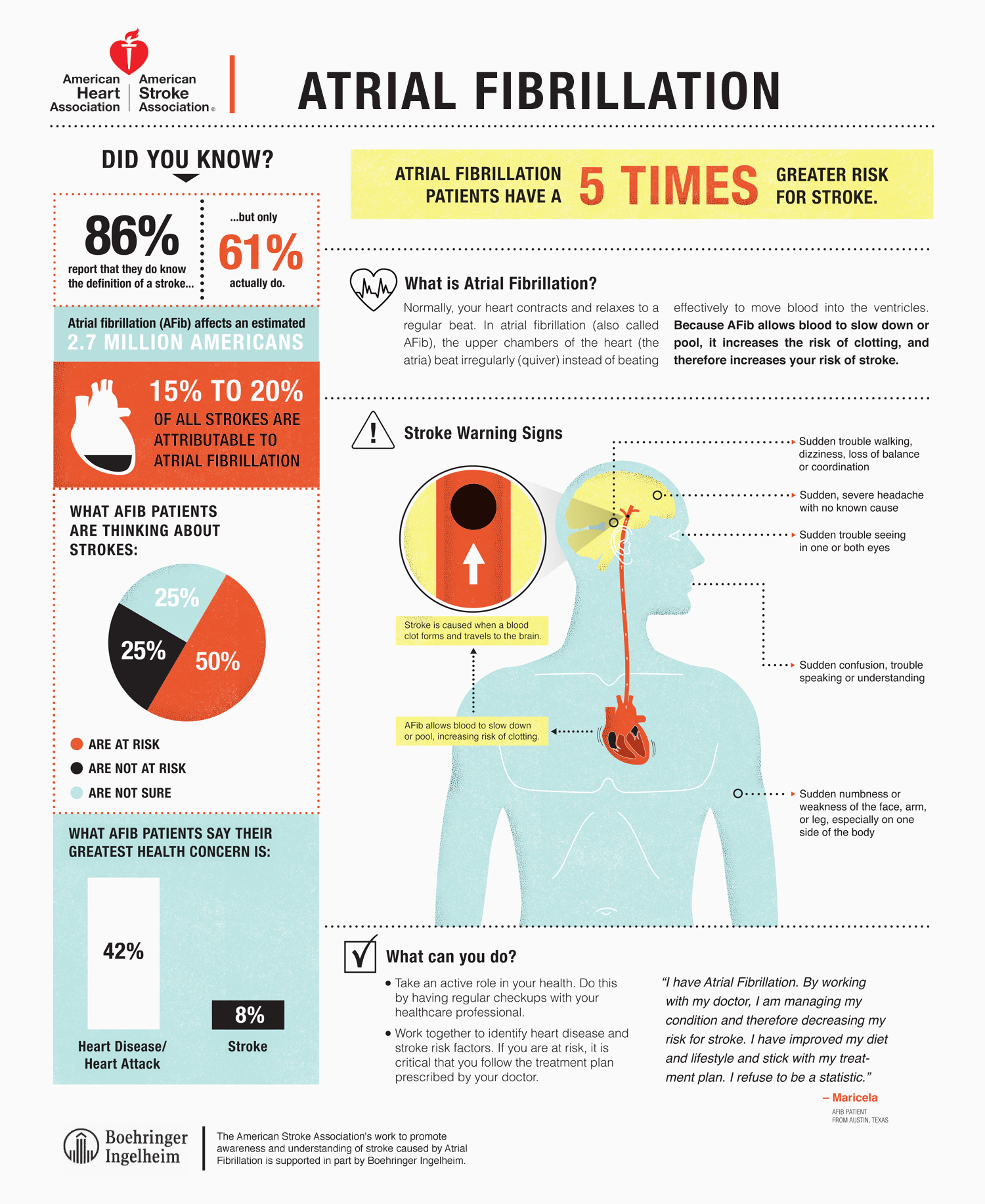
Example: This educational piece for the American Heart Association is an overview of atrial fibrillation. 

What is an infographic 13

The word “infographic” has experienced a meteoric rise in popularity over the last decade, largely due to the use of this medium for both branded and editorial content on the web. But as the buzz surrounding this word has grown, so have the arguments about the real answer to the question, “What is an infographic?” There are many schools of thought, but we believe the term should remain open and inclusive as the medium evolves.

What Are the Different Types of Infographics?

While there are many different presentations of infographics, there are three general categories they can fall into:

  1. Data visualization
  2. Information design
  3. Editorial infographics

Each serves its own purpose and can be a powerful storytelling tool—when applied properly. Let’s explore the difference between them.

1) The Data Visualization Infographic

You may be familiar with data visualization in the form of basic charts and graphs. Data visualization is simply a visual representation of data. We consider it an artistic science, as it uses design aesthetics to increase data comprehension, synthesis, and ultimately recall. Whether you’re looking at meta patterns or single data points, data visualization translates that data into a visual language you can easily and instantly understand.

In the age of big data, this is especially important. We need to both make sense of numbers and be able to easily share the story they tell. To see how and why data visualization is so powerful, take a look at this video. (If you’ll note, we did indeed create a video that visualizes the power of data visualization—case in point.)

Now, want to see the power of data visualization at work? Take a look at the data visualization below.

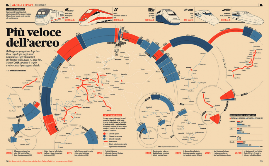
Example: You probably don’t speak Italian, but you can likely decipher the information presented in this graphic by Francesco Franchi. This illustrates why data visualization is the most interesting and universal way to make information accessible and understandable to a wide group of people.

What is an infographic 1

In application, the practice of data visualization is the most numbers-heavy—and typically is what a purist would describe as a “true” infographic. But, as with all infographic design, the display method is rooted in the context and desired message.

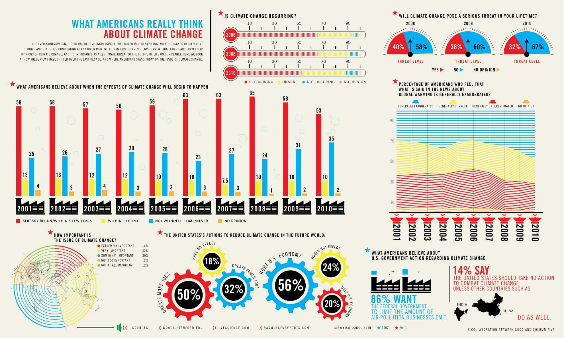
Example: This GOOD infographic features classic data visualization in the form of bar charts, pie charts, and graphs. 

what is an infographic charts

Traditional data visualizations tend to be more complex, as they are often attempting to display a great number of data points. In some cases, though, data visualization graphics functionally serve only as art pieces, if no specific message can be extracted.

Example: Reddit user andrew_elliott created this stunning data visualization of his baby daughter’s sleep habits.

what is an infographic

When properly executed, however, data visualizations should be both beautiful and meaningful, allowing the viewer to decipher data and recognize trends while admiring the aesthetic appeal. (To dive deeper, learn more about why you should embrace the power of data storytelling.)

2) The Information Design Infographic

Information design is a subset of graphic design that focuses on the display of information efficiently and effectively. It’s a broad category, encompassing many functional design disciplines.

It differs from data visualization because it is not made from specific data points but rather concepts or other information, such as process, anatomy, chronology, or hierarchy.

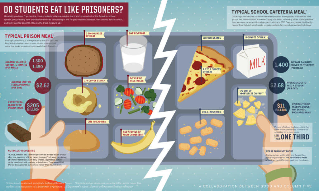
Example: This piece of information design by GOOD compares prison food to school lunches.

What is an infographic 2

In your day-to-day life, you may encounter information design in the form of flowcharts, organizational diagrams, or timelines, clarifying structure and order in a way not possible solely using text.

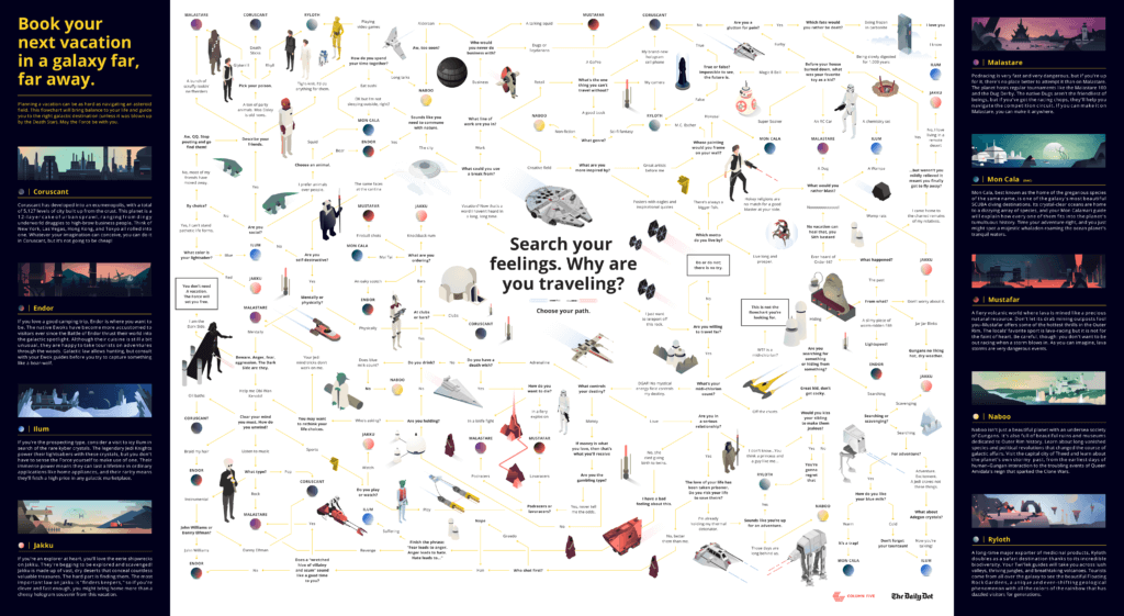
Example: This epic Star Wars flowchart by The Daily Dot is another example of useful information design. 

what is an infographic 3

Instructional diagrams, anatomical illustration, and some applications of cartography would also fall under this label.

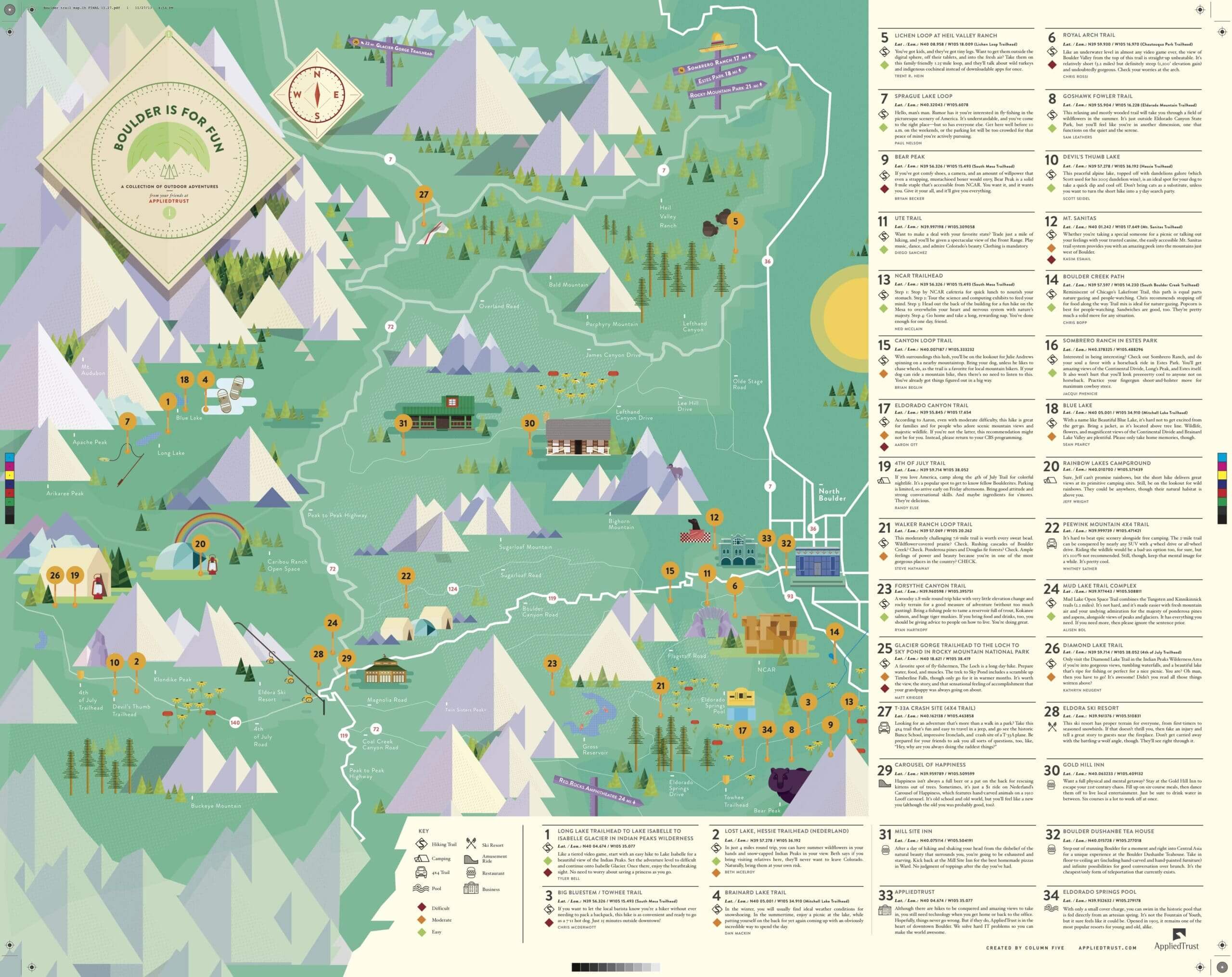
Example: This map by AppliedTrust uses geographic information design. 

what is an infographic map

For information design, the goal is to use design to communicate a message that is both clear and universal.

3) The Editorial Infographic

Although major publications have been featuring infographics for decades, there is a shift in the style and type of visual content they are producing. This trend has also been spurred by the rise of social. Infographics have become highly shareable content, so publications are embracing the medium to better engage readers.

Previously, editorial infographics were limited to simple bars, lines, and pie charts, using illustration solely in more complex features to map an area or show the anatomy of an object.

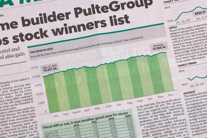
Example: A classic editorial infographic from USA Today. 

What is an infographic 5

But there has been a dramatic increase in the number of publications utilizing graphic content to replace more traditional editorial features.

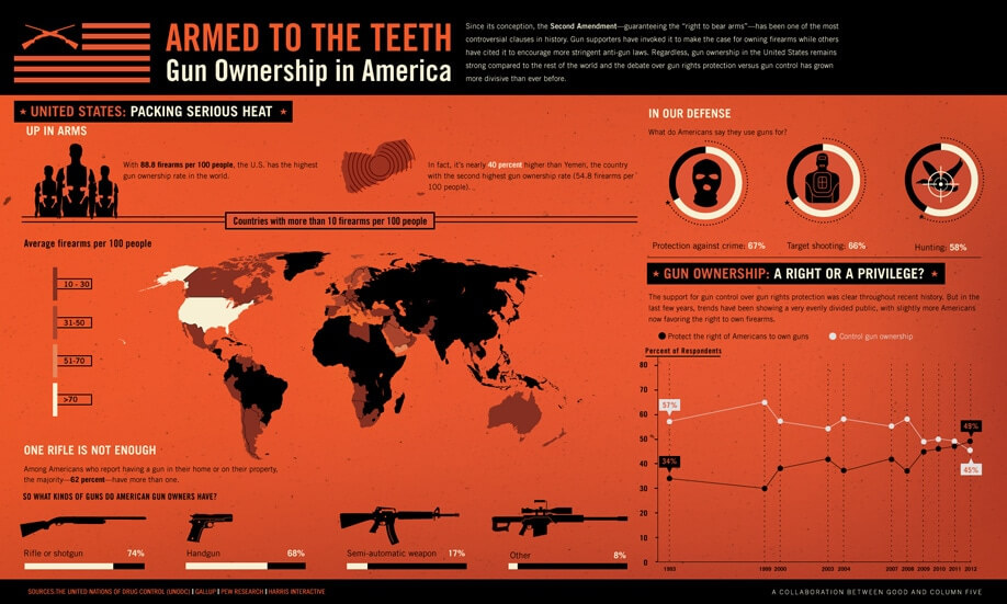
Example: A GOOD Magazine infographic on gun ownership.

What is an infographic 6

This adoption has also spread into the commercial sector, with many start-ups and larger corporate blogs using graphic content or “charticles” to display thought-leadership within an industry and bring attention to their site.

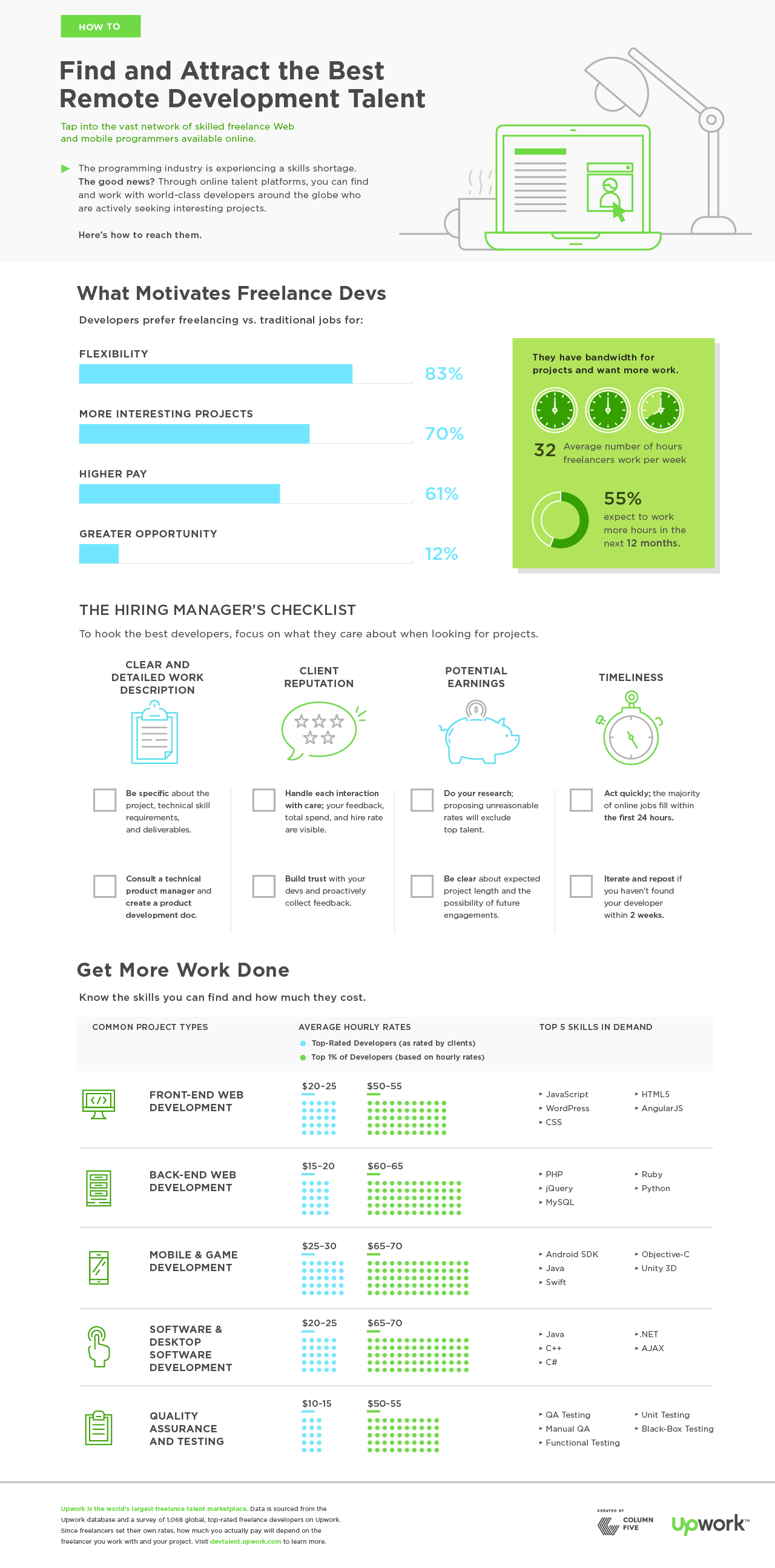
Example: This editorial infographic by Upwork gives hiring managers insight into how to hire in the tech industry. 

what is an infographic example

While some of these infographics can cross the fine line over to advertorial, the good ones do not. The value of editorial content is best realized when providing interesting insight from uniquely informed sources.

This doesn’t mean that infographics aren’t an incredibly valuable tool in marketing. They are, but they are most powerful and effective when they present an editorial narrative vs. a branded message. (For more on that, explore how infographics can benefit brands.)

Infographic Design Styles

Regardless of the content or data depicted—editorial or branded—infographics are more flexible than ever in terms of their design format, allowing you to tell your story in unique and engaging ways. That said, the most common formats are:

  1. Static infographics
  2. Animated infographics
  3. Interactive infographics

Again, each has their own unique benefit. The story you’re telling, as well as the platform you’re using to tell that story, should influence what format you choose.

1) Static Infographics

These are the simple infographics you’re probably most used to seeing, best used in blogs, articles, brochures, print, etc. Even though static infographics don’t “move,” there are many ways to make them visually interesting, including line art, illustration, photography, papercraft, and more.

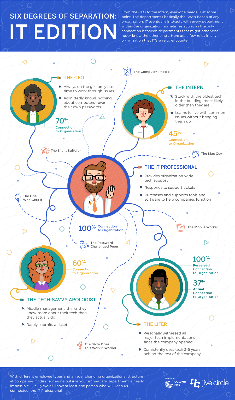
Example: This static infographic by Jive is a useful piece of content marketing, easily shared online or published alongside thought leadership. 

what is an infographic static

2) Animated Infographics

Animated infographics are, as their name implies, animated. You may recognize these as GIFs of infoGIFs. They are particularly engaging if you want to grab attention, making them ideal for use on social, where they will stand out in someone’s content stream. They can also be used to enhance online articles, tutorials, etc.

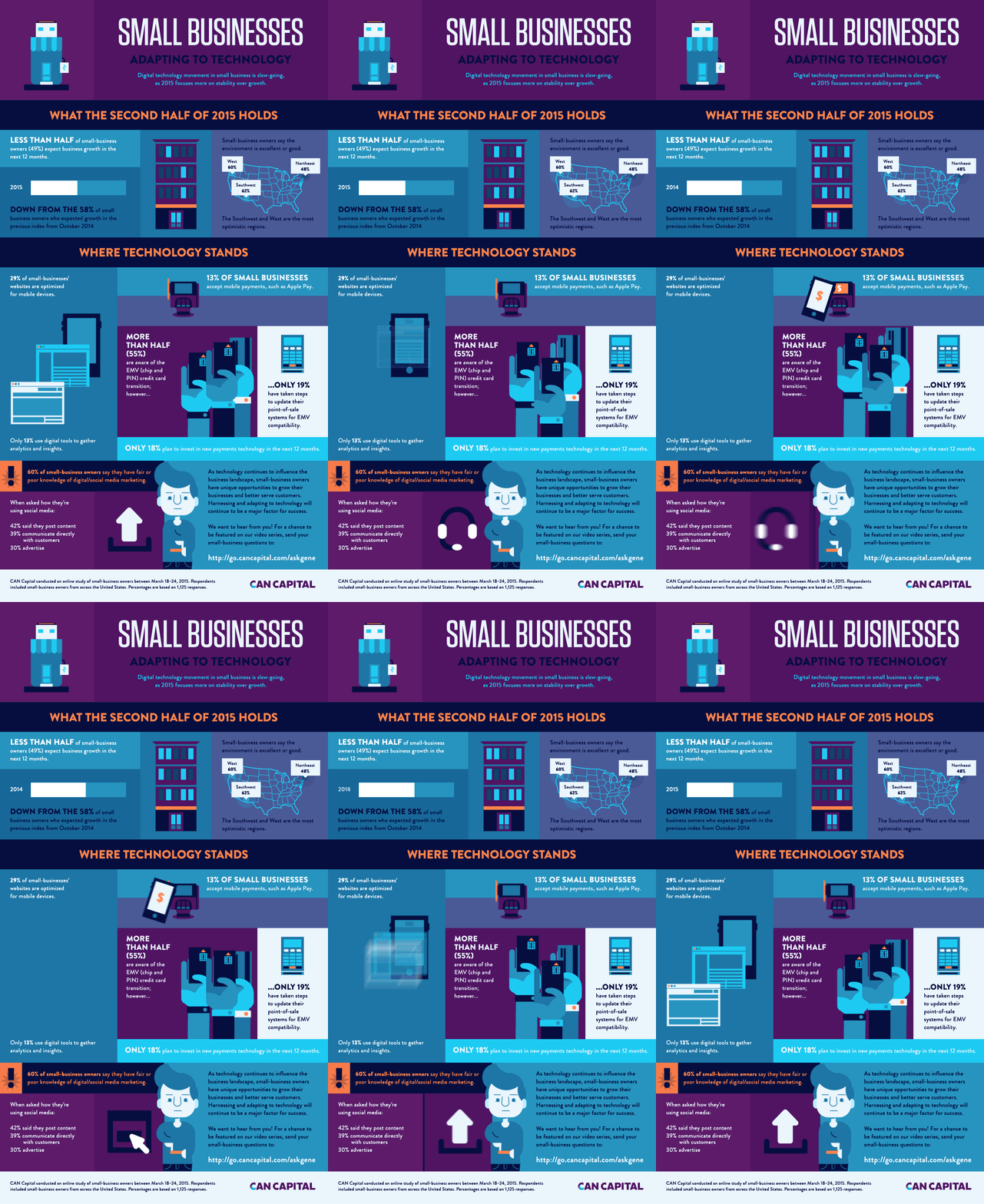
Example: This animated infographic by Can Capital looks at how small businesses are adapting to tech. 

what is an infographic

If you want to experiment with this format, here are 3 ways to turn your static infographics into animated infographics.

3) Interactive Infographics

Interactive infographics require some sort of action or input from the viewer. These are best utilized for large data sets, where a simple static infographic wouldn’t be able to tell the story sufficiently. With interactive infographics, the viewer can either explore data at will, or be guided through a contained narrative.

Example: The interactive data visualization we created for Northwestern University of Qatar turned a staggering 10 million cells of data into an easily navigable experience. 

what is an infographic interactive 1

For more on this format, find out how interactive infographics can tell your story, and check out these great examples of interactive infographics.

How to Create a Great Infographic

When talking about infographics, we need to acknowledge the room for change and growth. Design is inherently about using innovation and imagination to provide clarity, and so the medium will continue to evolve over time. We just hope that as they do, creators will maintain a commitment to quality and integrity in the medium.

So, if you’re feeling inspired to create one yourself, here are our best tips to make it a success:

Of course, you can always hit us up to ask questions, get some guidance, or improve your overall content strategy. We’re happy to help tell your brand story in any way we can.

10 Examples of Infographics with Minimal But Effective Design

Content alone can’t make a truly great infographic; you need great infographic design. The best infographics make a visual statement, combining the best of design and data visualization to deliver a strong story. But sometimes designers get a little excited and over-design (usually with the excuse of “making the most” of the space), overshadowing the story and creating a dense visual jungle for the reader to find their way through. Let’s all take a vow to end that epidemic right now. Sometimes the best stories can be told through simple, tasteful design—no chart junk, no visual clutter. To show you what that looks like, we’ve compiled some of our favorite examples of infographics that take a minimal approach for maximum effect. 

10 Examples of Infographics with Simple Design

If you’re ready to simplify your style, take a look at these beautiful, minimalist designs that put the story front and center.

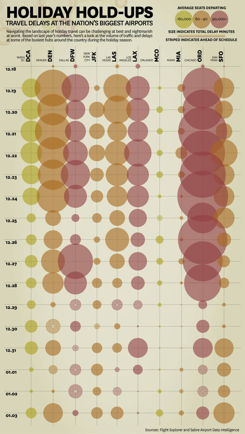
1) “Holiday Hold-Ups — Travel Delays At The Nation’s Biggest Airports” by Travelocity

This infographic provides useful information to travelers looking to avoid crazy holiday air travel. By breaking down travel traffic by major airport and date, Travelocity helps people better plan their trips. With a beautiful color palette and simple design, this infographic features data visualization at its best. The data is intuitively ordered and color-coded, making it easy for any reader to decipher in an instant. 

examples of infographics

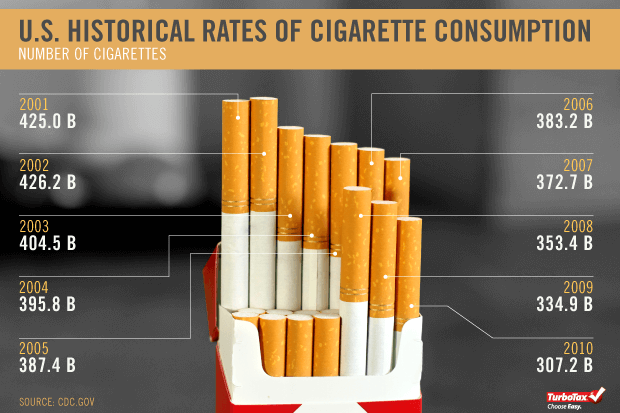
2) “Cigarette Taxes In Photos” by Intuit

Tactile data visualization is a fantastic technique to bring the data on spreadsheets into the real world. And when you can turn the medium into the message, it’s a slam dunk. This infographic series covers cigarette taxes and cigarette consumption, using actual cigarettes to illustrate the data. It’s simple, visually arresting, and creative data visualization that is far more enticing than a static illustration alone.

minimal infographic design

3) “Gadgets Galore” by eBay

This is one of our favorite examples of infographics that use simple data visualization effectively. Here, eBay’s infographic on the most desired gadgets depicts the year-over-year popularity of some of the most popular products in tech, broken down by gadget and consumer age. Whereas the design might have been cluttered by over-illustrations of the gadgets and confusing comparisons, this one manages to present all the information in a neat, on-brand visual.

examples of infographics

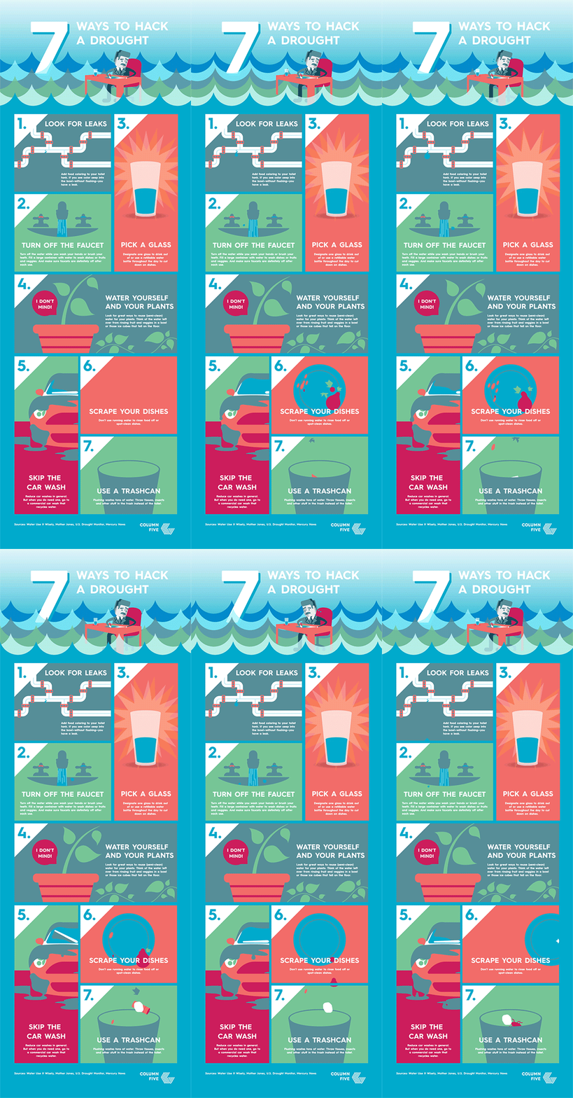
4) “7 Ways to Hack a Drought” by Column Five

Just because a design is simple doesn’t mean it’s relegated to black-and-white line art. This animated infographic design is an eye-catching piece of content that offers easy tips to help people save water. The bright colors and movements bring the story to life, while its modular design makes it easy to extract portions for use in blog posts, social, and other pieces of communication, helping extend the reach of the piece.

minimal infographic design

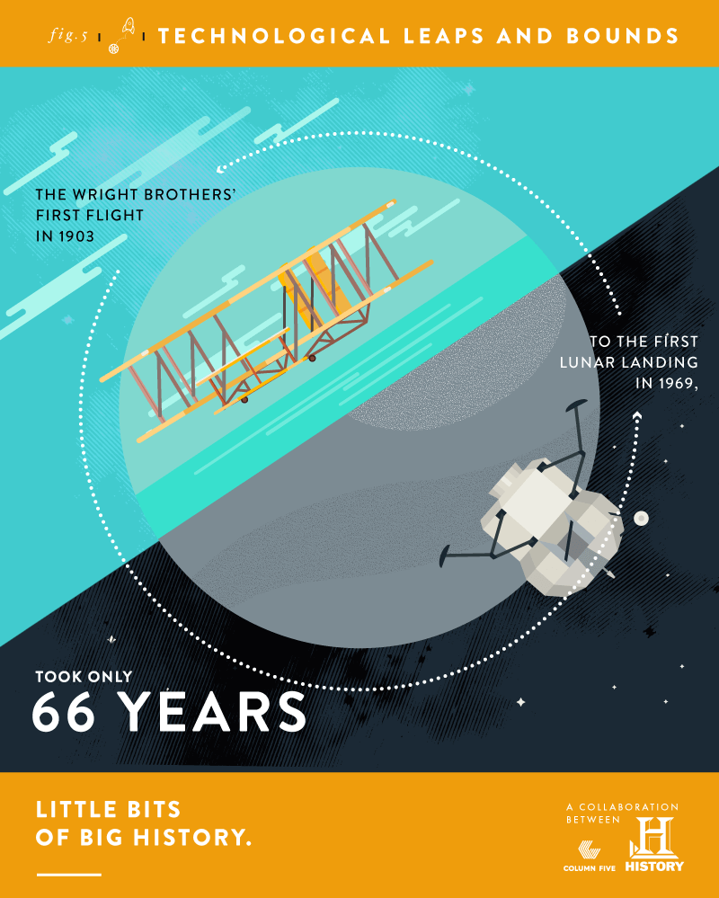
5) “Little Bits of Big History” by A&E Television Networks

This mini infographic series features bite-sized snippets of history, which are easy to digest and fun to share. Featuring facts about everything from the planet Jupiter to the moon landing, each graphic includes a brightly colored illustration or visualization. By creating multiple mini infographics instead of one large one, they could seed the content on social, making viewers eager for the next installment.

minimal infographic design

6) “Inside the DIY Filmmaker’s Toolkit” by Wistia

Even if you don’t have data to visualize, you can still create an infographic design that enhances the content. For this simple infographic depicting the essential tools for filmmaking, simple hand-drawn illustrations add a sense of artistry and capture that work-in-progress feel. For an infographic about DIY filmmaking, this aesthetic captures the infographic theme.

examples of infographics

7) “Find and Attract the Best Remote Talent” by Upwork

The best infographic design presents information in a clear hierarchy, includes strong visualization, and follows an intuitive story arc. For this infographic, a modular design, on-brand accent colors, and clean data visualization guide the reader through the info, delivering the story in a simple and straightforward way. 

minimal infographic design

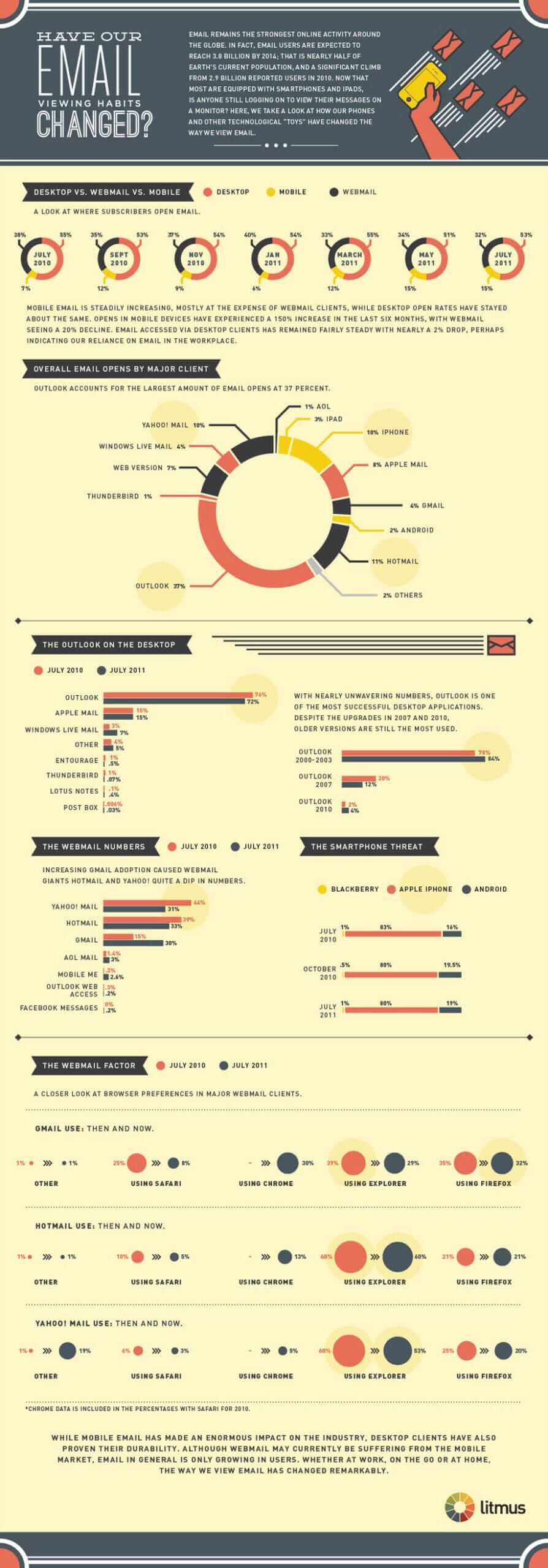
8) “Have Our Email Viewing Habits Changed?” by Litmus

This infographic design is the perfect example of data visualization without chart junk—and story told with minimal visuals. Designers often inject characters or unnecessary illustrations to “color” up an infographic, but the information can be plenty impactful if it’s well visualized, as this infographic shows.

minimal infographic design

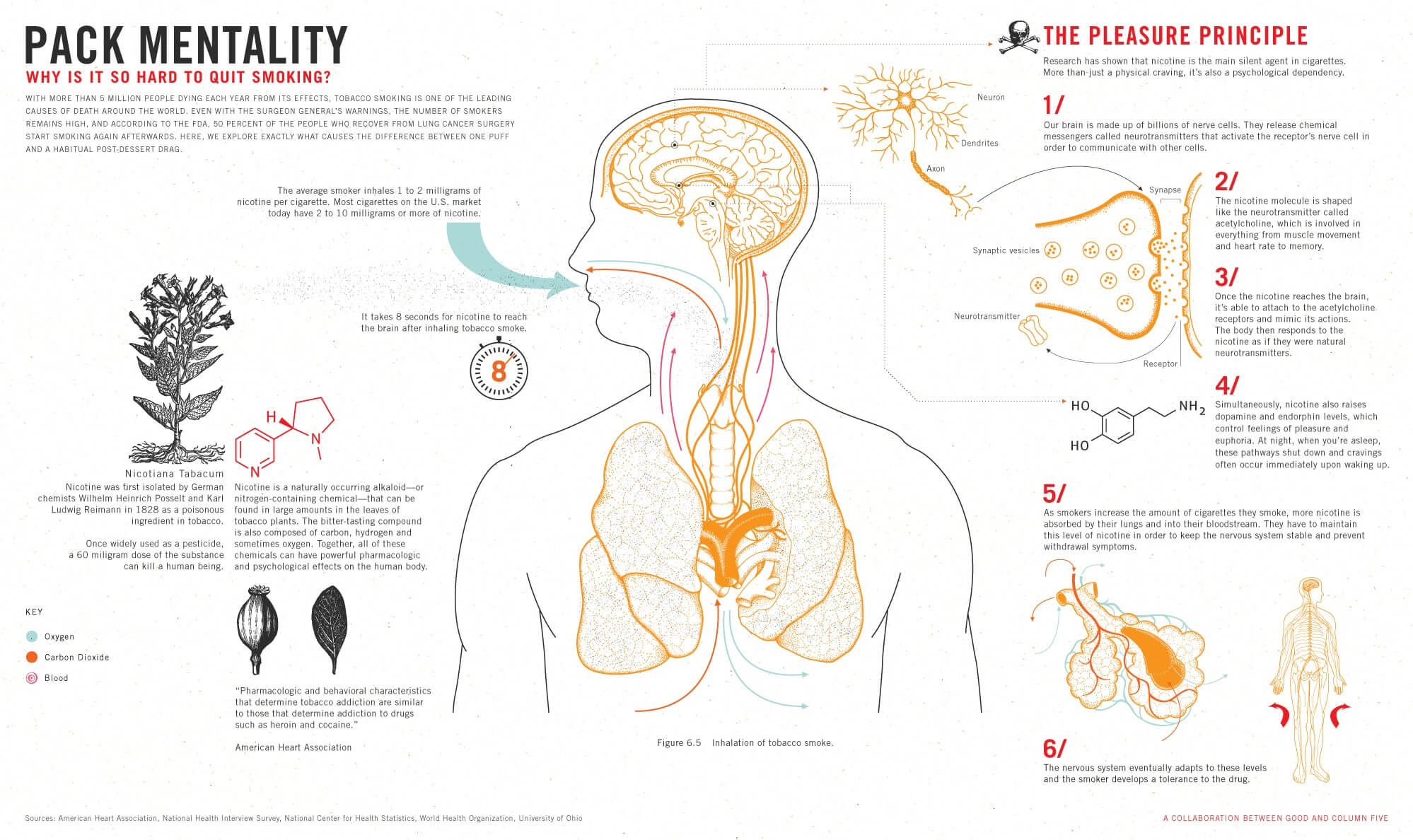
9) “Why Is It So Hard to Quit Smoking?” by GOOD Magazine

Most of us were first introduced to the concept of “infographics” by the little illustrations and diagrams that appeared in our school textbooks. This infographic design brings back that style, giving us a closer look at the biological challenges of quitting smoking. What makes this design work is that the illustrations are thorough but simple—without being elementary—giving it a modern take on that classic textbook feel.  

minimal infographic design

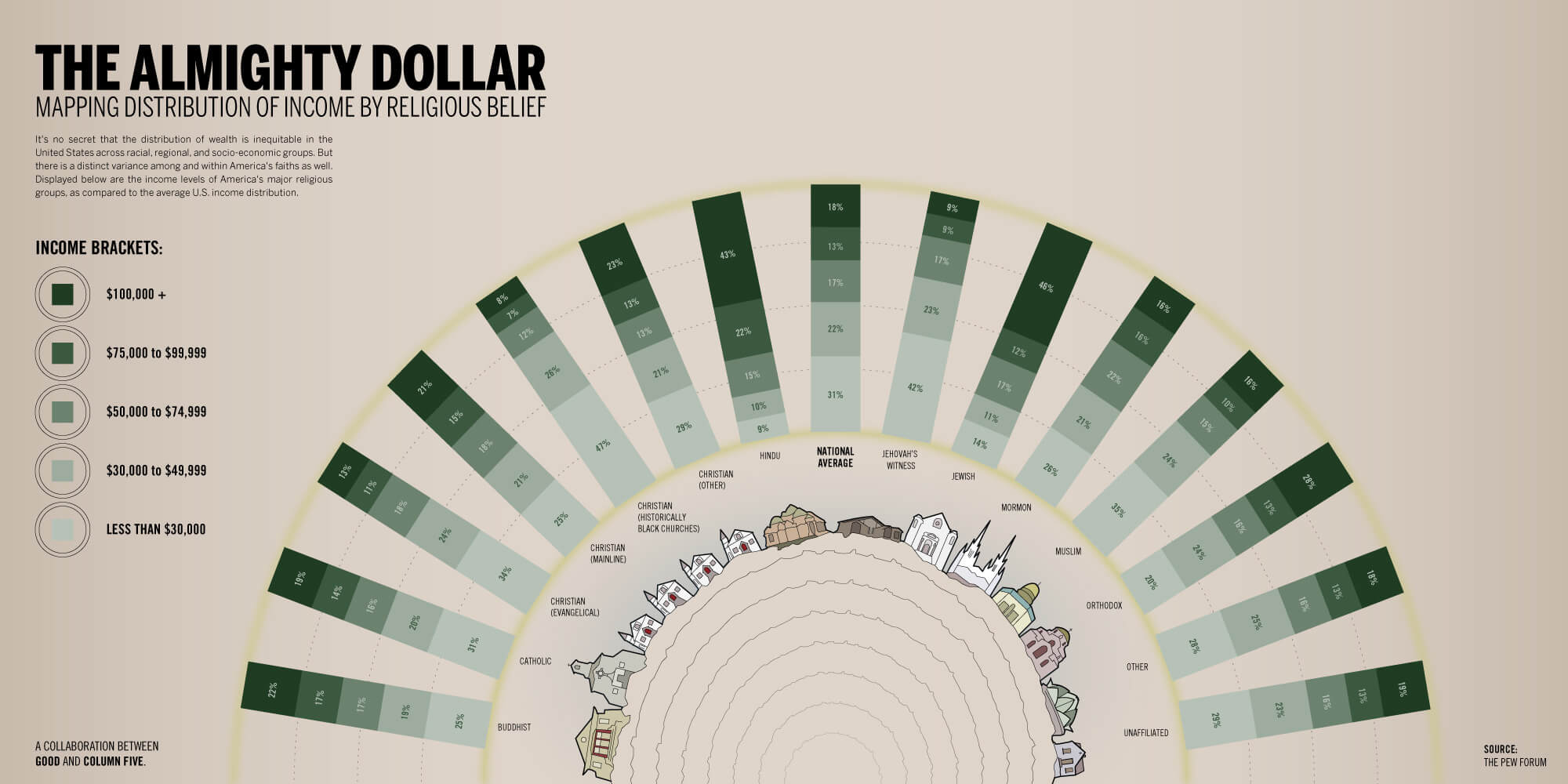
10) “The Almighty Dollar” by GOOD Magazine

Another gem from GOOD, this infographic design uses every design tool to enhance the story. From the green saturation of the stacked bar charts to the simple illustrations of religious centers, it is as artistic as it is analytical—and that is the key to great data visualization.

minimal infographic design

How to Create Better Infographics

We hate to see bad infographic design thrive, so we’re determined to share anything and everything we learn to help you make better infographics. If you want to stay on top of the latest trends, tips, and best practices, here’s some more stuff to check out:

If you still need a little help with your infographic design, we’d love to chat about it.

7 Simple Strategies To Help You Tackle Your Goals

It’s a new year. Whether or not you’re the resolutions type, we’re guessing you have some goals you’d like to achieve—and making them happen isn’t always easy. Time, energy, willpower—there are a million things that make it difficult. But with a little more structure and discipline, you can achieve your goals. The key to getting that structure? Habits.

Lately, we’ve been intrigued by the work of Gretchen Rubin, author of Better Than Before. Her excellent book teaches you how to form habits based on your personality type, a huge factor in making them stick. Whether you want to lose weight or build a website, the more you build related habits into your life, the more likely you are to succeed.

We’re total converts to Rubin’s methods, and we’ve found a few of her strategies particularly useful. Since we love them so much, we wanted to share 7 strategies to help you work more efficiently, build more structure, and live a happier life. Depending on your personality type, some may be more attractive to you than others. But they can all help in some way. Enjoy.

1) Monitoring

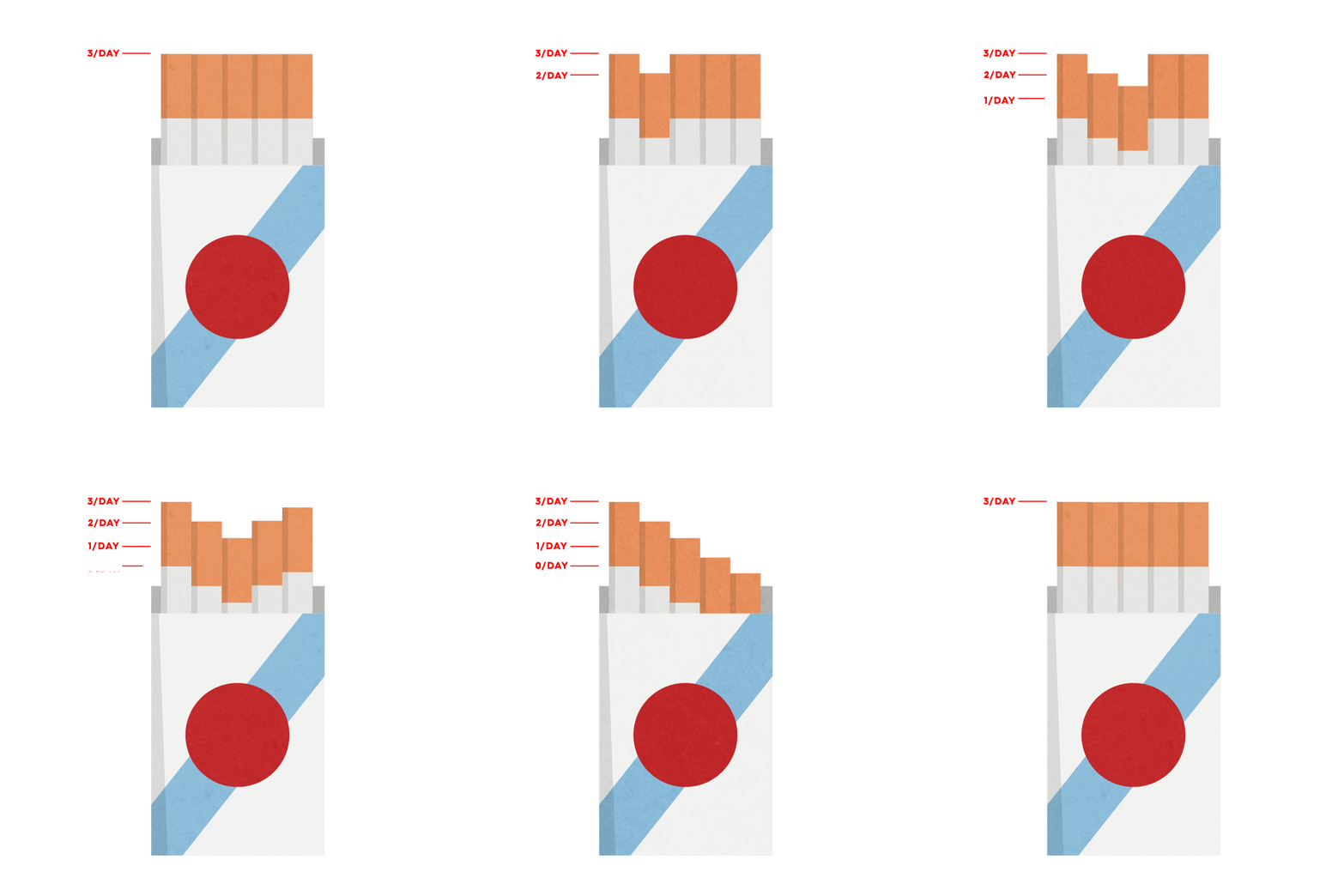
Before you try to change a behavior, monitor, measure, or track it. This will give you accurate data to measure your progress against.

Example: If you want to stop smoking, track not just how many cigarettes you smoke a week but the frequency and times of day.

habit strategies

2) Strategy of Convenience

Make it easier to do positive things and harder to do negative things.  

Example: If want to avoid sweets, keep them out of your pantry sightline—or decide not to keep them in the house at all.  

habit strategies

3) Pairing

Staple one activity to another so that you only allow yourself to do one thing when you do the other.

Example: If you want to exercise more, decide that you can only watch Netflix when you’re on the treadmill. 

03_treadmill

4) Accountability

Find someone to participate in or report your progress to—even better, assign a consequence for not following through.

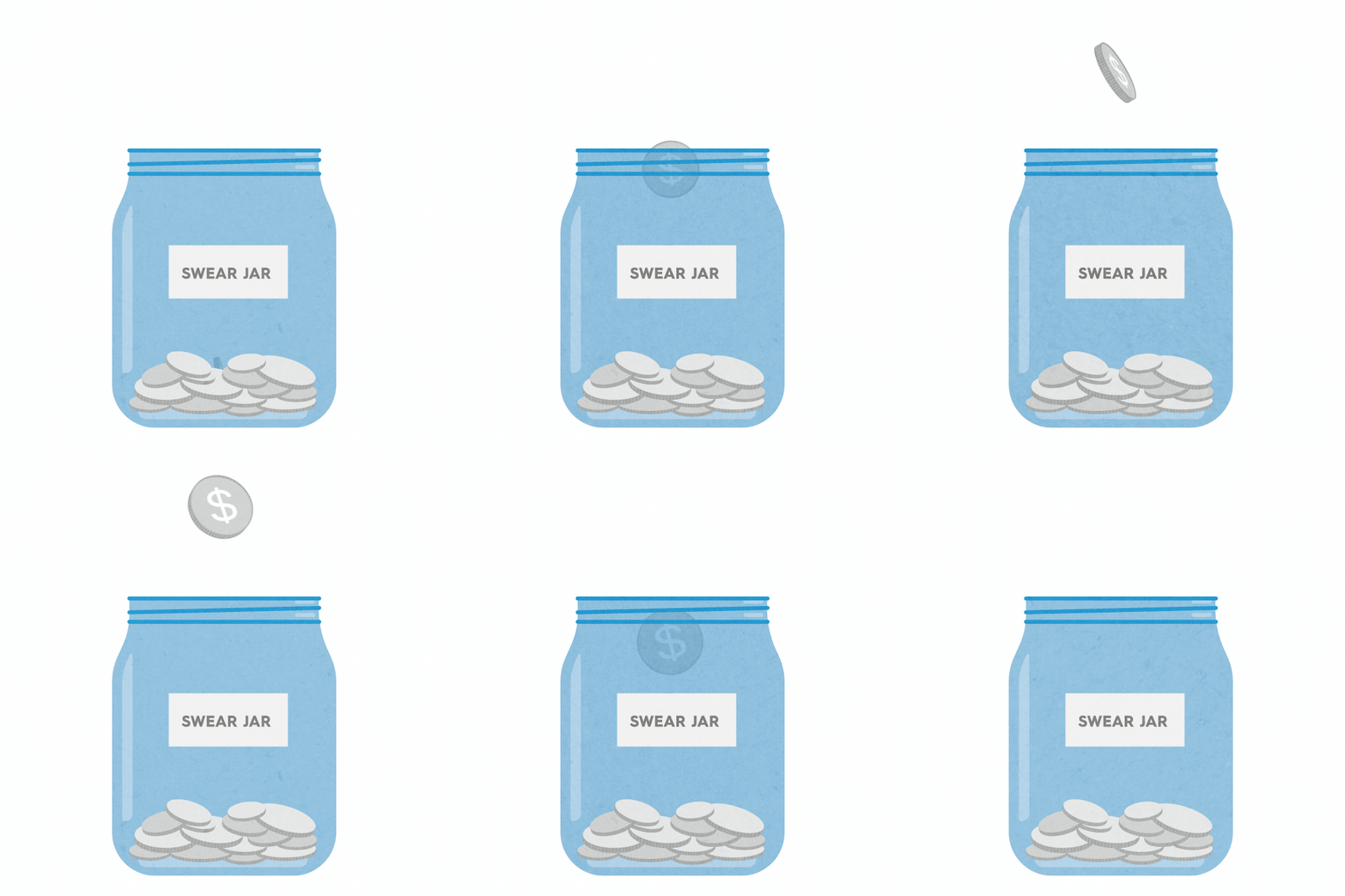
Example: If you want to swear less, take a note from your mother and charge yourself for every slip-up. 

habit strategies

5) Scheduling

Schedule events in your calendar to carve out dedicated time—no matter how minimal.

Example: If you want to volunteer more, designate the first Saturday of each month as your volunteer day. 

habit strategies

6) Distraction

Research shows cravings diminish after 15 minutes. Redirect your focus via a menial task or mental exercise to bide your time.

Example: Instead of drinking a glass of wine, create a quick flower arrangement. 

habit strategies

7) Clarity of Action

Break your goal down into specific, concrete actions. The more specific you are, the easier it is to track. (Call back to tip #1: Monitoring!)

Example: If you want to eat healthier, decide to bring a home-cooked meal to work 3 days a week. 

habit strategies

We hope some of these strategies help you make progress in the areas you want, and we wish you luck on your journey. If you want more, check out Rubin’s book to learn about all 21 strategies. And if you ‘ve found any useful productivity hacks of your own, we’d love to hear about them.