81. “Is it Better to Rent or Buy?”
Like many other infographics on this list, the goal of this interactive by Mike Bostock, Shan Carter, and Archie Tse for the New York Times is educational; it helps viewers figure out whether they should rent or buy. The extent to which you can personalize this interactive is pretty impressive.

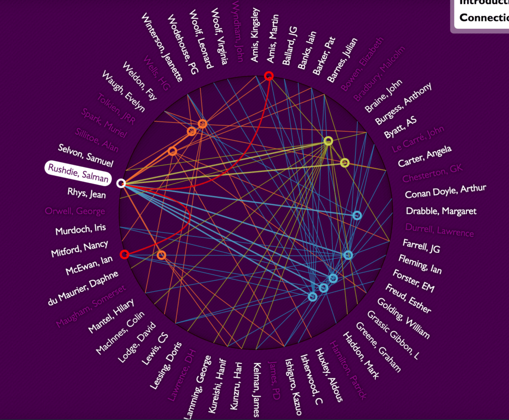
82. “20th Century Authors”
Good writers keep good company. This interactive by Stardotstar shows how famous authors are connected.
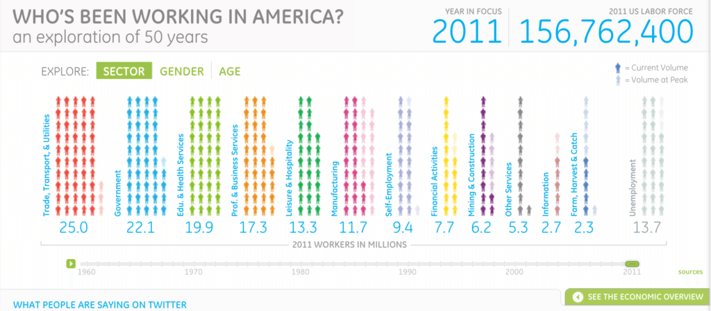
83. “Who’s Been Working in America?: An Exploration of 50 Years”
This interactive infographic by Periscopic for General Electric shows viewers the demographics of the American workforce over the past 50 years.
84. “U.S. Gun Deaths in 2013”
As the gun control debate rages on in America, this interactive by Periscopic presents the data related to deaths from gun violence in a powerful way: through time stolen from victims.

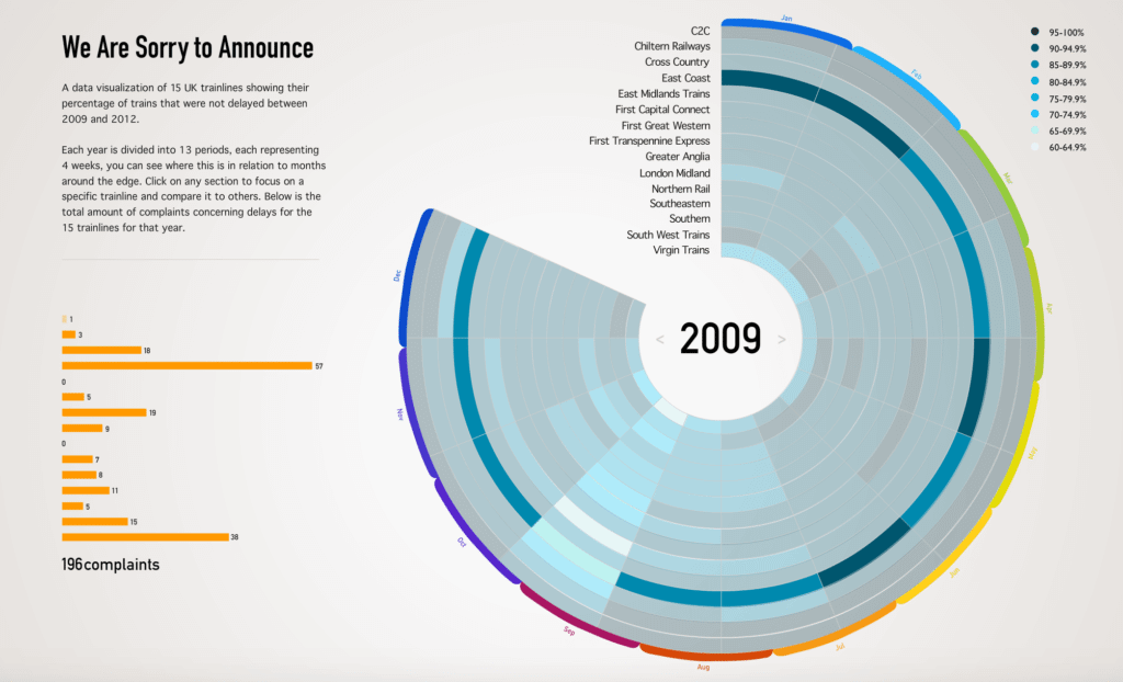
85. “We Are Sorry to Announce”
This interactive by Harry Stewardson explores the percentage of train delays in the UK over a 15-year period.
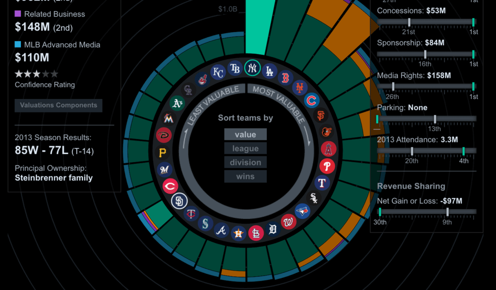
86. “Major League Baseball Franchises”
Major League Baseball teams have enormous valuations, reaching into the billions. This interactive by Bloomberg breaks down each team’s value.
87. “Supreme Court Decisions”
The Supreme Court rules on the most significant cases in the country, and it has varied in its leanings over the years. This interactive infographic by Column Five visualizes how the court has ruled (liberally or conservatively) since its beginnings.

88. “Top Secret America”
This interactive infographic brought to you by The Washington Post is an excellent example of web design and journalism intersecting. The interactive lets you explore the secret organizations of the nation as a whole, as well as individually.

89. “Mapping Student Debt: How Borrowing for College Affects the Nation”
Collective student loan debt is up to $1.3 trillion. This interactive debt map by Marshall Steinbaum and Kavya Vaghul for the Washington Center for Equitable Growth illustrates the extent of this epidemic in our nation.

90. “The Atlantic Slave Trade in Two Minutes”
This interactive by Andrew Kahn for Slate shows the journey of millions of slaves through the centuries. The interactive can be paused and rewound, allowing viewers to click on individual journeys and see the beginning and ending of each destination, as well as the number of those enslaved.

91. “Based on a True Story” by David McCandless
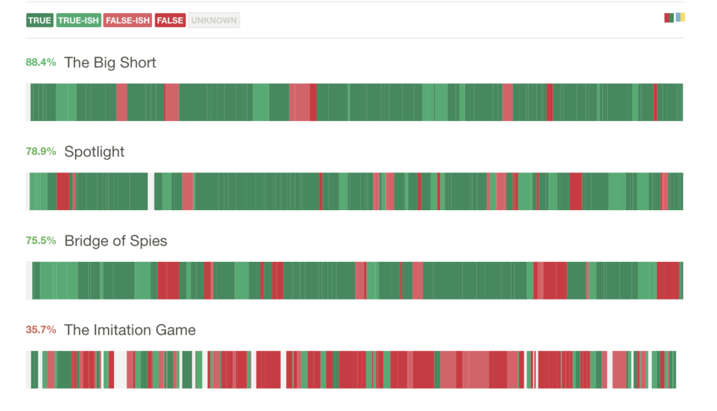
This interactive analyzes whether films “based on a true story” are, in fact, accurate. You can see scene-by-scene breakdowns comparing reality to fiction.
92. “15 Trillion Dollars of World trade”
This interactive by Owen Cornec for Harvard’s Center for International Development depicts an economic landscape of countries around the globe. It may take a moment to load, but there’s a lot of data coming together for this graphic, and it’s well worth the short wait.

93. “Nuclear Notebook: Nuclear Arsenals of the World”
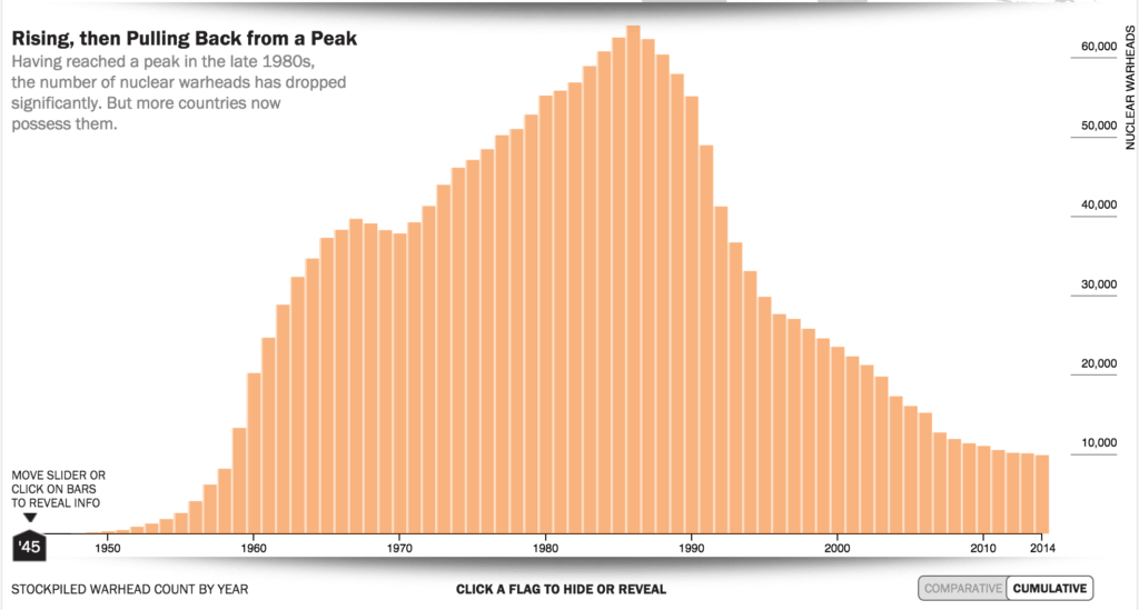
Nothing will scare you into a sleepless night like this interactive infographic by The Bulletin, which lets you see how the number of nuclear weapons has increased since the ’40s.
94. “Better Life Index”
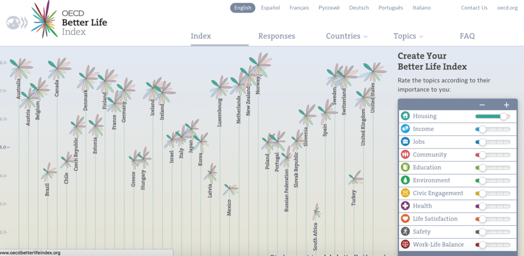
This interactive by Moritz Stefaner shows the quality of life worldwide. Input the things that are important to you, and you’ll see which countries would give you the best quality of life.
95. “Baseball Analytics, Chartball Style”
If you want to see a baseball player’s offensive stats all at once, you’ll love this interactive by Andrew Garcia Phillips. Featuring radar charts and single-player visualizations, it’s a deep dive into stats.

96. “Most Common Use of Time, By Age and Sex”
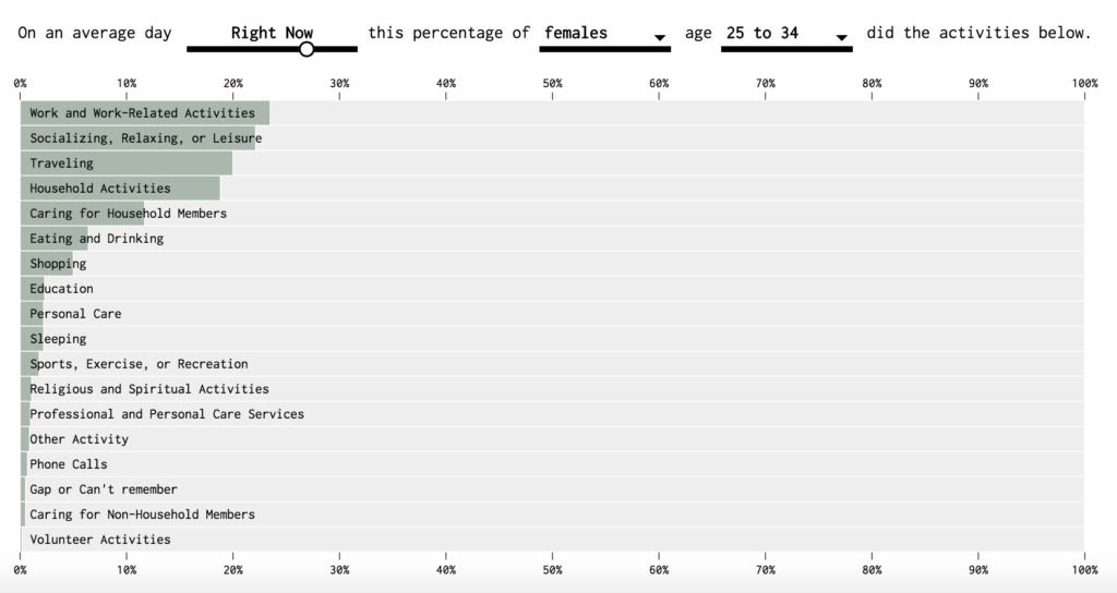
Time is a precious commodity, and we all use it in different ways. Here’s another Nathan Yau interactive that lets you see how you use your time compared to others.
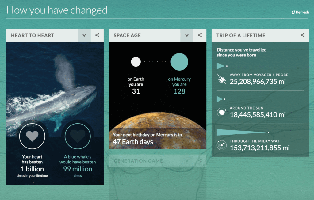
97. “Your Life on Earth: How You and the World Have Changed Since You Were Born”
This interactive from BBC teaches you about yourself, as well as the world around you. Simply answer a few simple questions, then see the data on how have you changed, how has the world changed, and how have we changed the world.
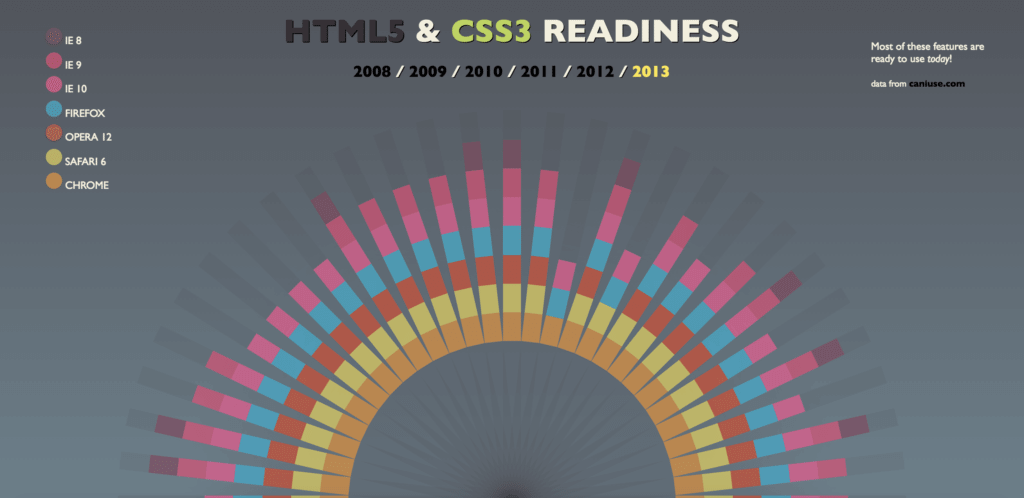
98. “HTML5 & CSS3 Readiness”
This interactive, created by Paul Irish and Divya Manian, shows how HTML5 support has evolved since 2008. Let your nerd flag fly!
99. “Beerocracy: Who Drinks the Most Beer Worldwide?”
People like infographics about beer almost as much as the real thing, so here’s another interactive by Retale that focuses on the world’s beer consumption.

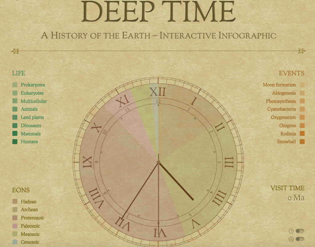
100. “Deep Time”
If you weren’t paying attention in class, this interactive built by Jamie Brightmore breaks down time as we know it—visualizing the entire known history in a single clock. Learn about major events, eons, and everything else you slept through.
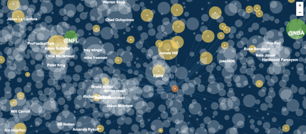
101. “The Complete Sports Twitterverse”
Who are the most influential voices in sports? Find out, according to this visualization by Andrew Garcia Phillips, which visualizes the major sports players on Twitter.
How to Make Your Own Interactive Infographics
As you can see from this list, interactive infographics can take many forms and tell many stories. That said, great interactives aren’t created overnight. It takes a lot of skill, patience, and a dedicated team to create a truly great one. Luckily, you don’t have to wander into the woods blindly if you’re about to start your own project.
We’ve created many interactive infographics over the years, so we know what makes them work—and what can make the project go horribly wrong. To help you avoid the mistakes we made, here are some tips and resources to make the process easier from start to finish:
- Learn the ins and outs of interactives. Sometimes people embark on an interactive project just because it seems like something cool or novel to do. Before you dive in, find out what interactives are, why they work, and what types are best for different stories.
- Choose the right idea. Interactive infographics are better for certain types of stories than others. To make sure your idea will work, ask yourself these 5 questions in your next interactive brainstorm.
- Make sure you have the right elements. Learn about the 4 keys to a great interactive to make sure you can deliver a great piece.
- Follow best practices for data storytelling. Download our free e-book, The Content Marketer’s Guide to Data Storytelling, for more tips.
- Get maximum exposure. Try these 5 tips to get the most eyes on your interactive.
Remember that interactive infographic design is a highly specialized skill. If you’re not sure if you have the bandwidth or resources to pull it off, you might consider some expert help. If you’re on the hunt, here are a few questions to ask to vet a content agency. We’d also be happy to chat about any ideas you might have.


