In case you didn’t know, we’re major design geeks when it comes to brand identity. From data visualization to motion graphics to infographics, we’re obsessed with design in any medium—especially when it comes to branding. A beautifully designed visual identity doesn’t just support a brand; it elevates it. From your packaging to your social presence, a strong visual identity instantly communicates who you are, what you’re about, and why people should want to interact with you.
Conversely, a weak identity can degrade your brand experience. It’s easy to assume that just because you have an identity (e.g., logo, colors, typography) it’s effective. But if your visual identity is disconnected, inconsistent, or an inaccurate reflection of your brand, you aren’t telling a cohesive brand story. That makes it harder for your brand to connect with and establish a relationship with the target audience and people you’re trying to reach. Luckily, there are plenty of brands out there that are doing it right.
15 Brands With an Awesome Visual Identity
We always love to celebrate great work, so we’ve rounded up some of our team’s fave brands to show you the best real-life examples of a visual identity at work.
From beer to bedding, each of these brands artfully uses their visual identity to entice and engage in creative ways. We hope they inspire you to do the same.
1. Lloyds Bank
Lloyds’ refresh balances heritage with modernity. Cleaner typography and simplified brand elements make digital touchpoints feel approachable, while the classic green signals trust and reliability. The result? A visual system that feels familiar yet modern, giving the brand clarity and confidence without feeling stuffy.
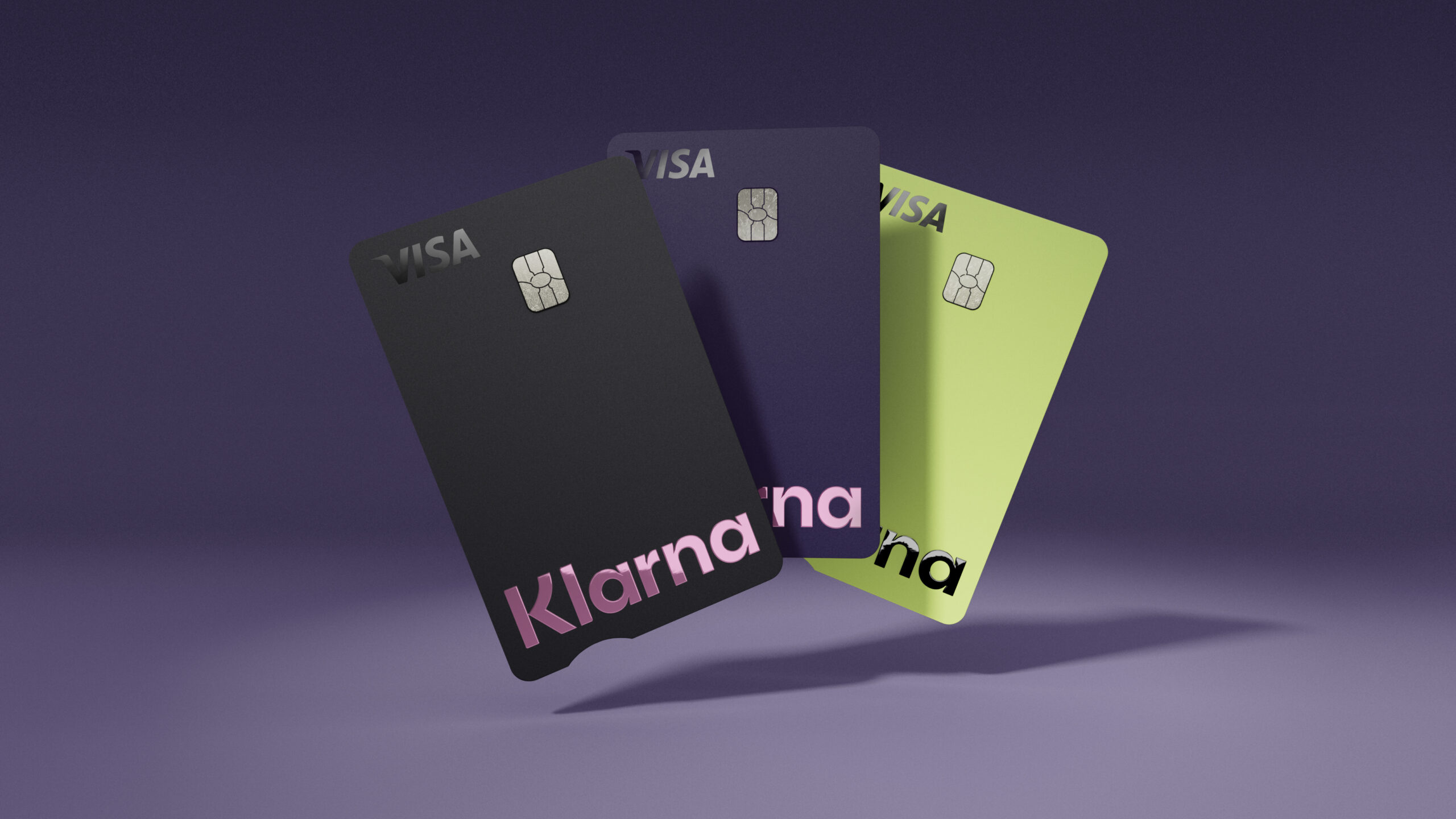
2. Klarna
Klarna makes finance feel fun. Bold typography, expressive icons, and soft pastels give the brand a playful, approachable energy. Every touchpoint — from app to social — feels consistent, making financial transactions less intimidating and more human.
3. Headspace
Headspace keeps calm at the center of its identity. Friendly illustrations, gentle color palettes, and consistent application across channels make every interaction feel approachable. The whimsical yet structured aesthetic reflects the brand’s promise: helping people feel more mindful and less stressed.


4.DocuSign
DocuSign’s visuals have grown along with the business. Clean layouts, clear hierarchy, and dynamic use of shape and color give the platform a sense of efficiency and professionalism. Geometric forms and restrained color choices make the brand trustworthy without being cold or distant.
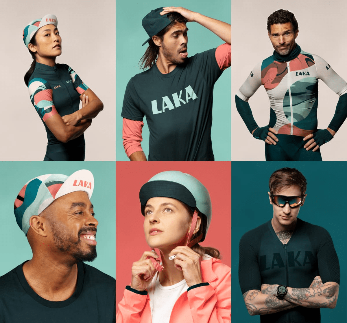
5. Laka
Laka’s identity is full of personality. Energetic colors, playful shapes, and a modular system make the brand feel alive and community-driven. The aesthetic communicates approachability and modernity, while giving the brand a distinctive, friendly energy that stands out in insurance.
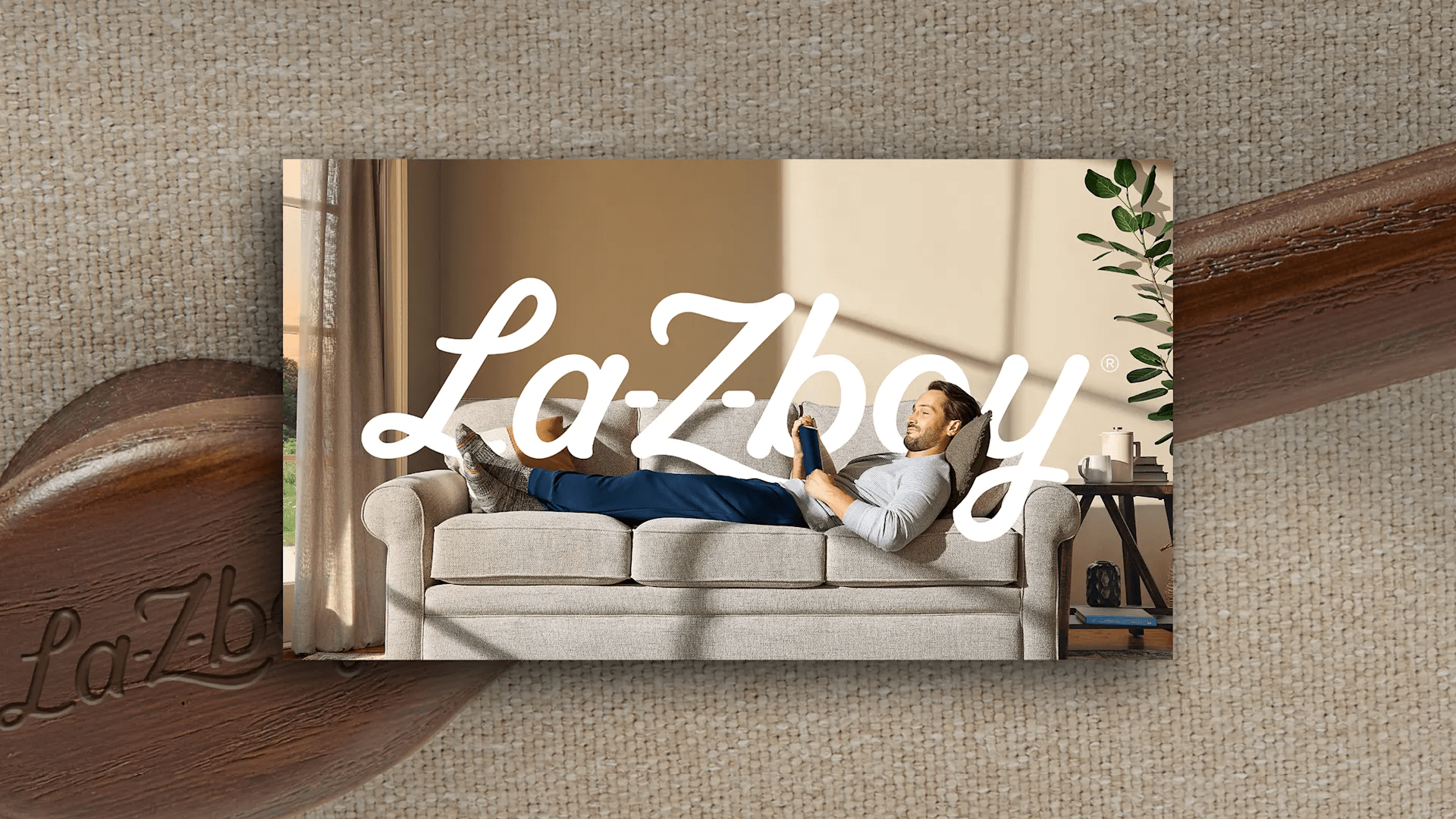
6. La‑Z‑Boy
La-Z-Boy’s update leans into comfort and warmth. Soft, rounded typography and earthy tones give the brand a cozy, approachable feel, while modern layouts and a refreshed palette make it look contemporary. It’s a great example of updating a legacy brand without losing the core identity people already trust.
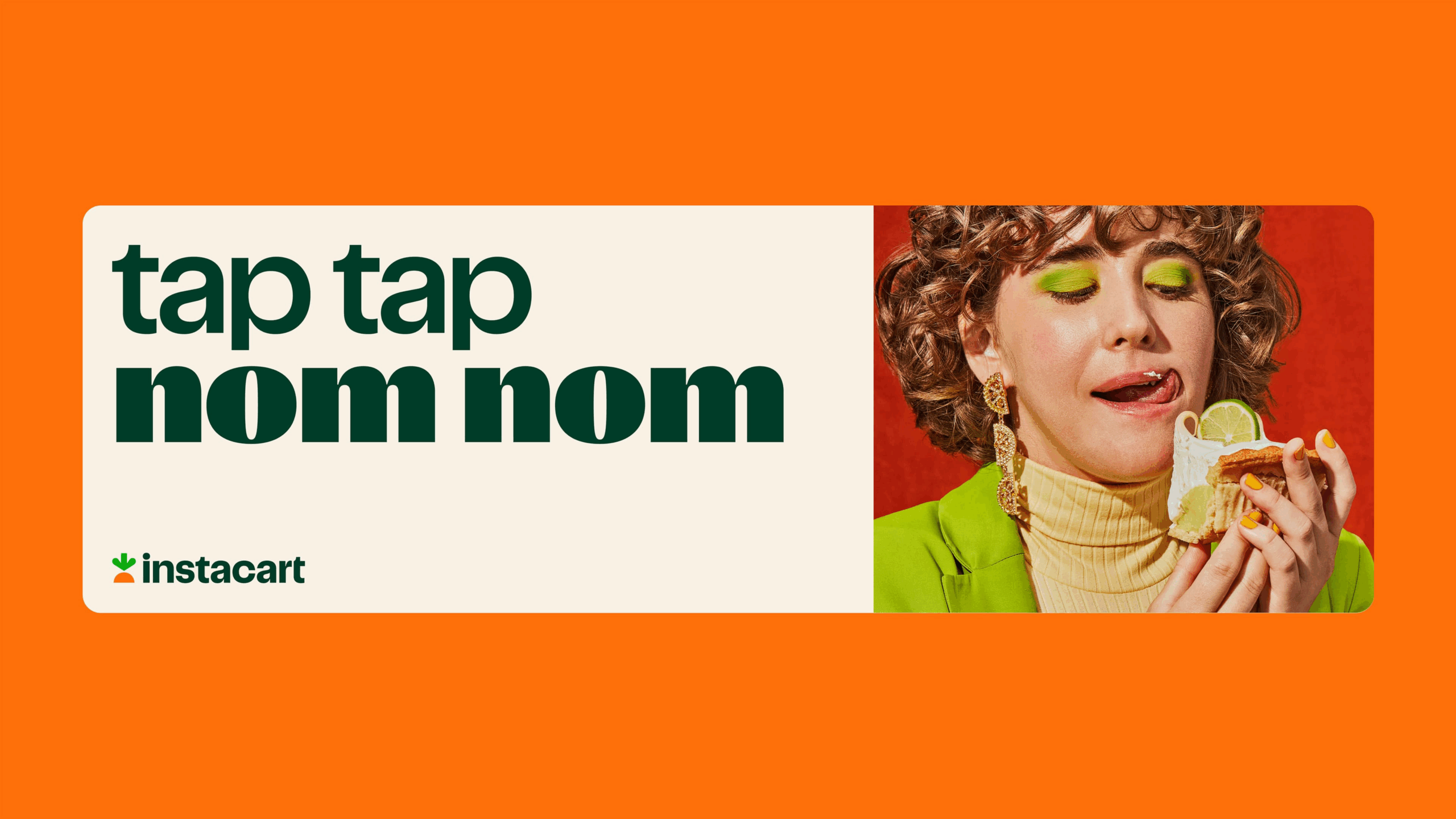
7. Instacart
Instacart balances utility and friendliness with their rebrand. Bold lettering, flexible logo forms, and vibrant greens and oranges make the brand energetic and approachable. The design communicates both convenience and joy, giving customers a sense that grocery shopping can be simple—and even fun.
8. Jetify
Jetify keeps it minimal but sharp. Clean typography, strong contrast, and a restrained palette make the SaaS brand feel professional without being cold. The visuals communicate efficiency, clarity, and modernity in a way that appeals to both technical and non-technical audiences.

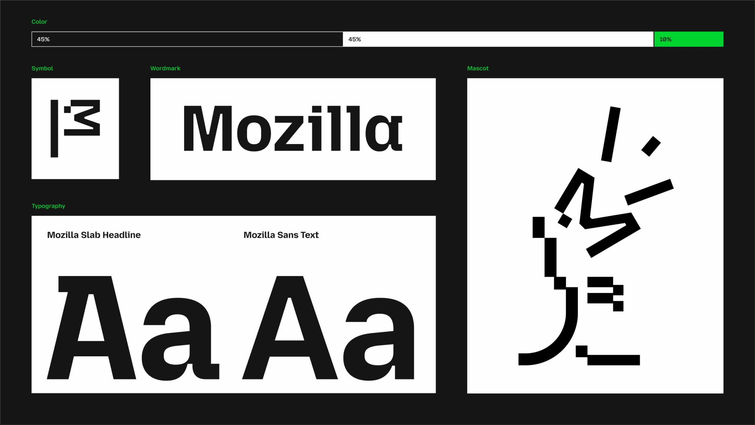
9. Mozilla
Mozilla’s identity signals openness and innovation. Vibrant accents, abstract shapes, and modular layouts make the brand feel flexible and community-driven. The dynamic aesthetic reflects creativity, approachability, and a global sensibility.
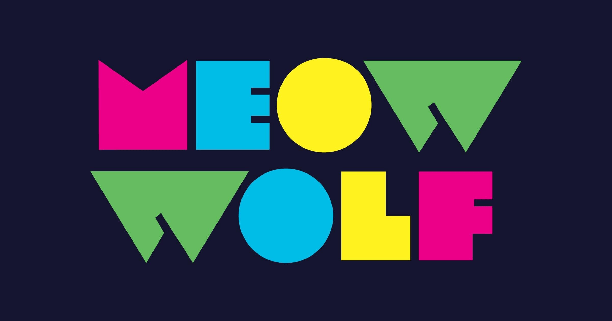
10. MeowWolf
Meow Wolf’s identity is immersive and unapologetically bold. Bright colors, layered visuals, and motion-driven elements turn every touchpoint into an experience. The result is a playful, surreal aesthetic that makes the brand unforgettable.
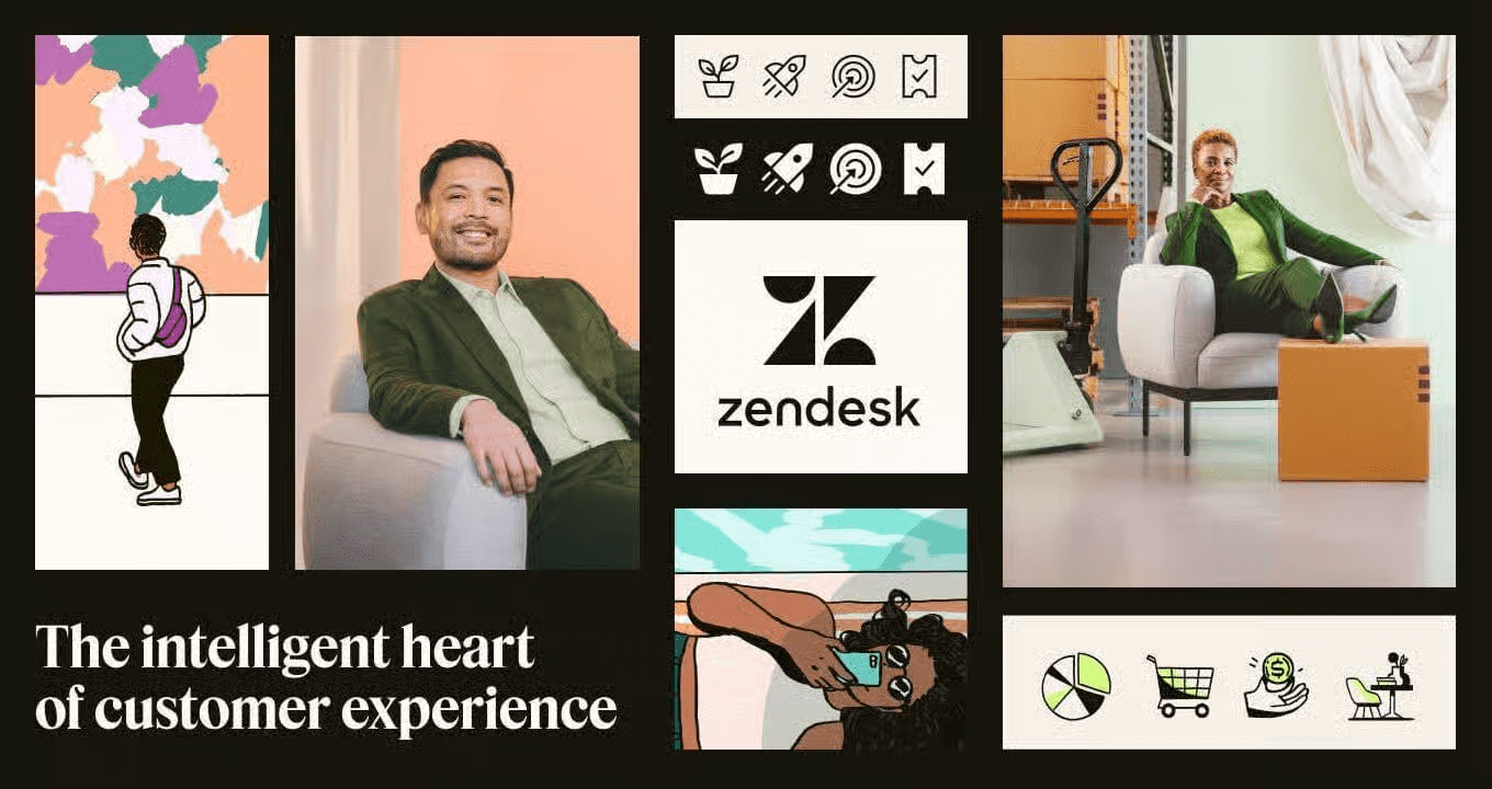
11. Zendesk
Zendesk’s clean, structured visuals support the product experience perfectly. Rounded geometric shapes, soft colors, and consistent iconography make the brand approachable and professional. The design communicates reliability and helpfulness, which is exactly what users need from enterprise software.
12. Chobani
Chobani makes healthy food feel fun. Hand-drawn illustrations, vibrant color accents, and textured photography bring the brand to life while emphasizing freshness. The playful, natural aesthetic balances approachability with credibility—something few consumer brands pull off so consistently.


13. Decathlon
Decathlon’s visuals communicate energy and clarity. Bold iconography, flexible layouts, and bright, dynamic colors make the brand feel lively and global. The aesthetic reflects the excitement of sports while remaining accessible to a broad audience.
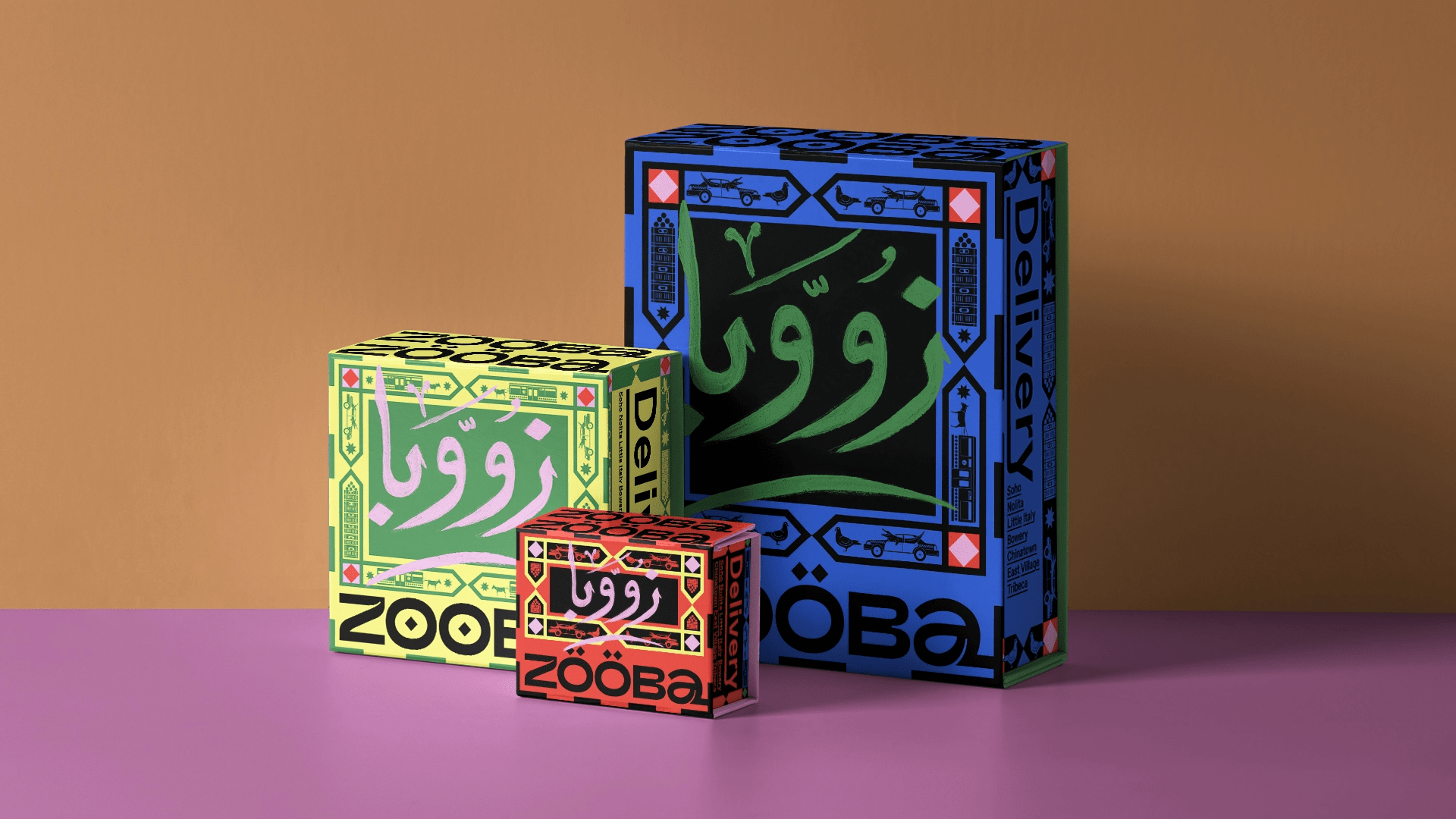
14. Zooba
Zooba’s identity captures the energy of Cairo streets. Hand-painted typography, layered patterns, and bold color choices give the brand an immersive, playful personality. The design feels authentic and approachable, turning cultural references into a visual language that sticks.
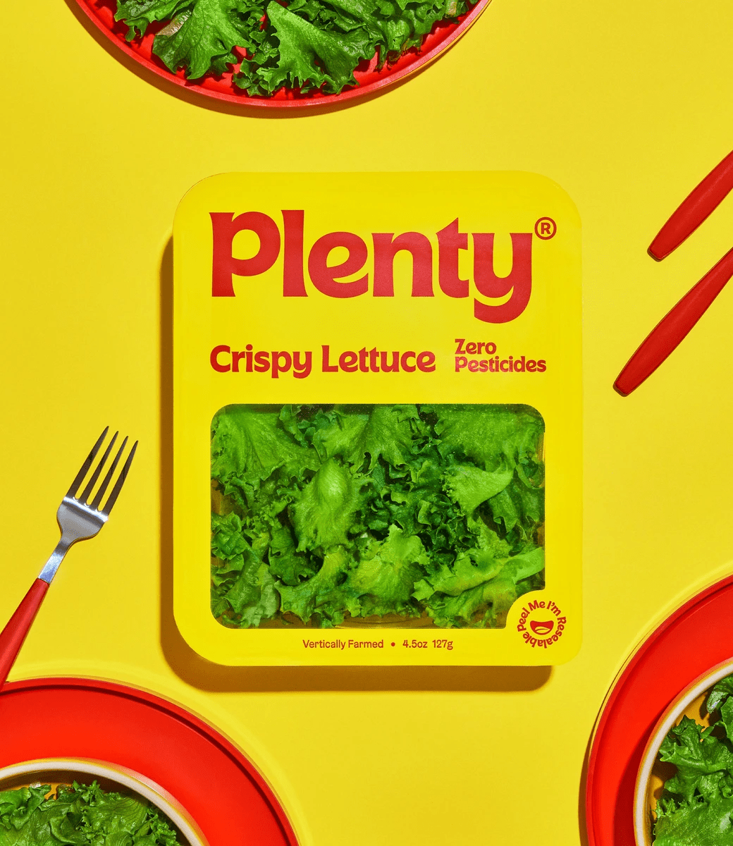
15. Plenty
Plenty’s visuals make sustainable food feel exciting. Unexpected, vibrant colors combined with a warm, friendly typeface give the brand personality and energy. The aesthetic communicates freshness, approachability, and modernity, making healthful food visually craveable without leaning on clichés.
How to Improve Your Visual Identity
If these brands have inspired you to up your design game, there are plenty of things you can do to build a strong visual identity. If you’re not sure where to start, try these helpful next steps.
- Learn about the keys to a strong brand identity. If you want to design a memorable identity, you need to know what will make or break yours. Start with our guide to design a brand identity, and follow these tips to build a beautiful identity.
- Use the right tools. From logo, to color, to type, bookmark these 75 helpful tools, resources, and tips to build a great brand identity.
- Create a memorable and flexible logo. Your logo should work for everything from your social presence to your packaging. Use our guide to design a logo with less stress. Want more examples? Check out these logo design tips.
- Limit your colors. Use one main color, two primary colors, and a few accent colors. For more inspiration, find out about brand color psychology.
- Choose the right typography. Follow our guide to find typography that complements your logo and works cohesively with your other visual elements.
- Make it comprehensive. Content creators need a variety of visual tools to create truly compelling content. Use this handy checklist to design your comprehensive visual identity.
- Follow design best practices. Find out how to fix the most common visual design mistakes to make sure your branded content works.
- Get inspired by pros. Check out these impressive rebrand examples to see how smart brands have reinvented themselves.
- Make your visual identity easy to use. It’s hard to preserve your brand integrity if your visual identity isn’t properly applied. Find out how to create a comprehensive brand style guide, and follow our tips to keep your content on brand.
- Use your identity to bring your brand story to life. Good design isn’t about making things look pretty; it’s about telling a compelling story. Follow our tips to upgrade your annual reports, infographics, video, motion graphics, and content marketing. Then explore our brand storytelling guide.
That said, we know it’s easy to hit a wall if you don’t have the bandwidth or resources to do this work completely. If that’s the case, you might want to consider bringing in a creative agency for support. Follow these tips to find the creative agency that’s right for you, find out what it’s like to work with us on your brand identity, or holler at us. We’d be happy to help bring your brand to life in any way we can.


Let's upgrade your marketing game
Get fresh tips, how-tos, and expert marketing advice every week. (15,000 people already are.)