The quality of your infographics is always determined—in part—by the quality of the content you use to create them (aka sources). Using low-quality, biased, or excessive sources can weaken your infographics in many ways. They can feel fractured, forced, or fail to tell a coherent story. Worse, suspect sources (or a lack of citation) can affect your credibility, permanently damaging your relationship with your viewer. Thus, it’s crucial that you approach sourcing correctly.

How to Source Infographics Properly
Luckily, high-quality sources are everywhere, available from governments, industry trade associations, research institutes, think tanks, etc. Best of all, you can often find them for free. With a wealth of data at your fingertips, it’s easier to create compelling content. Here are our 5 tips for sourcing infographics, plus a few examples and tips to make sure you do it the right way.
1) Choose Sources That Tell a Story
If you’re not telling a story with your infographic (translation: explaining a narrative or allowing a narrative to be explored), it will be challenging to keep your viewer’s attention. Whether it’s educational, entertaining, or inspiring, people need that hook. Essentially, a good story starts with good data. Finding the right story in that data can be a challenge, which is why you need a data source that is comprehensive and tells the complete story.
Learn how to tell a single, powerful story in your infographic, try these 5 tips to find compelling stories in your own company’s data, brush up on your data storytelling skills, and check out these 16 ways to think of interesting infographic story ideas.
(Note: Sometimes an infographic isn’t the right format for your data story. Here’s how to decide if it is. )
Example: Incapsula turned its own proprietary research into an engaging animated infographic for their readers.

2) Make Sure Your Sources Are Reliable
Not all data producers are created equal. Always use data sets from as unbiased a producer as possible. Good sources include data collected or produced by government agencies, such as the statistics compiled by the U.S. Census Bureau or the Department of Labor. Other top-tier data sources can include industry white papers, surveys conducted by reputable think tanks/research organizations, or findings published in academic publications.
It’s important to note that surveys conducted by polling agencies or think tanks, while usable, often have a political agenda, so always use discretion. Also, if using proprietary data, make it easy for people to find out more about the data (e.g., how it was gathered, how old it is, how many people were surveyed, etc.).
To find credible data, check out these 100+ sources of free data. Once you do have your data, vet it by asking yourself the following:
- Who wrote this webpage? Does the author have credentials?
- Is this webpage affiliated with a credible organization?
- When was the website last updated?
- What is the purpose of the organization that is hosting the website?
- Does the author provide a bibliography?
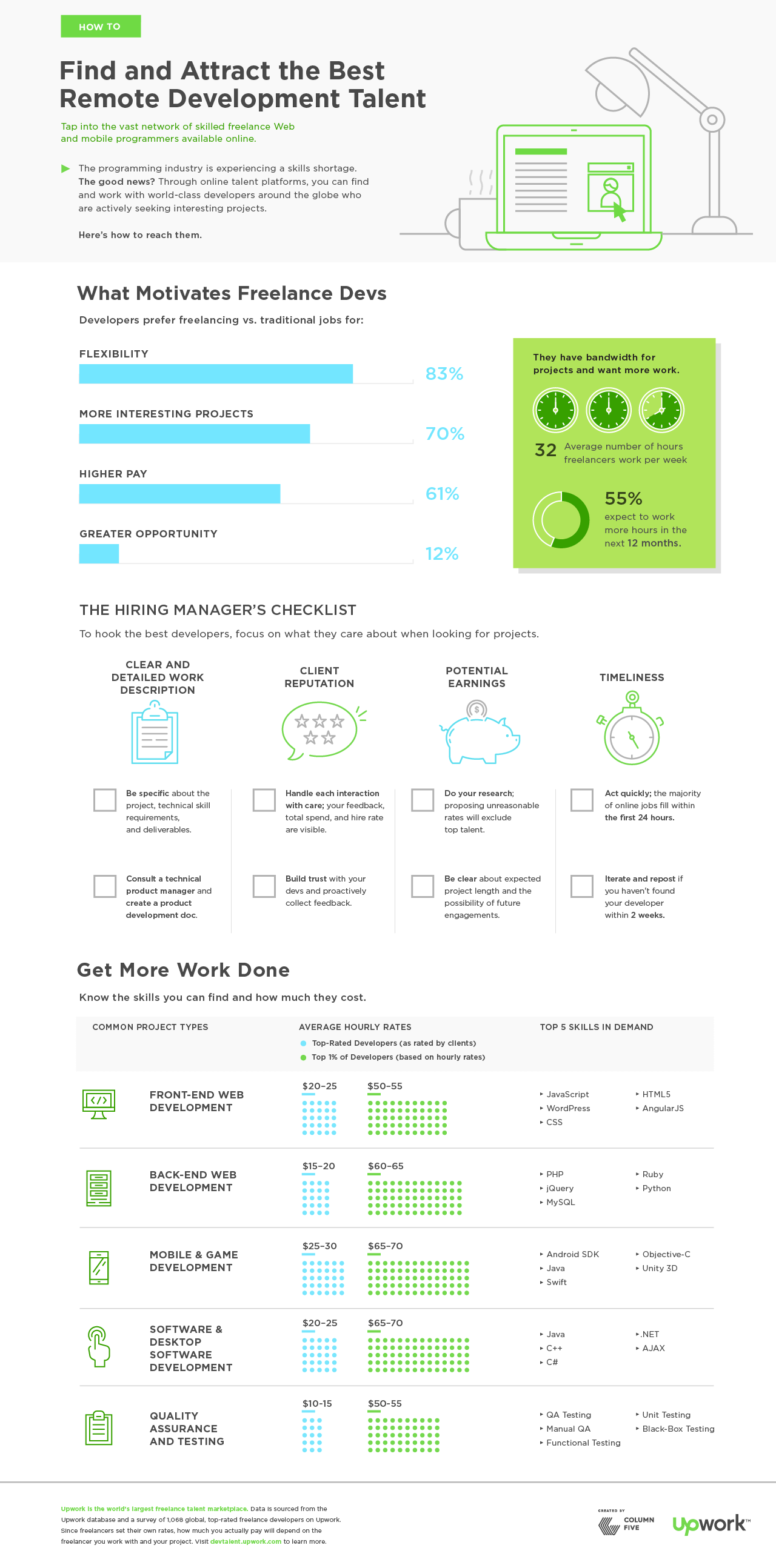
Example: This infographic for Upwork visualizes the findings of a survey conducted by the organization. As such, sourcing includes information on methodology for greater transparency.

3) Make Sure Your Sources are Relevant
The world changes quickly, and the pace of change is accelerating. To ensure you’re on the right track for sourcing your infographics, use the most recently published version of the data you’ve decided to use. Some data producers, such as the Department of Labor, revise their data on an annual or even monthly basis, but this is not always the case for every data producer.
As a rule of thumb, try not to use data that’s more than a year old. Two years is acceptable in some cases if that’s the best you can get. Beyond this, use discretion. In all cases, be transparent about the age of the data set you are using (either included in the infographic copy or at the source list at the bottom). This provides context and clarity.
If you are using multiple sources, make sure they are complementary. Even if you only use two data sources, they can still create a lot of variance. Using two data sets that clash, such as data collected by think tanks on opposite sides of the political spectrum, makes crafting a narrative difficult.
Example: This Pinterest infographic features data from two complementary studies, including updated data from a survey originally conducted in 2016.

4) Limit Your Sources for Consistency
Finding multiple data sets from multiple sources on one subject can be exciting, but don’t get ahead of yourself. You can’t create a consistent narrative with 15 different sources. (Look up any “15 Things You Didn’t Know about Boobs” or “20 Tips for Coping with Mesothelioma” and you’ll see what I mean.) Each additional source you use can introduce mistakes or biases from the original research. Thus, the fewer sources you use, the better. (Yes, we’ve seen infographics made with more than 20 sources; no, we won’t tell you who made them.)
One data set is ideal. Try to limit it to less than three if you can. Remember: The more you add, the more variance you get from different methods, different contexts, and different priorities of the data producers.
Example: LinkedIn uses a single source to educate people about building a content marketing machine.

5) Cite Your Sources Appropriately
When it comes to structuring the content, make sure that a proper context is provided for your readers. While we’ve already established that data should be recent, reliable, credible, and consistent, when you’re creating an infographic from multiple sources, it’s important to provide as much context to the reader as possible about what information came from what source.
Always cite the primary source—not the Wikipedia article—in the graphic. When citing sources in text, specify the source and year published.
- DO: “A 2012 Microsoft survey found…”
- DON’T: “One survey found that…”
Remember: Infographics are only as good as the content they convey; data-driven infographics are only as good as the data they use. To produce consistent, high-quality work, ensure that you are always using strong data sets that are timely, work well with each other (if there are multiple data sets), and are provided by reputable organizations. These elements will create a strong foundation upon which to build your design, resulting in a story told as powerfully as possible.
Example: This infographic by HighFive cites its source in the first paragraph, making it clear where the data comes from and how it was collected.

Make Sure Your Design Tells Your Story, Too
The story you tell with words and data is only one part of a successful infographic. Bringing that story to life through design is an entirely different skill, especially if you’re dealing with data. If you’re ready to move into the design stage:
- Follow data visualization best practices. Learn how to design the most common charts and graphs, and try these 25 tips to improve your visualizations.
- Avoid rookie mistakes. Find out how to avoid the 15 most common infographic design mistakes.
- Make the process easier. Follow our best tips for every stage of the infographic process, based on the 4,000 infographics we’ve made.
- Get inspired by great work. Check out these 9 awesome examples of infographic design.
- Get expert help if you need it. If you don’t have the bandwidth to handle production, use these tips to vet your infographic design agency (and learn how to work better with the agency you choose).
If you do need someone to take things off your plate, let’s chat about how we can hook you up.


