C5's GPT offers expert advice and resources to solve your marketing problems. Ask a question, or start with these prompts.
Build a competitive content strategy
Create content at scale
Implement AI marketing
Bridge sales and marketing
Improve marketing ROI
Build a strong brand strategy
How can SaaS firms effectively use data visualization in their marketing?
Transform internal data into compelling content by finding stories within your company’s proprietary data sources like customer surveys, usage analytics, and performance metrics. This creates unique content that competitors can’t replicate and demonstrates real expertise.
Increase comprehension and retention by presenting complex information visually rather than through text alone. Data visualization appeals to both analytical and emotional brain processing, making information easier to understand and remember.
Build trust and credibility by deriving content from credible sources and enhancing data stories with well-designed visualizations.
Create versatile content formats including infographics, interactive reports, social media content, and case studies. Data visualizations can be repurposed across multiple channels and incorporated into various content types to maximize their impact.
8 Things to Look For in Your Data Visualization Agency
Data visualization is an incredibly valuable tool for marketers. It helps you communicate important insights in a visual way, helping you deliver your message more impactfully. But not everyone does data design right—even if they say they do. A good data visualization agency knows data is about more than charts and graphs; it’s about bringing your data to life.
How to Find a Data Visualization Agency
To make the hunt a little easier, here are 8 great questions to ask to help narrow down your search for the right data visualization agency.
1) Do they demonstrate their data expertise?
Many agencies can churn out an infographic, but a great data visualization agency knows the fundamentals of data. They don’t just design; they can analyze and dig into the data to uncover interesting insights. They should also demonstrate that knowledge and share their knowledge and expertise freely. You want to know you’re working with true experts.
2) Do they turn data into stories?
Data analysis is only step one of creating a great data visualization. Turning those insights into a solid narrative and using data visualization to support that narrative is what will make your project truly successful. You don’t just want a data visualization agency to plug your data into a design program. You want them to help you create the most impactful narrative possible.
3) Do they design data according to best practices?
Now here’s where a lot of agencies fall short. Yes, you can design a chart. Yes, you can add a pretty illustration. But this is not what true data visualization is.
The entire point of the art is to make data as comprehensible as possible, to present it in the most easy-to-digest format. There are subtle but very effective ways to do this. The way you label, order, or use color can help or hurt your data visualization. (You can find out more about best practices in our Data Visualization 101 e-book.) Ask them about their data design philosophy to get a sense of how they approach it.
4) Do they work in different mediums?
There are many ways to present data visualizations, including infographics, interactive experiences, video, and more. The format you choose is informed by your data story, which is why it’s so important to work with someone well-versed in data storytelling. They should be able to design whatever the data requires.
5) Have they created similar work before?
If you have a specific idea in mind, you want to work with a data visualization agency that has the skills and experience to execute it for you. (You also want someone who can tell you if your idea doesn’t serve the data well.) Take a look at their portfolio to see if they’ve created similar work or have experience with similar clients or industries.
6) Do they have a good response when you ask them what their favorite type of chart is?
You want to work with people who are passionate about their craft. Asking this question will give you a sense of their knowledge and enthusiasm for data visualization. Trust us, any self-respecting data nerd will have an answer. (And if you want to hear some very strong opinions, you might also ask them which side of the pie chart debate they’re on.)
7) What recent piece of work are they particularly proud of, and why?
You can comb through their portfolio to get a sense of what they do, but if you aren’t the most data-literate person, it’s likely you’ll miss the nuance and craftsmanship that goes into a strong data visualization. Having them explain their thought process behind a design or what they did to help enhance comprehension will give you a sense of their creative process and problem-solving skills.
6) Do they have thorough and thoughtful processes?
There are a lot of moving parts in a major data visualization project. Content needs approval, brand guidelines needs to be communicated, data need to be double-checked. If these responsibilities are unclear, if they fall through the cracks, or are ignored completely, it can affect the quality—and credibility—of your data visualization. Make sure you are clear on how they work, and how they expect to work together with you.
7) Are they transparent with you?
You want a creative partner you can rely on to produce good-quality work. If they seem less than confident, if their pricing is murky, or if you get a general bad vibe, it’s best to move on. Again, a lot of agencies claim that they can do any data visualization, but it is a very specific skillset that requires true expertise.
8) Do they approach projects as collaborative?
You don’t want an antagonistic partner, but you don’t want a total yes-man either. A great piece of data visualization happens when the best ideas make it to the front—regardless of ego. If you have a great design suggestion, they should be open to it. If you’re heading in the wrong direction, you want them to tell you so. The goal is the best project possible. Work with a data visualization agency that puts that value above all else.
Ask these questions while you’re on the hunt and you should be able to find the right partner fairly painlessly. But remember: Finding your partner is only the beginning.
How to Work with Your Data Visualization Agency
If you want your brand to get the best work from your agency, it’s important to establish a good rapport from the jump. Here are a few tips to make the process a little smoother.
Communicate a clear goal. Your data visualization agency is made up of expert designers and data storytellers who are adept at creating visualizations to communicate a specific purpose. They need to know not only what the goal is for this particular project but how it plays into your larger communication goals. Is it meant to engage people on social? Will it be used at a tradeshow? This info will influence their decisions at every stage, from the language they use to the format they use to present the data. Start off on the right foot with a detailed creative brief to clue them in. Here’s how to write one if you haven’t done it before.
Don’t just dump your data on them. It’s exciting to have a partner who can dive into your data, but that doesn’t mean they’re your personal assistant. Far too often a client will get so excited they’ll send over every single piece of data they have, giving us a veritable ocean of data to wade through. This wastes precious time for the data visualization agency and, ultimately, your organization—the longer they take, the longer you wait. When you deliver data, it should be organized, complete, and a decent amount of data. (Sometimes people come to us with three stats and ask us to turn it into a data story. Other times, it’s an insane database of randomness.
Let them extract the most meaningful insights. You may already have a story in mind—and you may have the data to support it—but there may be a more interesting angle in that data. (Sidenote: We hate to see people try to retrofit data just because they have a “great” idea. Not only does this result in a weaker story but you risk misrepresenting data, which can hurt your credibility.) You should have filled your data visualization agency in on the project’s goal, so let them help extract the most valuable insights to achieve that goal.
Collaborate on the story. Once the most interesting insights are uncovered, it’s vital to shape a narrative that will communicate them with the most impact. This is a highly collaborative process. You know who you’re trying to reach—how they think, what problems they face, the language they use—so you should help guide your data visualization agency. We believe the best story wins, no matter who it came from.
Follow these tips and you should be able to form a productive and creative partnership together. Of course, we’d be happy to build that partnership with you. If you’re looking for someone to turn your spreadsheets into a compelling data story, reach out.
25 Tips to Instantly Improve Your Data Visualization Design
Data visualization design is both an art and a science, which is why it can be challenging for noobs to master. But if you want to master data storytelling—and make a strong impact through content—it’s a crucial skill.
The Power of Data Visualization
Your brain is prewired to process visual content much quicker than text, which is why data design is so effective. By “seeing” the data, it is easier for your brain to intake, synthesize, and retain the information presented.
To see the power of data visualization at work, watch this quick video.
https://vimeo.com/29684853
Unfortunately, a lot of people think that slapping a few charts together means you’re doing data visualization design well. Not only are you not doing it well; you might actually be hurting your brand. Subpar data design comes in many forms—a confusing visualization, mislabeled data, 3D charts that skew perception, etc. In these cases, your credibility may be on the line, and nobody wants that.
Even if you’re not misrepresenting data, if you aren’t presenting it in its most optimized form, you’re doing a disservice to your reader. Luckily, there are many simple things you can do to ensure your data stories make the impact they should.
So, if you’re ready kick your data visualization design game up a notch, we’ve compiled our team’s best tips to help you fix common data design mistakes and enhance your existing data visualizations, one chart at a time. We even arranged this list by category in case you need a quick reference. We hope they help.
25 Tips for Data Visualization Design
To start, let’s cover a few general things to keep in mind. Remember that every data visualization design choice you make should enhance your reader’s experience—not yours. (Sorry, but it’s not about showing off your sweet line-art skills.) Follow these tips to do your data justice.
1) Choose the chart that tells the story. There may be more than one way to visualize the data accurately. In this case, consider what you’re trying to achieve, the message you’re communicating, who you’re trying to reach, etc.
2) Remove anything that doesn’t support the story. No, that doesn’t mean you kill half your data points. But be mindful of things like chart junk, extra copy, unnecessary illustrations, drop shadows, ornamentations, etc. The great thing about data visualization is that design can help do the heavy lifting to enhance and communicate the story. Let it do its job. (But don’t use 3D charts. As previously mentioned, they can skew perception of the visualization.)
3) Design for comprehension. Once you have your visualization created, take a step back and consider what simple elements might be added, tweaked, or removed to make the data easier for the reader to understand. You might add a trend line to a line chart, or you might realize you have too many slices in your pie chart (use 6 max). These subtle tweaks make a huge difference.
Comparison
Data visualization makes comparison a lot easier, letting you actually “see” how two different data sets stack up to each other. But just putting two charts side by side doesn’t necessarily accomplish that. In fact, it can make it more confusing. (Ever tried to compare 32 different pie charts? Yeah, didn’t think so.)
4) Include a zero baseline if possible. Although a line chart does not have to start at a zero baseline, it should be included if it gives more context for comparison. If relatively small fluctuations in data are meaningful (e.g., in stock market data), you may truncate the scale to showcase these variances.
5) Always choose the most efficient visualization. You want visual consistency so that the reader can compare at a glance. This might mean you use stacked bar charts, a grouped bar chart, or a line chart. Whatever you choose, don’t overwhelm by making the reader work to compare too many things.
6) Watch your placement. You may have two nice stacked bar charts that are meant to let your reader compare points, but if they’re placed too far apart to “get” the comparison, you’ve already lost.
7) Tell the whole story. Maybe you had a 30% sales increase in Q4. Exciting! But what’s more exciting? Showing that you’ve actually had a 100% sales increase since Q1.
Copy
Data is about numbers, certainly, but it is generally used in conjunction with copy to help provide context for the point at hand. That said, in many data visualizations, infographics, and e-books, we see data visualization and copy working against each other instead of together.
8) Don’t over explain. If the copy already mentions a fact, the subhead, callout, and chart header don’t have to reiterate it.
9) Keep chart and graph headers simple and to the point. There’s no need to get clever, verbose, or pun-tastic. Keep any descriptive text above the chart brief and directly related to the chart underneath. Remember: Focus on the quickest path to comprehension.
10) Use callouts wisely. Callouts are not there to fill space. They should be used intentionally to highlight relevant information or provide additional context.
11) Don’t use distracting fonts or elements. Sometimes you do need to emphasize a point. If so, only use bold or italic text to emphasize a point—and don’t use them both at the same time.
Color
Color is a great tool when used well. When used poorly, it can not just distract but misdirect the reader. Use it wisely in your data visualization design.
12) Use a single color to represent the same type of data. If you are depicting sales month by month on a bar chart, use a single color. But if you are comparing last year’s sales to this year’s sales in a grouped chart, you should use a different color for each year. You can also use an accent color to highlight a significant data point.
13) Watch out for positive and negative numbers. Don’t use red for positive numbers or green for negative numbers. Those color associations are so strong it will automatically flip the meaning in the viewer’s mind.
14) Make sure there is sufficient contrast between colors. If colors are too similar (light gray vs. light, light gray), it can be hard to tell the difference. Conversely, don’t use high-contrast color combinations such as red/green or blue/yellow.
15) Avoid patterns. Stripes and polka dots sound fun, but they can be incredibly distracting. If you are trying to differentiate, say, on a map, use different saturations of the same color. On that note, only use solid-colored lines (not dashes).
16) Select colors appropriately. Some colors stand out more than others, giving unnecessary weight to that data. Instead, use a single color with varying shade or a spectrum between two analogous colors to show intensity. Remember to intuitively code color intensity according to values as well.
17) Don’t use more than 6 colors in a single layout. Enough said.
Labeling
Labeling can be a minefield. Readers rely on labels to interpret data, but too many or too few can interfere.
18) Double check that everything is labeled. Make sure everything that needs a label has one—and that there are no doubles or typos.
19) Make sure labels are visible. All labels should be unobstructed and easily identified with the corresponding data point.
20) Label the lines directly. If possible, include data labels with your data points. This lets readers quickly identify lines and corresponding labels so they don’t have to go hunting for a legend or similar point.
21) Don’t over label. If the precise value of a data point is important to tell your story, then include data labels to enhance comprehension. If the precise values are not important to tell your story, leave the data labels out.
22) Don’t set your type at an angle. If your axis labels are too crowded, consider removing every other label on an axis to allow the text to fit comfortably.
Ordering
Data visualization is meant to help make sense. Random patterns that are difficult to interpret are frustrating and detrimental to what you’re trying to communicate.
23) Order data intuitively. There should be a logical hierarchy. Order categories alphabetically, sequentially, or by value.
24) Order consistently. The ordering of items in your legend should mimic the order of your chart.
25) Order evenly. Use natural increments on your axes (0, 5, 10, 15, 20) instead of awkward or uneven increments (0, 3, 5, 16, 50).
How to Master Data Visualization & Storytelling
Of course, if you really want to stay on top of your game, make sure you’re up-to-date on best practices for data storytelling at every stage of the process.
Choose the right format. To make sure your data has the strongest impact, you need to present it in the right package. Whether you’re creating an e-book, infographic, or motion graphic, pick the right format for your data visualization story.
6 Ways to Get the Bullshit Out of Your Data Visualization
Good data storytelling can do wonders. It helps you find interesting insights. It helps you tell unique stories that people want to hear. And with beautiful data visualization, you can deliver that story, no matter how complex, in an easy-to-digest package. This is why data visualization is such a useful tool—and why it’s become so popular. But like many things, the more people do it, the more mistakes get made. This is a disservice not only to the practice but to the very people these data visualizations are for.
At the very least, bad data visualization is a nuisance. At worst, it can seriously hurt your readers’ trust in you, and, ultimately, your relationship. We are on a mission to rid the world of BS visualization, so we’re breaking down 6 ways to avoid the bad data visualization epidemic. Keep these in mind for your next project.
1) Use Really Good Data
Good data storytelling starts with good data. But in an “alternative facts” world, not all data is good data—and because people want to jump on the data train, they’re churning out infographics right and left with subpar sources. That is some major BS. So how do you know what counts as “good” data?
It comes from a solid source: Data can be tricky because it can be easily misrepresented or inaccurately collected by organizations with an agenda. Source your data from trusted, credible sources. Even better, use your own internal data. Here are a few more tips on how to properly source data, as well as some great places to find data if you’re stuck.
It’s clean and complete:Missing or incomplete data can affect your interpretation and throw things off. Before you dive in, clean and sort data so you know you’re working with the right stuff.
It has a story:Just because you inject a few stats into a blog post doesn’t mean you’re really doing data storytelling. A great story lies in the interesting insights you extract from a data set. Follow our primer to find out how to find a story in your data. (It also has tips on cleaning your data, too.)
2) Tell the Full Story
It’s tempting to hone in on a single data point that supports a pre-conceived narrative, but if it doesn’t really fall in line with what the data is telling you, don’t present it as such. For example, let’s say your team saw a 50% increase in sales in Q1. Showing that increase alone makes it look like you’re killing it. But if you include the full set, including numbers from the previous quarter that show a 75% decrease in sales, it’s a very different story. Data helps you establish trust and build a relationship by showing readers information. Withholding or misrepresenting erodes that trust in a second.
Example: We used data from the Clarity‘s Global Entrepreneurship Monitor Report to craft an interesting infographic about the ages that entrepreneurs are most likely to pursue their business. With that data, the reader was able to see the larger picture and identify where they land on the age spectrum.
3) Choose the Right Chart
We admire any designer who attempts data visualization—so long as they take the time to learn how to properly do it. (To start, check out our guide to designing the most common charts and graphs.) Choosing the right visualization is crucial not just to the aesthetic of your piece but also to your readers’ understanding. Did you know 3D charts can visually skew data? That patterns distract from the data? That negative numbers should never be represented with the color green? These may seem like pesky rules, but they do affect the way a chart is interpreted.
4) Don’t Make Your Reader Do More Work
Data visualization is all about making things easier to understand and interpret. But oftentimes little things can interrupt the experience, like when…
A reader has to hunt for a chart legend
The legend is so far away from the chart they have to keep looking back and forth to try to make sense of what they’re seeing
Data that is meant to be compared is presented in two separate, difficult-to-compare charts (e.g., five pie charts side by side vs. two stacked bar charts together)
The beauty of data visualization is that you use the best of both worlds—design and text—to enhance. So let design do the heavy lifting where needed. After you design anything, give it a pass to see if anything may be added, removed, or condensed to improve comprehension. For more on this, see the 8 design mistakes you should avoid in your visual communication.
Example: We partnered with the NFL to produce print reports featuring data and analytics for each team’s web performance. Each report contained detailed information, presented in an appropriate visualization.
5) Ditch BS Chart Junk
Design can do a lot to enhance your data visualization. But too many designers care more about the design than the data. This results in a lot of unnecessary chart junk. These cluttered charts, filled with icons, illustrated characters, or outrageous creative “treatments,” make us cringe—definitely not the reaction you want.
6) Double Check E-V-E-R-Y-T-H-I-N-G
Obviously, you’re not willfully trying to sabotage your data visualization. But regular old carelessness is usually the cause of the biggest mistakes we see. (Remember the Fox News pie chart that totaled 193%?) Something always happens when data travels from spreadsheet to fully designed layout. That stray label, transposed number, or missing data point can throw everything out of whack. Things to keep an eye on:
Labels: Are they all there, and do they match the data?
Numbers: Do they match the original text?
Visualizations: Do the bar charts match the data? Are bubbles sized proportionately? Is each segment on your pie chart accurate?
Copy: Are chart labels, legends, etc. typo-free? Is anything cutoff or misplaced?
Always give it a final pass before you send it into the world.
Above all, if you really want to keep the BS out of your data visualization, always challenge yourself to improve your skills. To get started, here are a few more resources to keep you on your toes:
If you still need a little help with your data storytelling, we’d love to work together.
7 Data Storytelling Tips From Centuries-Old Data Visualization
Although the infographic Renaissance has triggered its resurgence, data visualization is nothing new. For hundreds of years, data designers have brought numbers to life to give us better insight into the world around us—and their data storytelling lessons are as relevant as ever.
To take a little walk down memory lane, we’re showcasing historic data visualizations that demonstrate great data storytelling. From data labeling to proper comparison, here are 7 things you can apply to your own data visualizations.
1)Keep the Focus on the Data
Charles Minard’s 1858 “Les Émigrants du Globe” map was a simple depiction of immigration patterns. Simple is the keyword here. There are no over-illustrated continents that distract from the immigration routes. There is no unnecessary labeling (beyond the simple continent name), and the key is simply colored. Everything is easy to track and discern. It’s simplicity at its best.
2)Label for Comprehension
While it feels like there’s a lot going on in this 1865 chart depicting British coal production from 1850-1864, Minard helped make the data more accessible through useful labeling. We see the X and Y axis labeled in increments for context, along with grid lines and directly labeled sections, color-coded for distinction. (Note that he didn’t also include a colored key, which would have been redundant.) Well-labeled charts reduce interpretation time, helping increase comprehension.
3)Choose the Most Effective Data Visualization
There are many ways to display data, but the goal is always to tell the strongest story. That’s what Florence Nightingale was determined to do when she and William Farr analyzed death rates during the Crimean War and realized that most soldiers had not died in combat; it was actually “preventable diseases” that claimed the most lives.
To convince Queen Victoria and Parliament to invest in better sanitary conditions, she needed to present the data in its most impactful way—as she said, “to affect thro’ the Eyes what we fail to convey to the public through their word-proof ears.” In 1858, she created the “Diagram of the causes of mortality in the army in the East,” which featured the entirely new polar area chart, a variation of the pie chart. The visualization shows death by month, color-coded by cause of death. The chart showed the story impactfully, and she successfully argued her case for better sanitary conditions.
4) Tell a Comprehensive Story
The beauty of data visualization is that you can communicate far more information in a more digestible package than you can with text alone. While that doesn’t mean you have to use every piece of data at your disposal, you can tell a rich story in a single visualization. Charles Minard’s 1869 map of Napoleon’s Russian campaign shows this well.
As data visualization expert Edward Tufte notes, “Minard’s graphic tells a rich, coherent story with its multivariate data, far more enlightening than just a single number bouncing along over time. Six variables are plotted: the size of the army, its location on a two-dimensional surface, direction of the army’s movement, and temperature on various dates during the retreat from Moscow. It may well be the best statistical graphic ever drawn.”
5) Order data for comprehension
True data visualization artists know that data visualization is about more than displaying data; it’s about displaying data so the reader understands that information quickly and completely. Simple details like ordering do a lot to enhance the experience of viewing a data visualization.
This is demonstrated with William Playfair’s “The Commercial and Political Atlas” from 1786, depicting Scottish exports and imports throughout the year. Playfair depicted the data in ascending order so the viewer could quickly identify the most active regions. To order effectively, arrange data numerically, alphabetically, or sequentially.
6)Compare for Context
One of the biggest benefits of data visualization is the ability to not just “see” but be able to compare data points. Playfair’s 1805 “Chart of Universal Commercial History” plots the ebb and flow of regions throughout history, allowing us to see the individual story compared to the larger view. These types of micro/macrocosm looks help provide context and color to a data story.
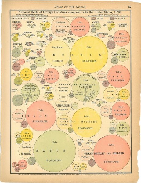
7)Make it Beautiful
While data visualization best practices have changed, the art remains just that—an art. This specimen from the Rand McNally World Atlas was published in 1890. The subject is certainly less than thrilling (“National Debts of Foreign Countries and the U.S. in 1890”), but it is so damn pretty you’d want to hang it in your office today.
Although we can always learn from history, data visualization is an ever-evolving practice. To make sure you stay on top of best practices, here are a few posts that can help:
If you need a little help with your data storytelling, we’d love to work together.
10 Creative Ways to Repurpose Your Data Visualizations
Great data storytelling languishing in blogs, a beautiful chart hiding on a designer’s desktop, a great graph shared once in an infographic—these are some of our biggest pet peeves, because a great data visualization should never go to waste. It takes a lot of time and skill to produce beautiful data visualizations, and we think you should get the most mileage out of anything you put that much energy into.
10 Ways to Reuse a Data Visualization
That’s why we encourage you to republish, repurpose, remix, and reuse your data visualizations as much as possible. (We actually call this a divisible content strategy, which you can read more about here.) We know that it’s easy to wrap up a project and move on, but you should really look at all content you create through two lenses:
How you’ll use it in its first iteration
How to use it to extend the shelf-life of the content or support other collateral you’re creating
For data visualizations in particular, there are a lot of things you can do to extend their reach. Here are some of our favorites.
1) Infographics
Now, for many people, the whole reason you end up with a slick data visualization is because of an infographic. But if you’re starting with a visualization from, say, your annual report, you may be able to find a new home—and even a new story—in an infographic. Additionally, you may have a series of infographics on similar subjects. As long as it’s relevant, save your designers some work and repurpose the visualizations you have.
Example: We helped Highfive turn data from a company report into a visual, shareable infographic.
If you want to make an effective infographic, check out our best tips from creating more than 4,000 of them.
2) E-books and White Papers
No matter what you make, visuals will always enhance it. (To see the power of visualization in action, check out this video.) And when you have a great data visualization, it’s because you have great data (well, we hope). For things like e-books and white papers, data is a great way to tell your story and break up the information with engaging visuals.
Example: We worked with HP to create their highly visual Enterprise 2020 e-book, featuring plenty of data visualizations.
For more tips on how to make better content marketing, check out our e-book archive.
3) Reports
Whether it’s a client report, company report, or annual report, a great data visualization makes it a lot easier to “see” the significance of numbers. When you need to communicate or support your argument, data visualization is very useful. (Also, who wouldn’t prefer a well-designed piece in their inbox over a droll spreadsheet?)
Example: We partnered with the NFL to produce print reports featuring data and analytics for each team’s web performance. Each report contained detailed information, presented in a visually engaging way for easy reference.
When you are publicly presenting information, you need it to be visually impactful. Whether you’re trying to engage an audience at a talk or grab the attention of someone passing by your booth at a tradeshow, a beautiful visual always helps. This is especially true for any environment where audio may be ineffective, like on a loud and busy tradeshow floor.
Example: We partnered with the Gates Foundation to design a highly visual presentation, using data visualizations to make the information easier to synthesize.
Interactive content is a great way to bring people into a story, to immerse and engage them. If you really want your data visualizations to come to life, interactives can do it. You may decide to incorporate a data visualization into an interactive slideshow or make the actual visualization interactive. There are plenty of options, depending on what you need.
Example: We worked with Microsoft to create their Anatomy of a Breach interactive website, which includes animated data visualizations that show how prevalent the crime is. (Go behind-the-scenes of the project here.)
Animated data visualizations differ from interactive infographics because they don’t actually require interaction; they can move on their own. Because they’re visually stimulating and stand out, they are an awesome way to catch someone’s eye in a social feed or spruce up an old blog post.
Example: We partnered with Takepart to create a set of GIFS that highlights facts important statistics about veterans to address mental health support for veterans. Though simple, the animated data visualizations make a powerful statement.
If you haven’t noticed, we’re big proponents of motion in all its forms, both in animation and interactivity. Video is a natural extension of that. It may be an animated motion graphic or a live-action video, but both also provide opportunities to infuse your story with data.
Example: We partnered with Foodbeast and Totino’s to help tell a data story about Americans’ binge-watching habits. Using the actual Totino’s product as a visual challenged us to come up with creative data visualization.
Microcontent is a huge part of a divisible content strategy. What is it? It’s basically all the little visual stuff you use to promote things: the blog teasers, social content, one-off graphics. Data visualizations make perfect microcontent, especially on social. Say you have an infographic featuring 5 different charts. Extract each chart, post it as a visual tweet, and you have 5 different posts promoting a piece of content—each from a different angle. This is one of our favorite ways to both promote and extend the shelflife of pieces of content.
Example: We collaborated with the Golden State Warriors Warriors to create a piece of data visualization microcontent to celebrate Stephen Curry’s MVP award.
Gone are the days of the old-school page-long press release. Journalists, publications, and the public want to know the core message as quickly as possible. This is especially true for journalists who are looking for interesting content to cover. A visual press release that features compelling data—along with a beautiful visualization—is much more likely to get you noticed (and published!).
Example: A single panel extracted from our modularly designed infographic for Jive Software is a great visual to entice a publisher to follow a story or envision the content on their site.
Every organization has different communication needs that vary department by department. There are many types of collateral that can get a nice upgrade with data visualization. Think of the regular collateral you have (or stuff you’d love to have) that could benefit, including sales brochures, employee materials, etc.
Example: Google asked us to help bring their Trust/SMB Whitepaper to life. So we created a data-rich, print-ready brochure used to promote Google Apps.
8 Tips to Do Great Work with a Data Visualization Agency
We’ve created many data visualizations with many different partners, so we know first-hand what makes these projects succeed and what turns them into a total disaster. To make sure you get the best work from your data visualization agency, we’ve put together a few insider tips on how to communicate and collaborate the right way.
8 Tips to Do Great Work with a Data Visualization Agency
It’s not easy to find the right data visualization agency for your project. (If you’re still on the hunt, check out our tips for how to vet them.) And once you find the right partner, the work doesn’t end there. You don’t want a gun for hire; you want a collaborative partner who will help bring your data to life. But working together means you each have a responsibility to do your part. To get the best work from your data visualization agency—and the best project possible—here are a few tips to make the process a little smoother.
1) Communicate a Clear Goal
Your data visualization agency is made up of expert designers and data storytellers who are adept at creating visualizations to communicate a specific purpose. They need to know not only what the goal is for this particular project but how it plays into your larger communication goals. Is it meant to engage people on social? Will it be used at a tradeshow? This info will influence their decisions at every stage, from the language they use to the format they use to present the data. Start off on the right foot with a detailed creative brief to clue them in. Here’s how to write one if you haven’t done it before.
2) Don’t Just Dump Your Data on Them
It’s exciting to have a partner who can dive into your data, but that doesn’t mean they’re your personal assistant. Far too often a client will get so excited they’ll send over every single piece of data they have, giving us a veritable ocean of data to wade through. This wastes precious time for the data visualization agency and, ultimately, your organization—the longer they take, the longer you wait. When you deliver data, it should be:
Decently organized: Make it easier for your data visualization agency to “see” what they’re looking at.
Complete: We can’t tell you how inconvenient it is to go back and forth in search of a few missing numbers. Clean and sort your data to avoid this.
A reasonable amount:Sometimes people come to us with three stats and ask us to turn it into a data story. Other times, as we mentioned, it’s an insane database of randomness. Provide a solid data set that gives your data visualization agency enough to work with.
3) Let Them Extract the Most Meaningful Insights
You may already have a story in mind—and you may have the data to support it—but there may be a more interesting angle in that data. (Sidenote: We hate to see people try to retrofit data just because they have a “great” idea. Not only does this result in a weaker story but you risk misrepresenting data, which can hurt your credibility.) You should have filled your data visualization agency in on the project’s goal, so let them help extract the most valuable insights to achieve that goal.
4) Know Your Terms
There’s a reason you’re using a data visualization agency, and it’s likely because you are not a data scientist or designer yourself. That’s OK, and you’re doing the right thing. But when it comes to collaborating on a data project, it’s important to know the basic lingo. This helps clear up miscommunication and ensures you’ll all stay on the same page. If you need a little help:
Check out our guide to the most common charts and graphs: It’ll help you learn the difference between a pie chart and a donut chart so you don’t have to call it “that circle thing.”
Learn about different visualization formats: Here’s a great rundown of the differences between data visualization, infographics, animated infographics, interactive infographics, motion graphics, and video.
5) Collaborate on the Story
Once the most interesting insights are uncovered, it’s vital to shape a narrative that will communicate them with the most impact. This is a highly collaborative process. You know who you’re trying to reach—how they think, what problems they face, the language they use—so you should help guide your data visualization agency. We believe the best story wins, no matter who it came from.
6) Share Brand Guidelines
We can’t tell you how frustrating it is for a data visualization agency to put their heart and soul into a beautiful visualization only to be told—after the fact—that it doesn’t align with brand style. Make sure you share this information from the start. Conversely, if your brand guidelines don’t include directions for data visualization, this is the perfect opportunity to create some rules.
7) Identify Your Editors
Careless mistakes are the quickest way to ruin your data visualization’s integrity. Sometimes it’s a transposed number. Sometimes an entire chart is missing. With so much back and forth, these things can fall through the cracks. Make sure you have designated “editors” on both teams that will be accountable for reviewing and ensuring accuracy. (Note: This doesn’t have to be a proper “editor.” It may be a project manager or producer.)
8) Be a Good Creative Partner
There are many moving parts in a data project, and issues can come up at every stage. To help keep everything running smoothly, follow general rules to be a good collaborater:
Designate a point person: This should be the contact to interface with your data visualization agency whenever they have a question or problem to solve.
Get sign-off at every stage: Make sure all stakeholders have reviewed and approved content at each stage, from copy to design.
Be responsive:Be respectful of your partner’s time. Don’t leave them hanging on questions or delay sending over important documents.
Offer constructive feedback:Consolidate your feedback from stakeholders, and frame it in terms of what works and what doesn’t, instead of what you did and didn’t like.
Follow these tips, and we guarantee your project will be a lot smoother. The only argument you’ll have is about where to get a beer together after your awesome project goes live.
How to Pick the Best Data Visualization Format For Your Story
If you want to tell a powerful story, data is the way to go. Whether it’s proprietary data, industry research, or public data, there are compelling stories all around. But even the best data story can lose impact if it isn’t presented the right way. That’s why it’s so important to choose the right data visualization format for your data.
We find that there is a lot of misinformation or misunderstanding around this topic. Many people think that throwing a few charts and graphs into an article is all they need to tell a good data story. Or they think they can stuff a trillion data points into an infographic and call it a day. While the intention might be right, the execution is so wrong.
We want you to tell the best data stories you can, so we’re breaking down the different types of storytelling formats to help you choose the best for your data. (Note: This isn’t entirely prescriptive, but it should send you in the right direction.)
Data Visualization Formats/Tools
Before we dive in, let’s clear up a few terms to specify what we’re talking about. When it comes to data storytelling, people tend to use certain terms interchangeably (or misuse them entirely), but there are very different types of data mediums and data visualization formats. For the purposes of this post, here’s how we break it down.
Data visualization: In the strictest sense, this refers to the actual visual representation of data. This may mean basic charts and graphs or larger, more complicated visuals. But it is about the visual specifically.
Information design: Information design is the visual representation of information—with no data at all (think of an organizational flow chart). We won’t be talking about info design here, but we think it’s important to understand the distinction.
Infographic: An infographic is a graphic that includes data, copy, and visuals. These elements work symbiotically to tell the story. (That means your infographic may include data visualizations.)
Animated infographic: These are infographics that include motion or animation. These are not interactive (see below), because the viewer doesn’t control the motion or animation.
Interactive infographic: An interactive infographic is any web-based content that lets you interact with the data on the screen. You may scroll over, click, expand, or otherwise manipulate the on-screen data.
Motion graphic: These are animated graphics that tell a story. Motion stories can be told through kinetic text, animated visuals, or both.
Video: This is live-action film, which may also incorporate text, graphics, etc.
Luckily, you have more options than ever to tell your story. But this can also make it tricky to choose which is best.
Before You Choose a Data Visualization Format
There are many elements that influence how you might best present your story. Before you decide on a format, think of the bigger picture. Each of these may affect the route you take.
Goal: Before you create anything or even come up with an idea, you should always know what your goal is. This is just as important to data storytelling as anything else. Are you trying to increase brand awareness? Establish your expertise? Engage your social followers? Some formats can help you achieve these goals more than others.
Story: An effective data story isn’t just a smattering of stats. If you’ve done your job well and teased out the insights, you can craft a narrative to reveal that story. That said, the story you’re trying to tell will very much dictate the data visualization format you choose. Is there a clear message? Are people meant to uncover or assign their own meaning to the story? Are you creating a useful resource? Are you trying to guide them to a next action? Keep this in mind.
Volume of data: This is one of the biggest issues we see over and over. People can go data-crazy sometimes and extract a mountain of data to turn into a story. That’s nice, but you must consider how much data is really required to tell the story. Sometimes you have millions of data points, and that’s OK. Just don’t stuff those into the world’s longest infographic.
Audience: Who are you trying to reach with your data story? Who will be interested in it? What level of knowledge or understanding do they have? What data visualization formats are they accustomed to interacting with? If you are targeting older boomers, for example, a fancy interactive might not be the way to go.
Distribution: Where will your data story live? On your blog? On social? Published on an industry site? How will you drive traffic to the piece? Know this from the get-go. If you are trying to engage people on social, the format you choose sure as hell better be optimized for social. (We once designed a beautiful animated infographic only to find out the publisher’s platform didn’t support the format. Then we cried.)
Choosing Your Data Visualization Format
Each data story is unique, so there isn’t a single rule or formula for choosing the best presentation. However, some are better suited than others to help you achieve your goals.
Data visualization
A strong data visualization can be used alone or as part of a larger piece. The power of strict data visualization lies in, of course, the visualization. A stunning visual is not only aesthetically appealing but lets the viewer “see” the story. Sometimes, a simple data visualization can be even more powerful than a detailed story with additional copy or context.
Good for: Data visualizations are often used as one part of a larger story in an infographic, white paper, e-book, on social, etc. (Simple visualizations are especially useful for situations in which time or attention is limited and you need to tell the story “at first sight,” such as a visual at a tradeshow booth.)
Example: This simple data visualization is a convenient guide to grilling meat. The data is depicted in chart form, making it easy for readers to get the info they need at a glance.
To make sure your data visualizations are effective, design them according to best practices. Find out how to do that with our Data Visualization 101 guide.
Infographics
Infographics are particularly useful to communicate in a simple, clear, and easy-to-understand way. They are aesthetically engaging and easy to share, making them a great tool for brand awareness. Publishers have become increasingly interested in infographics, as they visually enhance stories. Additionally, panels or slices from infographics can be repurposed as microcontent, helping to further promote the piece of content and give you more bang for your buck.
Good for: Social, content marketing, visual aids, editorial publishing, etc.
Example: This Jobvite infographic on paid parental leave tackles a relevant subject for their target audience and presents data in an easy-to-understand manner.
Animated infographics have all the same benefits of infographics, but the addition of motion makes them more attention-grabbing. They are a good option if you want to mix up your content and experiment with motion without creating a full-on interactive or motion graphic. Like infographics, motion elements can also be repurposed in other areas.
Good for: Social, advertorial, or editorial, specifically situations where you need to grab attention to attract people to the content.
Example: We helped Newscred visualize the results of their content marketing survey by creating an animated infographic. The modular design allowed panels to be used individually or together.
Interactive infographics are ideal for instances in which you have an enormous amount of data that needs to be easily navigable. You may present that as an exploratory interactive, in which users can dive into the data to extract their own meaning, or as a narrative interactive, in which you guide them through the interactive. Interactives require the viewer to actively engage by physically inputting information or manipulating data. It also encourages the viewer to spend more time with the content.
Good for: Engagement, deep data exploration, and immersive storytelling.
Example: We turned 10 million cells of data from a Northwestern University Qatar survey into a clean, colorful, easy-to-navigate piece. The interactive allows for exploratory storytelling, where the user can decide what data they are most interested in.
Motion graphics are particularly useful when you have an abstract concept or a story that needs more context to connect the dots. It is a contained storytelling format, which makes it easier to deliver a succinct story or direct message. It is also passive, allowing the viewer to sit back and absorb.
Good for: Telling a succinct story in a short amount of time.
Example:We collaborated with NBC Universal to create a motion graphic encouraging Americans to reduce food waste, using data from the Natural Resources Defense Council.
Video has become an increasingly popular medium, largely thanks to social platforms. Like motion, video can also incorporate text, graphics, and data visualization and offers an opportunity to demonstrate creativity. However, perhaps its strongest selling point is its ability to put a “human” spin on data stories by putting actors front and center.
Good for: Telling a succinct story in a short amount of time, especially when you are trying to create an emotional connection with the content.
Example: We partnered with Foodbeast and Totino’s to help tell a data story about Americans’ binge-watching habits. Using the actual Totino’s product as a visual challenged us to come up with creative data visualization.
https://vimeo.com/190951671
Learn more about why humans are so attracted to video.
Remember: Story First
No matter what data visualization format you choose, remember the basics that will make it succeed: Strong data and a strong story. If you need a little help in that area, here are some things that might help:
If you need a little help with your data storytelling, we’d love to work together.
Presentation: The Value of Data Visualization
The Value of Data Visualization was created for presentation at the Richmond Federal Reserve’s “Unleashing the Power of Local Data” conference.
How do content marketing agencies help SaaS brands grow?
Content marketing agencies provide strategic expertise and fresh perspective. They can help identify brand positioning gaps, develop comprehensive content strategies, and spot opportunities that internal teams might miss. Agencies bring experience from working with multiple clients and can offer insights into industry best practices.
Agencies offer specialized skills and infrastructure for consistent content production. From copywriters and designers to data visualization experts and video producers, agencies have the talent and processes to create quality content at scale. This allows SaaS brands to maintain consistent publishing schedules without overwhelming internal resources.
Agencies help SaaS brands differentiate through strategic storytelling. By helping brands identify their unique value proposition, brand voice, and key messaging pillars, agencies can create content that stands out from generic competitors. They focus on creating content that only your brand can tell.
Agencies provide established networks and resources for content distribution. Beyond creation, agencies have relationships with media contacts, influencers, and distribution partners that can amplify content reach. They also stay current on platform changes and best practices across channels.
What content formats are most effective for SaaS lead generation?
Ebooks and guides generate high-quality leads: These formats provide substantial value and justify gating, as they offer step-by-step tutorials or deep dives into specific subjects. Because they’re rich and data-heavy, people spend more time engaging with the content.
Interactive content drives higher engagement: Interactive formats like microsites, quizzes, and data visualizations allow users to direct their experience and tend to be more memorable. They can transform dry topics into engaging experiences that capture attention.
Video content communicates complex information effectively: From explainer videos to product demos, video helps communicate information quickly and effectively while building stronger emotional connections with viewers.
Data-driven content positions you as a thought leader: Research reports, industry surveys, and original data analysis provide unique value that publications and audiences seek. This type of content can generate earned media coverage and establish authority in your space.
What are the most impactful types of content for B2B SaaS marketing?
Brand Content: This is content about your company (not your product), including who you are, your Brand Heart (purpose, vision, mission, values), and brand messaging (tagline, value prop, messaging pillars). This is valuable content that helps people feel connected to you, aligned with your values, and part of your community without getting into the nitty-gritty of your business offerings.
Editorial Content: This is content meant to educate, entertain, inspire, or demonstrate your brand expertise. This can include all types of content—often in the form of thought leadership or actionable advice, such as articles, guest posts, infographics, data visualizations, podcasts, videos, etc.
Product Content: This pillar is for deeper-funnel content, particularly informational content related to your products or services that’ll help buyers gain trust. This includes content about what you do, such as sales materials, one-sheeters, interactive or motion demos, product trials, explainer videos, etc.
Talent Content: Talent content is all about your employer brand, culture, etc. It’s geared toward prospective employees, as well as current employees. It’s basically everything people would want to know about what it’s like to work for your company: what your culture is like, who works for you, what life is like behind the scenes, etc. It’s also a way to celebrate and acknowledge those who do work for you and make them feel more connected to the company.
Performance Content: This is tactical content used to drive a specific KPI, such as landing pages, CTAs, PPC, etc.—basically anything that doesn’t fit neatly into one of the buckets above. It’s often supplementary content for campaigns related to other pillars. While less comprehensive than other content types, it plays a vital role in achieving marketing KPI.

 Comparison