
No matter what your infographic goals are, getting more traffic will help you achieve them. But you can’t just send an infographic out into the void and expect results. To make it successful, you need to carefully strategize and intentionally craft content that will be so interesting and impactful that readers can’t wait to share it. This is especially true when it comes to infographic design and distribution. Hence, we’re sharing some of our best infographic tips to help you get your content in front of the right people—and make it memorable.
Why Infographic Design and Distribution Matter
Great infographic design captures people’s attention and makes the message easier to digest. A solid distribution plan gets that infographic in front of people so that they can engage and absorb that message. That’s why you need to execute both to the best of your abilities.
Great infographic design is irrelevant if it never makes it to someone’s social feed. And the best PR in the world won’t help you if the content isn’t attractive enough for your contacts to post.
We know this firsthand. Over the last decade of producing and publishing infographics, we’ve made plenty of mistakes in these areas, but along the way we’ve also discovered the most effective best practices for infographic design and distribution.
Here, we’re sharing our best tips to help you create content that you’re proud of—and that people can’t wait to post. No matter what role you’re responsible for, these should help you do your job to the best of your ability.
11 Handy Infographic Tips
To make your infographics as visually engaging as possible, here are a few things to remember.
1) Know Who You’re Designing For
Before you start your infographic design, think about the people you’re trying to reach and the story you’re trying to tell. For the people, consider: What types of content are they used to seeing? What do they tend to gravitate toward?
As for content, you still need to consider the story you’re telling, the brand you’re representing, and how to best represent that.
Infographic design for a tech company will likely look quite different from one for a cosmetics blog. Design choices, such as colors and illustration style, should be driven by their purpose, not because you’ve “been really into lucite green lately” or “just wanted to show the world that geometric shapes can define our souls.” (In fact, you should always be able to justify a design choice as it relates to your content’s goal.)
To make these decisions based on research and not whims, make sure your team has well-crafted personas, as well as a creative brief that is comprehensive.
2) Design for Your Distribution Platforms
In addition to knowing what type of people you’re designing for, you need to know where this infographic will live. Is it meant to be circulated through Facebook? Published via the company blog? These digital environments will greatly affect how people interact with your work.
To successfully stand out in the wild chaos of the digital void, think about all the places your infographic might appear:
- What’s the biggest size the blog, landing page, or microsite will allow for images? Will this be viewed on mobile? Know your specs ahead of time.
- What social platform will this be promoted on? Facebook, Twitter, Instagram, and Pinterest all display different dimensions.
- Is there a chance it will be printed? If so, then it changes the color game. RGB for web; CMYK for print.
- What’s the ideal resolution? Well, here it is: 72 dpi for web, 150 dpi for retina screens, 300 dpi for print.
There’s nothing worse than completing a design only to find out you have to completely rework it. Know these answers from the beginning.
3) Follow Infographic Design Best Practices
The initial visual impact of your infographic will instantly attract or repel people—even before they read the headline. That’s because humans can process visual content in 13 milliseconds, according to MIT. First impressions matter, so every aspect of design must be on point. (And, yes, even seasoned designers can make rookie mistakes.) Things to pay special attention to:
- White space and alignment: The eye needs a visual break, so make white space your friend. Consistent spacing is also really important. Grids and baselines ensure the viewer’s eye has the opportunity to look at, adore, and internalize each component of your infographic.
- Clear and logical type hierarchy: You can’t go buck wild with fonts. It’ll end up looking like some frantically assembled ransom note. Limit yourself to one or two font families and as few font styles as possible, or you’ll risk reader reactions of the worst kind. (As typographer Stephen Coles said, “You can’t be a good typographer if you aren’t a good reader.”) Your goal is to guide readers through the content in the most intuitive way.
- Colors and values: Your infographic should always reflect your brand’s visual language, but utility matters most. Can you read the text against that background? Do the two categories in the legend contrast strongly enough to see a difference? Will that red render properly on Facebook?
A few additional infographic design tips:

For more tips on designing good content, avoid these 15 common infographic mistakes, and make sure your brand style guide is up to date.
4) Nail Your Data Visualization
Obviously, great design can captivate people and make them want to engage with your content, but credibility is what makes them want to share it. That’s why accurate data visualization is so important. If a chart is incorrect, it erodes the reader’s trust in the content.
But great data visualization isn’t just about depicting data accurately. It’s about doing so effectively. If a graph or chart is too difficult or confusing to interpret, people will instantly check out. There are plenty of little tweaks you can make to improve the way people digest and synthesize the content, and it’s a designer’s job to do so. Everything from the way you build your bar charts to the way you list your sources affects comprehension.
To brush up on data visualization best practices, learn how to design the most common charts and graphs and follow these 25 tips to improve your data visualizations.
5) Watch Your Length
The days of the endless infographic are over. People want valuable content, but length does not equal value. (In fact, 46% of respondents to a 2017 Demand Gen Report said they prefer shorter content.)
If you have so much content you don’t know what to cut, it probably means you’re trying to tell too many stories in one. In these cases, either distill your infographic into a single narrative or turn it into an infographic series. If you need a little inspiration, here are some of our favorite examples of infographic design that do this well.
6) Design In Modular Pieces
We love creative infographic design, but designing modularly is a smart and economical way to use the space. It helps create an intuitive sense of hierarchy, and it also makes it easier to break your infographic into teaser images to share on social, use in blogs, or send to a publisher. (These types of assets are infinitely helpful for your distribution team.)
Pro tip: Have these assets prepped before you publish, sized in the appropriate dimensions and resolution. (Use this infographic to find out how to size images for every social channel.)
For example, this animated infographic by NewsCred is modularly designed, making it easy to split and distribute.

Infographic Tips for Distribution
If your team has nailed the infographic design, your job should be a bit easier. But here are a few ways to make sure their hard work doesn’t go unloved.
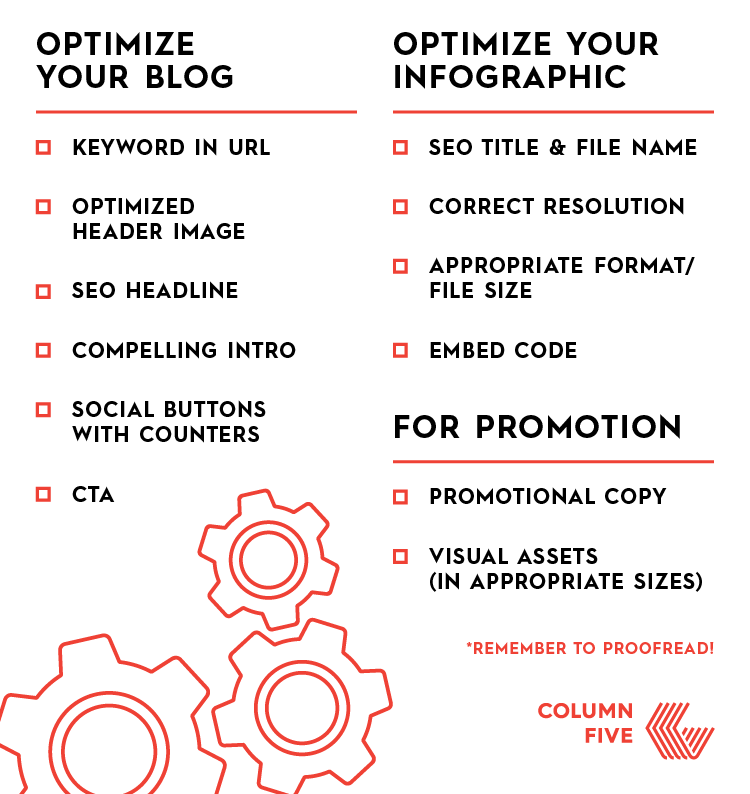
7) Optimize Everything
Infographics are great to build SEO, but we can’t tell you how many people forget this crucial step. Your infographic, landing page, and blog should all be optimized to get you the most traffic and the most shares.
That means including the appropriate keywords in filenames, headers, images, URL, and blog copy. And don’t forget to add (and test!) social sharing buttons on your blog.
Find out more about how to optimize your blog and follow this helpful checklist to make sure everything’s good to go—before you hit publish.
8) Use Paid Social to Your Advantage
Organic traffic is awesome, but it’s often the outcome of at least some intentional outreach. The Internet’s like a gigantic festival of carnivals, and it certainly doesn’t help that social algorithms are ever-changing, increasing your content’s odds of getting lost in the social shuffle.
That’s why paid promotion is evolving into a standard practice. According to the Content Marketing Institute’s 2017 B2B Content Marketing Report, 84% of marketers use social promotion. Adding paid amplification to your posts will give them the boost they need to land eyeballs on your content.
To help make that happen, use images and determine the most relevant channel(s) to promote your work. For more tips on how to optimize social promotion, check out our Ultimate Guide to Content Distribution e-book.
9) Reach Out to Publications that Post Related Content
Look for publications that post content similar to the infographic you’ve created, and reach out to the journalists who cover related topics. Offering these publications editorial content can provide them with valuable visual assets to use in their posts, which creates greater visibility and helps you build a long-term relationship.
To do it effectively, here’s our step-by-step guide to reaching out to publications. You can also reach out to them when you’re at the ideas stage so that you know they’ll be interested before you even make the infographic.
10) Leverage All Relevant, Owned Channels
Since this isn’t the Mad Men era, you don’t have to rely on advertising points of contact. You own channels. You’re in charge of an email newsletter, a blog, and probably a billion different social accounts. Besides, you have internal company feeds and employees with a billion social accounts themselves. Don’t underestimate employee advocacy. (Leads developed through employee social marketing convert 7x more frequently than other leads.)
Before you send your infographic out via newsletter or social, share it internally to build your share numbers. That way readers can see it already has traction.
11) Repurpose Your Infographic
An infographic shouldn’t be a one-and-done deal when it comes to distribution. Depending on the subject, you can rebump the infographic if it’s seasonal or relates to a suddenly trending topic. (For example, our infographic guide to grilling meats and veggies always does well around the 4th of July weekend.) This can give you a nice hit—long after the infographic is published.
You can also look for opportunities to reuse portions of the infographic or the infographic itself. (Again, this is why modular design is so helpful.) Whether you add it to a blog post or use it to promote a new e-book, repurposing will always help you get more mileage for your team’s work.
You can even pre-plan content to be repurposed. Find out how a divisible content strategy gives your brand more for less.
Improve Your Infographic Design, From Start to Finish
We hope you’ll give these infographic tips a try and let us know how they worked for you. (Feel free to send us any of your own, too!) But remember that every stage of infographic creation affects how impactful it will be. If you want to improve your team’s efficacy (and skills) at every level, here are a few more posts you might like:
- Try these 16 ways to come up with better infographic ideas.
- Bookmark these 101+ infographic tips, tools, and resources to help your team.
- Follow these 19 tips to help you be more effective at every stage of the infographic process.
If you still need help, we design and distribute cool infographics all the time. Hit us up if you want to talk shop.

Let's upgrade your marketing game
Get fresh tips, how-tos, and expert marketing advice every week. (15,000 people already are.)