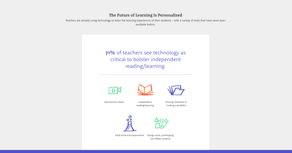
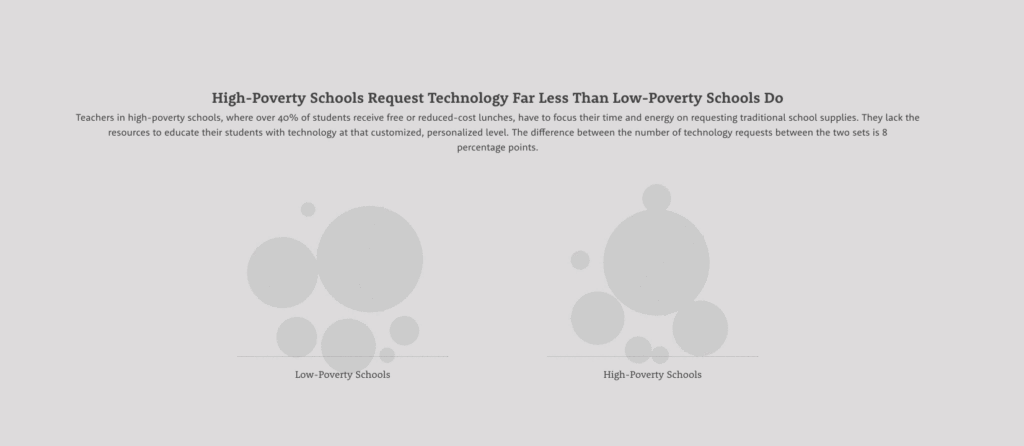
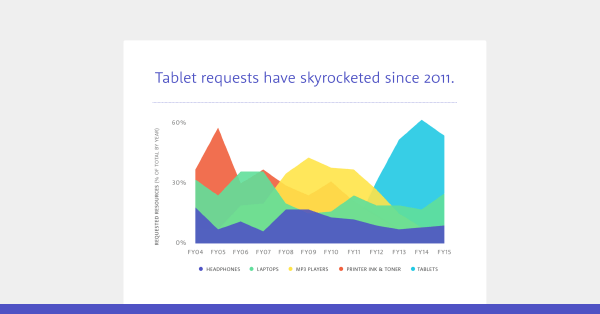
If you’re not familiar with DonorsChoose.org, the crowd-funding platform that lets anybody donate to classrooms in need, you should be. They do good work, and we’ve enjoyed working with them since our agency was just starting out. (In fact, our very first motion graphic was for DonorsChoose.org.) We love what they do because we care deeply about education (our founders all met in college), so whenever we get a chance to help them affect change in that arena, we’re on board. When they approached us to help visualize their new survey in an interactive infographic, it was an easy yes.
The Ask
DonorsChoose.org had just finished a teacher survey that explored how educators use technology in the classroom—and how they use the platform to fundraise for the technology that their districts can’t or won’t provide. The survey results provided some great insights into how teachers are putting technology to work, challenging the misconception that technology in the classroom is somehow frivolous.
As tech fundraising is a common challenge, DonorsChoose.org wanted to present the findings to showcase the lack of funding and why this is a problem. Knowing how much we love data, they came to us to help visualize the information in the most compelling way.
The Interactive
When you have a significant amount of data to work with, the biggest challenge is presenting it in an easy-to-digest package for your audience. We decided on an interactive infographic, with both animated and static elements, to help guide viewers through the data in the most impactful way.

To do this, we collaborated with the DonorsChoose.org team to sort the data, determine what would work best visually, and lay out how the information would be presented. The interactive helped us bring the survey results to life, giving readers the full story through maps, data deep dives, and classroom stories.


The biggest challenge was explaining both sides of the issue: the benefits of tech in the classroom and barriers to funding. To tell the two sides of this story, we divided the interactive into two sections. The first section talks about how much teachers lack tech; the second shows why not having tech is problematic for our future. This allows for a cohesive narrative as you explore the interactive.

The result is an interesting interactive infographic that allows viewers to explore the story and helps make the case for this important area of education. Explore it below or click to the full interactive here:
[iframe src=”http://hacking.education/tech-in-classrooms/” width=”700″ height=”400″ scrolling=”yes” ]
We’re so happy that we had the chance to help DonorsChoose.org further their mission, and we encourage you to check out their site and donate to a classroom in your area.
Want to see more of our work? Check out these behind-the-scenes project features.


