If you’re at the visual identity stage of your branding (or rebranding) process, there are many things to think about.
- What do you need to communicate through your visual identity?
- What elements do you need to design?
- How do you apply your visual identity correctly?
It can feel a bit intimidating, and the stakes are high.
According to the Lucidpress State of Brand Consistency report, consistent branding can increase revenue 10%-20%.
Fortunately, we’ve been around the branding block quite a few times, so we know the pitfalls you might fall prey to when building your visual identity—and we know what hacks can make it a heck of a lot easier. So, today we’re giving you the full rundown of the basics you need to include and the extras you might want to add, along with our free visual identity checklist and best tips to make the design process a bit easier.
Whether you’re tackling the process in-house or using a freelancer, here’s everything you need—and everything you need to be aware of.
Before You Start
All of the components we mention here are meant to help you build a solid visual identity foundation. This includes basics like color and logo, plus additional elements like illustration and data visualization. In general, this is ideal for brands that create a wide variety of content (and have a large team of content creators). Naturally, every brand is different (e.g., a lean startup vs. a global corporation), so it’s important to think about your needs now and how your brand might evolve as you go forward.
We like to think of designing a visual identity like buying a car. You might order the top-line model with the powerful engine, sunroof, and leather seats. You might just need a basic model to get around town. Or you might upgrade that basic model with a bike rack and stereo system for your weekend adventures. Ultimately, there is no one-size-fits-all template.
So, with that said, let’s talk about what makes a good visual identity—no matter what it includes. (BTW, before we dive in, you should also see our Ultimate Guide to Build a Brand Identity and download your free brand identity toolkit to make the process easier for yourself.)
What Makes a Good Visual Identity?
A strong visual identity isn’t pretty; it’s purposeful, helping you communicate who you are, no matter the medium. More specifically, a good visual identity is:
- Distinct: It’s unique and stands out from the crowd. (Think of iconic brands like Nike or Apple.)
- Memorable: It makes an impression.
- Scalable: It should be able to grow with your brand, whether you’re branching out into new products, services, or even new industries. As you go through the process of designing, remember that you aren’t just designing for today. You’re designing for your brand’s future.
- Flexible: It works across different mediums, such as web, print, etc.
- Cohesive: Every piece works together. Thus, your content stays consistent.
- Easy to apply: You want to equip your brand designers (and any content creators) with the tools they need to properly do their job, so it needs to be intuitive to use.
Keep these criteria front of mind as you make each design decision. (Trust us, it’s easy to stray away when you get deep into iterations.)
What to Include In Your Visual Identity
Again, depending on the space you play in and the type of content you create, you can customize your visual identity according to your needs. However, there are some core basics that all brands need:
- Logo
- Color palette
- Typography
Beyond that, you’ll want to consider:
- Photography
- Illustration
- Iconography
- Data visualization
Designing these elements well is crucial to your brand’s success, but it takes care and intent to do it successfully.
FYI, things can get a bit chaotic, depending on how many people are involved in your visual identity design. Know who needs to approve each element of the identity, and create a reasonable timeline (with built-in approval stages) to keep everyone on the same page throughout the process.
Your Visual Identity Checklist
We’ve helped many brands bring their visual identities to life, and we’ve learned something from each one. Here’s how we suggest you tackle each element as efficiently and effectively as possible. Note: Make sure to follow these steps in order, as each element creates a foundation for the next.
BTW, we’ve also created this handy checklist to get you through the process from start to finish.

1) Logo
Your first goal is to design a strong but flexible logo that reflects your brand personality and is easy to apply.
Tips
- Design in black-and-white first to make sure the design stands on its own (without the influence of color).
- Ensure the logo design works for web and print.
- Test that it renders well at small sizes.
To find out how to get through the process with less stress, check out our step-by-step guide to design a logo you love, and find out what logo mistakes to avoid. You can also take a look at these 15 examples of brands with an awesome identity for early inspiration.
Example: We created a new visual identity for the Expanded Special Project for Elimination of Neglected Tropical Diseases (ESPEN), a WHO organization on a mission to eliminate five specific tropical diseases. To bring their mission to life, we created a symbolic logo that features a rendering of the African continent, made of five bars: one for each disease they’re battling.
2) Color Palette
Color is a highly emotional element of branding, but it’s a bit tricky because people’s emotional response to different colors can be so subjective.
According to the “Impact of Color on Marketing Research” study by Satyendra Singh, people make up their minds about people and products within 90 seconds of their initial interactions; 62%‐90% percent of the assessment is based on colors alone.
For your brand, it’s important to curate a simple but flexible palette that you feel best represents your personality. You also need to build a comprehensive palette that allows designers enough options to work with—without overwhelming them.
Tips
- Choose 1 main color, along with…
- 2 primary colors
- 3-5 complementary colors
- 2 accent colors
- Make sure colors can render correctly on screen.
For more on the science of color and how to select the right palette, see our guide to find the right colors for your brand.
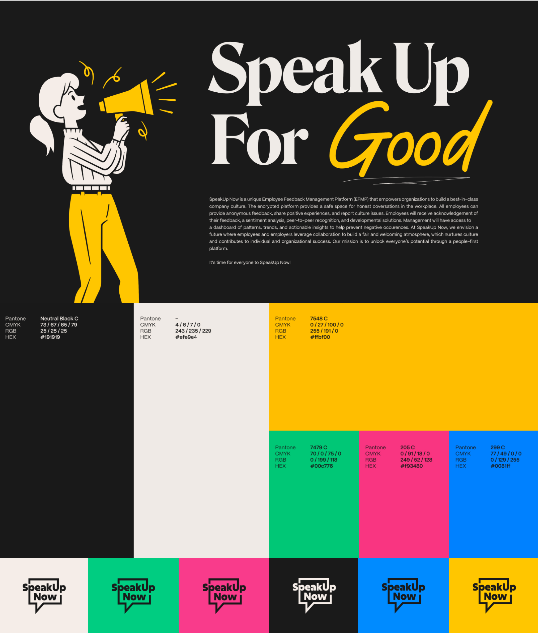
Example: The SpeakUp Now visual identity includes a bright and bold color palette to reflect the brand’s personality.
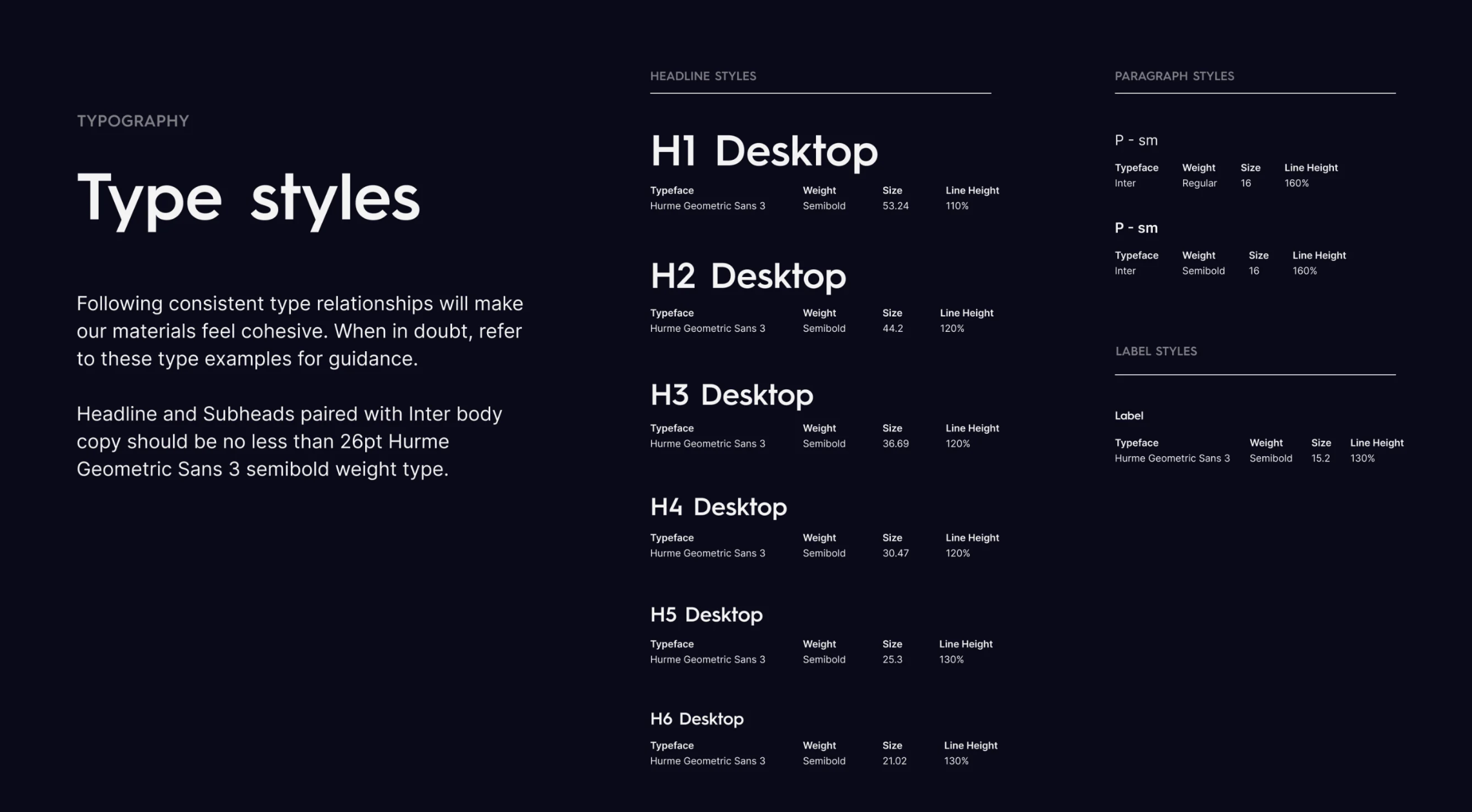
3) Typography
We think of branding like building a house. You start with your foundation, then build from there. If you think of your logo and colors as a foundation, typography is simply the natural extension of the visual language.
Tips
- Typography should be influenced by the shape and style of your logo, as you always want a complementary and cohesive look.
- Identify a primary, secondary, and tertiary typeface.
- Consider mixing serif and sans serif.
- Test for legibility in print and on screen. (FYI, a 2012 study from Humboldt-Universität zu Berlin found that larger font sizes can foster a stronger emotional connection.)
For more on where to find typefaces, how to choose them, and more, see our guide to choose the right typography for your brand.
Example: For our own agency brand guidelines, we clearly outline not only type but hierarchy.
4) Photography
Photography is more important than ever now that so much of your brand story is communicated through images. If you’re using people-centric imagery, be cognizant of your viewer and how imagery reflects upon your brand (e.g., diversity and gender). A good visual identity will dictate how to select and treat photography.
Tips
- Use consistent, cohesive visual styles.
- Ensure imagery is high quality and high resolution.
- Be mindful of inclusive representation.
A note on stock photography: People love to harangue brands for using it. While it is a widespread problem, you can still create a unique design treatment that turns a bland stock image into a photograph that tells your brand story. Just make sure you clearly lay out the dos and don’t for things like filters, design treatments, resolution, etc.
To learn more about the role of images in storytelling, see Fabrik Brand’s guide to brand photography.
Example: Visage’s brand identity provides direction for photo treatments, specifying the color, text, and photo quality.

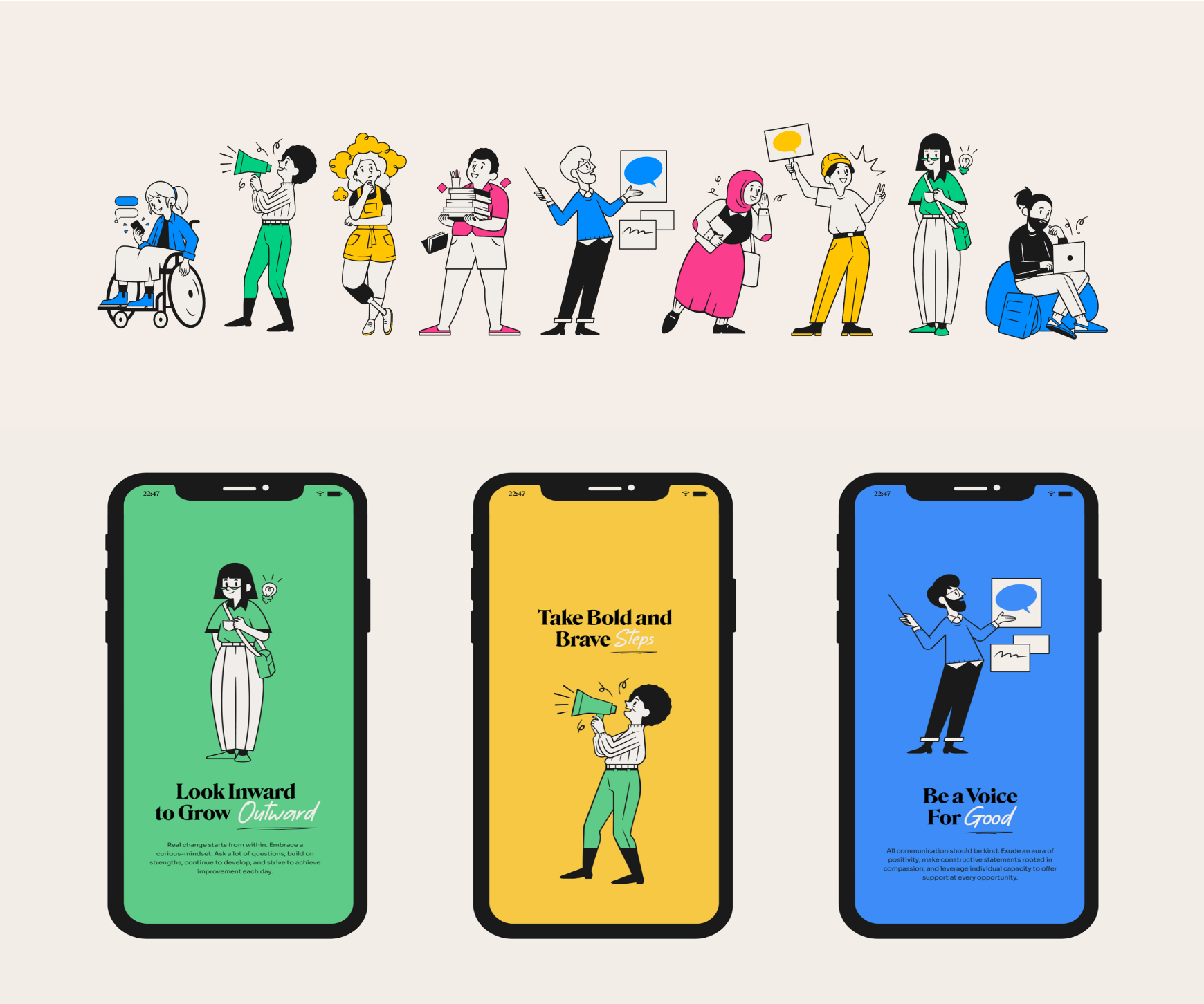
5) Illustration
Developing a unique illustration style is a smart way to visually brand your content, but you don’t want to go overboard. You also want to ensure the style is replicable (especially when you have multiple designers creating branded content).
Tips
- Choose a single style.
- Keep it simple. (Use illustrations to visually enhance, not overwhelm.)
- For character illustration, be cognizant of how you’re depicting people, characters, or products.
To figure out how to illustrate your brand, follow Smashing Magazine‘s tips for drawing a strong visual identity.
Example: SpeakUp Now’s brand identity uses a joyful and inclusive illustration style that reflects the diversity of their audience.
6) Iconography
Iconography is a visual shorthand to communicate info quickly and simply. That said, the goal of iconography is clarity and understanding—not to show off your artistry.
Tips
- Avoid clipart. Custom iconography is preferred.
- Make sure the image is relevant to the subject and that the symbolism makes sense. (Run them by someone else to make sure they do make sense.)
- Don’t mix and match illustration styles—choose a consistent style.
- Double-check that icons render clearly at small sizes.
Remember: Iconography is part art, part science, so you want to make sure things are as clear as possible. For more tips, see Design Systems’ complete guide to iconography.
Example: Make sure that any visual elements you create can easily translate to different mediums. For example, when we helped LinkedIn brand their Hack Day camp, we needed to ensure that any iconography and or imagery would work across branding materials, including special patches made for campers.

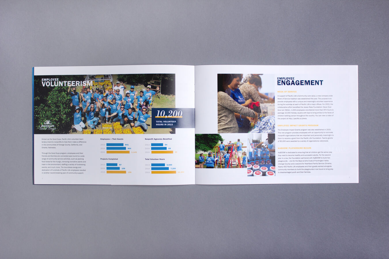
7) Data Visualization
Not every brand needs data visualization guidelines, but as data becomes more pervasive, it’s wise to create them, as design can significantly affect a reader’s understanding of data.
Great design enhances data comprehension and makes it easier for the reader to consume. Bad design skews or misrepresents data and erodes trust in a brand. Thus, when designing data visualization guidelines, make sure to follow best practices.
Tips
- Avoid chart junk. (If it doesn’t help enhance comprehension, it doesn’t need to be there.)
- Avoid clashing patterns. (Use color instead.)
- Don’t over-illustrate or use 3D charts.
- Order data intuitively (alphabetically, ascending, or descending).
If you’re not familiar with designing data, find out how to design the most common charts and graphs with our Data Visualization 101 guide, and check out these 25 tips to improve your data visualizations.
Example: Data visualizations often appear in things like white papers or reports, so it’s important to provide visual direction for design and color use within them.
Note: Although we’ve covered the main elements of a visual identity here, you might need to create additional guidance for things like interactive experiences, video, motion graphics, and other visual content.
Don’t Forget Your Brand Style Guide
To make sure your visual identity is applied correctly, you need a comprehensive brand style guide that shows your team (and any outsiders you might be collaborating with) how to create on-brand content every time.
If you haven’t created one before or your current one needs an update, find out how to build a brand style guide that people will actually use.
How to Complete Your Brand
A visual identity is only one aspect of your brand. Make sure your team is equipped with the tools they need to communicate who you are, what you do, and why people should choose your brand by building a comprehensive brand identity.
- Identify your Brand Heart. Start with our free Brand Heart workbook, and see our complete guide to build a brand strategy to build a strong brand from the ground up.
- Find your personality and voice. Start with these 5 tips to find your brand personality, and use our free questionnaire to find your brand voice.
- Articulate your brand messaging. Fill out your brand messaging framework to identify your tagline, value prop, and messaging pillars, and follow our tips to write compelling messaging that converts.
- Tell your brand story effectively. Follow our tips to brainstorm strong brand story ideas, and check out our guide to create high-quality content.
But if you get stuck, don’t be afraid to bring in expert help. Find out how to choose the right creative agency for you. And if you need help with any part of your brand strategy, find out what it’s like to work with us on your brand identity or hit us up.

Let's upgrade your marketing game
Get fresh tips, how-tos, and expert marketing advice every week. (15,000 people already are.)