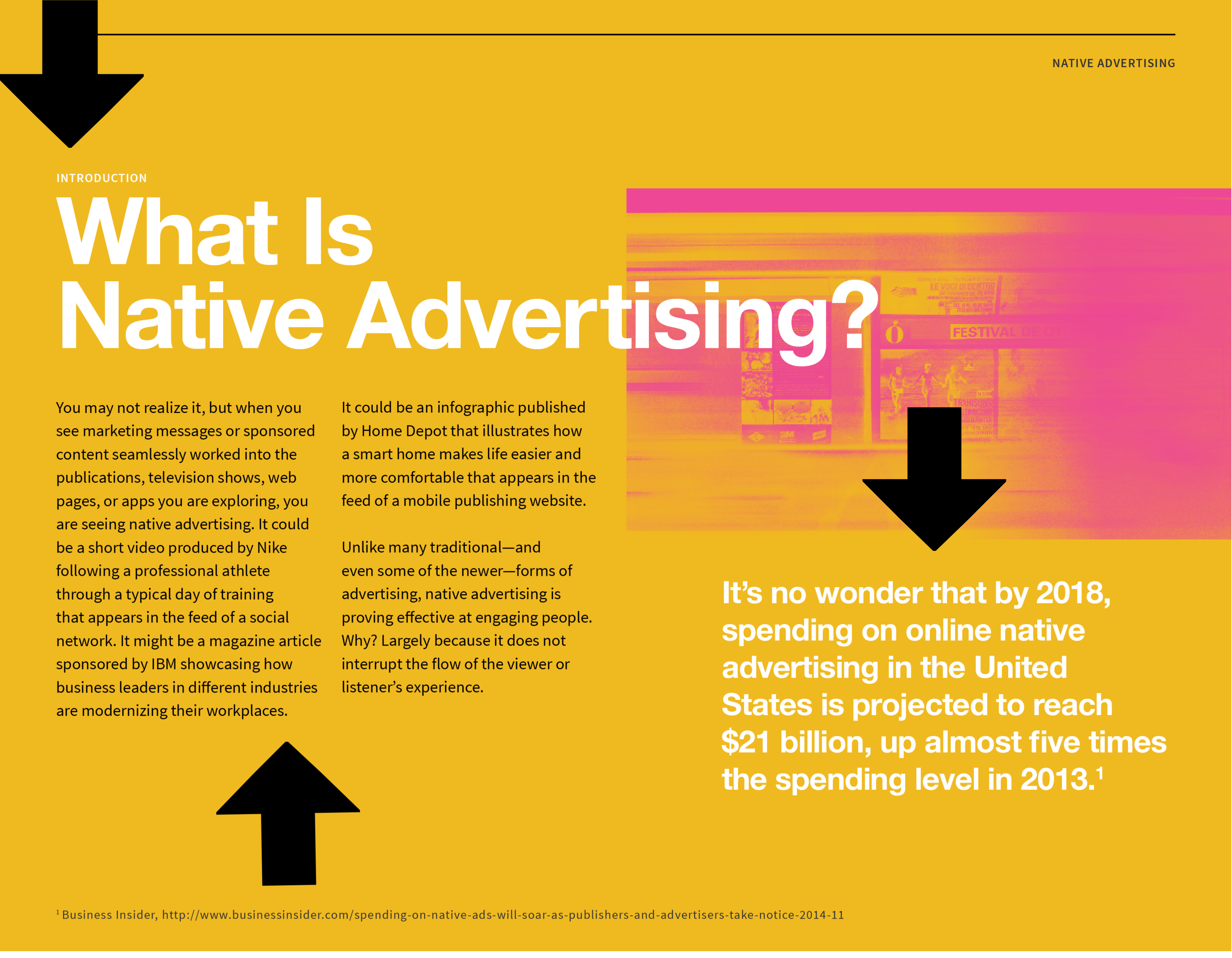
7 Creative E-book Design Examples (B2B + B2C)

In marketing, good e-book design isn’t just about making something pretty; it’s about enhancing your viewer’s experience with your content. When you turn a boring cover into a stunning calling card, or a cluttered layout into a visual treat, or a confusing data set into an elegant visualization, you make it that much easier to grab—and, most importantly, keep—your audience’s attention.

We love it when we see brands from all industries up their e-book game by applying A+ design, and we think seeing others’ good work can inspire you too. That’s why we’ve rounded up some of the most standout examples of e-book design we’ve seen lately.  

B2B Marketing Strategy Toolkit CTA

7 Excellent Examples of E-Book Design

If you’re facing an e-book design project and need a little inspiration, we have just what you need. Here are seven great takes on e-book design from both B2B and B2C brands. 

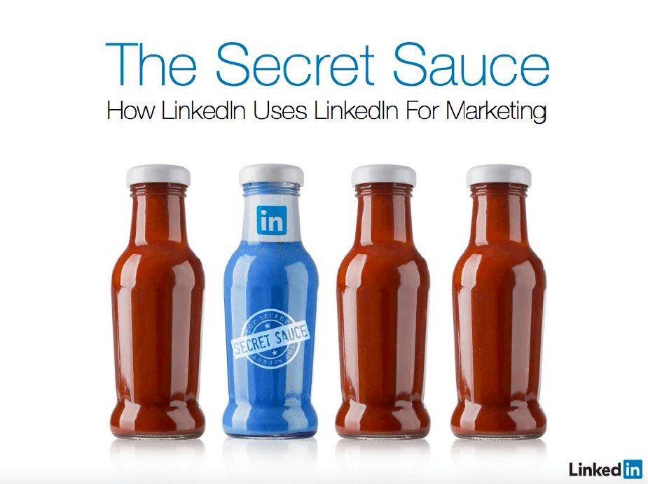
1) The Secret Sauce by LinkedIn

Why we love it: A great cover

Linkedin ebook example

We’re suckers for a bold visual, and this e-book cover hits the mark for several reasons. 

  1. It’s a clever theme, demonstrating that LinkedIn has the literal secret sauce (bonus points for making it the only bottle with a label).
  2. Its clean photography really pops, especially compared to most of the boring covers in the B2B space. 
  3. It reflects LinkedIn’s brand identity via their signature bright blue (a visual differentiator). 

When you’re looking to make an impact, a visually arresting cover is the way to do it in an instant.

Note: While a cover is incredibly important, maintaining a design aesthetic throughout all of your content is equally as important. LinkedIn decided to promote the e-book by creating an infographic, which also carries the same visual theme. A+ all around.

Linkedin ebook example 2

Tip: Make sure your e-book design reflects your brand identity. To make it easier for content creators to replicate, find out how to craft a strong brand’s style guide.

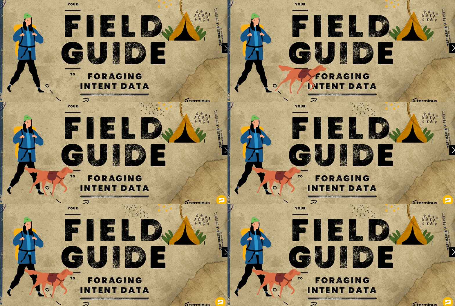
2) Your Field Guide to Foraging Intent Data by Terminus

Why we love it: A clever theme

Gathering data is a crucial part of a marketer’s job, but you can feel like you’re lost in the weeds. Terminus does an excellent job of translating this metaphor into an exciting adventure guide. From the people and animals to the maps and trails, this interactive e-book is a perfect example of how a little creativity can drastically enhance a viewer’s experience. By giving it this unique twist, learning how to gather data feels like an exciting adventure—not a dull chore.

B2b e-book examples 3

Tip: It’s easy to come up with obvious visual metaphors (e.g., lightbulb = idea), but challenge yourself to come up with a visual theme that is both relevant and interesting.

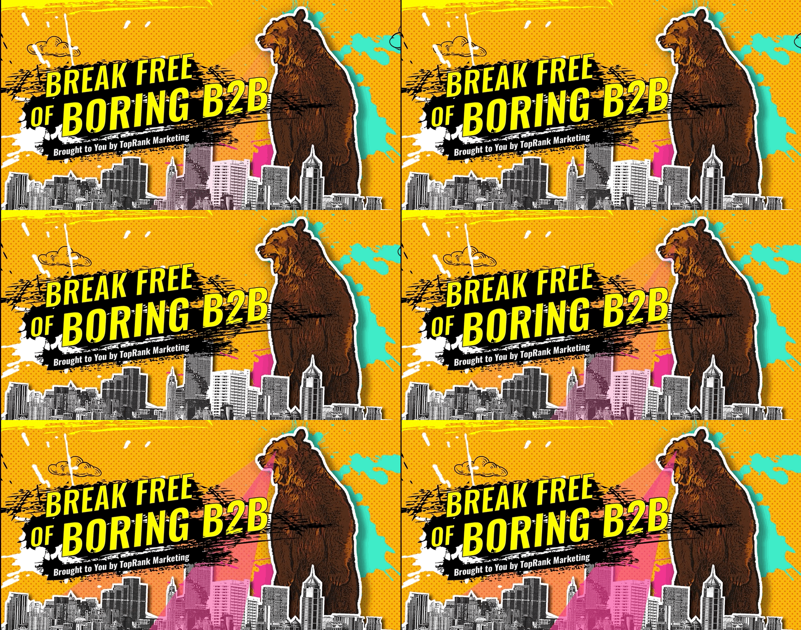
3) Break Free of Boring B2B by Ceros

Why we love it: Unusual imagery

This is a perfect example of super creative e-book design for a subject that can be notoriously, well, boring. This interactive e-book is an explosion of color, pattern, and surprising imagery that is totally unexpected. From a screaming bear to a soda-drinking cat, it takes Internet meme aesthetic to a whole new level while delving into the ins and outs of B2B content marketing. We love an eye-catching interactive, and this brings the best of animation and information together in one easy-to-navigate package.

E-book examples page with bear

Tip: Since you don’t have to be literal in your metaphors, think about the real message you’re trying to deliver. Ceros wanted to prove that B2B doesn’t have to be boring, so they created a totally surprising and whimsical e-book design to prove just that.

4) STFU Already by Unbabel

Why we love it: Bold palette and typography

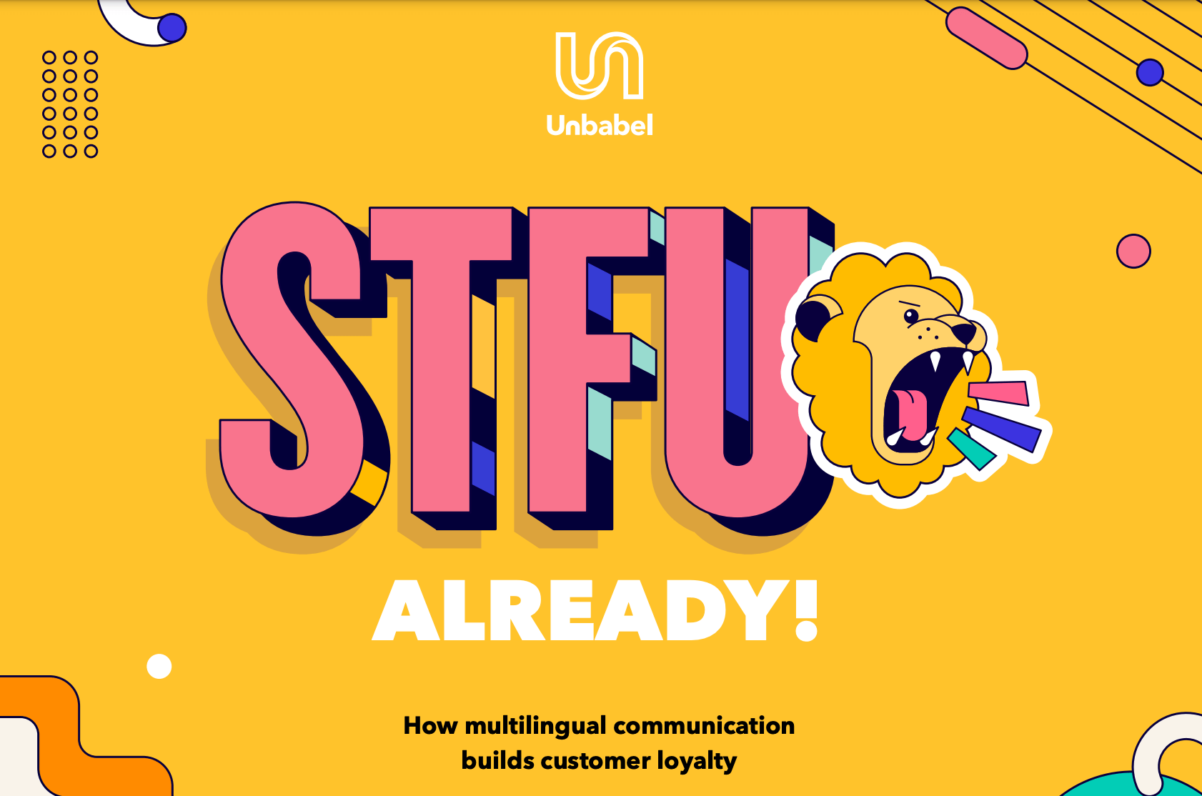
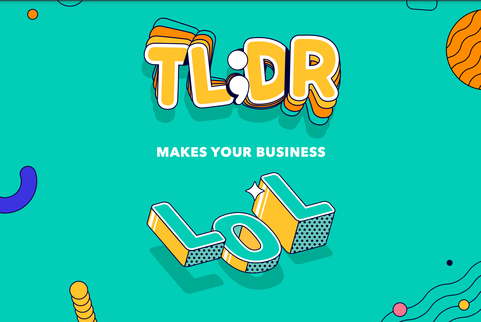
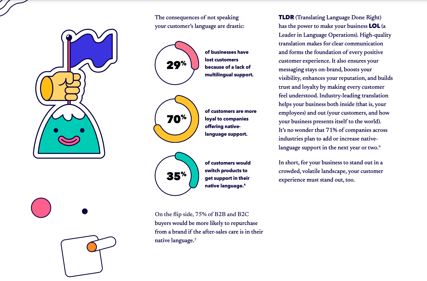
Not all e-books have to be interactive adventures. Unbabel’s thoroughly entertaining PDF e-book proves you can make a big impression without a ton of bells and whistles. Its bright and bold color palette, playful illustrations, and beautiful typography make the subject matter that much more interesting. Whereas they could have taken the technical route, espousing their software benefits in a boring brochure, this technicolor approach generates excitement and curiosity about their offering. F yeah, Unbabel.

Unbable e-book design example Unbable e-book example 2 Unbable e-book example 2

Tip: Bold colors can help you stand out from your competition, especially when you use them for your cover. If you’re not sure what fits your message, find out how to curate the right color palette for your brand. 

5) How EU Banks Can Ensure EPI’s Success by Feedzai

Why we love it: Pops of personality

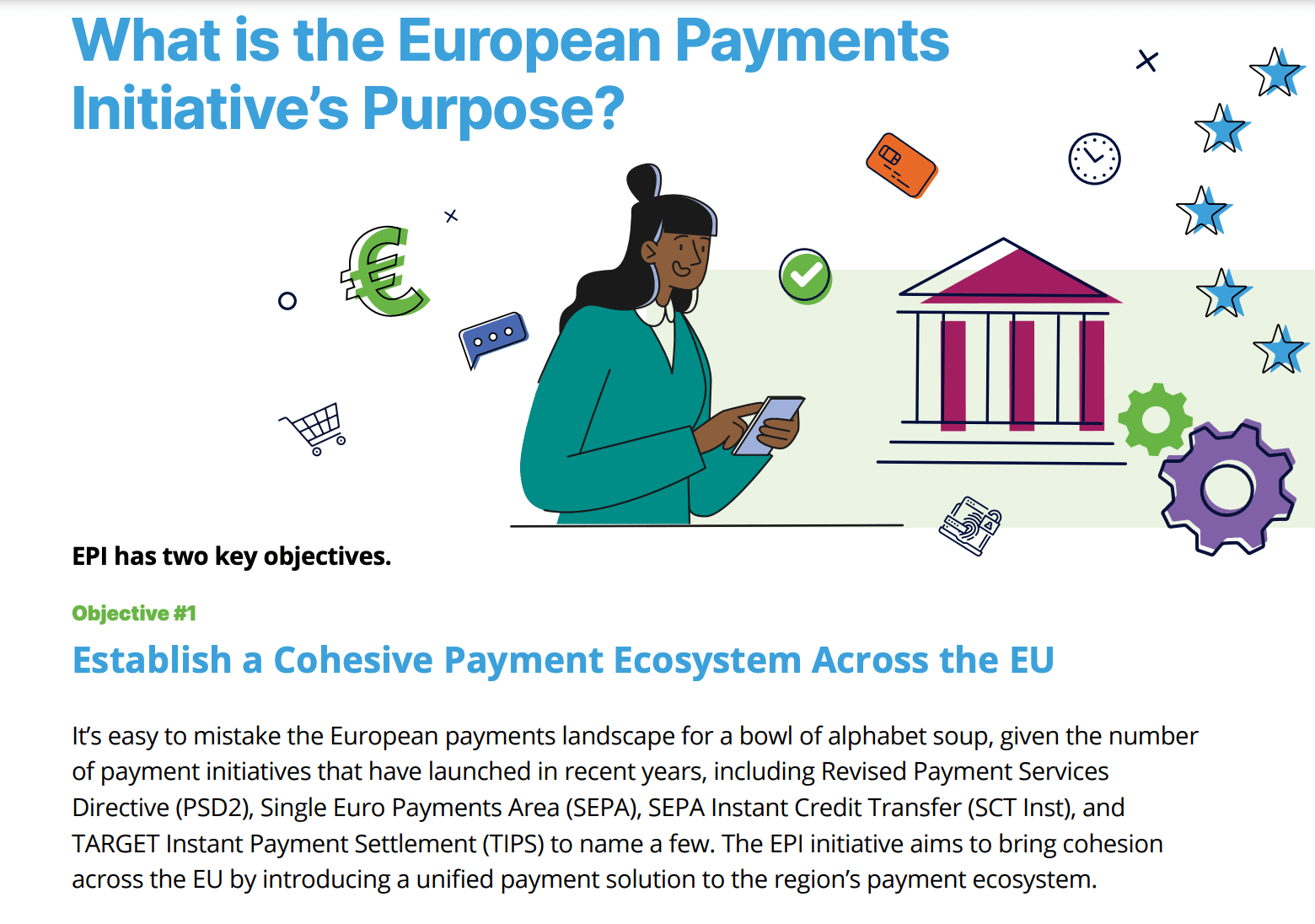
Any time a brand can transcend their product offering and show us who they are, it’s a win for brand storytelling. Feedzai is a perfect example of this. For an e-book about financial safety, which may seem rather droll, they do a good job of adding personality via people-centric illustrations (which feature a balance of genders and more than one skin tone—thank you).

Feedzai ebook example 3

Tip: Depicting diversity is crucial. Be mindful of who you’re representing through imagery (be it illustration or photography).

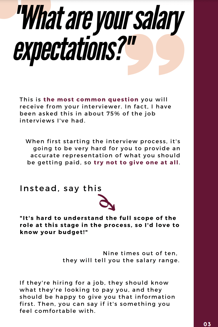
6) How to Successfully Negotiate a Higher Salary in 4 Easy Steps by Her First 100K

Why we love it: Simplicity with style

Good e-book design doesn’t mean you have to design a custom font, create hand-drawn illustrations, or conduct a 5-day photoshoot to get the best images. This guide makes great use of photography, typography, layout, and negative space to deliver the information in a straightforward, cohesive package. If you wanted proof that strong design can elevate even the simplest e-book, this is it.

Her first 100K ebook 2 Her first 100K ebook

Tip: If you don’t have a ton of design resources, simple typography treatments and callouts can do a lot to make content easily digestible.

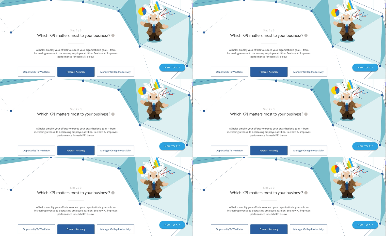
7) Einstein’s Guide to AI Use Cases by Salesforce

Alright, so this one isn’t technically an e-book, but it is a clever piece of lead generation. You answer a few questions about what type of work you do, and this interactive guides you to the most relevant case study for you. This is a very clever way to create a personalized, guided experience through strong design. The Einstein character animation, the simple and clean navigation, and the brand colors make this a clearly branded experience.

Salesforce einstein e-book design example

Tip: Simple interactivity can make all of your content more engaging, whether it’s an e-book, guide, or questionnaire. If you’re curious to learn more, find out how to brainstorm great interactive content ideas. 

How to Nail Your Own E-book Design

We want to see better e-book design in the world, so we’re always happy to share the tips we’ve learned from our own projects. If you’re looking for more tips to improve your e-books…

And if you need a partner to help bring your next e-book to life, here are 12 tips to find a good content agency. You can always hit us up too.

B2B Marketing Strategy Toolkit CTA

Blend Consumer Banking E-Book

Blend’s digital platform streamlines the journey from application to close—for every banking product. For this project, Blend was specifically interested in a report that would explore the state of the industry as it relates to the application process for deposit accounts, the keys to a good process, and how institutions can best serve their customers.

However, this wasn’t a standard data design project. Before we could bring the data to life, we needed to get it. So we crafted custom criteria to outline the key factors you need to create a successful application experience and audited a list of 100 financial institutions (including banks and credit unions) to score each. Of course, the challenge with all data storytelling is identifying the most relevant information (aka the real story). Because the primary goal of the report was to help readers improve their own application practices, we focused on identifying industry trends and the most interesting insights to turn into relevant takeaways for the reader.

The result was a high-value piece of content that establishes Blend’s authority and expertise in the industry, and positions the brand as a trusted resource to their customers—a content marketing win-win.

5 Easy Ways to Turn Your Old E-Books Into Fresh Infographics

Content takes time, money, and resources to produce, which is why we believe you should get as much mileage as possible from anything you create—especially with cornerstone content like e-books. Unfortunately, marketers are usually sitting on an archive of great content that’s just gathering dust, either because it never had much traffic to begin with or because it’s been forgotten. This is a huge waste.

You can get a lot more from your existing assets by using them to create fresh content. This approach is called a divisible content strategy, and not only is it economical but it expands your reach, takes less work, and helps you promote other content, helping strengthen your entire content ecosystem. 

One of the best ways to breathe new life into old content is to create infographics. Things like e-books, reports, guides, research, and surveys are filled with valuable information and interesting data insights that can be used to tell many different types of stories—and infographics can help bring those stories to life in unique ways.

5 Ways to Create Infographics

If you’re not sure what types of infographics to make from your e-books, here are some of our favorite ways to extract stories and come up with new ideas.

1) Expand on a Topic

E-books and reports are full of valuable information, but they can only cover so much on a given topic. By exploring a related subject or doing a deeper dive into a single topic, you can create an interesting infographic that educates your reader—and encourages them to learn more by checking out the original e-book. Pro tip: Comb through the sidebars or callouts in your e-books or reports—those are often great subjects to explore.

Example: To promote their What DDoS Attacks Really Cost Businesses survey, we helped Incapsula create an infographic on the anatomy of a DDOS attack. While the survey covered how the issue affects businesses, it didn’t precisely explain how these attacks happen. Creating this infographic allowed Incapsula to further educate people while promoting the survey.  

repurpose infographics 1

2) Create a How-To

People are always eager to learn something, and if you can provide them with practical information that makes their lives easier, they will love you for it. Turning your best tips and tutorials from e-books or other cornerstone content into compelling infographics is a great way to provide value—in a highly shareable format.  

Example: We partnered with LinkedIn to create a fun infographic that offered tips on how to create a great marketing machine. The infographic was used to promote the brand’s e-book, The Marketing Skills Handbook, which included many more great tips.

repurpose infographics 2

3) Summarize a Chapter or Topic

Infographics are an effective form of storytelling because they help people process information visually, making them a great way to communicate concepts that may be complex or challenging to explain. Also, not everyone has the time to dive into an e-book or research report. Creating a condensed infographic version that includes the most important, interesting, or relevant information provides a great service.

Example: Education company Course Hero is dedicated to helping people learn online, so we partnered with them to create a series of infographics that summarize famous works of literature. These infographics are useful study materials for busy students, helping them learn in less time.  

repurpose infographics 3

4) Find a News Angle

Newsjacking can be a great tactic to give older content new relevance, as long as it’s done appropriately. (Follow these tips to make sure you do it the right way.) Think about the trending topics in your industry or in the larger media landscape. Do you have data that might shed light on an industry trend? Is there a social tie-in that might make your content more interesting?

Example: To promote their Definitive Guide to Digital Advertising, we helped Marketo create an infographic on the “Mad Men” of the millenium, showing the major trends that define today’s marketing landscape—contrasted with those of the Mad Men era. Thanks to the popularity of the show, it was an interesting, unique, and relevant angle that helped Marketo join the conversation in an organic way. It was also picked up by Ad Week, helping Marketo expand their reach.

repurpose infographics 4

5) Tell a Surprising Story

Data and research often contain interesting, unique, or surprising insights and discoveries that tell a very interesting story. Turning that type of information into a compelling infographic is an easy way to repurpose content and get more attention.

Example: We helped High Five craft an infographic based on their 2015 Workplace Culture and Communication Report. The story revealed the negative effect that tech has on the workplace—a surprising take that is relevant to people in all industries.

repurpose infographics 5

How to Make a Truly Great Infographic

Coming up with a strong infographic idea is just the first step. Once you’re ready to start creating that infographic, you must follow best practices at every stage of the process. To ensure your infographic is as successful as possible, follow these tips to nail everything from copywriting to promotion.

If you need a little help getting everything done, find out what to look for in an infographic design company. Or let us know what you’re struggling with. We’d love to chat.

How to Make E-Book Templates to Create E-books Faster

Providing people with high-quality, comprehensive content is a great way to build relationships, increase leads, improve SEO, and more. That’s why e-books are such a valuable tool for marketers. The problem is they are also one of the more difficult pieces of content to produce. From copywriting to e-book design, it can take a lot of time and energy to create something of quality. But there are always ways to work smarter, not harder. And we’re always on the hunt for the best tools, tips, and tricks to make your life easier. So let’s talk about one of the easiest ways to create quality e-books in less time: e-book templates. If you are a brand that produces a lot of e-books (or wants to), templates will change your life.

The Benefits of Custom E-Book Templates

When some people hear the word “template,” they think of a ‘90s PowerPoint slide. But well-designed templates don’t turn your content into a boring brochure. They are an efficient way to create content that is:

  • On-brand: An e-book design template is designed around your visual language, including fonts, colors, logos, etc. You don’t have to get approval from an art director, and you can be confident that you’re producing something that always reflects your brand.
  • Consistent: If you look through your archive, you will probably notice your e-book design reflects a range of styles and design aesthetics. This is problematic if you’re trying to build an instantly identifiable brand (and who isn’t?). Whether you’re working with a freelancer, an agency, or an in-house designer, templates ensure that everything you do will have a cohesive feel.
  • Easy to replicate: Building an e-book design from scratch takes a ton of time. But you can reduce that time tremendously with a comprehensive template. You just pick and choose the elements you need, then plug your content in. This makes it easy for novice designers (or even marketers) to create something of quality with a quick turnaround.
  • Economical: If you don’t have to create a brand-new design every time, you can reduce costs while increasing your output. That gives you a higher ROI for every e-book you create.

So, how do you create these magical templates?

How to Build E-Book Templates 

We know marketing teams are usually overloaded, especially designers. But remember that a little bit of work up front can save you a ton of time down the road—and make designers’ lives a lot easier. If your team doesn’t have the time, you might consider using a content agency (or baking templates into an engagement you already have). But if you’re going to DIY it, here’s the simple 3-step process to create an intuitive visual design system that anyone can use.

1) Go Through Your Existing E-Books

You might only have a handful of e-books, or you might have a huge archive (in which case you can choose, say, 10). Go through each to identify the common elements that you will need to build into your e-book design template. The goal is to build something that works for any e-book subject, so it should be comprehensive and scalable.

This might include things like:

  • Cover design
  • Data visualization (charts and graphs)
  • Illustrations
  • Diagrams
  • Sidebars
  • Callouts and pullquotes
  • Images/captions
  • Chapter breaks
  • Headers/subheads
  • Iconography
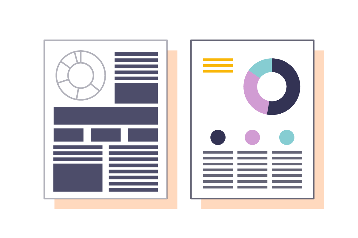
E-book design template

Identify the most common design elements in your e-books. 

Make sure to poll your team about what they might also need. You can also look at brands whose content you admire. (Here are 5 great e-book design examples you can learn from.)

2) Build Your Design System

Once you know what your design should include, start building those elements. At this stage, you’re building your visual system, such as:

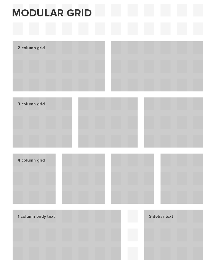
  • Grid system
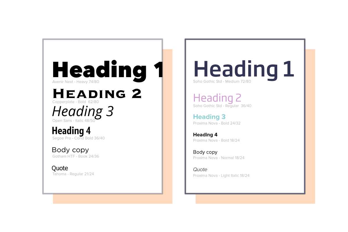
  • Typography (heirarchy, headers, bodycopy, bullets, hyperlink style)
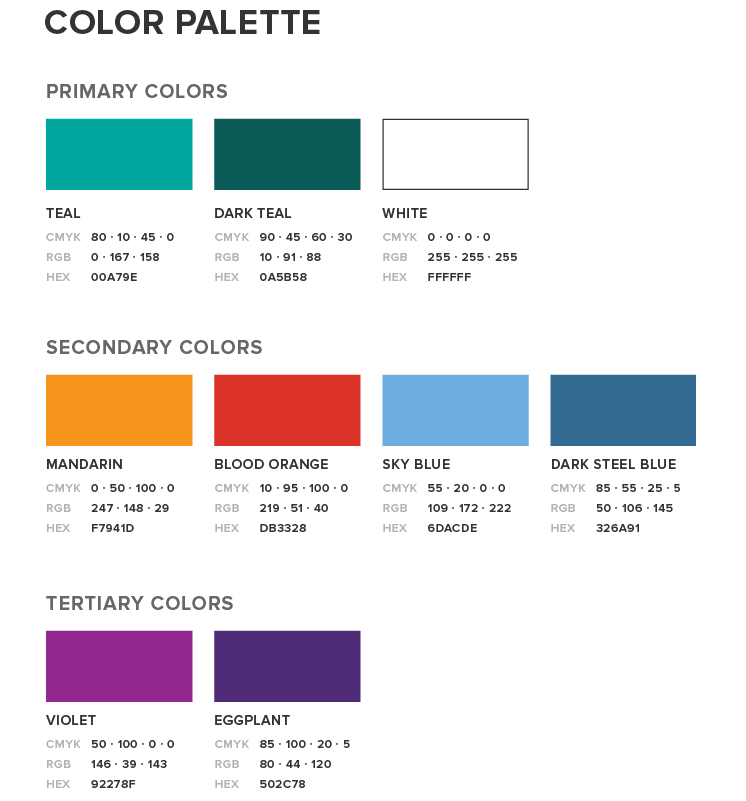
  • Color palettes
  • Graphic elements
  • Data visualization styles
  • Photography style
  • Illustration style
  • Layouts

Everything should adhere to your visual language. Don’t have one? Here’s how to make one, as well as everything it should include.

3) Create Your Template

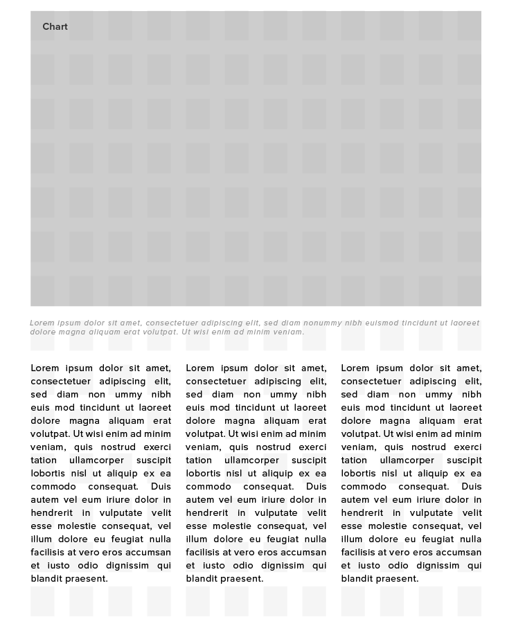
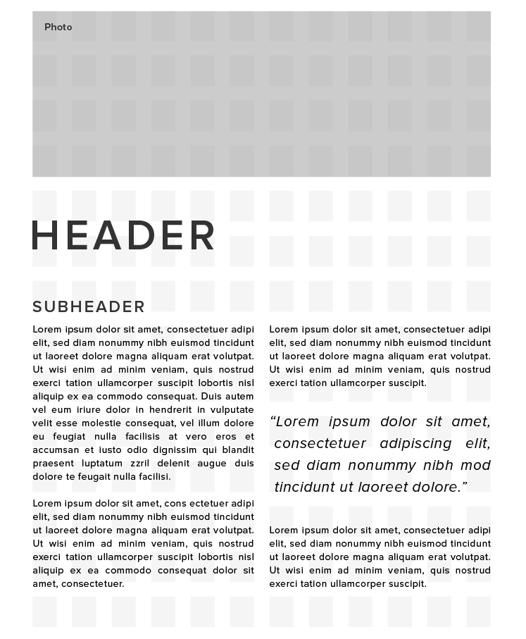
To turn your visual system into a practical guide, build out your design files, providing mockups of actual pages that reflect best practices. (If you already have an e-book design that works well, you might adapt it to the guidelines.) Examples:

E-book design template

The important thing is to offer clear explanations and visual examples of everything. Whoever picks it up, whether a freelancer or in-house designer, should be able to understand it and replicate it without asking questions.  

You might also include any relevant design tips. (And make sure you avoid these 30 common e-book design mistakes.)

Once you put your e-book design templates to work, you’ll see how much easier they are to produce, and you’ll be grateful you put the work in. 

Remember, too, that you can also make the most of your work by repurposing your e-books after their first run. (Try these 9 tips to do that, and check out this roundup of 101+ resources and tools to make better e-books.)

Look for More Ways Template Can Improve Content Creation

There are always ways to improve how you do things, so think about how templates might help in other areas of content marketing, including:

  • Infographic templates
  • Interactive templates
  • Social templates
  • Reporting templates
  • Ad templates

We know that not everyone has the resources to tackle design templates, though. If you need a little help or someone to help lighten your content load, holler at us.  

Interactive E-book: The Content Marketer’s Guide to Brand Video

If you don’t have video in your content mix, you’re missing out. It’s simpler to make than ever, and people really want to see it. (A 2014 Levels Beyond survey found that 51% of millennials would rather watch a video than read.) Now is definitely the time to dive in.

But we know you might be a little intimidated (or overwhelmed) to start, and you probably have a lot of questions. We’re here to help.

Our new interactive e-book, The Content Marketer’s Guide to Brand Video, covers everything (seriously, everything) you’ve ever wanted to know about brand video but were too shy to ask, including:

  • Why are humans biologically wired for video?
  • How can brands use video to deliver a strong message?
  • What makes a truly great brand video?
  • How do you measure the ROI of video?
  • What does it take to produce video?
  • How should you act on set?

It’s all there, plus great data, pro tips, and great examples of brand video. We also made it interactive so you can skip to the stuff you want to know—and bookmark it when you want to come back. Click below to check it out now. 

brand video

And if there’s anything we didn’t answer, we’d be happy to chat.

6 Easy Fixes to Makeover Your E-book Design

How’s your latest e-book doing? How’s your oldest e-book doing? Have downloads dipped? It’s frustrating, we know, but sometimes a few quick tweaks to your e-book design can really improve your readers’ experience, making them more eager to consume your content and connect with your brand. If the content in your e-book is gold, but people are tapping out before they get to page 2, consider how a makeover might help.

Does Your E-book Design Need a Makeover?

Design integrity has a lot to do with how content quality is perceived. First, print out your latest e-book. Take a critical look at what’s in front of you:

  • What catches your eye?
  • How does it flow?
  • What do you feel when you look at it?

These gut reactions and first impressions are what your reader probably experiences, too. We hate to see you give off the wrong impression, so we’re here to help. All it takes is a little creativity to turn a blah design into something beautiful. Here are 6 ways to do it.

1) Choose a Theme

The problem: Your design is totally generic or all over the place, mixing clashing styles, imagery, and visual metaphors right and left.

The fix: E-books are awesome because they give you a nice creative canvas to tell your story. The best, most effective e-books deliver a single story, and use every element of design to support it. Choose a single theme or concept to ground the design, then use your creativity to bring it to life.

6 ways to makeover e-book design

2) Rehab Your Cover

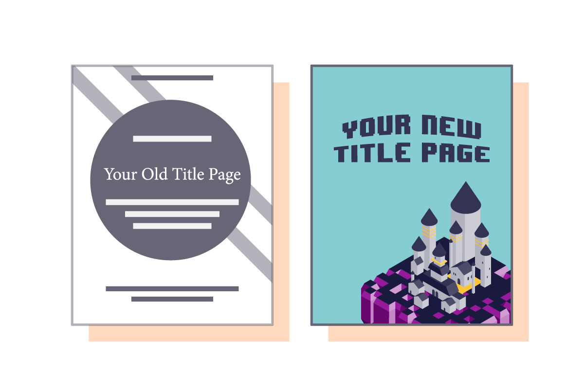
The problem: The cover is the first thing people see, but too often marketers miss the mark. The most common mistakes: too cluttered, no imagery, irrelevant imagery, boring typography, generic design.

The fix: Let your content be the guide. Use high-quality imagery to catch the reader’s eye and draw them in. The cover should match the content theme and infuse a little brand personality into it. There should also be an intuitive grid-based layout and logical header hierarchy so that everything is clear at a glance.

6 ways to makeover your e-book design3) Add Personality with Imagery

The problem: Your e-book looks like a PowerPoint: generic templates, boring iconography, etc.

The fix: Consider both the tone of the content and your brand personality. The images you use should help cultivate a feeling that supports your message. Is your e-book about employee collaboration? Let’s see people working together. Is it about increasing revenue? Let’s see some tasteful data visualization.

6 ways to makeover e-book design

4) Condense and Trim Down Copy

The problem: Someone got a little carried away in trying to build suspense, so you have to flip through 5 pages of “teaser” content before you get to the meat of a section. Conversely, they packed so much in that you’re facing a cluttered mess on each page.

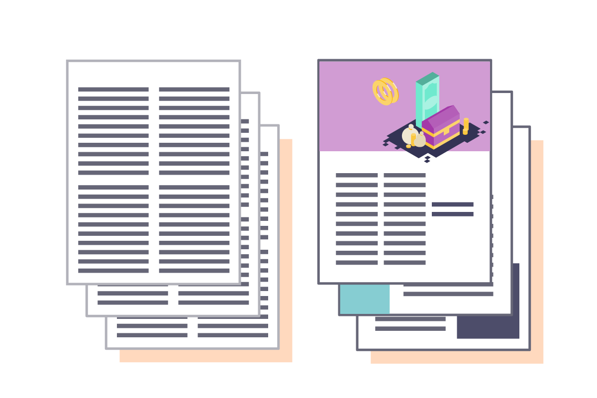
The fix: Know two things: Negative space is your friend, and pages should be used economically. While chapter breaks may deserve their own page, condense content to deliver the message efficiently. Oftentimes this means trimming down content on a page. Removing an extraneous pullquote or sidebar can make a huge difference. Also look for opportunities to let design do the heavy lifting. A paragraph explaining a process can be visualized in a single diagram. A stat in a callout can be turned into a chart. These are great ways to break up the text. 6 ways to makeover e-book design5) Kill the Visual Junk

The problem: Some designers hear the word “visualize” and go nuts, packing every page with illustrations, photos, charts, or iconography.

The fix: Look critically at every visual element. Ask yourself:

  • Does this enhance the story? Things like illustrations are often added arbitrarily without much thought.
  • Can it be condensed? Data visualization can sometimes make things even more confusing if, say, you’re trying to compare three bar charts when a single grouped bar chart would do it better.
  • Does it make sense? This is especially true for icons, which can be far too abstract to represent anything meaningful.

If the answer isn’t yes, say bye. 6 ways to makeover your e-book

In addition visual elements, colors can sometimes overwhelm. A helpful tip: Use 1-2 main colors and 2-3 accent colors.

6) Tame Your Typography

The problem: There are so many fonts and sizes it looks like a teenager’s notebook.

The fix: Limit the number of type styles (the combination of kerning, leading, point size, etc.) to create consistency and harmony. Also, don’t use more than 2 typefaces, and do follow a grid. 6 ways to makeover e-book designFor more of our tips on great e-book design, here are a few posts you might like:

If you need an expert to help you out, let’s chat.

Free E-Book – How to Maximize Publishing with Microcontent

Content marketing is all about diversity: high-value evergreen content that informs, mixed with high-impact, real-time content to bring awareness to your brand. But content marketers are often pulled in every direction, tasked with creating a high volume of content to fill each bucket while ensuring that every piece feeds long-term brand goals.

With limited resources and ever-increasing demands, how do you create content that is economical and impactful? Enter microcontent—an effective approach to content creation that requires little effort and provides maximum value.

Ebook-Cover

In this e-book you’ll learn:

  1. What microcontent is: Learn about the different formats to get an idea of what you might want to experiment with.
  2. Why microcontent supports your content strategy: From long-term goals to day-to-day publishing, learn how microcontent helps support your efforts
  3. How to create effective microcontent: Whether you’re just starting to create content or have an enormous archive, find out how to produce a high volume of content with minimal effort.

DOWNLOAD THE E-BOOK

Free E-Book: How to Build a Long-Term Content Strategy in a Real-Time World

How do you get the most results from your content marketing? With a killer content marketing strategy. Of course, in a real-time world, it can be hard to plan ahead. When news stories break or a product launch gets postponed, you have to adapt your content while keeping your long-term goals in mind. And no matter what you publish, you also have to keep everyone from your sales team to your social following happy. It often feels like you’re serving two masters—or five or six. But with the right planning, you can create a long-term strategy that saves your energy and your sanity.

A well-crafted, long-term strategy has built-in flexibility and a solid foundation, letting you fill in your content needs as you go—even if (and when) your larger goals change. It means you can stay agile enough to react to the latest trending hashtag while scheduling production for your next evergreen infographic. (Trust us, we did it last week.)

Want to know how? Check out our new e-book, How to Build a Long-Term Content Strategy in a Real-Time World. We cover everything you need to know to create a strategy that works for you, including: 

  • Why a long-term strategy saves you time, energy, and money
  • How to identify your objectives
  • What type of content will serve your objectives
  • How to map content to your objectives
  • How to effectively schedule content

Check out the e-book, and let us know your tips for creating a content strategy.

How to Build a Long-Term Content Strategy in a Real-Time World

NEED HELP WITH YOUR CONTENT STRATEGY OR CONTENT CREATION? LET’S CHAT.

Free E-Book Download: The Ultimate Guide to Content Distribution

Though content marketing is the new frontier, marketers are still facing the age-old question: How do you get your brand’s content in front of an audience? Thanks to the proliferation of new media, with the right distribution strategy, you can reach more consumers than ever before.

Still, it’s easy to feel overwhelmed. Sure, you can create content, but how do you know if it’s serving your marketing goals? Once it’s created, where do you publish? And how do you optimize content for maximum results? Over the last few years, we’ve heard these concerns from all corners of the content marketing globe. And, in many ways, things have only become more confusing as more platforms pop up.

Because we’re in the business of making confusing things easy to understand, we thought it was time to help make sense of it all. At Column Five, we’ve assembled a pro Communications team to help some of the world’s biggest brands reach the right audience. We’ve also made friends over at Onboardly, a PR agency that specializes in content marketing for startups. Our brands have learned plenty over the years (both the easy way and the hard way), so we joined forces to create the new e-book, The Ultimate Guide to Content Distribution.

Whether you’re a PR pro or DIY content marketer, this e-book covers everything you need to know about content distribution, including all our insider tips and tricks. Want to make the most of your content? Download the e-book to learn about:

Crafting a killer content strategy: Get tips for strategic ideation to make sure your content serves your objectives.

Content formats and types: Curate your content marketing mix to include a variety of formats primed for different platforms.

Tips for making media contacts: Learn how to cultivate relationships with journalists and social influencers to expand your content’s reach.

Choosing the right distribution channels: Learn about how each channel can serve your goals and identify which channels to target.

Measuring your ROI: Find out which metrics help track your content’s success at every stage of the sales funnel.

Good content deserves to be shared. With a little bit of structure, planning and foresight, your content can make a major impact.

UltGuide-ContentDistribution-3 (1)
Want more on creating great content marketing?
Of course, if you need a little help with your content, we’d love to chat

HP 20/20 E-Book

Outlook for the future.

Infographic Ideas: 16 Easy Ways to Come Up with Amazing Ones

Infographics are an excellent way to communicate, and the right infographic ideas can help deliver a lot of content in an easy-to-read format. And, yes, they do look pretty. But they’re much more than a pretty package. When used correctly, they are a powerful storytelling device. By combining great visuals, great data, and great copy, they stimulate powerful learning centers in the brain, helping connect ideas much quicker than images or text alone. (If you want to learn more about their application, check out our guide to infographics.)

So how do you put them to work for you? Whether you’re a newbie who’s never worked on one before or a seasoned content creator who’s produced a ton of infographics, remember that all good infographics start with good infographic ideas.

I’ve sat through a couple thousand infographic brainstorms, and I know firsthand that coming up with a killer idea doesn’t always happen at will. So, to make things easier—and share some hard-earned knowledge—I’ve compiled a list of some engaging and tried-and-true ways to come up with great infographic ideas, as well as a few examples to inspire you. I hope it helps your next brainstorm.

16 Tips for Infographic Ideas

1. Industry Trends

You’re consuming information relevant to your industry all day: newsletters, articles, blogs, think pieces, reports, etc. These can all be great fodder for an infographic. Next time you run through your bookmarked content, think about what information stands out and how it might be translated into a piece of visual content.

If a particular item you come across stays with you—or irks you—there is probably a great infographic idea somewhere in there.

microsoft-2016-marketing-trends

2. Pop Culture Trends

Music, entertainment, sports, fashion—these are great sources for infographic ideas. These popular subjects are always trending and, when gamed right, can help elevate the visibility of your infographic. We’ve visualized everything from rap artists’ lifestyles to breakdowns of blockbuster movies, so the options are pretty endless.

150827_digit-songcostgraphic

3. Social Trends

Cultural trends can be a powerful source to tap into for infographic inspiration. Organizations like Pew Research are constantly releasing reports on a variety of issues relevant to the larger culture, from demographic data to social opinion polls.

Whether they’re serious or light-hearted, broad or niche, think of how these trends may be turned into interesting infographics. For example, we’ve previously tackled the selfie-obsessed generation and the brunch phenomenon.

evolution-of-the-selfie-infographic

4. News Items

There’s no shame in newsjacking. It’s a great way to insert yourself into the conversation. For example, when California’s drought was in the news (and our SoCal HQ office was withering), we created our “7 Ways to Hack a Drought” infographic to spread the word on water conservation.

Monitor headlines and take a look at Google Trends to keep your finger on the pulse. One caveat: Avoid tragedies or hot-button political issues. We’ve seen too many brands mess up royally. (See our tips to make sure you’re newsjacking the right way.)

droughthacks-01
droughthacks-02
droughthacks-03
droughthacks-04

5. Upcoming Events

Ideally, you’re working ahead and carefully planning your editorial calendar. Make sure you’re regularly reviewing upcoming events—everything from major holidays to movie releases—to spot any opportunities to plug in content.

Tip: Forekast is “the Internet’s calendar,” and it tracks holidays, awareness months, etc. We’ve used it to inspire everything from our interactive infographic in honor of Black History Month to a camping guide to Coachella.

infographic ideas

6. In-House Data

One of the best ways to differentiate yourself from your competition is to tell unique data stories. Not only are these interesting to consumers—and the press—but they are totally original because they’re based on proprietary data. (Translation: Your competition can’t copy them.) Beyond annual reports, case studies, or sales data, there are so many ways to find unique stories in your data. See our guide to data storytelling to turn your spreadsheets into great content.

infographic-idea-4

7. Surveys

Whether you coordinate with your marketing team to poll your own customers or wait for a major industry publication to release their most recent survey results, this data is ripe for visualization. Pair it with a structured narrative, and you have infographic gold.

We especially enjoyed working on CWIF’s Egg Tracker Interactive Report. It was a ton of data made easy to understand through visualization.

0-02-1024x586

8. Existing Content

If your brand has been actively content marketing, then you likely have an archive of previously produced content. Everything from blog posts, to press releases, to case studies can be repackaged to tell a new story. This is the easiest and leanest way to get more mileage out of your existing content.

For example, we turned a section of our Ultimate Guide to Content Distribution e-book into an infographic on how to optimize your blog for content distribution.

howtooptimizeblog

9. Company Culture

Content marketing is vital to a company, but culture marketing is also integral to your brand. If there are causes, hobbies, or other things that are of particular interest to you and your coworkers, let them feed your infographic ideas.

For example, after a discussion on women’s health, our team created the#PeopleForPeriods interactive, which aims to help destigmatize the discussion of menstruation. We also once tracked our Beer Friday consumption.

beerfridayproject2

10. Academic Studies

There’s no substitute for amazing scientific data, especially when it helps support the fresh perspective and message you’re trying to convey. Google Scholar can help you search a ton of studies in a variety of fields, from social psychology to tech. You can use this to inspire your next idea or to help enhance one you already have.

vnpenis

11. Government Reports

There is a wealth of public data available from every branch of the government, all of which can be put to good infographic use. Most of it is easily accessible, and each organization has an active newsroom that puts out press releases for notable findings, which can be a great source of infographic ideas.

Here are 00+ data sources to comb for inspiration. You can bookmark particular findings or pull a stat to chew on later. For example, we used public health data to create this infographic on pandemics throughout time.

transparency-2-1000x600

12. Target Keywords

You are making an infographic for a reason: You want it to be seen. You know evergreen pieces will give you the most value for the work you put into them, so why not use SEO to your advantage?

Depending on your goals, you’ll want to search relevant keywords to see what terms you might rank for. Consider what type of subjects or angles might be relevant to those search terms, and turn them into an infographic. For example, we created this infographic on designing effective visual communication to help our SEO as a design agency.

140409_10tips_ra11

13. Tutorials

You can tell someone how to do something, or you can show them. Infographics are a powerful form of information design, so they’re ideal for tutorials. However, simply slapping pictures and words together doesn’t mean you’ve created a clear and easy-to-follow instructional infographic. You need to use visual cues and strong copy to effectively guide people through a process. For example, here’s a tutorial we made about the 4 ways to fold a shirt.

shirtfoldingfinal

14. Something Someone Else Did

How many times have you come across a killer piece of content and wished you’d thought of it? It can be frustrating, but odds are if you thought of it, you can also think of ways to make it better.

Good content is about providing great value. If you can do something better, do it. Over the years, we’ve seen plenty of visualizations for particular cocktails, but when the Kentucky Derby came around, we decided to visualize how to make multiple versions of the classic Mint Julep. It was a specific spin on a visualization style plenty of other people have done, but we made it our own.

howto-makemintjulep

15. Company Materials

Time, energy, and attention are precious commodities. Communication in the digital age should focus on making the biggest impact in the least amount of time. Take a look at your existing company materials: sales brochures, press releases, employee handbooks, etc. It’s likely there is material in there that can—and should—be visualized to create a more efficient and enjoyable experience for customers and even employees.

This is a great opportunity to demonstrate your creativity to turn these boring pieces into visual gold. A great example of this is marketer Amos Haffner‘s resumé, which he turned into an infographic.

infographic ideas

16. Your Personal Passions

If there’s something that you particularly love, or are just curious about, you can sometimes find a unique angle that might be worthy of infographic exploration. It’s especially impactful if you turn your company values into interesting infographics about causes you care about or ideas you want to promote. This helps you share your beliefs and cultivate a community around them.

diversity-premier-league_2-1024x353

How to Create Your Infographics

We hope these prompts have inspired a slew of ideas to keep your publishing calendar full. If you’re ready to bring those ideas to life…

And if you need any help creating your infographics, bring in professionals who can turn your concepts into professional-looking infographic ideas that truly resonate. Let’s chat about how we can help.

How to Create a Brand Style Guide in 5 Steps (Tips + Examples)

Maintaining quality and consistency in your brand’s content is a challenge, especially if you’re creating a large volume of content (or working with many content creators). Without the right direction, you can easily end up with Frankensteined content plagued by incorrect colors, misplaced logos, and off-brand messaging. Creating a seamless brand experience is crucial. (According to research, 35% of organizations achieved 10-20% revenue growth by presenting their brand consistently.) But how do you ensure your content is always on brand?

Create a comprehensive brand style guide—and use it.  

A brand style guide acts as the blueprint for everything your team creates. It’s never just colors or logos. It’s a complete approach for a unified look, voice, and feel across every single audience touchpoint.

What Is a Brand Style Guide?

A style guide is simply the documentation of your brand identity, presented in a format that makes it easy to apply the identity to any content you create. From your logo to your brand voice, it’s a toolkit to help you present a consistent, cohesive brand to the world. 

Why Do You Need a Brand Style Guide?

Everything you create should represent your brand accurately. But the larger your network, the harder it can be to monitor content and make sure everything is up to par. (Sometimes it isn’t even a freelancer’s fault; in-house teams can get a little too lax as well.)

This is why a brand style guide is so important. Not only does this provide consistency but it actually benefits your brand in several ways.

  • More quality control: Not everyone has an Art Director available to look over every project, and oftentimes you’re up against a deadline. These, and many other variables, can result in content that is disjointed and ineffective. Your reputation depends on the quality of your creative content, so having well-documented guidelines ensures that you’re always putting out content you’re proud of. 
  • Increased comprehension: Clear communication and good design make life easier for your reader or viewer. Guidelines for things like data visualization, color use, or typography help creators design content that is more effective, creating a better content experience overall. Also, this simple act is a tremendous service for the people you want to connect with. It shows that you value their time and are invested in helping them get the info they need and want.
  • Better brand recognition: Brand guidelines help you deliver a cohesive brand experience, making it easier for people to recognize your valuable content. When you provide consistent, high-quality content, people come to rely on you and—even better—seek out your content. They trust you will deliver what they want every time, and that trust is the basis of every strong relationship. 

Ultimately, if you want to build a successful brand, you need a style guide.

Example: Whether it’s an e-book or infographic, LinkedIn adheres to a strict visual language, including consistent use of their signature blue color, data visualization style, and other details. 

LinkedIn Brand Guidelines

What Should a Brand Style Guide Include?

Your goal is to create a practical style guide that empowers brand creators to create a variety of on-brand content. While style guides are often thought of as design-only, you want a document that helps people understand how your brand looks and speaks. What might that look like?

Brand Heart: This is basically the high-level explanation of your brand’s core principles, which can influence everything from the way you speak to customers to the way you design your websites. It encompasses your:

  • Purpose: Why do you exist?
  • Vision: What future do you want to help create? What does the future look like?
  • Mission: What are you here to do? How do you create that future?
  • Values: What principles guide your behavior? 

Verbal Identity: This is everything related to how you speak about your company, describe your products, communicate with customers, etc. This includes your:

  • Brand essence
  • Voice
  • Tone
  • Personality
  • Messaging
  • Tagline
  • Value proposition
  • Messaging pillars/differentiators

Visual Identity:

  • Logo
  • Colors
  • Typography
  • Additional elements (if needed)
  • Photography
  • Illustration
  • Iconography
  • Data visualization

Note: If you’re a new brand, you may not have a full brand identity created. But you should at least have the basics (logo, color, typography), as well as brand voice and personality guidelines.

If there are any of these elements you haven’t built out yet, see our guides to:

What Makes a Good Style Guide?

An incomplete style guide is basically just as effective as no style guide at all. If you want yours to be as helpful as possible, it should be:

  • Comprehensive: Again, your style guide should help anyone create on-brand content, so make sure you have included as much relevant information as possible.
  • Practical: You want your style guide to be comprehensive, but you don’t need to overwhelm people with information. (This will make it cumbersome, and your team will probably avoid using it.) Provide clear direction with simple, succinct language, and helpful examples.
  • Accessible: Everyone on your team should know where to find your style guide.

Most importantly, your style guide should be customized for your brand’s unique needs—whatever they may be. For more insights, check out how to create brand guidelines that work.

How to Create a Style Guide

So how do you make guidelines that work for everyone? Just follow this step-by-step guide.

Step 1: Choose Your Format

Depending on your needs, you can design your style guide for multiple mediums. 

  • Static (print): If you’re going old school, you can create printed guidelines. We’ve seen plenty of brands transform their guidelines into works of art in this way. (See the award-winning hard copy of the Fisher and Paykel brand guidelines.)
  • Static (web): Digital guidelines are the easiest way to make your guidelines accessible from anywhere. You can simply create a PDF for your site or server.
  • Interactive (web): More and more brands are opting for interactive style guides, which are easy to navigate and more dynamic. 

You may even experiment with all three formats, depending on your needs.

Step 2: Create a TOC

Your brand guidelines are the summation of your brand strategy. They basically function as your bible; therefore, they should include everything anyone might need to know about your brand. To guide your creation, outline the elements you plan to include.

Again, you don’t have to include each of these items if they aren’t relevant, but you should include the basics (verbal identity and logo, color, typography).

Brand Heart: You can also include your company history, milestones, or any other relevant info one would want to know about the company’s background. This information is important because it explains the core of your brand: who you are, what you do, and why it matters. 

  • Purpose
  • Vision
  • Mission
  • Value

Verbal Identity: In addition to these, you can include any other elements that help people communicate more effectively or provide more context (e.g., a list of words you DON’T use, or the standard descriptions of your services).

  • Brand essence
  • Voice
  • Tone
  • Personality
  • Messaging
  • Tagline
  • Value proposition
  • Messaging pillars/differentiators

Visual Identity: 

  • Logo
  • Colors
  • Typography
  • Additional elements (if needed)

Photography

Illustration

Iconography

Data visualization

Depending on the size of your company, the industry you’re in, or the content or products you produce, you might include directions for additional things, such as audio branding or even scent branding.

Step 3: Build Out Your Style Guide

Now that you have your outline, you can start to flesh out your guidelines. Focus on clarity and practicality as you write your copy and add design. To make your style guide easier to apply, you can also include tips, call-outs, sidebars, etc. We find it especially helpful to include: 

  • Dos and don’ts: This is helpful to identify the key mistakes to avoid.
  • Checklists: It’s probably not realistic for every single piece of creative content to be approved by an Art Director, but it’s important to give content a final edit/once-over to ensure on-brand design. A simple checklist can help catch any of those little errors like incorrect logo usage—before it goes out the door. 
  • Examples: How should your brand voice be used for social, press releases, marketing emails, or product descriptions? What does your typography hierarchy look like? What are the correct logo dimensions? Showing what these things look like in real life makes them much easier to emulate.
  • Tools and resources: Do you use an app to double-check your hex codes? If it helps you, it will probably help others.

For each section, give enough detail to explain but don’t exhaust your reader. If your brand guidelines are the size of an encyclopedia, they will only serve as a beautiful paperweight on someone’s desk. (And if a noob can’t interpret it, you’ll be in trouble.)

Example: The Expanded Special Project for Elimination of Neglected Tropical Diseases guidelines provide direction on proper logo use, including when and where colored logos should be used. 

Brand guidelines

Remember: Helpful brand guidelines don’t just tell—they show. When and where you can, let design do the heavy lifting. Also, your brand guidelines themselves are a piece of branded content. Inject your brand personality wherever you can.

Step 4: Vet Your Style Guide

The whole point of a style guide is to eliminate questions about how to design on-brand content. Whether you have 5 content creators or 500 working for your brand, it’s smart to ask someone to proof and sanity-check your style guide before you distribute it to everyone. (Otherwise, you may be flooded with questions and comments.)

Share it with someone who is intimately familiar with the brand to find out:

  • Is it clear?
  • Is there anything missing?
  • Are there additions that may improve the reader’s experience?

Ultimately, a style guide only helps a brand if it helps the people who work for the brand.

Step 5: Make Your Brand Guidelines Easy to Access

One of the most common reasons people ignore brand guidelines is simply because they can’t find them, and that’s how you end up with 1,000 brochures printed with your old logo.

Make sure your guidelines are in an easy-to-find place (e.g., company server or company Wiki) and shared with everyone, especially new employees or creative partners. Even if you have a printed version, render a digital PDF too. 

5 Awesome Brand Style Guides to Inspire You

Every brand is unique, but if you want to add a dash of creativity to your guidelines (and who doesn’t?), here are some of our favorite style guide examples that do it the right way. For more, see brand identity design and examples and our curated list of brands with a bold and beautiful visual identity.

1) Mailchimp

Mailchimp offers interactive guidelines for both copywriting and design. The level of detail they provide for copywriters is unparalleled. Want to know how to write legal content? Newsletters? Social content? They detail it all, along with writing principles, web tips, word stylization, and more.

Similarly, their design guidelines are both beautiful and succinct, communicating the brand’s design philosophy through the guidelines themselves.

2) Zendesk

A strong brand identity is able to tell a strong story, and Zendesk does that supremely well. In fact, their style guide feels less instructional and more editorial, as they break down the elements of their brand identity, including simple dos and don’ts, tips, and resources to make it easy to apply.

zendesk style guide example - tips

zendesk style guide example - shapes

3) Gusto

Not every brand needs to design a clean interactive. A well-designed PDF can be just as helpful, as Gusto proves. Their brand guidelines shine because of their simplicity and efficacy. Not only do they provide practical guidelines but they really educate the user on why these guidelines are so important and how they communicate the brand’s philosophy.

gusto brand guidelines 1gusto brand guidelines 3

4) ELM

Colorful, clean, and engaging—those are the hallmarks of ELM’s brand guidelines. Smooth interactivity, animation, and visuals make this a joy to behold. They do a fantastic job of letting design do the heavy lifting, too. For example, instead of simply explaining how the primary, secondary, and accent colors should be applied, they created a colorful data visualization that breaks down usage across the brand. This is exactly the type of creativity that can turn brand guidelines into a powerful piece of communication. 

ELM style 2ELM style

5) Starbucks

For a megabrand like Starbucks, maintaining a cohesive brand identity is a challenge. But with their comprehensive brand style guide, Starbucks provides all the guidelines creators need to succeed.

The interactive guidelines are beautifully designed according to the brand identity itself, featuring the brand’s signature colors, as well as animation and a bevy of case studies (aka visual real-world examples) to capture attention.

Always Keep Your Brand Guidelines Updated

Your brand is always growing and changing, so your brand guidelines should reflect that. Work with your brand team to schedule regular content reviews to make sure the guidelines are being appropriately applied. Brand stakeholders should also identify what needs to be updated, expanded, clarified, removed, or edited.

Most importantly, have regular conversations about what is or isn’t working, and ask your team for any ideas that will make using brand guidelines easier. For expert help, preserve your brand integrity with professional brand guidelines.

Brand Style and Storytelling Pay Off

At the end of the day, a sharp, consistent brand style creates trust. Your content will better connect. People will start to recognize and remember what your company represents. That feeling of familiarity? It pays dividends over time.

That said, if assembling guidelines feels like too much, consider calling in outside experts who live and breathe consistency. Find out what it’s like to work with Column Five on your brand identity. We’d be happy to take it off your plate.


Ask a Marketing Expert

C5's GPT offers expert advice and resources to solve your marketing problems. Ask a question, or start with these prompts.

Build a competitive content strategy
Create content at scale
Implement AI marketing
Bridge sales and marketing
Improve marketing ROI
Build a strong brand strategy