
We have been living, breathing, and talking about infographics since 2008. We literally wrote the book on them in 2012 (see Infographics: the Power of Visual Storytelling). And all these years later, with a couple thousand under our belt, you’d think we’d be sick of them. But the truth is, no matter how much we hear about the death of infographics, we know that they still work.
In fact, during our tenure, the marketing and media landscapes have changed enough that today they are more flexible, more creative, and more relevant than ever.
A Lot Has Changed Since the Infographics Rennaisance
When we first started in the business, infographics felt like a cool little secret. They looked pretty and generated a ton of traffic. Unsurprisingly, the trend took off like wildfire, ushering in the era of content marketing.
Suddenly we saw a deluge of infographics, some horrendously designed and some that could barely be considered an infographic. This was followed by a major push to both reign them in and legitimize the medium. (Today, there are master’s degree programs specifically for data visualization and infographics. We ourselves taught a Visualization of Information course at Columbia from 2012 to 2016.)
Amidst the infographic boom, technology, media, and distribution channels evolved at breakneck speed, resulting in the landscape we have today.
Some of the most notable changes we’ve seen since from then to now:
- Mobile has skyrocketed. According to a 2016 comScore report, mobile accounts for 65% of digital media time spent in the U.S. This allows audiences to consume content anywhere, anytime.
- Visual platforms are pervasive. Social media has gone entirely visual. (Again, we started in 2008—Instagram was launched in 2010.) Images and video have become the language of social (shout-out to Snapchat).
- Publishers have gone visual. Whereas infographics were once the novelty of USA Today or The New York Times, virtually all traditional publishers (and their Web counterparts) have injected visuals into their content, including infographics, images, video, interactives, and more.
- Our publisher partners consistently point to visual content as their most successful pieces.
- Audiences are more visually literate. Audiences crave visual content for good reason—a 2014 MIT study found that the brain can process an image in as little as 13 milliseconds. (Take a look at our infographic on why your brain loves visuals for more about that science.)
- Now, thanks to the proliferation of infographics and visual content, audiences have come to expect—if not demand—visual content, prompting a huge rise in video, image-sharing, etc.
- Technology has improved. With the shifts in social and traditional publishing, the tech behind these platforms has improved to allow for more functionality, supporting GIFS, infographics, interactives, images, and longer video.
- This is not just a trend. As technology continues to evolve and improve over time, we will only see more of this (hello, AR/VR).
- Brands have embraced design-centric thinking. A decade ago it might have been more difficult to get a CMO to sign off on a beautifully designed piece of content, but now infographics, e-books, and visual annual reports are the norm. (Research even suggests that design thinking may improve a company’s bottom line.)
- Data is still the darling. In a world of splintered media, with each blog giving its own spin, there is more desire for objective data. This has given rise to successful data-centric publications, such as Vox and FiveThirtyEight.
Where infographics are at now
Like many trends and new technologies, we’ve seen the peak and plummet. This is a historical pattern, but it doesn’t spell instant death. While some technologies fall off (e.g., Betamax players), as new trends and technologies are introduced (radio, photography, TV), adoption grows, even after the novelty wears off.
This trend is visualized in Gartner’s 2015 Hype Cycle for Emerging Technologies:

Yes, we are past the boom, but infographics are finding their place among the plateau of productivity.
Why Marketers Still Need Infographics
So, the real question remains: Are infographics still effective for marketers? If they aren’t instantly sending a million hits to your site overnight, are they worth it?
Marketers say yes.
According to a 2015 Ascend2 Content Marketing Trends survey, marketers rated infographics among their top 3 most effective types of content.

The Benefits of Infographics
Why do marketers still use infographics? Because they are a versatile tool to help you achieve a variety of marketing goals, including:
SEO/Traffic: According to LewisPR, image-rich content gets 94% more views than content without relevant images. Infographics remain great traffic boosters.
Paid and earned strategies can help amplify your reach, but your ROI really lies organic traffic, which helps you long after a piece is published.
We know this firsthand. We believe in the value of creating a variety of content for our blog, including data visualizations, motion graphics, video, and, of course, infographics. That said, 5 of our top 10 pieces most trafficked pieces this year were infographics.
Example: When we published an infographic last year, it hit its immediate traffic spike. Over time, it has slowly but surely gained traction, sending us steady traffic a year later.

(Note: You can also tweak your image keywords easily to improve your SEO, which helps over time. The added benefit: Because image names can be tailored for SEO, other sites don’t get dinged for copying your content the way they would with a text-based blog post.)
Engagement: Infographics are great for garnering engagement—especially on social.
A 2014 Stone Temple Consulting analysis of 4 million tweets found that tweets with images garnered 5-9 times as many retweets and 4-12 times as many favorites. (Interestingly, the less social authority you have, the more images boost your retweets, which is great news for smaller brands.)
Additionally, you can use different assets from the same infographic to provide variety for repeat social promotion.
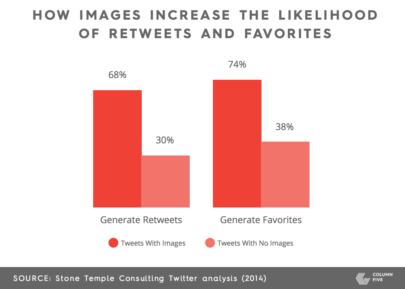
Shareability: Social behavior is a huge reason infographics are so popular. Consumers are more likely to share good content—but visual content consistently garner more shares, as the graphic above shows. in the last few years we’ve seen all social platforms push to support images, GIFS, and video.)
For this reason, in the last few years we’ve seen all social platforms push to support images, GIFS, and video.
Example: An infographic we published 3 years ago was shared extensively on Facebook this summer, resulting in a great boost.

Earned media: Because infographics are so effective, publishers are eager to use them to support their editorial. (See our tips on creating Publication-Tailored Content to increase your chances of placement.) The advantage of creating infographics for publishers is not just your expanded reach and prestige but getting access to their targeted audience.
Example: We partnered with NewsCred to create an infographic about Snapchat users. The infographic was picked up by 20 extra social media marketing-related publications, all within the social media marketing sphere. That was the perfect audience for us to reach—without doing much.

4 Ways to Get The Most From Your Infographics
One of the most exciting things about infographics now is the various ways you can put them to work. While the long-form static versions still do their job, you can also experiment in other ways.
(Note: Before you create any infographic, you should always ask yourself if an infographic is the right format for your story or if other types of visual content, such as explainer videos or interactive infographics, might be a better choice.)
If an infographic is the way to go, here are some ways to improve its efficacy.
1) Try different formats: Infographics don’t have to be static. We’ve created infoGIFS for social and interactive infographics to accompany editorial pieces.
Example: Our award-winning interactive infographic for Microsoft guided users through a data breach.
2) Create divisible content: One infographic can be repurposed in many ways, which is helpful for maintaining a consistent publishing schedule. Split them up for:
- Visual assets for your blog.
- Social images
- Use in other formats, such as annual reports, presentations, etc.
If you haven’t experimented with this tactic before, learn more about the benefits of divisible content.
3) Visualize your proprietary data: Your customer surveys or internal data can easily be turned into an interesting infographic.
Example: We turned NewsCred’s proprietary data into a series of animated infoGIFs.
4) Turn them into a series: Instead of cramming info into one long piece, split them up. This allows you to tell a tighter story, approach a subject from different angles, and generate more content.
Example: We collaborated with Course Hero to visualize the themes, context, characters, and authors of students’ favorite literary works.
A Few Reminders About Infographics
A 2015 MIT study examined the traits that make images memorable. These infographic-relevant takeaways might help you up your game.
- Watch your titling: The study found that the best visualizations included titles that used concise, descriptive language to sum up the takeaway message. Pro tip: Make sure your titles and labels don’t include redundant information (e.g., using the same title or copy for a section header, chart label, and blurb call-out).
- Design appropriately: Images that effectively break down a concept will improve recall. Design should always enhance, never distract. (Learn how to avoid 8 common design mistakes.)
- Optimize your infographic for SEO: This is a common mistake we see many brands make. Check out our tips to help you do that.
- Reinforce messaging: Good infographics use visuals to communicate information the text does not. That said, call out relevant insights that your audience may overlook.
Infographics are not the cool new kids they once were. Churning out a ton of infographics as a haphazard “content strategy” and delivering audiences sub-par content is a thing of the past—and that’s great. We are witnessing the next evolution of infographics as they mature into reliable friends for marketers.
If you want to stand out, you need to commit to quality work that provides value to your audience, no matter the medium.
Infographics should still play an important role in your content strategy, but they need to be applied strategically and appropriately, depending on the resources at hand and your long-term goals. (That goes for every content marketing tool, too.) Keep that in mind as you continue to measure the ROI of your content investments and analyze the contributions of each content type.
Remember: There is no single template for content marketing. If it works for you, it’s what you should do.
As always, if you need help with your infographics or other visual content, we’re happy to chat. And if you want to learn more about infographics, check out these 3 predictions for the future of infographics.


Comments