An Agency’s Fixes for 15 Content Marketing Strategy Mistakes

From AI to analytics, content marketers have more tools to succeed than ever before. But you can only get the best results if you’re working with a solid content marketing strategy from the start. 

Having been in the content marketing game for well over a decade, we’re often surprised to see the same problems plague our clients, whether they’re smaller startups or Fortune 500 behemoths. 

  • They aren’t aligned around the same goals. 
  • They struggle to understand their audience. 
  • They don’t create effective content. 
  • They can barely get any piece of content out the door.

The problems go on and on, but once we dig into their content marketing operation, we generally find that these problems stem from one, or two, or five things that are wrong with their core content strategy. 

Luckily, some of the biggest problems can be solved by the simplest fixes—and we can give them to you. So, whether you’re dealing with recurring challenges or one big blocker, here’s how you can break through and get back on the right track.

Content strategy toolkit CTA

How to Fix the Top 15 Content Marketing Strategy Mistakes

If you’re guilty of one (or all) of these common mistakes, don’t get down on yourself. We know about these firsthand because we’ve been guilty of them too. But we also hope you’ll right these wrongs, put our tips to work, and come out on top with your next killer case study. 

Mistake 1: Not Documenting Your Strategy

If you’re working with a small team, small budgets, and a long to-do list, it can seem inconvenient to stop and document your strategy. But keeping it “in your head” doesn’t do anyone any good. 

Only 44% of enterprise content marketers have a documented content strategy.
Content Marketing Institute

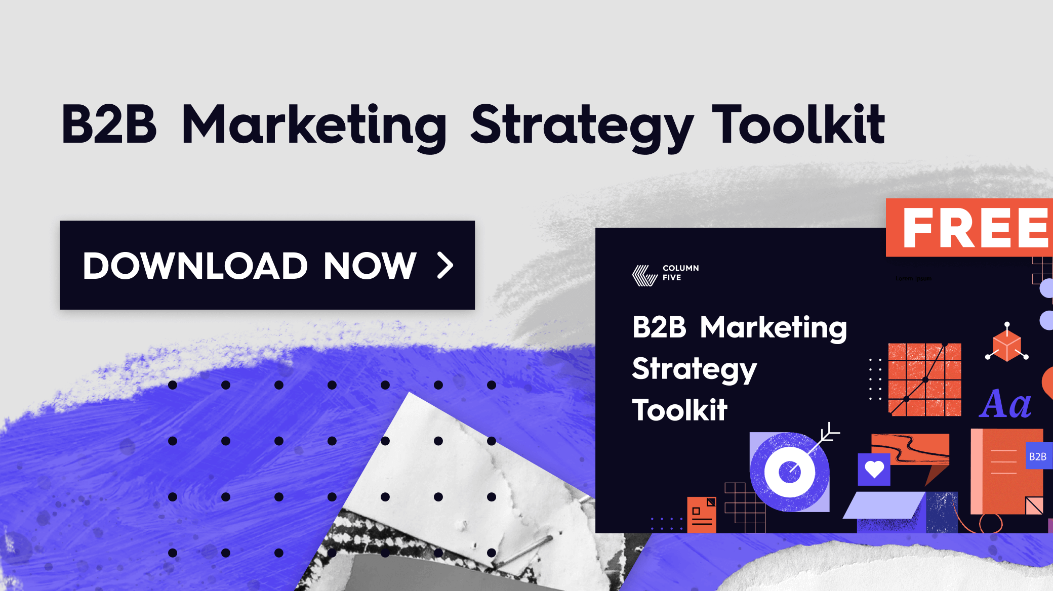
This is a sad statistic, but it’s not surprising, as we see too many clients come to us without a clear strategy on paper. It’s also no surprise that they struggle to work effectively or get the results they want. But the #1 thing you can do to completely transform your marketing is document your strategy. (Trust us, by tweaking our strategy on paper, we increased sales 160%.)

The fix: Download our free content strategy toolkit, then grab your core team, dig into your historical data, and work through the steps in our guide to create a content strategy. We’ve perfected the process to ensure you walk away with a solid, cohesive strategy that will help you achieve the goals you want.

Mistake 2: Working Without Personas

If the content you create isn’t collectively moving you toward your goal, it’s not the content’s fault. Oftentimes, weak content happens because you don’t know who you’re trying to create content for. 

The #1 challenge B2B marketers face is creating the right content for their audience.
Content Marketing Institute

We harp on this all the time—and for good reason. 

  • Who is your audience?
  • What do they need?
  • What do they care about?
  • What motivates them?

It’s important to do the footwork to get inside your audience’s minds so you know how to tailor your content to them. 

For example, when Dropbox asked us to help revamp their employer brand, we dove into audience insights to understand how to position the brand to potential employees. With a revised campaign, we were able to help Dropbox increase brand perception 7%. 

grid of colorful ads with smiling people

The fix: Talk to your potential customers, ask questions, and get inside their minds. (If you’re not sure who your audience is, here’s how to find them.) Once you have a clear picture, you can use our guide to create personas and ideal customer profiles. Going forward, anytime you have a content idea, use your personas/ICPs to vet your ideas or refine them to make them more compelling. 

(BTW, personalization can do a lot to make your audience feel seen. Find out how to use AI to add more personalization throughout the buyer journey.)

Mistake 3: Content Isn’t Tied to a Goal

Too much content out there is total fluff, overly salesy, or completely random. There’s no cohesive story or supporting message. To be truly effective, every piece of content should directly map to a goal.

The fix: Follow these tips to set clear, measurable goals that will get results.

Mistake 4: Not Including the Right Stakeholders from the Beginning

You might be excited to hit the ground running with your strategy, but a content marketing operation requires a lot of people—and they all have different opinions and perspectives. We can’t tell you how many times we’ve made it to the finish line with a project, only to be sabotaged by a barrage of last-minute adjustments from late-stage shotcallers.

41% of B2B marketers cite workflow issues/content approvals as a key challenge when creating content.
Content Marketing Institute

Feedback is not a problem inherently, but when people drop in with their opinions in the final stage (having often not reviewed the project goals), content often gets watered down or altered so significantly it no longer serves its original purpose. 

The fix: Build solid timelines with built-in review stages. Don’t go on to the next stage of production until you have sign-off from all relevant parties. (If you’re not sure who needs to be involved in what, here’s what an ideal content marketing team looks like.)

Remember: It’s important to get overall strategy buy-in from higher-ups before you even start to create content. The more you can involve people in the vision, the easier it will be to get the budget for that new video or design time for those social ads.

Mistake 5: Making Scattershot Content

This is probably the number one problem we see when brands pursue content marketing. They may get excited about a certain project or format, but their overall content is created and published inconsistently. 

54% of B2B marketers struggle with creating content consistently, and 44% struggle with creating quality content.
Content Marketing Institute

While a one-off piece might work if you’re lucky, you need a cohesive content plan that provides true value to your audience regularly.

The fix: Instead of publishing piecemeal content when you can get around to it, break your strategy down into content campaigns centered around a core message or theme. Use our brand messaging framework to make sure you’re tailoring the right message for each audience.

Mistake 6: Trying to Do It All Yourself

Year after year, marketers are asked to do more with less. Whether it’s a shifting economy, industry issues, or company challenges, marketers are always having to tighten their belts.

55% of B2B marketers are working with the same budget (or a decrease).
Content Marketing Institute

This means you have to be as smart as possible with your time and your budget. Fortunately, as AI technology has come on the scene, there are more ways to increase your productivity and reduce your workload by employing AI tools to help in everything from content creation to automation. 

A lack of resources is the #1 challenge facing B2B marketers today. But 72% have begun to use generative AI tools.
Content Marketing Institute

The fix: Review your tech stack to see what tools you’re using, and what tools you might add to the mix. (Here are 50+ content marketing strategy tools to help you work more effectively, plus 30 AI hacks to work more effectively.)

Mistake 7: Not Measuring or Not Measuring Correctly

This is one of our biggest pet peeves, and we see it over and over (even in our clients). You can’t make any clear progress if you have no benchmarks—and you certainly can’t demonstrate your ROI if you don’t track your results. 

The fix: Try this 3-step process to choose the right metrics for your goals, and double-check that you have the correct infrastructure in place to measure. (Trust us, we have spent more time than we’d like on the phones with reps to get the right tech on our site.)

Mistake 8: Refusing to Change

When you’ve put the work into a content strategy, it’s frustrating to change course halfway through when you realize it’s too unrealistic. But if there’s anything we’ve learned in the last decade of marketing, it’s that things change—and they change quickly (hi, pandemic!). 

The fix: It’s important to review your strategy regularly to ensure it aligns with your current goals and market conditions. A good strategy provides a firm foundation with the flexibility to scale. If you prefer to run lean, consider taking a moonshot approach to crafting a strategy. We used this to tweak our own content—and increased our leads 78% in 6 months.

Mistake 9: Missing Easy Opportunities

It’s easy to get tunnel vision when you work on your own brand day in and day out. (Again, we’re guilty of this too.) But it’s important to take a critical look at not only your own strategy but your competition’s strategy too. We can’t tell you how many times a simple competitor audit has surfaced surprising insights into areas a client can easily make a play.

The fix: You should always be looking for gaps to fill in your content strategy, as well as easy plays to get visibility. Start with our guide to find the best keywords to target (including low-hanging fruit your competitors aren’t targeting). You can also conduct a content audit to identify gaps in your own marketing mix, as well as subjects your competitors are covering.

Mistake 10: A Weak Production Pipeline

Content marketing takes a lot of work, but without the right resources, skills, or infrastructure to produce it, it’s nearly impossible to create quality content consistently. But if you have a clear division of labor and a streamlined workflow, you can achieve incredible results. 

For example, by optimizing workflow, we were able to help Course Hero produce 600 infographic study guides over three years. This helped them provide a massive library of guides to their audience and build a reputation as a trusted resource. 

course-hero-duo-1

The fix: Having made just about every mistake in the book, we know how to avoid the major pitfalls in content creation. See our guide to optimize your content creation process and work more effectively at every stage. 

Mistake 11: Not A/B Testing

This goes along with ineffective measuring. Your goal is to move away from guesses and hunches and look for more concrete answers by testing your hypotheses. You think blue is the right color for that button? You might be surprised to see that red is the real winner.

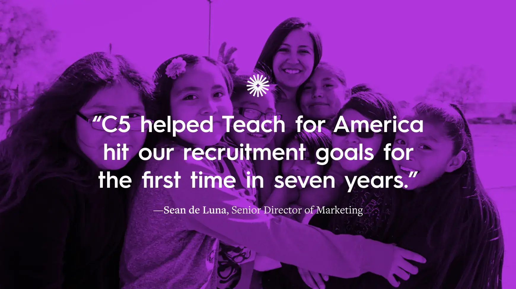
For example, when Teach For America asked us to deploy a paid media campaign to recruit new teachers, we embarked on a strategic testing campaign optimized for learning and iteration. Through this approach, we were able to eclipse their goals 124%.

The fix: Even if something is working, it might still be improved. Look for opportunities to tinker, tweak, and test wherever you can. (AI can be a big help here.) 

Mistake 12: Not Aligning Content With Your Journey

The strongest content marketing strategy delivers the right message, to the right person, at the right time. Unfortunately, too many marketers create content that is too generic or too granular. It’s no surprise that they can’t easily move their audience from one stage to the next. 

48% of B2B marketers struggle to align content to different stages of the journey.
Content Marketing Institute

The fix: If you want to be successful, you need to understand your audience’s needs at each stage, then choose both the messaging and format that will best speak to those needs. Start with our free template to map your journey and key messaging, then assess how to make great content for every stage of the buyer’s journey.

Mistake 13: Not Matching the Message to the Format

Different audiences crave different types of content formats, which are often influenced by channel. Whether it’s ebooks, infographics, or short-form video, it’s important to deliver your message in the right package.

B2B marketers cite case studies, video, and thought leadership articles as the top three most effective formats.
Content Marketing Institute

The fix: Understand which types of formats are best for different types of storytelling. See our breakdown of 13 types of content—and how each can help you achieve a different goal. 

Mistake 14: Not Maximizing Your Content

It takes so much time and energy to make great content, yet many marketers publish it once and let it gather dust for eternity. This is a huge opportunity missed.

The fix: Identify opportunities to repurpose and reuse content. For example, an e-book can easily be spun into a few blog posts and an infographic. Learn how a divisible content strategy can help you do this.

Mistake 15: Playing It Too Safe

True, you don’t want to fix something that isn’t broken. But never mixing it up breeds stagnation—and that’s creative death for your content strategy. Also, as brands become more and more homogenous, it’s increasingly challenging to stand out in the crowd. That’s why something you need to try something edgy from time to time.

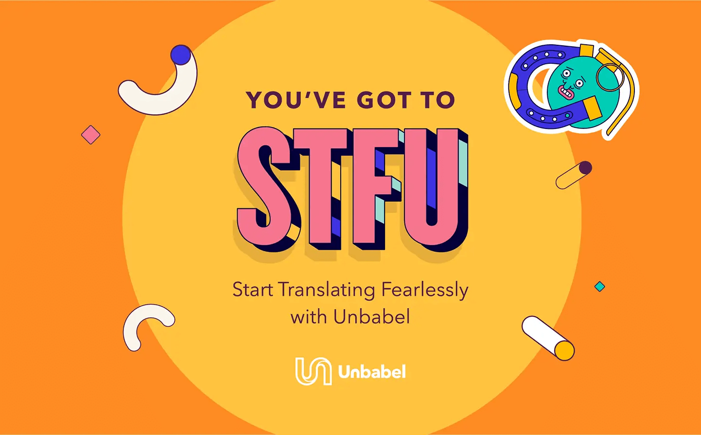
For example, we collaborated with Unbabel to create the edgy “STFU campaign.” This NSFW approach turned heads and helped the brand make a big splash.

Unbabel STFU campaign

The fix: Even if you don’t have a huge budget, challenge yourself to try something different, whether it’s a different format or a different way to ideate. If you want more tips to stand out, try these ideas to come up with bold campaign ideas

How to Strengthen Your Content Marketing Strategy

Ultimately, the key to a strong content marketing strategy is the ability to test, tweak, and adapt as you go. For that reason, we recommend reassessing your strategy quarterly to make sure you’re still aligned to your goals. In the meantime, continue to educate yourself, optimize your process, and look for ways to work smarter. If you need a few more tips to do that…

And if you still need some help, don’t be afraid to bring in some experts. You can follow our tips to find a good content marketing agency, or hit us up.

Content strategy toolkit CTA

5 Worst Mistakes SaaS Marketers Make (And Tips to Avoid Them)

If you’re working in SaaS, you’re under a ton of pressure. Innovation cycles happen quickly, rapid growth is the name of the game, and SaaS marketers are expected to deliver, deliver, deliver every quarter. With such high stakes, I see many of our clients scrambling to keep up—and, in the process, falling victim to the most common mistakes SaaS marketers make. 

Sometimes these issues arise from a lack of knowledge. Sometimes they’re the byproduct of company politics. But no matter the source, collectively, these mistakes will sabotage your marketing and hurt your brand in the long run. So, to help you avoid that outcome, I’m breaking down these common problems and offering a few tips to make your marketing as successful as possible.

B2B Marketing Strategy Toolkit CTA

5 Ways SaaS Marketers Sabotage Themselves

From bad strategy to faulty processes, here are the biggest issues to watch out for. 

Mistake 1: You down-prioritize strategy.

SaaS marketers are obsessed with moving quickly. (Again, they’re under an enormous amount of pressure.) 

Only 40% of B2B marketers have a documented strategy.
Content Marketing Institute

I often find clients come to us without a proper documented strategy. Or they claim to have a strategy, but it lives in their heads. This approach is often predicated on this false belief that formalizing and documenting a strategy slows you down.

But a strategy that lives in someone’s head only works for a team of one…sort of. If you ever plan to scale your team (and with a focus on growth, of course you do), you need a strategy to guide your growth. When it comes to a marketing strategy, the reality is that you pay now or you pay later—in time and money. Spoiler: When you wait, you pay a lot more. 

  1. You waste money on things that don’t work instead of approaching content with a developed strategy that lets you measure success—and adjust accordingly. 
  2. You waste time coordinating and producing all that ineffective content. And don’t kid yourself. You will never have more time to tackle your strategy later. As you grow, more people on your team means more complexity and less alignment (specifically because you don’t have a strategy to keep everyone on the same page). Stakes will be higher. Pressure will be higher. Tensions will be higher. 

This can all be solved by putting your time and energy into strategy upfront—and tweaking as you go. 

Tip: To keep your team on the same page with clear goals, responsibilities, and accountability, use our free B2B toolkit to build an airtight strategy that gets the results you want. 

B2B Marketing Strategy Toolkit CTA

Mistake 2: You’re spending money on PR before there’s a marketing strategy.

This is one of the most common mistakes I observe with potential clients. They’ll often say, “We’ve been working with a PR agency for a while, and now we’ve decided to now start marketing.”

Don’t get me wrong; I’m not anti-PR. It has its place, and a good PR agency is worth every penny. But taking a PR-first approach is often fueled by a desire for quick wins in the short term. This leads to fleeting gains when pursued too early. 

If you don’t have a marketing strategy that informs your overall approach, including things like goals, PR strategy, and PR budget, you’re making things harder for yourself. 

My advice is to get your marketing strategy dialed in and develop a track record of creating and distributing content on owned channels before you engage a PR agency for the long haul. 

You’ll be more likely to have solid benchmarks and a measuring framework in place, which will help you understand the value of your PR investment. You’ll also have more content on deck to feed people once your PR agency gets you placements and traffic. 

With a solid strategy, you’ll have a perfectly optimized pipeline to keep people interested and engaged with your brand.

Tip: Use our handy guide to develop a distribution strategy and get your content in front of the right people. 

Mistake 3: You’re ignoring brand issues.

Marketing = taking your brand to market. But what if your brand is in bad shape? What if you don’t have a clear sense of self to present to the world or guide your decision-making behind closed doors?

When SaaS marketers focus on content first and fail to nurture their brand, they may have some short-term wins. But long term, the brand will struggle to stand out in the marketplace. Simply put, no matter how amazing your marketing ideas are, if people are sorely disappointed with your brand once they interact with it, you’ll be fighting a never-ending uphill battle. 

Luckily, when you have a clear and cohesive brand, your marketing doesn’t have to work that hard. (It’s also a lot easier to create, as strong messaging and an easy-to-use brand style guide make it 100 times easier to create on-brand content as you scale.) 

When your brand and marketing are both dialed in, they reinforce each other in a virtuous circle. 

Tip: Identify who you are, what you care about, and what your purpose is, then use your messaging and identity to communicate that. To build out a strong brand that includes all these elements, download our free brand strategy toolkit

Mistake 4: Your team can’t get its act together.

As I said, SaaS marketers are often stressed out, and team dynamics usually play a huge role in this. 

I usually see this take form in three toxic ways:

  1. The free-for-all: Everyone wants to have a say in what marketing does, and decision-making becomes near impossible. Good ideas get caught up in the internal back-and-forth and often die on the vine. (This often results in a merry-go-round of starting projects, killing projects, then blaming an agency for poor results.)
  2. The dictatorship: At most large companies, the person with the biggest title usually has the final say. But the most senior person is also usually the furthest removed from any one project or campaign and is not best suited to make that call. 
  3. The breakdown: While executive involvement in marketing can lead to problems, their exclusion can as well. Without clear lines of communication and senior buy-in, you can seriously hamper progress (e.g., when a senior decision-maker’s late-stage review sends us back to square one) or even grind things to a halt (e.g., the dreaded “change in direction”). 

In all of these cases, folks let internal politics become a blocker, egos get in the way, and growth is stunted. (Note: This is why we keep our eyes peeled for these types of red flags before we take on clients.) 

Tip: You need a clear decision-making process, clear shot-callers, and an understanding of everyone’s responsibilities from the jump. Determine these roles at your strategy stage (and please have them defined before you bring in outside help). A healthy decision-making dynamic allows for executive buy-in with regular updates and approval stages. 

Mistake 5: You’re afraid of failure. 

I know there are many reasons SaaS marketers are afraid to experiment. 

  • They have a fixed mindset and don’t want to try something that won’t work. 
  • They don’t want to ruffle feathers or get in trouble with their internal “brand police.” 
  • They don’t have the resources, budget, or knowledge to pull it off. 

Stakes are high, but when you’re too afraid to try something new, you miss out on potentially huge rewards. In application, that timid approach often leads to milk toast creative. 

Sometimes, making the wrong decision is better than making no decision. 

The key to success is to take logical, calculated, and knowledgeable risks with your creative—something having a strategy can not only justify but encourage. 

Tip: Make sure you have your measurement infrastructure set up, then allocate a portion of your budget to testing and experimentation. With your baseline measurement, you can see how your efforts were received—and identify ways to improve next time. 

How SaaS Marketers Can Succeed Going Forward

If you’re guilty of one or even all five mistakes here, don’t worry. I’m not here to call you out, only to point you in the right direction. As you assess the state of your marketing operation, there are a few things to focus on for success.  

  • Remember your goals. Clear, measurable goals can help clear up a lot of internal strife. If you frame every decision in support of your goals, you will have a much better time keeping people aligned and getting the support you need. (This can even help you get more budget.
  • Put your audience first. As you get your own ducks in a row, remember that good marketing is really about making a connection with your audience. Create marketing personas to understand who they are, and look for ways to create content that provides true value to them.
  • Get the right help. Finding the right experts is one of the biggest challenges SaaS marketers face, so it’s important to choose an agency that intimately understands your brand and audience. If you’re on the hunt, see our tips to find the right agency for you

Above all, continue to educate yourself, challenge yourself, and identify new ways to support your team. Feel free to deep dive into our resources center for more content marketing guides, templates, and tools, and let us know if there’s something you’d like to learn more about. We’re always happy to help you do your job better.

B2B Marketing Strategy Toolkit CTA

The 10 Worst Mistakes in Saas Marketing (and How to Fix Them)

SaaS marketing isn’t easy. Your customer pool is smaller, there is more competition, and the path to purchase is much longer. But when you’re unwittingly making mistakes that sabotage your success, it’s that much harder. Having worked with SaaS clients over the last decade, we’ve seen tons of well-intentioned brands make missteps (both small and big) that affect their marketing negatively. Luckily, we know exactly what those mistakes are and how to correct course if you’re making them. 

B2B Marketing Strategy Toolkit CTA

How to Fix the Top 10 SaaS Marketing Mistakes

There are all sorts of ways you may be holding your brand back from doing your best marketing—even if you don’t realize it. From poor strategy to misguided newsjacking, here are the top 10 mistakes SaaS marketers make, plus easy fixes to get you back on the right track. 

Mistake #1: Unclear positioning. 

When clients come to us for content help, we always ask them about their core brand positioning: who they are, who they’re for, what they do, and why they’re different. Far too often, they can’t answer these questions succinctly. This is especially common in SaaS, where the most focus is spent on the product itself. But if you don’t have a crystal clear understanding of who you are and how you fit into the marketplace, your marketing will be scattershot and unable to help you establish a firm footing with your audience. 

Tip: Do a competitive analysis to understand how your competition is positioning themselves—and how you can stand out.

Mistake #2: Having a content strategy—that lives in your head. 

Only 46% of B2B tech marketers have a documented content strategy.
Content Marketing Institute 

This stat is completely shocking, but in our experience, it is far more common than one would think. Even if you’re working with a small team, your strategy can’t live inside one person’s head (or a few people’s, for that matter). There are too many moving parts and too many things to consider. This is why a weekly meeting to chat about priorities or to-do lists won’t cut it either. 

To be successful in marketing, you need a documented, measurable strategy to guide your content, track progress, and identify opportunities to improve. 

Although a strategy is a living, breathing thing that should evolve, you need something on paper to keep everyone, from your newest hire to your CMO, on the same page.  

Tip: Use our free content strategy toolkit to build a simple, measurable strategy that works. 

Mistake #3: Prioritizing product at the expense of brand.

It’s common for SaaS companies to have product-centric cultures, which is understandable if you’re in the early stages of your company. And product-market fit is certainly a critical hurdle that requires investment and focus. But in a competitive marketplace where features, bells, and whistles are quickly copied, it is your core brand that will help you differentiate and succeed long-term. Unfortunately, brand is often an afterthought, which makes marketing harder. 

It’s only when you have a clear understanding of who you are, what you care about, and what you’re trying to achieve that you can effectively share your values and tell your story. 

Tip: Use our free workbook to identify your brand heart, including your purpose, vision, mission, and value. This critical work will help you communicate your brand much more effectively to not only consumers but current employees, future employees, and industry peers.

Mistake #4: Ignoring your marketing fundamentals. 

Sure, there are lots of flashy new marketing tactics like events/stunts and AI bots of every flavor out there. But every marketing department should focus on mastering the fundamentals first: 

  • Search
  • Email
  • Social 

Good old-fashioned lead gen content and SEO can still carry the lion’s share of a fledgling marketing practice. But you need to invest in SES to make the most impact with your audience and create a content ecosystem that supports your goals. 

Tip: Content marketing is about building and sustaining relationships through content, but you need that content to be seen first. See our guides to find your target audience and create a distribution plan that helps them find your content. 

Mistake #5: Trying to do too much on social. 

97% of tech marketers use LinkedIn to connect with their audience.
Content Marketing Institute 

Yes, social is a huge component of your marketing fundamentals, but you don’t have to be everywhere at once. Sure, you’ll want to keep tabs on new channels (and create your brand handle), but it’s better to do a few channels well than spread yourself thin. 

In fact, not only do you not need to be on every channel but sometimes you can actually hurt your brand by trying to force your way into a space.

In general, if it doesn’t fit your brand, if your audience isn’t present on the channel, or if you don’t have the bandwidth to really go all in, stick to the channels that are tried and true. 

Tip: See our guide choose the right social channels for your brand—and use the right metrics to measure your success. 

Mistake #6: Choosing the wrong keywords. 

SEO content is a crucial source of leads, but going for those high-volume, high-competition keywords isn’t always the best choice for your SaaS marketing. While the idea of that page 1 ranking is tempting (especially for your ego), you might be missing out on your most valuable audience. Even with low search volume, high-intent terms can be pure gold. Since the average customer value (and therefore the value of a lead) is quite high in SaaS, even a search term with only 20 searches per month can be fruitful if it leads to a few leads. Best of all, the competition is much lower, making it easier to make your mark.

Tip: See our guide to choose the right keywords for your content strategy and put them to work.

Mistake #7: Focusing on what you think people think about your brand. 

As a marketer, you want to know what people think of your brand. But putting too much stock in social listening tools or “share of voice” metrics can distract you from really connecting with your target audience. 

Yes, there are plenty of tools that can support your content marketing efforts, but no single tool is a magic bullet. This is especially true of tools that try to scrape the various corners of the Internet to determine the market’s sentiment about your company. While these tools sound exciting, the tech just isn’t up to par.

Natural language processing technologies are yet to pick up on things like sarcasm or other subtleties that comprise a huge portion of online chatter. Beyond the most simplistic measures like the amount of times your brand is mentioned, social listening metrics shouldn’t be a top KPI for marketers. Ultimately, brand perception is best measured by conducting scientific surveying.

Tip: Brand perception really starts with brand connection; how well do people really connect to your brand? Start by talking to your current and would-be customers about who they are, what they want, their unique needs, desires, pain points, etc. The more you understand them individually, the more you can create marketing that speaks directly to them. When they connect to your content, they will see you as a trusted resource and guide, helping you get the positive public perception you crave. Another pro tip: Use these conversations to craft marketing personas that will help you brainstorm more valuable ideas for your audience. 

Mistake #8: Newsjacking. 

You want to join relevant conversations, exchange ideas, and stay relevant—but carelessly newsjacking is a terrible way to do it. There are too many examples of brands going down in flames for trying to inject themselves into a conversation they don’t need to be in. Unless you want to become a painfully funny meme, be very mindful of the ways that you engage around timely or trending topics. 

Tip: That’s not to say you can’t ever participate in the conversation. You just need to know when it’s appropriate to do so. See our tips to do newsjacking the right way to avoid disaster.

Mistake #9: Investing small against big results. 

60% of B2B marketers have been asked to do more with the same resources.
Content Marketing Institute

We recently talked to a SaaS company that wanted to generate $53 million in new customer marketing-attributed revenue for the year. Their budget? $2 million. They had no illusions about how impossible this ask was, but they also didn’t plan to make any adjustments.

Marketers, particularly those at budding SaaS companies, certainly need to be responsible stewards of marketing investments. Part of that is playing teacher internally and effectively educating teams about the relationship between goals and investment to create more reasonable expectations (or achieve a more reasonable budget).

Tip: Although marketers are masters of making things work (often with very little resources), there are many times where more budget is really the only way to achieve your goals. If you’re struggling in this area, follow our tips to get the budget you need. 

Mistake #10: Trying to do everything either in-house or via an agency. 

50% of B2B content marketers outsource their content marketing activities.
Content Marketing Institute

It’s hard to handle every part of marketing yourself. You can easily overextend yourself and end up burnt out and frustrated. Conversely, you don’t want someone else running your brand entirely. The most successful SaaS companies strike a balance, using expert help to support their marketing and get the best results. 

Agencies are great partners. They provide extra bandwidth, experience from other clients, a healthy perspective, and plenty of their own great, creative ideas. This enables folks at fast-growing SaaS companies to focus on the most important things. That said, agencies are meant to serve as an extension of a team (not in lieu of one). The best work comes when you form meaningful, strategic partnerships with best-in-class, specialized agencies. Bonus points when you can bring various agencies together (e.g., your brand/content agency and your PR agency). 

Tip: One of the biggest challenges in SaaS marketing is finding agencies with the right expertise. Follow our tips to find the right agency for you, find out what to look for when you vet your frontrunners, and use these tips how to form a good working relationship with your chosen agency. 

Of course, you’re welcome to start your search with us. Find out what it’s like to work with us on a brand or content strategy, or reach out directly. We’d be happy to steer you through the wilderness and get the results you deserve. 

B2B Marketing Strategy Toolkit CTA

How to Fix the 12 Most Common Mistakes in Brand Identity Design

A brand identity is an important tool to help your brand communicate, but just because you have one doesn’t mean it’s effective. There are many things, large and small, that can sabotage your brand identity design, from sloppy design to indecipherable text. These simple oversights, whether intentional or not, make it difficult to build a consistent brand identity that connects with people. Worse, many brands (we’re talking global brands) don’t even know they’re making these mistakes. Not sure if you’re one of them? You’re about to find out. 

The Biggest Mistakes in Brand Identity Design

Here, we’ve compiled the most common brand identity design issues we see, along with our best tips to help you upgrade your identity, differentiate your brand, and connect with the right people. 

brand identity cta

Mistake 1: Not Knowing Who You’re Trying to Reach

Designing a strong visual identity isn’t about what you want; it’s how you want to be perceived. The better you communicate who you are, the more authentically you can connect with people. 

But if your brand identity isn’t aligned to your true identity, and it doesn’t resonate with the right people, it won’t be successful about (no matter how pretty your logo is).

The Fix: To communicate honestly, you need to know who you really are (and, thus, how you want to be perceived). Start by using our Brand Heart workbook to articulate your brand’s purpose, vision, mission, and values. This will help you realign your brand identity to your core principles.

You should also create marketing personas to get insight into who your target customer is, what they think, and what entices them. With both your Brand Heart and your personas articulated, you can tweak your brand identity to deliver the right message to the right people. 

Mistake 2: A Meaningless Logo

Logos are super fun to design, but they can also be a huge headache. Sure, you can design something pretty and call it a day. But a really strong logo supports and reinforces your brand’s core identity, mission, and business. If you can’t connect your logo to your brand, it’s time to refresh.

Of course, logo design takes a lot of deep thinking and serious brainstorming. (FYI, we’re used to designing at least 50 options for a brand—just to start.)

The Fix: If you’re struggling to come up with a logo that connects to your brand, try our simple process to find a logo you love, and find out what logo design mistakes to avoid

Example: We created a new visual brand identity for the Expanded Special Project for Elimination of Neglected Tropical Diseases(ESPEN), a WHO organization on a mission to eliminate five specific tropical diseases. To bring their mission to life, we created a symbolic logo that features a rendering of the African continent, made of five bars: one for each disease they’re battling.

Visual identity logo example

Mistake 3: A Limited Visual Brand Identity

Your visual identity is meant to help you communicate effectively in many use cases. As such, you need to give your designers the tools they need to create on-brand content, no matter the medium. If you don’t provide these guidelines (and leave them to their own devices), you’re sure to end up with inconsistent content.

The Fix: You might not need an encyclopedia-thick brand bible for your lean startup, but it’s important to give your team guidelines for the basics, including:

  • Logo
  • Colors
  • Fonts and typography
  • Hierarchy
  • Photography
  • Illustration
  • Iconography
  • Data visualization
  • Interactive elements
  • Video and motion
  • Web design

For more tips on designing these elements, follow our guide to designing a memorable brand identity (based on science), and use our handy visual identity checklist

Mistake 4: Clunky Web Design

A good brand identity isn’t just robust; it features intuitive design. Indecipherable favicons, unresponsive websites, low-res images—these are the types of things that can make people turn away (and degrade your brand experience). 

The Fix: Whether you’re designing your logo or your website, consider various use cases and user experiences. Will your logo render well as a small social profile pic? Is that new interactive infographic mobile-responsive? These are the crucial questions to ask.

Mistake 5: Inconsistent Elements 

Just because you designed a logo, combined some colors, and chose a typeface doesn’t mean your visual brand identity is cohesive. If you want to create a unified experience, you need to design every element as a complement to the other.

The Fix: Start with your logo, then flesh out each element from there. Your typeface should work well with your logo (e.g., character shape and personality). Similarly, your colors should work well with your typeface (e.g., not too light to read).

Mistake 6: No Diversity in Imagery

No, we’re not talking about image styles. We’re talking about the people and/or characters you’re depicting, whether it’s in photographs or illustrations. It’s easy to fall into a rut, creating the same things over and over simply out of habit. But representation is important. Think about what the imagery you use says about your brand, your values, etc.

The Fix: Be mindful of diversity (age, race, gender, etc.) in the images you choose. Include specific direction in your brand guidelines, and give your team easy access to an image library that reflects your brand. Check out these 101+ tools to build a brand identity (including free stock sites) to find them.

Mistake 7: Poor Typography

Typography can enhance or hinder your brand experience. If things are too cluttered, indecipherable, or overwhelming, you’re only doing yourself a disservice. This is often an issue for online content, and it is one of the easiest ways to turn people off.

The Fix: To ensure your typography is always legible, try this clever test as recommended by lettering artist Jessica Hische:


How to visual identity

For more tips on selecting the right font pairings, see our guide to find the right typography for your brand

Mistake 8: No Design System

Much like designing a piecemeal brand identity with no cohesion, brands are also guilty of lacking a proper design system. It’s not just about the parts; it’s about how they go together. 

The Fix: Is there an intuitive hierarchy? Can people navigate your content easily? Designate the proper order of content, including headers, subheaders, body copy, images, blurbs, etc.

Mistake 9: Too Many Colors

This is one of the most common rookie mistakes (and a tell tale sign that you let an intern design your brand identity). Luckily, it’s easily remedied.

The Fix: Simplify it with:

  • 2 primary colors
  • 3-5 complementary colors
  • 2 accent colors

For more tips on curating the proper palette, follow our guide to choose the right colors

Mistake 10: Indecipherable Icons

Icons make life easier because they’re a visual cue to communicate quickly and effectively—without words. Therefore, simplicity and clarity are key. Unfortunately, too many brands get carried away with icons that are either redundant or too abstract to understand.

The Fix: If you’re not sure, have someone do a sanity check to confirm your icons are intuitive and appropriate.

Example: We collaborated with Avalere Health to create custom iconography for its health care-related content. 

visual identity icon

Mistake 11: Inaccurate Data Visualization

Thanks to the explosion of big data, brands are communicating with data more than ever. Data visualization is a powerful tool to make data easier to comprehend, but it can also do a lot of damage when data is misinterpreted or inaccurately represented.

The Fix: To make sure your data visualization is correct, use our Data Visualization 101 guide to design the most common charts and graphs.

Mistake 12: No Brand Style Guide  

One of the biggest reasons brands struggle to preserve their brand identity is because their content is consistently…inconsistent. Content creators are either “expected to know” how to apply their brand guidelines, or they’re left to their own devices. When this happens, it’s no surprise that content ends up looking Frankenstein-ed.

The Fix: To keep your team on the same page, document your brand guidelines, and makes sure to include various examples that demonstrate proper application.

More Tips for Creating A Strong Brand Identity Design

If you’re starting from square one, don’t be overwhelmed. Creating a good visual identity is a collaborative process, so make the most of your team’s creativity.

A few ways to do that:

But if you’re struggling, don’t be afraid to ask for help. Find out what it’s like to work with us on your brand identity or holler at us.

brand identity cta

10 Common Logo Design Mistakes (and How to Fix Them)

If you think logo design is easy, you’re probably not a designer. Even for seasoned pros, designing a beautiful and practical logo is a tough creative challenge. It’s a tedious process that requires a ton of research, expertise, and forethought. (That’s why we can guarantee that outsourcing the job to an intern or CEO’s nephew pretty much never turns out well.)

But even a highly skilled designer can run into trouble. Small mistakes and simple oversights can easily sabotage the logo design process—and the final design—without you even realizing it. That’s why it’s important to know what to avoid from the get-go.

The 10 Biggest Mistakes in Logo Design

We’ve had plenty of experience designing logos, so we know how to help you avoid those rookie mistakes. If you’re embarking on a fresh logo design or hitting a wall with your current design, here’s a roundup of the most common problems, plus our best tips and tricks to get you through the process.

1) Not Following an Intuitive Process

If you tell your team to just start brainstorming some ideas, you might end up with 3 or 300 ideas. If you tell your team to choose one (with no guidelines, rubric, or reasoning), it may be impossible for your team to narrow it down. The result? You go into endless rounds of fruitless iteration.

To save everyone’s sanity, from project manager to designer, it’s imperative to have a clear, intuitive process that helps you create a strong logo that works for you.

The Fix

Not sure where to start? Follow our step-by-step guide to create a logo with less stress, and bookmark these 100+ tools to build a brand identity.

2) Confusing Your Terminology

If you want any creative project to go smoothly, you need everyone to be on the same page and speak the same language. Thus, it’s important to use the right terminology.

The Fix

Know your logo definitions. The word “logo” has become a catch-all term for any image related to a brand, but in logo design, there are specific definitions for a logomark, wordmark, or combination mark.

Logomark: The image that represents a brand (e.g., Nike’s swoosh or Apple’s apple). For Column Five, it’s this:

Logo design 1

Logotype/wordmark: A brand name in a styled font (e.g., Coca-Cola’s elaborate script or Gucci’s clean font).

Logo design 2

Combination mark: Both the image and the styled brand name together (e.g., Puma).

Logo design 3

For the sake of flexibility and versatility, it’s more common for companies to have all three. Oftentimes, when people refer to logo, they mean a combination mark. 

3) Not Doing Enough Research

Logo design is fundamentally a communication challenge. How do you capture and communicate a brand’s essence through imagery? To do this well, you need to have a deep understanding of exactly what it is you’re trying to communicate—or not to communicate. The more knowledge you have, the better you can do this.

Rookie designers (or impatient brands) will sometimes dive into the brainstorm stage without the proper brand education. This always results in a weak logo that doesn’t accurately represent or reflect the brand.

The Fix

To make sure you have as much knowledge as possible, conduct a brand audit survey that clearly details your brand goals and objectives. Once you have this info, you can write a strong creative brief that will keep your team on the same page. (Per point 2, make sure you specify what type of logo you’re creating in your brief.) 

4) Creating Your Logo Design in Color (First)

A good logo stands on its own—without color. While color is an important element, of course, starting with color can make it harder to judge if your design is strong enough. Worse, designs that do work can be dismissed just because someone is thrown off by a color.

The Fix

To ensure your logo really works, design it in black and white first. This will help you narrow down your designs (as you will likely have multiple options). Then, when you are ready to work with color, follow our tips to choose the right colors for your brand.

Here, you can see the evolution of the logo we designed for The Cove (UCI Applied Innovation). We started with black-and-white renderings, which allowed us to build on each design until we had a final option. 

How to make a logo design

5) Using the Same Typography for Your Wordmark and Brand Content

When it comes to your wordmark, you want to keep typography simple and clean. But you don’t want to use an untouched typeface for your wordmark (e.g, Arial, 12 point). Why? Because your wordmark should be distinctive, unique, and a representation of your brand’s visual language.

The Fix

Sure, you can use a typeface as the basic inspiration (and the typeface you choose for your brand should complement your wordmark well), but it should be customized in some way. For more tips on selecting typography for your brand, check out this guide.

6) Using Generic Imagery

This shouldn’t have to be said, but we have to say it. There is nothing that will make your brand more forgettable than generic imagery. Hands shaking to symbolize community, a lightbulb to symbolize great ideas—you get it.

The Fix

The point of logo design is to find something that represents your brand, not a vague idea. You can still use symbolism, but be creative and look for things that speak to you directly.

We created a new visual identity for the Expanded Special Project for Elimination of Neglected Tropical Diseases (ESPEN), a WHO organization on a mission to eliminate five specific tropical diseases. To bring their mission to life, we created a symbolic logo that features a rendering of the African continent, made of five bars: one for each disease they’re battling.

How to make a logo design

7) Using Inappropriate Imagery (Without Realizing It)

The devil is in the details, especially when it comes to design. Shapes or white space can be used strategically to reinforce brand messaging in effective ways. However, this can backfire too. We’ve seen plenty of logo designs that unintentionally deliver the wrong message in the form of overly phallic shapes, inappropriate or inoffensive symbols in white space, etc. (Out of respect, we will not include those examples here.)  

The Fix

When you’re so immersed in a project, it can be hard to see any issue. That’s why we always recommend a sanity check from someone with fresh eyes.

The subtle arrow in the FedEx logo is a great example; you can see it in the white space between the E and X.

FedEx logo design 4

8) Making an Inflexible Logo

Your logo will be used in many ways, in many mediums. It should work well in print, online, and at different sizes (e.g., your website favicon). If your logo is too complicated, it won’t render well at smaller sizes. If it’s too generic, it won’t be distinctive enough to grab attention.

A good logo is future-proof, meaning that it will grow with your brand and work for as many use cases as necessary. 

The Fix

Create mockups for both web and print assets to get a sense of how well your logo translates. If you want more logo design inspiration, check out the great examples at Logo Design Love.

9) Falling Victim to Hivemind

You want your logo to be unique and distinctive. Still, it’s easy to get sidetracked by design trends or even industry standards. This has become especially true in recent years, as entire industries have started to homogenize.

For example, type designer James Edmonson of Oh No Type Co points out the similarities in these popular brand logos:

The Fix

Remember that you’re trying to solve a communication problem. Your designers should be able to justify why every element and aesthetic choice supports your brand goals.

10) Not Providing Logo Guidelines

This is one of the most common rookie mistakes by far. Don’t go to all the work to create a beautiful logo design, then sabotage your brand by letting people use it any way they want.

The Fix

To preserve your brand’s integrity, follow our guide to create comprehensive brand guidelines. (And make sure to include real-world examples to make things as clear as possible.)

Remember: Your Visual Identity Is More Than Your Logo

While your logo may be the most recognizable element of your visual identity, there are many other ways to communicate who you are and what you’re about. For more tips on creating a strong brand: 

Of course, if you’re stuck or short on time or resources, we’re happy to chat about how we can help. (If you want to know more, find out what it’s like to work with us on a brand identity engagement.)

How to Fix the 7 Biggest Brand Message Mistakes You’re Making

A strong brand message is one of the best tools to entice people to interact with you. Whether it’s a Facebook ad, a product description, or a CTA, you have a million opportunities to use good copy to make a connection. But so many brands let these opportunities go to waste, making brand messaging mistakes—both big and small—that either turn people off or fail to make an impact.

We hate to see bad messaging happen to good brands, so we have a few tips to make your copy even better before you send it out the door.

The 7 Brand Message Mistakes You Might Be Making

How do you make sure your copy connects every time? Here are the mistakes to avoid, plus the fixes that will help you improve the brand message you deliver in every piece of content.

1) You Aren’t Telling Your Brand Story

This is one of the most common and frustrating mistakes we see: a brand message that offers no value, no benefit, and pretty much nothing of interest. In short, it doesn’t really tell a story.

Think of an organic hair care brand that sends a mailer promoting “new shampoo!” There are plenty of new hair products on the market, so why should you care? Now if that mailer said, “Does your shampoo save the planet? Ours does.” There’s a story, a hook—something you definitely want to know more about.

The fix: Follow our guide to build out your brand messaging, and download our free brand messaging template below. 

Brand Messaging Template CTA-01

This will help you outline your tagline, value prop, and messaging pillars. This framework helps you tell your brand story cohesively and consistently, particularly through messaging pillars (aka major talking points/benefits that tell people what you do/why you do it better).

Brand Messaging Framework

Brand messaging FRAMEWORK

Any time you craft brand messaging, it should communicate one (if not more) of these brand messaging pillars. Sending a new drip campaign? Center it around a pillar. Spotlighting a customer? Center it around a pillar. The more you create a cohesive throughline in your messaging, the better your message will be received.  

2) You’re Using the Same Brand Message for Everyone

You know firsthand how quickly you tune out when you see a generic or templated email response. If it doesn’t speak directly to you—your needs, wants, interests—it’s irrelevant. The same goes for your brand message. A product or service offers different things to different people. But when a brand uses the same vague, generic messaging for everyone, it’s no surprise the copy doesn’t connect.

The fix: To write catchy copy that speaks to specific types of people, you need to know who they are. Personas, which represent your different target segments, can help you figure out who you’re talking to and help you tailor messaging accordingly. Follow our guide to create personas, and use our free personas template  if you haven’t created them before.

Example: Slack does a fantastic job of using brand messaging to communicate different benefits to different types of people.

branding-example branding-example brand-messaging

3) There’s No Emotional Hook

What grabs people’s attention? What makes people sign up, download, or buy? Emotions. But so much brand messaging lacks an exciting emotional hook. It focuses on the “what” not “why,” which makes it much less impactful.

The fix: Remember that your brand messaging is meant to support your value prop, which includes emotional benefits. To come up with brand messaging, think about what your brand does. Do you solve a problem? Satiate a desire? Assuage a fear? What do you want people to feel after they use it? Work on translating those emotions into words (e.g., descriptive adjectives, powerful verbs), and follow our tips to write compelling copy

Example: Patagonia’s brand is all about the spirit of adventure. To promote their new Micro Puff jacket, they lead with the enticing “Take nothing with you,” reinforcing that you’re free to experience more adventure with less stuff.  

brand examples

4) There’s No Brand Voice 

Good brand messaging isn’t just about what you say. It’s about how you say it. Unfortunately, we see tons of brands whose messaging is so bland and soulless it could work just as well for their competitor. To make a strong connection with someone, they need to like you. And to make that happen, they need to know your personality. Using your brand voice is the best way to introduce yourself.  

The fix: As you workshop your brand messaging, give it a second pass for brand voice. Think about the particular words, phrases, or tone that can properly communicate who you are. If you’re not sure what your brand voice is, use our guide to find it, as download our free brand voice questionnaire below. 

brand voice

Example: Everlane is a clothing company dedicated to breaking the mold through “radical transparency” in the production chain. As such, they’re eager to attract people with the same passion and vision. Thus, their career page is a personality-packed invitation that reflects the brand’s spirit.

brand-messaging 6

5) You Don’t Share Your Values

People nowadays are highly swayed by a brand’s values. They want to support, interact, and build relationships with brands they feel connected to. Brand messaging is a great way to communicate those values and beliefs, yet many brands keep those beliefs buried in a random blog post or mission statement.

The fix: Look for opportunities to showcase who you are and what you support, even in the most simplest of ways. (Much like the brand messaging pillars, you can also craft stories around specific values.) However, if you don’t have a solid understanding of your brand’s values, you should download our free Brand Heart workbook, which helps you articulate your purpose, vision, mission, and values.

Column-Five-Brand-Heart-Workbook-Download

For more inspiration on how to communicate those values through content, check out how these 10 inspiring brands do it.

Example: Comforter brand Buffy uses eco-friendly materials in their production chain, a value reinforced in a simple Instagram post.

View this post on Instagram

We couldn’t have done any of this without you! Here’s to a comfy new year ✨

A post shared by Buffy (@buffy) on

6) Not Taking Advantage of Every Piece of Copy

Your brand isn’t just communicated through your commercials. Everything from your site CTAs to your annual report can help you showcase who you are. That said, too many brands are focused on the bigger pieces of content, forgetting that anything your brand creates is an opportunity to show off.

The fix: Look for ways to inject a little personality and enhance the brand experience in messaging like your CTAs, product descriptions, Twitter bio, etc. You can also use these simple tips to find your brand personality

Example: LUSH is an eco-friendly cosmetics brand that does a great job of injecting personality into everything from their CTAs to their packaging. Case in point: Instead of a generic “Shop exclusive gifts” CTA, they encourage you to “Get first dibs.”

brand examples

7) Not Writing For the Medium

It’s easy to copy, paste, and condense when you’re publishing on different platforms. Your press release may be an abridged form of a blog post, your Facebook promo an abridged form of your press release. But remember that people communicate differently on different platforms, and that this can be both a blessing and a burden.

The fix: When you’re crafting brand messaging, especially content campaigns, identify your publishing strategy ahead of time. Where will you be publishing, and how does content need to be adjusted? Know from the get-go.

Example: How does a health insurance company connect on Instagram? For Oscar, whose mission is all about guiding people to the right healthcare (and therefore healthiest life), a weekend-ready post does it well.

View this post on Instagram

When the Oscar logo looks a lot like your weekend plans ☀️

A post shared by Oscar (@oscarhealth) on

Remember: Brand Messaging Starts With Brand Strategy

There are many ways for a brand to communicate, but communication (be it visual or verbal) is ultimately meant to help you execute your brand strategy. Without a fully fleshed out strategy, it will be difficult to ensure your brand messaging helps you achieve your brand goals. 

To help your brand tell its story as effectively as possible:

That said, this can all be a lot to undertake if you don’t have the time, bandwidth, or resources to do it effectively. If you’re stuck at any point, feel free to give us a holler. We’d love to help you with any aspect of your brand strategy. 

Brand-Strategy-Brand-Toolkit-CTA

How to Fix the 10 Most Common Mistakes in Marketing Campaigns 

Marketing campaigns are a fantastic tool to help you deliver a targeted message through a specific channel, which is why they’re such a crucial part of your content strategy. But not all marketing campaigns succeed the way they should—often because of simple oversights or unwitting mistakes many marketers don’t even realize they’re making. 

How do you know if you’re in this boat? There are a few telltale signs: Your marketing campaigns are lackluster, you’re not getting the conversions you want, and you’re feeling stressed out. Don’t feel bad if this is you. We’ve seen brands of all sizes struggle (and we’ve made plenty of marketing mistakes ourselves). Luckily, we’re here to help you spot your weak points and correct course ASAP. 

The Top 10 Mistakes in Marketing Campaigns

From misaligned messaging to a lack of brand voice, here are the most common mistakes we see in marketing campaigns, along with our best tips, tools, and fixes to help you get back on track.

Mistake 1: Marketing Campaigns Aren’t Tied to a Clear Goal

This seems like the most obvious mistake, but it’s easy to get excited by individual content ideas and lose sight of your larger goal. Whether it’s a campaign that doesn’t communicate your value prop effectively or doesn’t resonate with the right people, you’re doing yourself a disservice by putting effort into something that doesn’t serve your brand.  

The fix: When you brainstorm marketing campaigns, you should be able to justify how every piece of content you make supports your content strategy. If you’re like the 62% of content marketers who don’t have a documented content strategy (according to the Content Marketing Institute), start by documenting your content strategy.

Mistake 2: Brand-Centric Content

This is one of the most common mistakes brands make—no matter their size, no matter their industry. Yes, your brand is making the content, but that content shouldn’t be about your brand.

Good marketing campaigns connect with people through targeted content that provides some sort of value to them. Whether it’s educational, entertaining, or inspiring content, it needs to speak to their needs—not your brand’s wants. (The good news is that when you do this well, they will do what you want.)

The fix: Use empathy. When you’re brainstorming, think of who you’re trying to reach, the problems they face, and the desires they have. What do they want to hear, know, or see? How can you uniquely fill that void? For more inspiration, check out these 9 story ideas to provide value in your next campaign. 

Example: This simple ASPCA infographic educates people about how they can save their pet’s life in case of a natural disaster. This is a great way to provide helpful information to pet owners while furthering the organization’s mission: preventing cruelty to animals. 

marketing campaign example

Mistake 3: Using the Wrong Language

People know when they’re being sold to or talked at. (It’s why engagement marketing is quickly surpassing interruption marketing.) If your marketing campaigns feel too corporate, generic, or alienating (e.g., too many buzzwords), they will fail.  

The fix: Think of your marketing campaigns as stories, and try to find the emotional hook in your story. (Again, this is why empathy is important.) Also, consider the language you’re using. Make sure you’re speaking to their knowledge level and in your authentic voice. (If you’re not sure what that sounds like, here are 5 ways to find your brand voice.)

Mistake 4: Focusing on Quantity Over Quality

You may think making more content will get you more people, but it’s really the quality of your content that gets them. It’s better to invest in a high-value, evergreen piece of content that you can use for multiple campaigns than sink your resources into a ton of fluff that doesn’t really make an impact. 

The fix: You can still maximize your content across channels by thinking intentionally about what you’re creating and how it can be tailored for each channel and group. Microcontent, which is basically smaller content made from larger pieces, is a great way to do this.

marketing campaigns divisible content

Download our free e-book How to Maximize Publishing with Microcontent for more on this. 

Mistake 5: Poor Timing

Sure, you can publish your marketing campaigns any time, but some times are certainly better than others. Unfortunately, this is a major opportunity that many marketers miss.

You can greatly increase the impact of your marketing campaigns by pairing them with holidays, seasonal events, social events, company milestones, news stories, etc. As long as it’s a natural tie-in, this approach can help you get featured by publications and influencers, increasing your reach in general. 

The fix: Craft an editorial schedule that accounts for these things. Hubspot’s Ultimate Social Media Calendar is a great way to track upcoming events and look for potential tie-ins. That said, beware of hopping on a trend, news story, or event just because it’s popular. We’ve seen that backfire too many times. If are going to do it, follow our guide to newsjacking without being a jackass

Also, remember to bake in enough lead time for promotion, as many publications work far ahead of time. (For more ways to get coverage, check out our tips to promote your content like an agency.) 

Example: In honor of Women’s Health Week, we published our educational People for Periods interactive as part of a campaign to help destigmatize menstruation. This subject was a natural fit for the female-focused holiday, and it helped us get placement in major publications like Mashable

content marketing campaigns

Mistake 6: Trying to Do Too Much

Marketing campaigns can be any size, and it’s fun to brainstorm big ideas when you’re inspired. But trying to do too much in one campaign can hurt you more than it can help. Whether you’re trying to tell too many stories or producing more complicated content that you don’t have the skills or knowledge for (e.g., interactive or video), you risk diluting your message or creating something that doesn’t make an impact. 

The fix: Start small. A smaller but well-produced piece of content can serve you better than a larger piece that’s half the quality. Not only does this give you more control but you can test it and tweak according to your results. Once you succeed with that smaller effort, you can scale for larger campaigns. 

Mistake 7: The Wrong Metrics

Metrics help you measure your success, allowing you to tweak and refine your campaigns to improve your results. You may have your metrics in place, but if they aren’t providing the insights you need, they aren’t working for you. 

The fix: Any time you start a new marketing campaign, you should identify (or reassess) your metrics to make sure they’re aligned to your campaign goals. Follow our guide to find out which metrics are right for you. 

Mistake 8: Content Isn’t Optimized

While a marketing campaign may be targeted to one channel, there are many ways that people may come across your content. Organic search is a huge one, but if your content isn’t optimized for SEO, you’ll be missing out on a ton of sweet traffic. 

The fix: Use the right keywords (here’s how to find them), and optimize everything from your infographics to your blog. Also make sure your sharing buttons are working and your CTAs are strong.

Mistake 9: Branding Is Missing

Marketing campaigns shouldn’t be built around brand-centric content (remember: provide value first). But people should know it’s you who’s creating the content. Telling your brand story consistently and cohesively is the key to increasing brand awareness and building a relationship. If you’re creating great content—but nobody knows it’s from you—you’re doing yourself a disservice. 

The fix: Make sure your marketing campaigns reflect your visual identity, voice, and personality. Create clear and easy-to-apply brand guidelines that all content creators can use. This ensures consistency across channels. (Here’s how to craft those guidelines.)

Example: This motion graphic explainer video by Intuit provides an overview of the QuickBooks Invoice with Google Calendar app while expertly incorporating the brand’s vibrant green color into visual elements throughout the video.

Mistake 10: You’re Not Experimenting

We’re all risk averse, but in content marketing, playing it safe won’t always move the needle. Oftentimes marketing campaigns become sterilized or watered down because stakeholders get too nervous to deviate too far. But if you want better results, you need to make bold moves. 

The fix: If your marketing campaigns have become stagnant, experiment with a new format or mix it up in other ways. Again, if you start small, there are less stakes—but you might stumble upon something that will take your campaigns to the next level. 

Keep Learning, and Keep Growing

Every marketing campaign teaches you something, especially when you push yourself to grow and try new things. No matter what your message is, make sure you’re educating yourself, expanding your skills, and refining your content strategy to align with your long-term goals. For more ways to do that: 

And if you’re inspired to tell your brand story in a different way (but don’t have the knowledge, skills, or bandwidth to do it), hit us up. 

How to Fix the 10 Most Common Content Creation Mistakes

The pressure to create a steady stream of quality content is higher than ever. But the faster you move, the easier it is to stumble. We know this firsthand. Over the last decade of running Column Five, we’ve experienced plenty of challenges at all stages of content creation.

Whether it was a creative block or a rookie mistake during ideation or design, these blunders have resulted in major headaches. But they’ve also taught us a lot about what it takes to master content creation. We hate to see bad content happen to good brands, so today we’re sharing our fixes for the worst (but unfortunately common) content creation mistakes.

10 Things to Avoid in Content Creation (Plus Tips)

Whether you’re just starting out or you’ve been hitting the same snags for a while, we hope these tips will significantly improve your content creation process. 

Mistake 1: Creating What You Want, Not What People Need

In our agency’s early days, we would sometimes focus too much on the content we wanted to create, how we wanted to be perceived as “thought leaders,” and how these things related to what we were trying to sell. The problem? We weren’t thinking about the people we were trying to connect with. We weren’t solving their problems through content or educating them about the things they were interested in. Unsurprisingly, our content wasn’t connecting that well. Unfortunately, this is the number one mistake we see brands making over and over. 

The fix: To create truly engaging content, you need to understand the people you’re trying to reach and what they need. Start by creating marketing personas that identify the demographic and psychographic attributes of those people. 

To get the info you need to craft your personas, conduct customer surveys, chat with your sales team (they have a direct line to customer problems), comb through in-house data, or shoot off a quick email to ask a client what’s on their mind. This will help you brainstorm much better ideas that serve each persona. This is hands down the best way to come up with content ideas that provide real value. (Also, doing this will put you ahead of the curve. Surprisingly, 45% of marketers don’t vet their ideas through personas, according to CMI’s 2019 B2B Content Marketing report.) 

Mistake 2: Not Connecting Your Ideas With Your Content Strategy

Personas are an incredibly helpful tool to guide brainstorms, but it’s easy to focus only on what people want—not how that content will support your larger goals. 

For example, one of our data visualizations once reached a million views on Reddit overnight. People loved it, but it didn’t convert because it wasn’t aligned with our content strategy. If you’re in the same boat, you need to make sure your ideas work for your personas and your goals. (BTW, if you haven’t drafted your content strategy, follow our guide to do it.)  

The fix: You want your content to move people along the path to purchase, which means they need to hear the right things at the right time. To help align your messaging, map your buyer’s journey. This will help you identify the pain points your customers face at each stage and figure out how to position yourself as the solution. 

Additionally, to ensure you really have an effective piece of content, write out the idea, who it’s for, how the idea addresses a pain point, and what action you want them to take after engaging with the content.

Mistake 3: Forgetting to Tell a Story

Story is the key to connecting to people’s emotions. It captures their attention and personalizes their experience, creating a deeper relationship. (It’s why our tagline is “Best Story Wins.“) However, many brands overlook story, thinking they can just throw out a few stats in an infographic or create a brand-centric e-book. This content is much less interesting and, therefore, less effective. 

The fix: No matter the medium (infographic, video, interactive, etc.), center it around a narrative. This may be exploratory, allowing people come to their own conclusions, or it may be a guided narrative, where you guide them to a specific conclusion. Either way, you need to know the hook and resolution. For more on that, follow these tips to craft an infographic narrative or check out our 5 tips for better storytelling

Mistake 4: Thinking About Medium Later

Even if you’ve done your due diligence: built personas, identified pain points, solution, messaging, and story, you might be tempted to plunge in and unleash your creativity to bring your great idea to light—without thinking of the form that idea will take. We were guilty of this early on. Worse, we’d sometimes decide on a specific medium instantly without questioning if it was the right one.

Thus, we’d rush to turn a cool data set into an infographic, when an interactive, video, or written article might have been the best choice. This lack of oversight became painfully clear when we once created a great GIF series that a major publisher loved and wanted to promote—but its publishing platform couldn’t support.

The fix: Remember that medium is just as important as the message. Once you have vetted your ideas according to strategy, explore which medium would be most effective. If you’re not sure what would work, here’s a basic rundown of the benefits of different visual mediums.

Mistake 5: Overlooking Distribution

There’s nothing more frustrating to your promo team than getting looped in on a finished piece of content with no heads up. Without a plan to distribute content, or an understanding of where it’s meant to live, it’s harder to both promote. It’s also important to remember that not all ideas work for all channels. (Remember our GIF fiasco.) Without a vision for your distribution strategy, your content will definitely be less effective. 

The fix: Consider which distribution channels would be best to tell your story and connect with the people you’re trying to reach. (Also consider publisher and influencer preferences before you make your choice.) Pro tip: To increase your chances of publication placement, find out how to pitch a content idea to a publisher, and follow our guide to craft a distribution strategy that works.   

Mistake 6: Not Doing Substantial Research

Data is powerful, which is why it’s such an effective storytelling tool. However, its power lies in its relevancy. 

Back in the day, when we found a great study or data set that helped support a client’s content objectives, we would hit the ground running, then smack into a wall when an updated report, more relevant source, or trending topic came to light halfway through the project. By not doing our due diligence to find the freshest data up front, we wasted time and energy trying to shift gears halfway through.

Tip: Before you decide to move forward with an idea, build in a proper discovery phase. Research how a topic has been covered, what data is available, which information gaps are present (such as angles that haven’t been covered), and identify how you can contribute a new perspective. You can also check out these 100+ free data sources to find the data you need, or follow our tips to find the story in your own company’s data

Mistake 7: Having A Weak Production Infrastructure

To succeed in content creation, you need more than a great idea; you need the ability to bring it to life. Unfortunately, if you don’t have a solid production process in place, it will cause a domino effect. 

This happened to us in our early days. When we hit a snag in production, other projects would get put on the back burner, preventing us from creating a consistent stream of content. Through much trial and error, we have refined our process and built the infrastructure needed to produce quality content consistently. We’re also constantly exploring and experimenting with technologies and organization systems to help us improve everything from collaborative brainstorms to design feedback.

The fix: Build a content team with the right roles to keep things moving. (Luckily, this doesn’t require new hires—you can cover these roles with a two-person team.) You should also make sure everyone on your team is on board with your vision and has the resources and support they need to execute it. Planning well, adopting realistic timelines, and streamlining your process are the best ways to ensure you can follow through on your plans.

Note: With any creative endeavor, you are bound to make mistakes. But look at any speed bumps as opportunities to grow and improve. If you’re resilient when it comes to learning how to create content well, the payoff will be worth it.

Mistake 8: Not Having the Necessary Skills

We certainly believe in experimentation, risk taking, and an improve-as-you-go approach to content creation because we know that it’s easy to get paralyzed by perfectionism. However, there are some types of content that are costly to experiment with if you really don’t know what you’re doing (e.g., interactive design, motion graphics, video production). While it’s worthwhile to learn and expand, sometimes tackling this type of content creation as a true noob can waste money, time, and resources if you hit a snag or do something incorrectly. 

The fix: Bring in a pro to provide support or supplement your team’s skills where needed. Not only can they elevate your content, the knowledge exchange can be invaluable. That said, make sure you vet them appropriately.

You want to find the right creative partner, not just a gun for hire. If you’re on the hunt, here’s what to look for in a creative agency, as well as questions to ask them. 

Mistake 9: Ignoring or Overlooking Best Practices

Sometimes you might have the basic skill to do something, but you don’t have the knowledge or experience to know what best practices will improve the viewer’s experience (or what mistakes to avoid). 

For example, there are many simple things you can do to drastically improve the comprehension of a data visualization. Conversely, simple oversights in design can actually skew data (and thereby damage your credibility). 

The fix: Educate yourself on trends and best practices in content creation, or call in a pro to make your content as effective as possible. If you’re DIYing, here are 8 visual content mistakes to avoid, 25 tips to improve your data visualizations, and 15 design tips for your infographics.  

Mistake 10: Forgetting Your Brand

No, you don’t want your branding to overshadow your content, but you want people to know who made it. The more consistent your branding, the more people will become familiar with it, the more they’ll expect it and look to you as a resource. (Trust us: You’ll kick yourself if you forget to add your logo or attribution info and your infographic goes viral.) 

The fix: Make sure you have a well-crafted, comprehensive brand identity. (Start with our guides to find your brand voice, craft brand messaging, and design a visual language.) Most importantly, make sure you create brand guidelines that are easy to use. This will ensure consistency across content, which is especially important if you’re using an agency or freelancers.

Don’t Forget to Work Smarter, Not Harder

Content creation requires a lot of moving parts. While you don’t want to skimp or cut corners, the more you learn and the more efficient your process is, the easier it becomes. If you want a few more tips and tools: 

But if you find yourself continuing to struggle with your content strategy or creation, don’t be afraid to call in reinforcements. We’d be happy chat about how to tell your brand story most effectively.

Top 10 Mistakes In Content Distribution (and How to Avoid Them)

It takes a ton of work to create good content, so it’s super frustrating when it doesn’t make the impact you want it to. You may think it has to do with the quality of the content (and, sure, it might), but it’s more likely that your content distribution plan missed the mark.

To get people’s attention, you have to do more than hit publish and cross your fingers. And even when you have a content distribution plan, simple oversights can sabotage your efforts without you realizing it. (Don’t feel bad, we see this happen to brands all the time.)

Luckily, there are a lot of things you can do to improve your content’s impact—even if you’ve already published it. You just need to know what mistakes to avoid in your content distribution plan.

How to Fix the Top 10 Content Distribution Mistakes

After a decade in the game, we’ve seen just about every mistake someone can make, which is why we’ve compiled this roundup (plus our best tips) to help your content succeed. If your content hasn’t been working or has become less effective overtime, make sure you aren’t perpetuating any of these bad habits.

1) Creating a Plan After Content Is Finished

This happens a lot. A content team sends a fresh piece to the promo team and expects them to get it seen, placed, covered, and shared immediately. When things don’t go well, everyone ends up frustrated.

The fix: Always include your PR team from the beginning so that they can offer feedback about the content idea, have enough time to connect with their contacts, arrange exclusives, prepare a launch plan, etc.

You might also consider partnering with a publication to create tailored content. That way you can ensure the content will be featured. (Here’s how to reach out to a publication.)

Also, remember that different types of content can require different promotional tactics. See our tips for distributing motion graphics, e-books, interactive infographics, and infographics to set yourself up for success from the beginning.

2) Targeting the Wrong Channels

Your goal in content distribution is to get your content in front of the people you want to see it, so choosing the best distribution channels is crucial. Different content is better suited for different channels, too, which is why it’s important to have these conversations from the get go. (For example, Instagram is a more visual platform than Twitter.)

Focusing on the wrong channels, or not optimizing content for the channel, will only make it harder to connect with people.

The fix: Consider who you’re trying to reach and choose the most effective channels to reach them. You should also discuss these with your team before content is created to ensure content will be optimized for each channel.

content distribution plan channels

The same goes for social media. Instead of trying to hit every platform, consider focusing on those that will help you achieve your goals. Here’s how to determine which ones will work for you.

3) Tracking the Wrong Metrics

You can’t determine your success if you don’t have any way to measure it. That’s why metrics are so crucial to any distribution plan. The problem is that many brands are all over the place. Some don’t track any metrics, which gives them no insight. Some try to track all the metrics, then find themselves quickly overwhelmed. Many track the wrong ones, which makes it difficult to understand what is and isn’t working.

The fix: The key is to strike the right balance and only focus on metrics that provide the most valuable insight. See our guide to help determine which metrics matter most to you.  

4) Not Optimizing for SEO

This is such a common mistake, yet it is the most frustrating to see. SEO traffic plays a huge role in getting eyes on your content, yet so many brands don’t properly optimize their owned properties or content for SEO.

The fix: Make sure your website, blog, and content are optimized for keywords, as well as social sharing. You can start with our guide to optimizing your blog here:

how to optimize blog content distribution

Find out how to optimize your infographics, too.

5) Trying to Reach Everyone

Your content should speak to the specific group of people who are (or will be) in need of your product or service. But if your content is too vague or your distribution strategy too broad, it won’t make the impact it should.

The fix: Craft well-rounded marketing personas that detail exactly who it is you’re trying to reach, what they care about, how they consume information, etc. This will help you better vet content ideas and identify the right distribution channels. We recommend starting with three personas. Here’s how to create personas in four steps.

6) Making It Harder for People to Access Your Content

Yes, you want to increase your keyword rankings. Yes, you want to deliver more site traffic. But forcing people to your site to view content that could be easily published on social can create a bad brand experience that hurts you in the long run.

The fix: Make it as easy as possible for people to access and share content. For example, upload your video directly to Facebook (instead of forcing them to your site), add social buttons to your newsletter (to make it easier to follow you), etc.

Note: This doesn’t mean you can’t tease content, but give them something of value, too. For example, tweet an interesting data visualization from your latest white paper, and include a link to the white paper if they want to learn more.

7) Promoting Your Content Once

Sure, you want your new content to make a splash, but don’t take a one-and-done approach to the stuff you publish. It takes a lot of work to create content, so it’s a waste if you don’t promote it more than once.  

The fix: Look for ways to refresh, repurpose, and re-promote your content. For example, you might turn an old e-book into a new infographic or use a divisible content strategy to generate lots of microcontent from one single piece.

divisible content content distribution

It’s also smart to create content around evergreen topics that are always relevant to people (think comprehensive guides, tips, or FAQs). This is a great way to ensure you get the most mileage and long-term value from your content.

8) Not Building Strong Relationships

If you want to secure placement with influencers and publications, you need to cultivate a working relationship before you just spring content on them. Even if you think you have a relationship, one bad pitch can put you on the back burner for a while.

The fix: Find out how to cultivate these relationships, write stellar pitches, and keep on top of what publishers are looking for so that you can deliver it now (or in the future). You should also look for opportunities to cross-promote, guest post, etc.

9) Not Testing Your Tools

Luckily, there are lots of tools that can help your content distribution efforts. But like all tech, there are bound to be some difficulties. Unfortunately, a lot of brands will do a huge launch only to find out later that their tracking links were broken or social buttons weren’t working.

The fix: Regularly test your tools to make sure everything is in working order, and double check everything before you launch. (This goes for everything from tools, to links, to popup modals.)

10) Blowing Your Budget on an Ineffective Paid Campaign

Paid content distribution is a great way to increase your content’s reach, but only if it works well. Unfortunately, a lot of brands shell out for paid campaigns without testing first. This leaves them in the hole with little to show for it.

The fix: Run a small test first, then refine according to the results. This is a foolproof way to help you increase efficacy and prevent money from being wasted.

Remember: Successful Content Distribution Starts With Good Content

People are drawn to content that is relevant, interesting, helpful, entertaining, or inspiring. The better your content, the easier it will be to find and attract the right kind of people. To help your team make more effective content:

Of course, if you need help with your content or a little guidance on your content strategy, let’s talk about it.

How to Fix the 8 Most Common Visual Content Design Mistakes

Visual content is a crucial ingredient in your content marketing, as studies have shown it’s more likely to be shared, clicked on, and engaged with.

Unfortunately, according to a 2018 Venngage report, 66% of marketers struggle to create great visual content consistently. This isn’t surprising. Whether it’s due to a lack of time, resources, budget, or skills, poorly designed visual content is an epidemic. (You’ve surely seen it yourself.) Luckily, it doesn’t have to be.

We’ve created thousands of infographics, e-books, interactives, and other types of visual content over the last decade, so we know what can hurt or help your design—and we’re eager to help you improve.

Fixes for the 8 Most Common Visual Content Design Mistakes

Whether it’s a one-off piece for social media or your latest company e-book, remember that packaging is just as important as the content. Great design not only helps you stand out from the competition but it makes the experience of consuming the content better. With intentional design, you can actually improve comprehension, retention, and recall.

Conversely, you can easily sabotage the whole thing with bad design. By the way, bad design doesn’t always mean “ugly.” It can also be something that disrupts the experience. When people can’t read your overly illustrated title, interpret the data, or get past an assault of color, your visual content has failed, and your viewers will leave confused and frustrated.

With all the work you put into creating your visual content, dropping the ball at this stage is unnecessary heartbreak.

So, in the spirit of learning and improving together, we’ve rounded up the eight most common design mistakes we see in bad visual content, along with their easy fixes. Keep an eye out for these issues in every piece of visual content you create, at every part of the design process. (And may the design gods always smile upon you.)

Visual-Content-Design-Mistakes-1

We see this mistake all the time: infographics so cluttered your eyes cross or e-book chapters that get too creative with blurb placement. Don’t confuse your readers with an overcrowded or disorderly visual. If at first glance you wouldn’t know where to start reading, you’re in trouble.

When you think of visual content, always remember the content. Establish a coherent and obvious visual hierarchy to help guide your reader through. Otherwise, your message will get lost.

Pro tips:

  • Anchor your visual to a main focal point. This point should help your reader quickly grasp what the most important part of your message is.
  • Prioritize simplicity. Don’t include elements that distract from each other or compete directly with your focal point.
  • Use negative space to your advantage. Sometimes a little breather and empty space can help guide the eye to where it needs to be.

(For more examples of clean and simple design, you might check out these awesome minimalistic infographics.)

Visual-Content-Design-Mistakes-1

Laying out your visual content requires more than deciding what order you’re introducing information in or where you’re placing icons, visuals, and data. A misaligned visual typically results in a piece that looks sloppy or feels out of balance.

To avoid this, stick to a grid. These measurements will help you determine where to place everything as you build out your visual content.

Pro tips:

  • Watch your edges. The amount of space from the edge of your graphic should be consistent all around, especially where the header starts and the footer ends.
  • Keep consistent. Use consistent spacing between sections, and keep an eye out for headers and copy.
  • Double-check it. Do a final alignment pass before you finalize.

Visual-Content-Design-Mistakes-3

Colors can either bring your visual content to life or leave it in disarray. Ultimately, your brain can only handle so much, and color is a significant part of its visual processing. How often have you cringed at a neon infographic or strained your eyes to read colored type against a black background? Using color and using color well are two different things.

You can still play with color but always with the goal of enhancing your visual content. It should make content easier to understand, convey the tone of the information, and extend your brand’s visual language.

Pro tips:

  • Plan out your color scheme from the start. Use your brand colors (if applicable) or choose a color appropriate for the topic.
  • Use one dominant color and two accent colors. If you have to do more, be conservative.

(If you’re in a creative rut, sometimes it can help to mix up your design style. Here are 5 visual content to formats to experiment with if you’re feeling bold.)

Visual-Content-Design-Mistakes-4

Just because we can doesn’t mean we should. This is especially true when it comes to illustration. Including too many characters or getting a little too fancy with your headers does no good. In design, it’s smart to question everything. If something doesn’t support or enhance your narrative, it doesn’t need to be there.

Use illustrations wisely and purposely. Remember, visuals should help you communicate with less words.

Pro tips:

  • Use characters sparingly. Resist the urge to include character illustrations without a specific purpose.
  • Illustrate with intention. Select a few key elements that would benefit the most from an illustration to help strengthen your overall message.

(To see good illustration at work, you might want to check out these 75 examples of creative infographic design, 75 examples of e-book design, and 50 examples of awesome annual reports.)

Visual-Content-Design-Mistakes-5

It’s easy to get carried away with type. There are so many pretty fonts! So many weights! So many opportunities to combine type and illustration! Great in theory, oftentimes bad in execution. Getting a little too creative by trying to place an image between a header and a subhead or using too many fonts throughout interrupts the flow.

Carefully laying out and presenting type is key. Both the placement and variety of fonts you choose impact the quality of your visual content.

Pro tips:

  • Keep it simple. Pick a single font family to work with.
  • Don’t overwhelm the viewer. Don’t use more than three type styles within the same visual, and limit the amount of variation of weights and sizes for the fonts used.

(To make sure your typography is always on point, find out how to choose the right typography for your brand.)

Visual-Content-Design-Mistakes-6

Using data to support your message is fantastic. But slapping a data point on a graphic doesn’t necessarily help that data make its impact.

Far too often we see a great data visualization opportunity destroyed because the designer chose to simply list the data points. The only thing worse than that? Presenting an incorrect data visualization or making it appear skewed. Ensuring accurate representation and reliable data can make or break your visual content.

Pro tips:

  • Make sure all data is there. Check that chart labels and legends are consistent and legible, too.
  • Don’t skew data. Things like 3D charts or inaccurate comparisons can misrepresent data. Ensure accurate scale and consistency, too.
  • Save space. Instead of visualizing comparable data sets separately (e.g., three bar charts), combine them for easy comparison (e.g., one grouped bar chart). Do so only if appropriate.
  • Check the primary source to ensure accuracy. Take a look at our best practices for sourcing data, too.

(To learn more about proper data visualization practices, check out this Data Visualization 101 e-book to learn how to design the most common charts and graphs, and try these 25 tips to upgrade your data visualizations.)

Visual-Content-Design-Mistakes-7

It can be tempting to use familiar icons to help communicate information in visual content. But when it’s overdone, it looks awkward, out of place, and worse, unoriginal. (How many times have we seen a light bulb icon representing “ideas”?) This is also true for data (see above). If 10 in 80 people do something, do not use 80 people icons to visualize that stat.

Use the overall theme and messaging in your graphic to help craft icons that relate directly to what you are saying. Similar to when using illustration, think through where you need icons and where you need words.

Pro tips:

  • Make sure icons are appropriate. Avoid icons that are too on the nose (aka clichés) or completely unrelated to the subject at hand.
  • Use a consistent illustration style. Otherwise, they’ll look cobbled together from clip art.

(Remember that good design starts with a good creative brief. Use our brief template to make sure you have everything you need before you start.)

Visual-Content-Design-Mistakes-8

Visual content comes in many forms and is published in many different ways. Whether it’s for print or web, make sure you have the right resolution for your format. Account for advances in tech, like retina screens, and any other specifications.

Know your specs from the get-go, including size and resolution.

Pro tips:

  • Save for retina. Save images at twice the size.
  • Prep assets beforehand. Deliver final files in multiple formats and sizes, if needed (e.g., a full infographic and a single Facebook-sized panel for promotion).

(If you’re going to be publishing visual content online, make sure your blog and visual assets are optimized for SEO.)

Your Visual Content Checklist

Always design for your message and, again, question everything. At every stage, use this handy checklist to make sure you’re designing the best, most effective piece:

  • Color: Stick to the few colors within your color scheme.
  • Alignment: Stay consistent with similar elements throughout the graphic.
  • Hierarchy: Lead your reader’s eye through your work.
  • Illustrations: Make sure they complement content, not overpower.
  • Typography: Use one font family, three type styles, and consistent weights and sizes throughout.
  • Data: Visualize where appropriate, avoid redundancy, and present the data in the most compelling format.
  • Icons: Use icons that are clear and unique to the information you are presenting.
  • Format: Know where your work will live, and optimize it for that platform.

Remember, too, that your visual language plays a huge role in your visual content, ensuring everything you make is on-brand, consistent, and cohesive. For more on that:

  • Make sure your visual language is updated. Here’s a comprehensive checklist of everything you need to include, from logo to infographic style.
  • Make it memorable. Follow these science-based tips to design an effective visual language.
  • Learn how to design a logo you love. Try our step-by-step guide to create a logo with less stress.

Regardless of the type of visual content you’re creating, always look for ways to educate yourself and incorporate good design at every level of your organization. And if your team has limited bandwidth or needs some extra re-enforcements, we’re happy to hook you up.

How to Fix the 10 Most Common Infographic Mistakes

For as long as infographic marketing has been around, marketers have been making sloppy infographic mistakes. (Sorry, but it’s true.) From half-baked ideas to weak production processes, most of the things that sabotage an infographic happen long before you ever hit “publish.” 

We’ve worked with tons of partners, and we’ve noticed that no matter the size, tiny startup or Fortune 500 company, many marketers tend to make the same mistakes in their infographics over and over again. Some of these mistakes are unintentional, some are due to a lack of foresight, and some are just plain silly. (And, yes, we’ve also been guilty of them.) But the truth is that many of these “little” mistakes can greatly affect your infographic’s success. 

How to Avoid the Top 10 Infographic Mistakes

As a public service, we thought we’d ID the most pervasive issues—and offer up some fixes—to help you better navigate the infographic process in the future. So, without further adieu, here are the 10 mistakes to avoid if you want to create an impactful infographic.

1) Not Knowing Where You’re Going to Host Your Infographic

If we had a dollar for every time a partner requested an infographic without knowing where they would put it, we’d be richer than P. Diddy. No matter how great your infographic idea or how beautiful it looks, if you don’t know where it’s going to live or be seen, you’re gonna have a tough time getting eyes on it.

The fix: You should have a solid distribution plan before you even begin to brainstorm. Check out our e-book, The Ultimate Guide to Distribution, for more tips on how to plan one out.  

2) Gating Your Infographic

We know this is a hard one for some marketers. You want to create a valuable asset that generates lots of leads, so your first instinct is to gate it. While that’s a good strategy for cornerstone content like e-books, infographic marketing works well for awareness because the format is so shareable. If you want it to spread like wildfire or get picked up by major publications, keep it easily accessible.

The fix: For even more traffic and exposure, find out how to optimize your infographic for SEO and check out our tips to get publishers to feature your infographics.

3) Leaving Designers Out of the Brainstorm

Sometimes marketers consider designers to be machines. You tell them what you need; they give you what you want. But designers are an innately skilled group of people trained to solve communication problems. They aren’t just guns for hire.

Leaving them out of the brainstorm isn’t good for anybody. You lose out on their creative and critical thinking, and they lose out on the chance to shape an idea from the beginning.

The fix: Make sure you have all creative stakeholders present at your brainstorms and try these 4 ways to start thinking like a designer.  

4) Not Properly Vetting Your Ideas

When it comes time to brainstorm, there are a number of things that can go wrong. Marketers tend to get really excited about their ideas, forgetting that it’s other people who need to be excited about the idea.

This usually happens when important stakeholders get left out of the process (see above), so ideas aren’t always vetted against infographic marketing objectives. And sometimes even a good idea can be problematic (e.g., if it doesn’t translate globally or a competitor just did the same thing).

The fix: Make sure to vet ideas through personas and try these 16 exercises to come up with great ideas.

5) Starting a Design Without the Finalized Content 

If you love wasting time, money, energy, and sanity, this is a great way to do it. The infographic process has a lot of moving parts and creators, so it’s important to get approval at every stage. That means idea approval before copywriting, copywriting approval before design, etc.

You don’t want any surprises down the line (we’ve had to redesign too many infographics for just this reason), so save everyone the heartache.

The fix: Know who your stakeholders are from the start, and build in enough time for proper approvals.

6) Not Having an Infrastructure to Produce It

Not everyone has the resources or skill to create solid infographics, and there’s no shame in that. We always say it’s better to do something small but well than make something big and half-assed.

The fix: If you can’t create the content you need in the timeline you need, consider outside help. Follow these tips to find a great infographic marketing company and learn how to work with them once you do.  

7) Ignoring Brand Guidelines

Every organization should have a brand style guide (find out more about what you should have in yours). And every organization should strictly follow those guidelines. Too often we see people either totally disregard their brand identities or only adhere to half (say, visual guidelines but not voice guidelines).

The fix: Identify someone on your team to act as brand enforcer, reviewing all content to make sure it’s up to par.

8) Not Writing for Design

Good infographics use copy and design to tell a strong story. Sometimes people think that means they should cram as much as they can in, which is why there is a plethora of painfully cluttered infographics in the world. Infographic copywriting means being economical with word count, creating a logical flow, and telling a single story.

The fix: To start, find out how to craft an effective narrative.  

9) Giving Vague Design Direction and Feedback

Infographic creation is a collaborative process. Everyone needs to be on the same page, always keeping project objectives in mind. When it comes to design feedback, it’s important to frame things in these terms.

“I don’t like the pink” isn’t very helpful. “Let’s use a brighter shade of pink so the header stands out in the Twitter feed” is much better. The same goes when giving design directions at the beginning of the project. Whenever we hear a partner say, “Have fun with it! Do what you want!” we know there’s an 80% they will hate whatever we come up with.

The fix: Provide useful parameters, visual inspiration, and anything else you think will guide the designer in the right way.

10) Not Reusing Your Content

A single infographic can be used to support or supplement many types of content. Don’t just let it die in your archives. Consider ways to create microcontent, mini-graphics, or additional blog posts with your infographic.

The fix: Try a divisible content strategy for more tips on how to reuse content.

Keep Your Team Up to Date

Creating great content is an ever-evolving practice. It takes trial, error, communication, and plenty of collaboration. To keep you and your team on top of the latest tactics and best practices, you need to the right tools and resources. For more tips on doing better infographic marketing:

If you still need a little help, holler at us.

How to Fix the 15 Most Common Infographic Design Mistakes

Infographic design is no different than any other type of visual content design. It’s not just there to make things look pretty; it’s there to help tell the story. According to MIT, the brain can process visual information in as little as 13 milliseconds, which is why infographics are such an effective tool—if done well.

Infographic design plays a huge role in how you communicate your story, but too often we see design that does a disservice to the content. Whether it’s too cluttered or too confusing, bad design is one of the biggest threats to your infographic’s success. 

15 Common Infographic Design Mistakes

Remember: The number one goal in infographic design is to enhance the story through design. To make sure you’re doing that, here are 15 of the most common infographic design mistakes to avoid, plus our best tips to help you fix them.

1) Incorrect or Weak Data Visualization

As data visualization geeks, this might be our biggest pet peeve in infographics. It’s also an epidemic. Too many infographics feature misleading data visualization that incorrectly or inefficiently displays data. Even if you choose the right chart (which many don’t), you still need to design it to make the data as easy to understand as possible. Little things like ordering, labeling, color use, or comparison can greatly impact the success or failure of your data visualization.

The Fix: Brush up on your data skills to make the most impact. Start by following our guide to designing the most common charts and graphs. Once you’ve designed visualizations, carefully review them to see what might be added or removed to increase comprehension (think adding a trend line to a line chart, adding or removing labels, etc.). You can also check out our 25 tips to improve your data visualizations, including best practices and helpful breakdowns to help you present your data accurately and effectively.

Example: Marketo’s “Email Cheatsheet” infographic features a variety of simple data visualizations that follow best practices and support the story. 

infographic design tips

2) Endless Length

Admittedly, we thought this trend had died a few years back, but we still come across the endless-scrolling infographic from time to time. (The only one that did this well was Joe Chernov’s “Shark Attack” infographic—and that only worked because the outrageous length was the encoded message.)

The Fix: If you’ve tried to cut content but you just can’t lose it, consider breaking it up into an infographic series to get more mileage for your work.

3) Visual Clutter

Even though everyone preaches the gospel of white space, we still see instances where infographic designers try to be “economical” with space and therefore cram it all in. The problem is that when you emphasize everything, you emphasize nothing. Common culprits: chart junk, drop shadows, 3D, callouts, overlabeling, irrelevant or superfluous illustrations, etc.

The Fix: Focused and thoughtful visuals will increase comprehension and ensure your story is portrayed in the clearest way possible. Keep your design focused on enhancing the key takeaway you want your audience to remember. Anything else can actually work against you—even if its pretty.

4) No Visual Language

This might be the most common infographic design mistake we see. A brand makes a ton of different infographics, and each looks like it was made by an entirely different brand. A visually consistent brand identity makes a tremendous impact, so creating and adhering to guidelines in every aspect of infographics—from data visualization and colors to imagery and logo placement—is crucial.

The Fix: Make sure you have a strong, easy-to-understand brand style guide with guidelines specifically for your infographics.

5) Too Much Typography

Typography can give your viewer a clean, intuitive experience—or a total headache in the form of intruisive headers, indiscernible labels, and more. Beyond using too many typefaces or type styles, inconsistent type doesn’t bode well for building and preserving your visual brand.

The Fix: Limit the number of font families used to no more than 3 or 4 total, and keep type styles consistent throughout.

Example: Manduka’s “Find Your Soul Mat” infographic uses a chic, clean typeface that is easy on the eyes, well spaced, and follows a clear typographical hierarchy in terms of headers and callouts. 

How to avoid infographic design mistakes

6) No Clear Hierarchy

Aside from too much visual junk, hierarchy is all but nonexistent in many sloppy infographic designs. If you’re trying to deliver a specific, clear message, it’s fairly impossible when your reader doesn’t even know what block of text to look at first.

The Fix: It can help to wireframe out the hierarchy/structure of your infographic prior to jumping into design. You should also design around a main focal point to help guide your viewer through the content.

7) Insane Colors

Some people think “eye-catching” and “bold” translates to seven bright colors that really “pop.” Please, put the palette down. Color is its own language. The good news is infographics give you an opportunity to use it creatively to increase comprehension, such as an accent color to call attention to a data point or a callout. Even a lack of color (e.g., black and white) can look fresh and clean. But neon type on black? No thank you.

The Fix: A helpful rule of thumb is to use 1 or 2 dominant colors, plus 2-3 accent colors. Also, make sure you’re following your brand style guide. 

8) Crazy Copy

We talked about not making the content too long, but making it too dense is a problem all its own. This usually comes from too much content (a symptom of ineffective storytelling).

The Fix: Make sure you are telling a single story in your infographic, and look for opportunities for design to do the heavy lifting. For example, a single visual diagram may explain something more efficiently than a block of text.

9) Over-Illustration

A great theme and a tasteful illustration can bring a story to life or help make a concept clearer. But adding “personality” through illustration can sometimes backfire, especially when it comes to characters, which are the hardest to illustrate. If you don’t have a “defense of design,” where you can explain why and how the illustration enhances comprehension or the story, you don’t need the illustration.

The Fix: To enhance design through illustration, choose only a few elements to bring to life.

10) Irrelevant Design Themes

A theme is a great design tool. It ties things together and keeps them cohesive. While we don’t want to call anyone out here, we’ve seen some crazy infographic design themes—and not in a good way. A little creative treatment isn’t wrong, but when you have an infographic about cloud computing designed around a Taylor Swift theme, you’re probably off base.

The Fix: Design should always follow story. Choose a single theme that intuitively reinforces the subject.

Example: For Marketo’s infographic “How to Create Bite-Sized Content,” we used a snacking theme, reinforced in everything from illustrations to lollipop bubble charts.

How to avoid infographic design mistakes

11) Icon Issues

When it comes to icons, there are three common problems. They’re either too cliché, too confusing, or there are just too many. Simplicity, comprehension, and intuitiveness are the key to good icon design. Don’t try and distill complex ideas or processes into a simple icon—confusion and misinterpretation are the most likely outcome.

The Fix: Iconography should reflect your visual identity. No matter what you choose to design, use a consistent illustration style (no combining 2D and 3D or different weights).

12) Wrong Format/Resolution

As technology progresses, so must design. But a lot of infographic design is sabotaged simply by the wrong dimensions or poor resolution, incompatible with the devices or platforms the infographic is meant to be viewed on. (We’ve admittedly made this mistake before, too.)

The Fix: Double (even triple) check your specs before you start design. Ask questions about how it will be viewed. These things will influence the user experience.

13) Redundancy

With infographics, some people assume that means everything in an infographic has to be designed—and that the key to comprehension is content. This can result in a lot of redundancy, which defeats the purpose of a visual medium. If a chart denotes something, the subhead, callout, and chart header don’t have to reinforce it.

The Fix: Look for opportunities to condense, cut, or clarify content. That may mean combining charts, tweaking labels, removing callouts, etc.

14) The Small Stuff

In all infographic design, the devil is in the details—those little tweaks that individually may not seem so significant but collectively affect how the viewer experiences the infographic. Things like sloppy alignment, inconsistent illustration styles, or spacing can degrade the quality of your infographic (and, by default, the perception of your brand).

The Fix: Consider creating a final draft review checklist to ensure everything looks good before it goes out the door.

15) No Experimentation

Maybe it’s not a big deal today, but repeating the same infographic design ideas over time will stagnate and sink you. Yes, it’s important to create cohesive design for branding’s sake, but that doesn’t mean you have to follow the same template and dampen your creativity. Challenge yourself to mix it up.

The Fix: There are so many different visual formats to explore (see our guide to find out which is best to tell your story) and so many ways to mix up what you do with infographics, whether through motion or microcontent.

Of course, great infographic design should be built on great content, which means your team needs to get the story right from the get-go. For more tips on creating great infographics at every stage:

If you still need a little help with your infographic design, we’d love to work together.